Hi, just need your quick opinion... please rate the included three paragraphs by readability, like this:
2 3 1
Meaning you prefer the second paragraph the most and the first the least. Include comments/reasoning if you like.
Thanks.
| Quake3World.com https://www.quake3world.com/forum/ |
|
| Typography Help https://www.quake3world.com/forum/viewtopic.php?f=10&t=46768 |
Page 1 of 1 |
| Author: | obsidian [ 12-06-2011 09:12 AM ] |
| Post subject: | Typography Help |
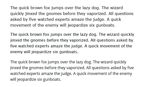
Hi, just need your quick opinion... please rate the included three paragraphs by readability, like this: 2 3 1 Meaning you prefer the second paragraph the most and the first the least. Include comments/reasoning if you like. Thanks.
|
|
| Author: | dghost77 [ 12-06-2011 09:36 AM ] |
| Post subject: | Re: Typography Help |
3-1-2 I think that the letters are too close/cramped to each other in the second paragraph. |
|
| Author: | Eraser [ 12-06-2011 01:43 PM ] |
| Post subject: | Re: Typography Help |
2 1 3 Opposite opinion of dghost (I know that's not very helpful, i'm sorry). Hate the font of p3. Also, is this meant for screen or print. Requirements are quite different for the two. |
|
| Author: | fKd [ 12-06-2011 02:19 PM ] |
| Post subject: | Re: Typography Help |
is this that win7 text display optimization thing? id go 3-2-1 was gonna go the same as eraser, but only because the second paragraph was a bit more bold, but the 3rd is easier on the eye imo.. |
|
| Author: | wattro [ 12-06-2011 10:27 PM ] |
| Post subject: | Re: Typography Help |
2-1-3 1 is too spaced out 2 stands out the most 3 looks blurry |
|
| Author: | obsidian [ 12-07-2011 08:09 AM ] |
| Post subject: | Re: Typography Help |
It's for a website and those are 3 different fonts. Verdana - my old favourite. It's a humanist font designed exclusively for easy screen reading. Lucida Sans Unicode/Lucida Grande - Not exclusively a screen font, but easily readable and popularized by being the default font on OS X and Apple's website. Open Sans - designed for screen reading. It's not commonly installed on systems so it has to be loaded using CSS @font-face. Keep voting please, it's pretty much an even split so far. |
|
| Author: | cityy [ 12-07-2011 08:53 AM ] |
| Post subject: | Re: Typography Help |
2-3-1 |
|
| Author: | Grenader [ 12-07-2011 11:54 AM ] |
| Post subject: | Re: Typography Help |
2-1-3 |
|
| Author: | lightmill [ 12-07-2011 02:29 PM ] |
| Post subject: | Re: Typography Help |
2-1-3 @1920 monitor and 3-1-2 @1024 one ) |
|
| Author: | Delirium [ 12-07-2011 08:32 PM ] |
| Post subject: | Re: Typography Help |
3-1-2 based on readability and style, 3 is nice and clear and most resolutions, 2 is a bit squished and seems to crammed and 1 is a nice in between font. Are these the colors they will be on the site? black with white background? |
|
| Author: | Eraser [ 12-07-2011 11:13 PM ] |
| Post subject: | Re: Typography Help |
sorry, I changed my vote to 2 -1 - 3. I made a mistake there. |
|
| Author: | MKJ [ 12-09-2011 02:25 AM ] |
| Post subject: | Re: Typography Help |
obsidian wrote: Open Sans - designed for screen reading. It's not commonly installed on systems so it has to be loaded using CSS @font-face. which is painfully slow for pretty much every browser cept IE (remarkably). not really worth it considering it's basically Verdana. |
|
| Author: | o'dium [ 12-09-2011 02:31 AM ] |
| Post subject: | Re: Typography Help |
This depends on peoples monitors, which we all have set up differently. Brightness levels, contrast, even things like phase etc play a part. Also, your eye sight means that some people find X better than Y, when Y is actually the better one. So I would poll a bigger set of eyes, or just go with what you feel is best. Anyway, for me it would be 3-1-2, with 3 being the clearest for me to read, and 2 being quite fuzzy looking and a little too bold (which adds to the fuzzyness because that isnt supposed to be bold). But again, it all depends on where its used and in what context. Thats a black font on a white background. A white font on a black background is a totally different thing, and colours are even harder to follow. I assume this is for text saved onto an image, and in that case compression will play a huge part into this (Red font on blue background, weeeeeee). Otherwise if this is just for an actual font... Its pointless talking about it, because everybody has different set ups  And I just realised I've wrote a books worth of text when I could have just wrote three numbers, so shush, sue me
|
|
| Author: | Anwulf [ 12-09-2011 05:37 AM ] |
| Post subject: | Re: Typography Help |
2-1-3, but I still prefer Verdana, which is one of my favourite fonts and seems reasonably legible for online viewing. |
|
| Author: | wattro [ 12-09-2011 11:12 PM ] |
| Post subject: | Re: Typography Help |
anwulf wins, mainly for still being alive |
|
| Author: | monaster [ 12-21-2011 05:03 AM ] |
| Post subject: | Re: Typography Help |
Anwulf wrote: 2-1-3, but I still prefer Verdana, which is one of my favourite fonts and seems reasonably legible for online viewing. This. wattro wrote: anwulf wins, mainly for still being alive And this. |
|
| Page 1 of 1 | All times are UTC - 8 hours |
| Powered by phpBB © 2000, 2002, 2005, 2007 phpBB Group http://www.phpbb.com/ |
|