Open discussion about any topic, as long as you abide by the rules of course!
Yeahso
Posts: 522 Joined: Mon Sep 21, 2009 10:23 am
Post
by Yeahso Thu May 12, 2011 1:49 am
Is that what they're called? I've never seen anything like them in my life.
Not really my style of photography, but wanted to try something a bit different.
xer0s
Posts: 12447 Joined: Sat Feb 10, 2001 8:00 am
Post
by xer0s Thu May 12, 2011 2:12 am
Yeahso wrote:
God damn.
You've got me rolling tonight...
Captain
Posts: 20410 Joined: Thu Jan 05, 2006 2:50 am
Post
by Captain Thu May 12, 2011 2:16 am
Yeahso wrote: Is that what they're called? I've never seen anything like them in my life.
They usually indicate tornadic activity, so you probably won't witness them in England.
xer0s
Posts: 12447 Joined: Sat Feb 10, 2001 8:00 am
Post
by xer0s Thu May 12, 2011 2:22 am
Yeah I've seen those clouds a several times. I live in an area with some of the most fucked up weather. 60 degree swings, tornados, softball size hail, amazing lightning storms, blizzards (with lightning), heat waves, drought, and floods. Nothing is off limits...
andyman
Posts: 11198 Joined: Wed Feb 09, 2005 8:20 pm
Post
by andyman Thu May 12, 2011 2:41 am
Decided to go with color tonight
Captain
Posts: 20410 Joined: Thu Jan 05, 2006 2:50 am
Post
by Captain Thu May 12, 2011 5:12 am
xer0s wrote: Yeah I've seen those clouds a several times. I live in an area with some of the most fucked up weather. 60 degree swings, tornados, softball size hail, amazing lightning storms, blizzards (with lightning), heat waves, drought, and floods. Nothing is off limits...
Except rational thought...
Whiskey 7
Posts: 9711 Joined: Sat Jul 21, 2001 7:00 am
Post
by Whiskey 7 Thu May 12, 2011 6:54 am
andyman wrote: Decided to go with color tonight_ [/img]
Very nice andyman
Yeahso
Posts: 522 Joined: Mon Sep 21, 2009 10:23 am
Post
by Yeahso Fri May 13, 2011 1:17 am
Quite getting into this weird stuff.
andyman
Posts: 11198 Joined: Wed Feb 09, 2005 8:20 pm
Post
by andyman Fri May 13, 2011 1:30 am
I like that one.. how long to put together?
Tsakali
Posts: 7175 Joined: Thu Mar 02, 2000 8:00 am
Post
by Tsakali Fri May 13, 2011 1:51 am
wow that's really cool stuff..it's like a new type of art all together
andyman
Posts: 11198 Joined: Wed Feb 09, 2005 8:20 pm
Post
by andyman Fri May 13, 2011 3:29 am
This one came out a little darker than it looked like in the editor... oh well
Yeahso
Posts: 522 Joined: Mon Sep 21, 2009 10:23 am
Post
by Yeahso Fri May 13, 2011 7:11 pm
andyman wrote: I like that one.. how long to put together?
Couple of hours of actual work, a lot of time seems to be spent staring at the screen wondering what'll go where.
This one took about 45 minutes.
xer0s
Posts: 12447 Joined: Sat Feb 10, 2001 8:00 am
Post
by xer0s Fri May 13, 2011 8:19 pm
So are you combining several shots into one? Or how are you ending up with this final product?
Yeahso
Posts: 522 Joined: Mon Sep 21, 2009 10:23 am
Post
by Yeahso Fri May 13, 2011 9:35 pm
Yeah, every element in the picture is from a separate photograph I have taken at some point.
andyman
Posts: 11198 Joined: Wed Feb 09, 2005 8:20 pm
Post
by andyman Sat May 14, 2011 12:30 am
That is outfuckingstanding!
andyman
Posts: 11198 Joined: Wed Feb 09, 2005 8:20 pm
Post
by andyman Sat May 14, 2011 1:36 am
little surfboard sunset shot
andyman
Posts: 11198 Joined: Wed Feb 09, 2005 8:20 pm
Post
by andyman Sat May 14, 2011 4:14 am
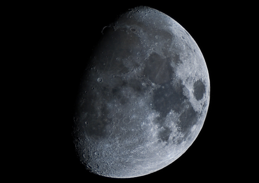
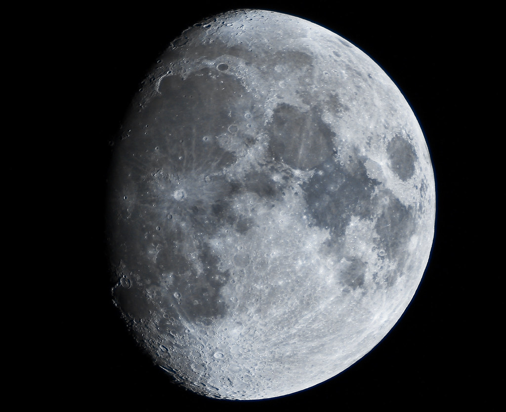
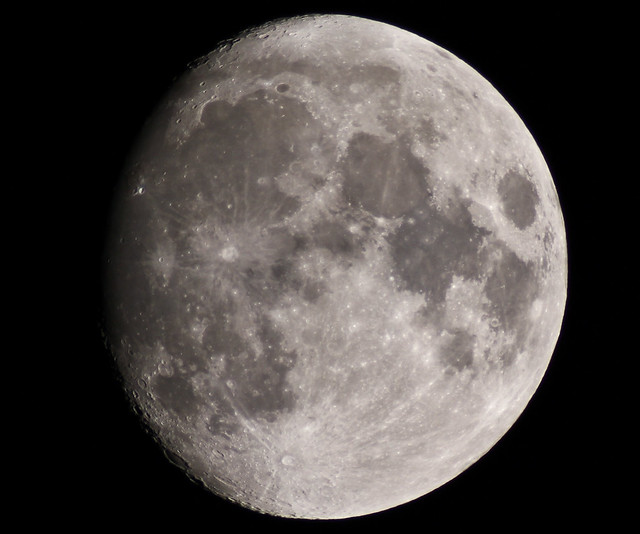
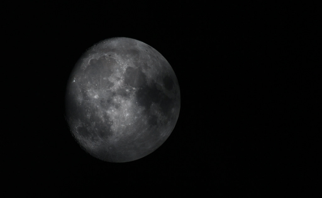
4 more days and it's full, 3 more days and the new telescope gets here.. heck yes
Peenyuh
Posts: 3783 Joined: Thu Jan 03, 2008 3:46 am
Post
by Peenyuh Sat May 14, 2011 10:07 am
DUDE! Did you juss say "heck"?
[color=#00FF00][b]"How do you keep the natives off the booze long enough to pass the test?" Asked of a Scottish driving instructor in 1995.[/b][/color]
shaft
Posts: 12473 Joined: Fri Dec 10, 1999 8:00 am
Post
by shaft Sat May 14, 2011 6:37 pm
Tina, you fat lard, come get some dinner.
andyman
Posts: 11198 Joined: Wed Feb 09, 2005 8:20 pm
Post
by andyman Sat May 14, 2011 7:26 pm
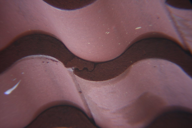
Rainy day, i'll take pictures of anything
andyman
Posts: 11198 Joined: Wed Feb 09, 2005 8:20 pm
Post
by andyman Sat May 14, 2011 11:45 pm
OH YEAH... had an epiphany earlier when I figured out what the little screw was for on the telescope adapter: to put eyepieces in there and hold them in place! The 9mm eyepiece fits, which gives massive magnification but also cuts a ton of light out, and I hacked up the 2x piece to make it fit in there too (but not at the same time). So tonight, I'll do a super zoomed in shot too.
here's an example
35mm lens
Telescope attached
Telescope with the 9mm eyepiece
No that's not a crop... craziness :P
andyman
Posts: 11198 Joined: Wed Feb 09, 2005 8:20 pm
Post
by andyman Sun May 15, 2011 5:46 am
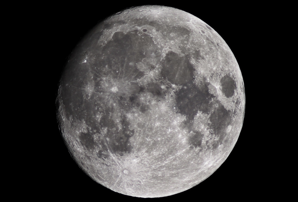
There was a lot of fast moving clouds tonight after the rain, this one has some clouds in front, I thought it made it look cool
I got some with the 2x and the other magnification lens but they aren't very clear and not really worth the trouble.
dubz
Posts: 513 Joined: Tue Sep 27, 2005 3:07 am
Post
by dubz Mon May 16, 2011 9:15 am
how depressing, shaft having a cook out by himself... keeping the spirits high after his wife and kids left him for some "piddla"