 |
 |
|

|
| Topic Starter | Topic: ct3tourney2 | ||||
|---|---|---|---|---|---|
|
cityy
surfaceparm nomarks  Posts: 1018 |
|
||||
| Top |
|
Hipshot
This is not Æon!  Posts: 2222 |
|
| Top |
|
cityy
surfaceparm nomarks Posts: 1018 |
|
||||
| Top |

|
roughrider
Swift and Deadly  Posts: 1679 |
|
||||
| Top |
|
Theftbot
Theftbot  Posts: 483 |
|
||||
| Top |
|
tehSandwich
Grunt  Posts: 64 |
|
||||
| Top |


|
roughrider
Swift and Deadly Posts: 1679 |
|
||||
| Top |
|
Hipshot
This is not Æon! Posts: 2222 |
|
||||
| Top |
|
deqer
Insane Quaker  Posts: 298 |
|
||||
| Top |


|
fKd
Immortal  Posts: 2476 |
|
||||
| Top |
|
Noruen
Insane Quaker Posts: 308 |
|
||||
| Top |
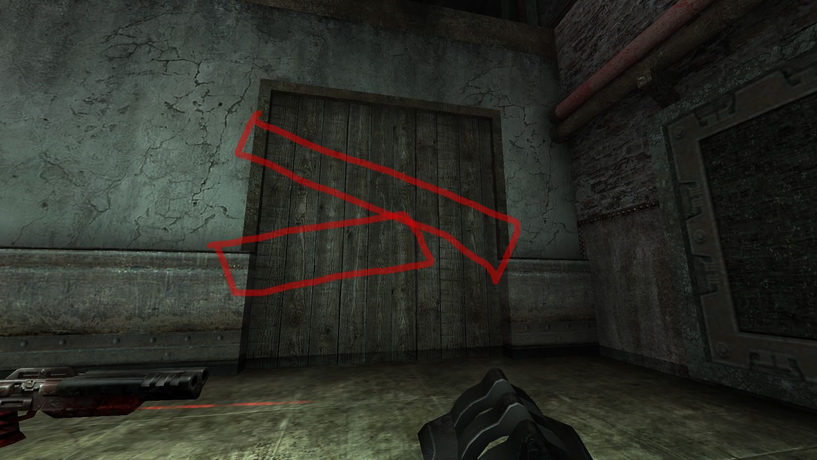
 I will try it.
|
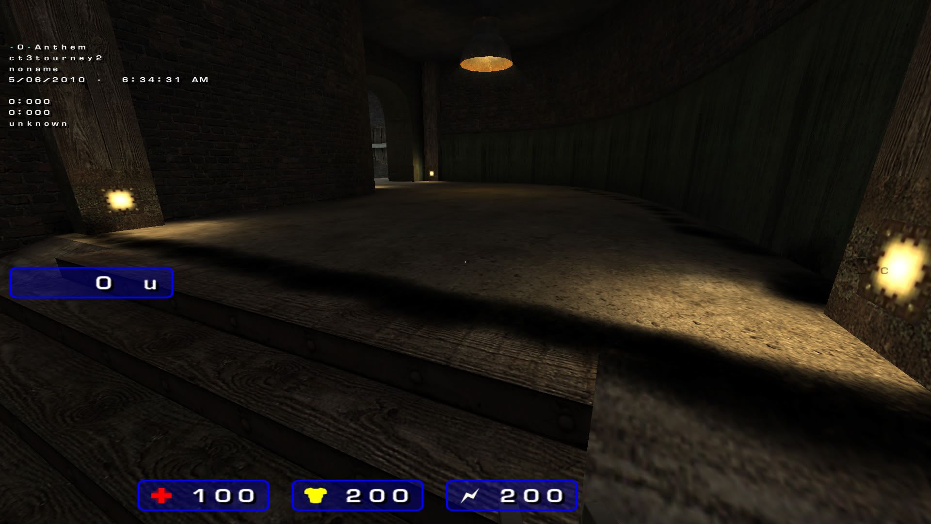
Anthem
Insane Quaker Posts: 399 |
|
||||
| Top |

|
fKd
Immortal Posts: 2476 |
|
||||
| Top |
|
dONKEY
The Afflicted  Posts: 581 |
|
||||
| Top |
|
cityy
surfaceparm nomarks Posts: 1018 |
|
||||
| Top |
|
tehSandwich
Grunt Posts: 64 |
|
||||
| Top |
|
cityy
surfaceparm nomarks Posts: 1018 |
|
||||
| Top |
|
Hipshot
This is not Æon! Posts: 2222 |
|
||||
| Top |
|
cityy
surfaceparm nomarks Posts: 1018 |
|
||||
| Top |


|
AEon
Boink!  Posts: 4493 |
|
||||
| Top |
|
Anthem
Insane Quaker Posts: 399 |
|
||||
| Top |
|
cityy
surfaceparm nomarks Posts: 1018 |
|
||||
| Top |
|
Anthem
Insane Quaker Posts: 399 |
|
||||
| Top |
|
AEon
Boink! Posts: 4493 |
|
||||
| Top |
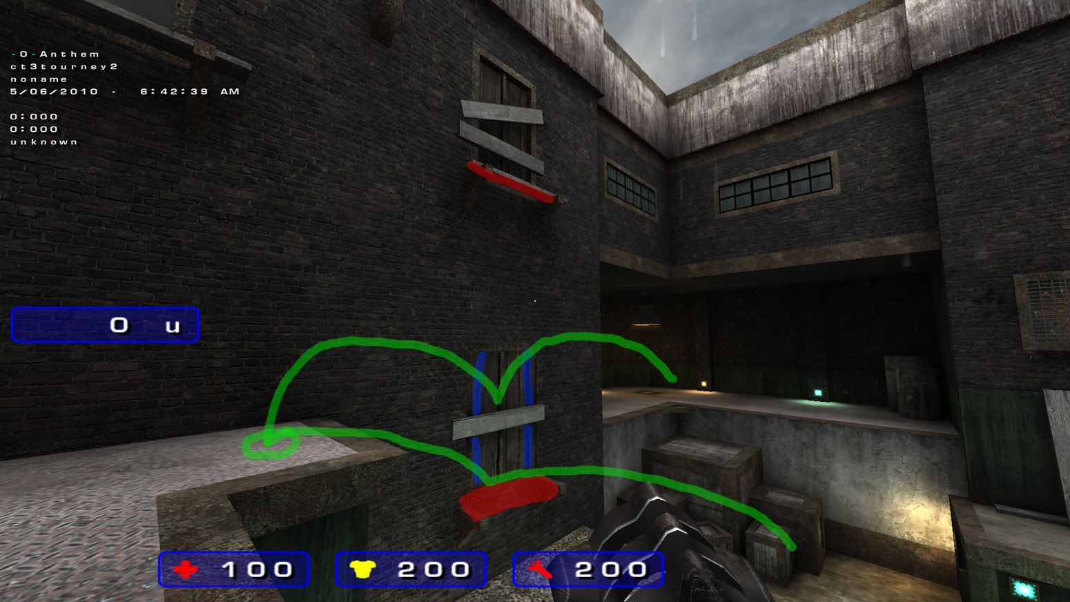
 Looks much nicer now.
|
Anthem
Insane Quaker Posts: 399 |
|
||||
| Top |
|
cityy
surfaceparm nomarks Posts: 1018 |
|
||||
| Top |
|
Anthem
Insane Quaker Posts: 399 |
|
||||
| Top |
|
deqer
Insane Quaker Posts: 298 |
|
||||
| Top |
|
Kaz
Señor Shambler  Posts: 849 |
|
||||
| Top |
|
Anthem
Insane Quaker Posts: 399 |
|
||||
| Top |
|
cityy
surfaceparm nomarks Posts: 1018 |
|
||||
| Top |
|
AEon
Boink! Posts: 4493 |
|
||||
| Top |
|
Anthem
Insane Quaker Posts: 399 |
|
||||
| Top |
|
^Ghost
Mercenary  Posts: 230 |
|
||||
| Top |

|
ShadoW_86
Insane Quaker Posts: 270 |
|
||||
| Top |
| Quake3World.com | Forum Index | Level Editing & Modeling |
  |