Someone PM'ed me asking about getting started with creating textures in Photoshop. Since this is a general advice topic that everyone can benefit from, I thought I would post this publicly (you can still PM me if you have any private questions).
POST EDIT: I may edit this post later with more stuff and maybe a few images. I'm too hungry right now to keep typing.
Get a Drawing Tablet
Pressure sensitivity when painting is key. It gives you a completely different dimension to work with than a mouse. A mouse button is digital, click or not clicked, 100% or 0%. A pen and tablet is analog, giving you 1024 (or more) levels of pressure sensitivity so you get full control of brush size and opacity.
Wacom is the de facto drawing tablet manufacturer. There are a few knock-off brands but most should be avoided. Wacom makes 3 main product lines, the consumer Bamboo, professional Intuos and the high-end Cintiq (display + tablet in one). Each comes in a variety of sizes.
The Bamboo has 1024 levels of pressure sensitivity and should work fine for most beginner texture artists. Intuos has double the pressure sensitivity (though on an 8-bit/channel image, you only have 128 values for shade so you're not likely to ever notice) and will also detect the pen's tilt. This is more useful if you do a lot more freehand painting. Textures are fine with a Bamboo, get an Intuos if you're doing other illustration work. You probably won't be getting a Cintiq unless you have a few thousand dollars sitting in your cookie jar. Get the size that you are comfortable working with and that you can afford. They don't take a lot of wear damage and are well built so you can feel good about investing in one.
Note: I've been having trouble with the latest drivers (6.1.6-7 for Windows 7) with regards to pressure sensitivity. If you find that you are having problems with intermittent fat lines when drawing, try rolling back the drivers one or two versions.
Calibrate Your Monitor
Anyone who uses a computer a lot should probably do this anyway. Make sure your monitor's output is what it should be or you'll be painting with the wrong shade for all your textures and end up with a hot pink texture theme rather than red. Monitors out of the box are typically calibrated for showrooms but are actually horrible to really work on.
There is software to help with eyeballing your calibration (Windows 7 comes with "Calibrate Display Color" utility) but I would really recommend a hardware calibration tool, they aren't expensive anymore so you should pick one up and are infinitely more accurate than eyeballing, which will also make you go cross-eyed. Calibration tools stick on your monitor and the software runs a bunch of colours on your screen while it samples the colours. An .icc profile is generated by the software which your OS uses to correct your display.
Setting Up Photoshop
There isn't too much to set up for Photoshop, but I do have a few pointers.
Check your preferences (Edit > Preferences)...
File Handling > Maximize PSD and PSB File Compaitiblity > set to "always".
Performance > Set your scratch disks if you have multiple drives. This is cache data that Photoshop uses, you can get a performance benefit if you put the scratch on your faster drives/partitions. If applicable on CS4/CS5, enabling GPU support helps speed and enables cool stuff like 3D model painting.
Cursors > Normal Brush Tip and for Other Cursors, choose Precise.
Guides, Grid & Slices > Set gridline to 32 with subdivisions 4, you may need to alter as necessary. This helps when you are working on the grid with textures.
Make sure you are working with 8bits/channel and RGB Color in Image > Mode.
Basic Photoshop Techniques
- Painting from scratch or from photo reference: Photo reference textures are easier to do so a lot of beginners will do this, but it creates a certain "look" that is hard to shake. Painted textures can still look very real, generally take longer, but will usually look way better than photo reference. Learn to work with painted textures and develop techniques for them and you can apply them to photos too for a hybrid of techniques. This will set your textures apart from other people.
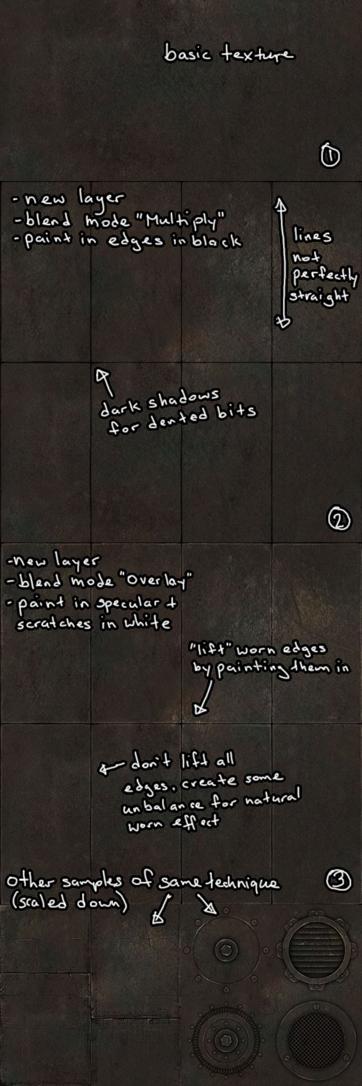
- Minimize use of generated effects like "bevel and emboss" because it just looks like "bevel and emboss" than real shadows and edges. Beginners tend to gravitate towards these features because there is an instant, "whoa, cool!" factor. These tools have their place, but for a beginner you're better off doing it correctly by hand-paint lighting, shadows and edges in. I see this effect on web sites and advertisements as well and I always facepalm.
- Learn to manage your layers. This is a core strength of Photoshop. Take the time to name your layers, use layer folders. It's not uncommon that I find myself working with 20 or more layers. Do it correctly and you may find yourself recycling layers from an old texture file to a new texture saving you time.
- Learn to use blend modes. Much of texture creation is about lighting and blend modes are a great way to simulate real world lighting. You can create additive (light) or subtractive (shadow) lighting effects, add detail textures to a base surface, etc.
- Learn to use adjustment layers and masks. Adjustment layers are a great non-destructive way of playing around with your texture brightness, contrast, levels, colour, saturation, etc. values. As a separate layer, they can be applied to just one layer or several, can be resorted and edited later. Pro-tip: With the adjustment layer selected above another layer, hover your mouse between the two layers and ALT-Click to make the adjustment layer affect only the one layer below (works for other blend-mode textures as well). Masks exist so you can remove backgrounds without actually deleting them. They are especially useful when working with photo references and vectors.
- Learn to work with vectors. Sort of an advanced topic all it's own, but these are useful for creating shapes. A basic use would be to create hexagonal bolts on metal surfaces. More advanced users can import files from Illustrator.
- Learn to work with fixed colour palettes across your texture set. Mismatched colours or rainbow textures tend to look awful. Set a few basic colours and use them across your entire texture set. You can create a custom palette on a separate layer or create your own swatches palette. This is where blend modes and adjustment layers come in.
- Create a base texture, then build up derivatives. Spend some time making a core base texture like a slab of iron, it should look pretty plain with few details and uniform so that it will tile properly. Then create a set of the same texture but with different details, iron plates, iron pipes, riveted iron, rusty iron, etc.
- Techniques for hiding seams: There are a lot and how you use them will depend on the situation. Some beginner tools are the stamp and heal tools. Photoshop's new Content Aware Fill and Content Aware Scale can work wonders at times. Sometimes copying a chunk of the texture to a new layer and positioning it over the seam can work too.
- If you are working with alpha channels (grates and stuff), you'll need to create a new channel in the Channels palette. It will be named Alpha 1 and you can toggle on/off visibility in the palette.
Basic Keyboard Shortcuts
- All the tools in the toolbox have shortcuts, you can see them all by hovering your mouse over them. Press and hold a tool with the little black arrow in the bottom right corner and it will open the tool group. Hold shift+tool_shortcut (shift+B for example) to switch between tool groups.
- Holding spacebar temporarily enables the move tool, so you can quickly move the canvas around while painting without actually switching tools.
- Tab toggles the tool palettes. F toggles screen modes.
- Alt+scroll-wheel zooms the document (or Ctrl++ and Ctrl+-)
- With any of the brush tools selected, right-click will enable the quick brush menu, so you can quickly choose among presets.
- Alt+left-click will sample the colour where your cursor is. Handy for quick colour changes.
- Alt+shift+right-click+drag opens up the quick colour menu so you can quickly choose a new colour.
- Alt+right-click+drag will allow you to quickly change the brush size (also [ and ] brackets).
- Number keys changes layer opacity. Just tapping 8 will set 80%. Hitting number keys quickly will set it to the actual value, hitting 8 and 8 quickly will set the opacity to 88%. With a brush tool selected, the number keys will change brush opacity.
- Ctrl+R toggles the ruler. Ctrl+' toggles grid. Ctrl+; toggles guide lines. Create new guide lines by dragging off the ruler.
References
Yeah, the web is full of tutorials, pick and choose a million. I'm sure there are a few good Photoshop books, but I never bothered to read one - Photoshop's interface may seem a little overwhelming at first, but it's actually quite intuitive and you'll learn where everything is soon enough with just random clicking and trying stuff out. I've self-taught myself Photoshop starting with version 2.5 and there really wasn't much help on the Internet in the '90's.
Adobe TV, while they are really trying to sell you on the product, does have some fantastic video tutorials teaching you about various techniques and tools, great for beginners and people who want to brush up on their skills. I've been watching ctrl+Paint recently for practising my freehand illustration techniques. If I had to choose just ONE texture creation tutorial on the Internet, I would pick Hard Surface Texture Painting.
Keep Practicing and Learning
Photoshop is one of those programs that you get better at with frequent practice. Occasionally, you'll learn about something new or develop a new technique which may completely simplify, improve or change your workflow. I still learn new stuff and figure out cool ways of doing things.
|