Well no they don't do that normally

Although I found some images with rocks just laying on top of each other without any mortar and they looked nothing like this ether
but as I said this was just a test and I think I learnt a bit from it
| Quake3World.com https://www.quake3world.com/forum/ |
|
| Screenshots https://www.quake3world.com/forum/viewtopic.php?f=10&t=51 |
Page 98 of 210 |
| Author: | g0th- [ 02-03-2009 08:12 AM ] |
| Post subject: | Re: Screenshots |
Well no they don't do that normally Although I found some images with rocks just laying on top of each other without any mortar and they looked nothing like this ether but as I said this was just a test and I think I learnt a bit from it |
|
| Author: | Kat [ 02-04-2009 01:39 PM ] |
| Post subject: | Re: Screenshots |
Kaz wrote: Pretty cool wall. Pretty cool wall. What you're possibly thinking of is something called "drystone walling" whereby the weight of a stone (+shape/size) is all that's used to hold it in place; the UK has a huge amount of this type of wall boundary to denote borders between fields and farm land. So technically a wall doesn't necessarily need mortar under certain circumstances.
Do rocks normally intersect like that? Shouldn't there be mortar or something |
|
| Author: | MKJ [ 02-05-2009 05:39 AM ] |
| Post subject: | Re: Screenshots |
it will probably fit better if used for a cobblestone road than a wall 
|
|
| Author: | obsidian [ 02-05-2009 08:19 AM ] |
| Post subject: | Re: Screenshots |
If you can space out the pieces of stone ever so slightly it would look better, so the stone doesn't look like they're intersecting into each other. Whether you want to add mortar between the stones is up to you. |
|
| Author: | g0th- [ 02-05-2009 03:21 PM ] |
| Post subject: | Re: Screenshots |
Thanks guys. We'll see if i ever decides to try to fix it. And just to clarify a bit. The single stone row you see on the screen is the only row of stones I did and baked a normal to it and then duplicated, mirrored, rotate and that sort of stuff so it was harder to detect the repetition. That's one of the reasons to why it's a bit hard to just quickly space the stones a bit out. On the bright side however It would be quite good to use in a engine that supports efficient "reuse of models" like Unreal 3 |
|
| Author: | obsidian [ 02-05-2009 08:14 PM ] |
| Post subject: | Re: Screenshots |
IIRC, model "instancing" saves memory bandwidth, but doesn't actually mean the video card draws less polygons or anything. |
|
| Author: | Silicone_Milk [ 02-05-2009 09:34 PM ] |
| Post subject: | Re: Screenshots |
Yeah from what I understand it just saves one actual geometric data block then has all other instances reference that data. The triangles still have to be drawn but it uses less memory to have all the models in the scene. |
|
| Author: | g0th- [ 02-06-2009 05:03 PM ] |
| Post subject: | Re: Screenshots |
Hmm, well approximately how much faster would it be to use instances then normal models. Maybe that's very dependable on the scene and the model itself? Anyway here's another wip, still a lot more to be done 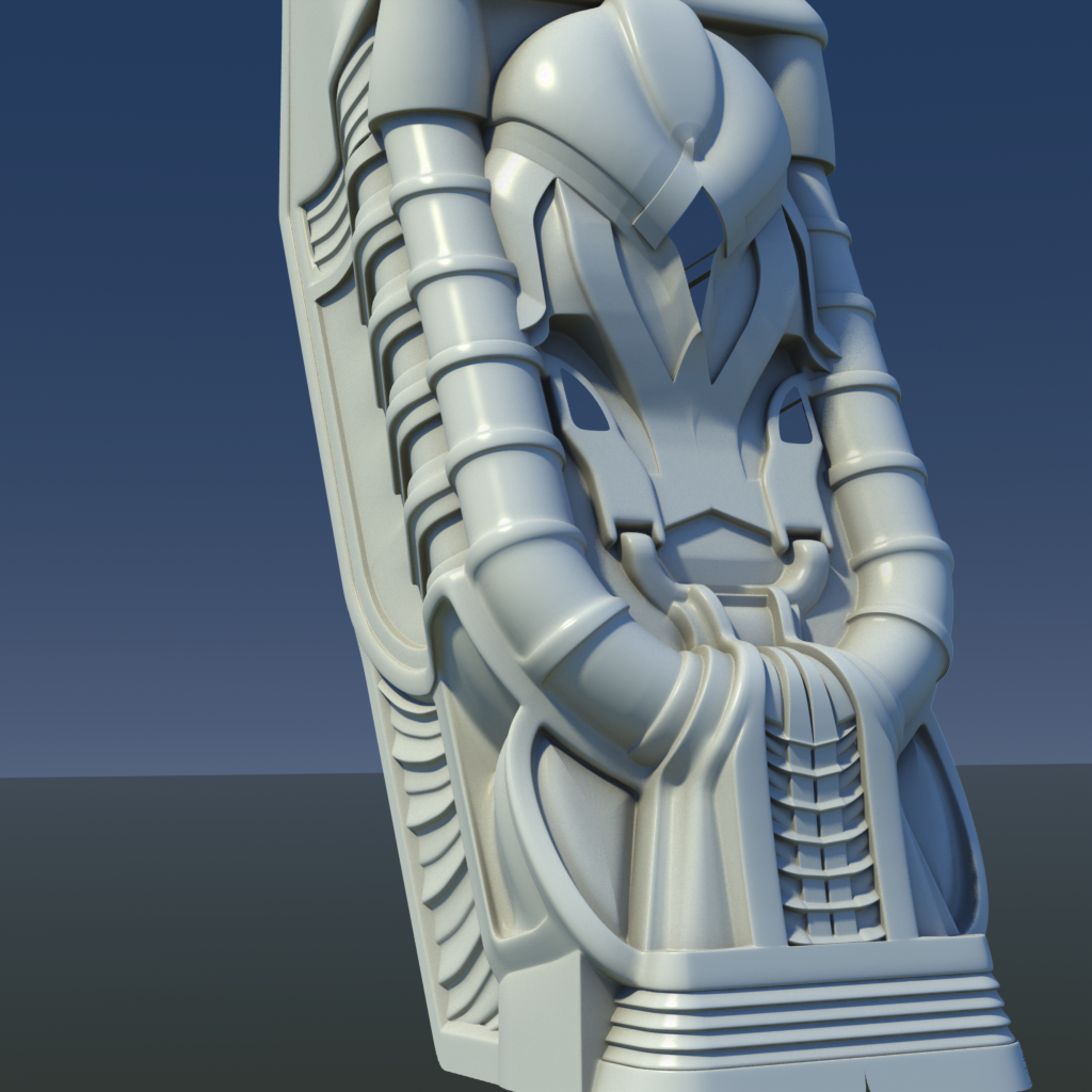
|
|
| Author: | Grenader [ 02-06-2009 06:14 PM ] |
| Post subject: | Re: Screenshots |
Whatever it is, that's an amazing piece of art. What did you model it in? |
|
| Author: | g0th- [ 02-06-2009 06:28 PM ] |
| Post subject: | Re: Screenshots |
Thanks Grenader. It's modeled in Modo. I Plan to bake it to a low poly mesh later to use in a new map I'm working on. |
|
| Author: | o'dium [ 02-07-2009 02:46 AM ] |
| Post subject: | Re: Screenshots |
Just thought you would like to see the latest versions of the Marauders? No, oh ok... Bah what the hell, I'll show you anyway. Shown below are the final versions of the Marauder Technician and the Marauder Scout. You can thank Bitterman and his fantastic lead pencil (Easy now...) for these awesome shots: [center]    [/center] [/center]As always, these shots have been available on the forums for quite a while. The forums is where all the good stuff gets posted, a lot of which is never shown in the news, so get your backside over there now and register
|
|
| Author: | Plan B [ 02-07-2009 08:13 AM ] |
| Post subject: | Re: Screenshots |
Hmm, I know it's only concept art, and no offense to your team mate, but those sketches look a bit "off". For instance, in that first pic, why does the guy need knee supporters for his shoes? Some laces would do just fine. To be honest, this is something I also notice in a lot of other games, where models are fitted with too elaborate attire that just doesn't seem functional. Trying to make them look more interesting and cool, I suppose, but looks kind of retarded. And in that third pic, right arm's way too long OR left arm's way too short. Plus head&shoulder mounted turrets? Meh. |
|
| Author: | o'dium [ 02-07-2009 09:11 AM ] |
| Post subject: | Re: Screenshots |
I would take those crits, apart from the Last pic, hes a Tech (Medic). Most of whats there is functional in game lol. Still, valid crits. Cant say I agree with them. Theres only so much you can keep things real before it gets boring, and when your dealing with the future, with mutants and all sorts, its kinda silly to say "this wouldn't happen" because you just dont know 
|
|
| Author: | pjw [ 02-07-2009 09:17 AM ] |
| Post subject: | Re: Screenshots |
Edit: ^^^^Okay, you said it with a lot fewer words. Nevermind me. Plan B wrote: Hmm, I know it's only concept art, and no offense to your team mate, but those sketches look a bit "off". For instance, in that first pic, why does the guy need knee supporters for his shoes? Some laces would do just fine. To be honest, this is something I also notice in a lot of other games, where models are fitted with too elaborate attire that just doesn't seem functional. Trying to make them look more interesting and cool, I suppose, but looks kind of retarded. And in that third pic, right arm's way too long OR left arm's way too short. Plus head&shoulder mounted turrets? Meh. Sorry, but I totally disagree with this sort of feedback. If you're going to step through concept art for almost any sort of speculative fiction game with your "logic goggles" on, then you'll probably end up tossing out just about everything (and I say "almost any sort" only because there are certain very "hard" stories and concepts where the creators go to great lengths to ground them in known science and reality--that's a whole different animal). By the same token, with a little imagination, I can "logic" back in just about anything, with a bit of rationalization: The guy is obviously wearing the knee protector things because he patrols an environment with occasional puddles of knee-deep toxic sludge that would damage his legs otherwise. Or perhaps he regularly has to crawl through ducts, or passages that have been bored through abrasive silica crystals...his hand protectors are in his back pocket, or perhaps just out-of-frame there... In the third pic, the left arm is obviously shorter because it was lost (cut off? blown off? intentionally amputated?) at about mid-bicep (thus the smaller/shriveled look), and replaced with a short, functional prosthetic that allows him to still manipulate objects, or tear out throats. Trying too hard to force concept art to "make sense" seems, to me, to kind of miss the point. Concept art *is* about looking interesting and cool, and it's also about "what if" and stimulating the imagination. It shouldn't be outright nonsensical or stupid, but it's not necessarily about providing something that's immediately understood, familiar, and consistent with what you know. Just my $0.02. I think it looks interesting and cool. Keep on keepin' on.
|
|
| Author: | rgoer [ 02-07-2009 10:47 AM ] |
| Post subject: | Re: Screenshots |
obsidian wrote: IIRC, model "instancing" saves memory bandwidth, but doesn't actually mean the video card draws less polygons or anything. more important than the memory savings, it saves draw calls... all instances of a given mesh are drawn with a single draw call
|
|
| Author: | Plan B [ 02-07-2009 11:05 AM ] |
| Post subject: | Re: Screenshots |
No, seriously, when you want to suspend disbelief, you still want it to make sense in its own universe, even if these mutants are wading through toxic sludge. Having a guy wear knee straps, joined to his shoes, is not plausible in any kind of a fucked up fanatsy. Let alone carrying head&shoulder turrets. There are a lot more realistic things these mutants can adapt to, equally offputing, but more realistic. Focus on that. |
|
| Author: | o'dium [ 02-07-2009 11:46 AM ] |
| Post subject: | Re: Screenshots |
Erm, I already told you it wasn't "head & shoulder turret" lol...? |
|
| Author: | Shadowdane [ 02-07-2009 03:14 PM ] |
| Post subject: | Re: Screenshots |
Dunno if this will turn into anything, but got bit by the mapping bug. I haven't done anything in about 3-4yrs, but decided to try something out. Found this high-res texture pack for Q2, gonna try them in a Q3 map I think. Yes its a wall, but what do you think thus far? hehe 
|
|
| Author: | g0th- [ 02-07-2009 03:48 PM ] |
| Post subject: | Re: Screenshots |
Looks pretty good Shadowdane. The texture at the top of the structure looks a bit out of place though |
|
| Author: | Shadowdane [ 02-07-2009 04:48 PM ] |
| Post subject: | Re: Screenshots |
g0th- wrote: Looks pretty good Shadowdane. The texture at the top of the structure looks a bit out of place though Thanks goth-, Yah I put that together in maybe 30 mins or so. Not 100% if I'll use these textures at all. They do look nice cause most of them are double the resolution used in Quake 3. |
|
| Author: | fKd [ 02-08-2009 01:18 PM ] |
| Post subject: | Re: Screenshots |
i like the highlights on the textures, but imo these kinda textures look a little weird as the lighting seems to get a little lost on really busy textures. looking cool tho man. btw, how did you get q3rad to work in vista? dont think i can switch back after gtk.. but yeah |
|
| Author: | Shadowdane [ 02-08-2009 06:36 PM ] |
| Post subject: | Re: Screenshots |
fKd wrote: i like the highlights on the textures, but imo these kinda textures look a little weird as the lighting seems to get a little lost on really busy textures. looking cool tho man. btw, how did you get q3rad to work in vista? dont think i can switch back after gtk.. but yeah Just had to setup Compatibility Mode. I tried to use GTKR v1.5... but god they changed some things that just seems stupid. Like why can't I select a face and instantly clone the texture by middle clicking another texture in the 3D window. That technique saved sooo much time doing aligning textures. So went back to v1.4, which I know blind folded! Here are the settings I used: 
|
|
| Author: | o'dium [ 02-14-2009 02:49 AM ] |
| Post subject: | Re: Screenshots |
Another new piece on concept art, this time of the Drone: 
|
|
| Author: | fKd [ 02-15-2009 11:30 AM ] |
| Post subject: | Re: Screenshots |
looking forward to seeing these in 3d
|
|
| Author: | o'dium [ 02-15-2009 02:13 PM ] |
| Post subject: | Re: Screenshots |
Well, speaking of 3D, heres the latest update on the Flamer, low poly with normals. A couple of errors that are getting fixed up: 
|
|
| Author: | fKd [ 02-15-2009 02:37 PM ] |
| Post subject: | Re: Screenshots |
how do you hold it? it looks like there is a lever/trigger at the bottom, but then there is that handle thing with a button? surely you have some kinda grip further down the gun? or am i missing something? and where are the gas canisters? its a cool model, should look wicked textured and in action |
|
| Author: | o'dium [ 02-15-2009 02:42 PM ] |
| Post subject: | Re: Screenshots |
Theres an extra grip on the left side of the model, that you cant see in this shot. It sticks out the side Good question though, I can see why you would think that
|
|
| Author: | [acid] [ 02-17-2009 09:37 AM ] |
| Post subject: | Re: Screenshots |
This is the conversion of "chlorophyl", a former Warsow map, which I built in collaboration with 2 other mappers. It's already final, so for the curious people here's the download. 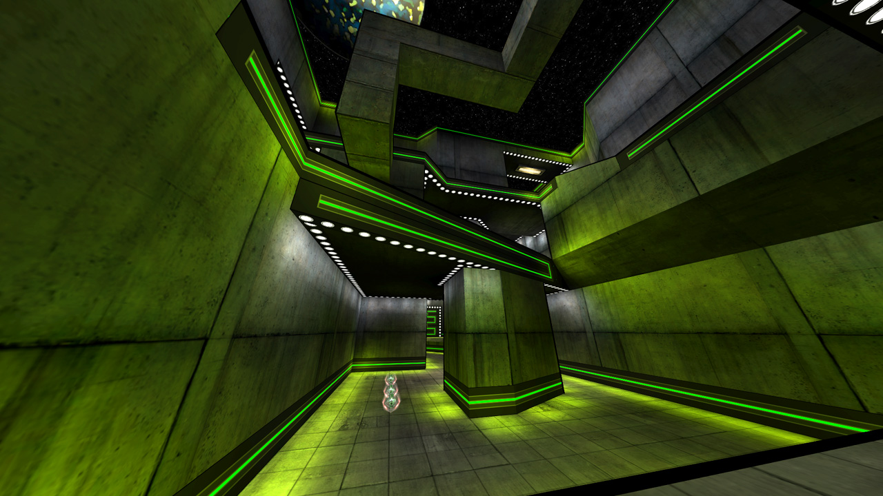
|
|
| Author: | o'dium [ 02-18-2009 12:15 PM ] |
| Post subject: | Re: Screenshots |
Just a little tease... These are some WIP shots of RtCW's mp_beach "Beach Assault" thats being remade. As you can see, there isn't any detail added, no real decals, the outdoor lighting isnt there, the terrain is missing, all sorts of things... But hey, WIP media is WIP media! 
|
|
| Author: | Silicone_Milk [ 02-18-2009 12:38 PM ] |
| Post subject: | Re: Screenshots |
Needs more bloom. |
|
| Author: | Hipshot [ 02-19-2009 01:58 AM ] |
| Post subject: | Re: Screenshots |
rgoer wrote: very cool Hipshot, when can we test it? Hopefully next week (or the one after that). But it's not going to have this theme. I changed it after a while, didn't work with the layout. |
|
| Author: | Kaz [ 02-19-2009 07:27 AM ] |
| Post subject: | Re: Screenshots |
MP Beach is easily the best map, ever. Ever. |
|
| Author: | phantasmagoria [ 02-19-2009 01:20 PM ] |
| Post subject: | Re: Screenshots |
o'dium wrote: Just a little tease... These are some WIP shots of RtCW's mp_beach "Beach Assault" thats being remade. As you can see, there isn't any detail added, no real decals, the outdoor lighting isnt there, the terrain is missing, all sorts of things... But hey, WIP media is WIP media! I don't agree with the pipes coming out of the front of the bunker in the first shot. |
|
| Author: | fKd [ 02-19-2009 01:36 PM ] |
| Post subject: | Re: Screenshots |
yeah, not a good place to put something as it could get shelled/panzered... it should be reinforcing material |
|
| Author: | o'dium [ 02-20-2009 12:34 AM ] |
| Post subject: | Re: Screenshots |
They were already changed after I posted the shot and noticed myself. |
|
| Page 98 of 210 | All times are UTC - 8 hours |
| Powered by phpBB © 2000, 2002, 2005, 2007 phpBB Group http://www.phpbb.com/ |
|