looks really nice, fKd
 but, man, that sky shader is looking outdated as ever. it would be interesting to see how the gothic theme would look under a modern skybox and crisp lighting.
keep it up, looking forward to testing this.
| Quake3World.com https://www.quake3world.com/forum/ |
|
| Screenshots https://www.quake3world.com/forum/viewtopic.php?f=10&t=51 |
Page 194 of 210 |
| Author: | Pat Howard [ 01-07-2015 02:07 PM ] |
| Post subject: | Re: Screenshots |
looks really nice, fKd but, man, that sky shader is looking outdated as ever. it would be interesting to see how the gothic theme would look under a modern skybox and crisp lighting.keep it up, looking forward to testing this. |
|
| Author: | obsidian [ 01-07-2015 08:17 PM ] |
| Post subject: | Re: Screenshots |
Not sure I like the long flight of stairs (not good for playability, probably better with a JP?), and the wrap-around trim. The other screenshots look great. It doesn't have that distinctive look behind your usual maps because of the very different theme, which is good in a way. |
|
| Author: | Pat Howard [ 01-07-2015 09:53 PM ] |
| Post subject: | Re: Screenshots |
obsidian wrote: Not sure I like the long flight of stairs (not good for playability, probably better with a JP?) a JP might be better, but, just to add a second opinion, i've actually never had a problem with long stairs in FFA maps. the staircases in Chiroptera and Estatica never bothered me. i think they are kind of epic. obsidian wrote: It doesn't have that distinctive look behind your usual maps because of the very different theme, which is good in a way. i agree. @fkd: i remember you telling me about gothic maps you were working on in the past and i was always so curious to see what they looked like. it's cool to see you working with different textures. update: about the wrap-around trim. you can break this up by interrupting it with vertical supports like i have done on the top-level detail here. or you can break up the overall horizontal line by pushing modular chunks of architecture up or down. i think sock is the master of this. |
|
| Author: | camel [ 01-14-2015 08:38 PM ] |
| Post subject: | Re: Screenshots |
Stargate Command Center SGC Work in Progress:  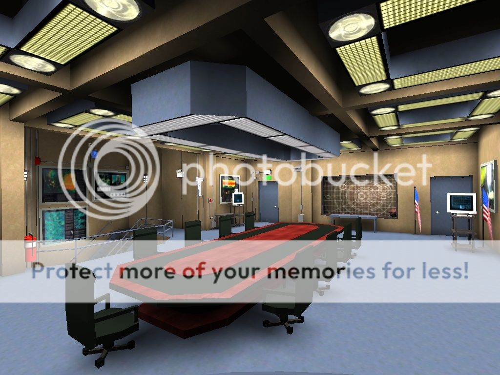   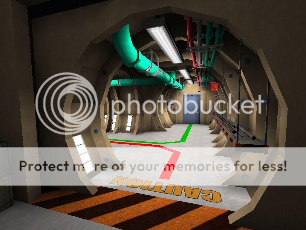     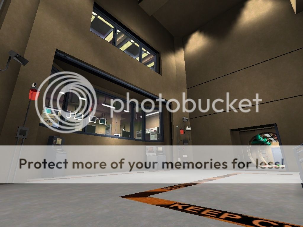   Full Gallery at: http://s447.photobucket.com/user/camel- ... 0WiP/story Video preview: https://www.youtube.com/watch?v=Xk9tgLrjCG0 Video File MP4 60 FPS: http://adf.ly/wFnGP |
|
| Author: | Theftbot [ 01-14-2015 10:16 PM ] |
| Post subject: | Re: Screenshots |
Nice BUT seems too bright! |
|
| Author: | AEon [ 01-15-2015 05:02 AM ] |
| Post subject: | Re: Screenshots |
camel, absolutely amazing work there. Looking at the screenshots, also watched the video on YT, one is so overwhelmed that one thinks... "so what is the big deal?"... Well just imagining trying to create that myself, is dizzying. Very well done... you recognize all the main areas from the TV series. I imagine some of the areas are connected in an "interpreted" way, meaning there was actually no material to show how things are actually connected? Anyway, realism totally eludes me, so it is always interesting to see reality-based architecture for a change. |
|
| Author: | Eraser [ 01-15-2015 06:51 AM ] |
| Post subject: | Re: Screenshots |
Looks nice, but doesn't seem suited for Q3 gameplay at all. Urban Terror would be a better fit. |
|
| Author: | Theftbot [ 01-15-2015 10:17 AM ] |
| Post subject: | Re: Screenshots |
Or Tremulous |
|
| Author: | fKd [ 01-15-2015 12:01 PM ] |
| Post subject: | Re: Screenshots |
obsidian wrote: Not sure I like the long flight of stairs  There is a jp below that fires you up to the top, the steps are more for descending. |
|
| Author: | camel [ 01-15-2015 12:05 PM ] |
| Post subject: | Re: Screenshots |
Theftbot wrote: Nice BUT seems too bright! I did tested few brightning levels, gamma 1.40 seems best for it, even without gamma parameter on light compiling, the map is bright enough, but nasty black spots appear AEon wrote: camel, absolutely amazing work there. Looking at the screenshots, also watched the video on YT, one is so overwhelmed that one thinks... "so what is the big deal?"... Well just imagining trying to create that myself, is dizzying. Very well done... you recognize all the main areas from the TV series. I imagine some of the areas are connected in an "interpreted" way, meaning there was actually no material to show how things are actually connected? Anyway, realism totally eludes me, so it is always interesting to see reality-based architecture for a change. Thanks, I've been spending some time on looking how the things are exactly to made them up for my map, but there is several versions of SGC, I've looked on GMOD, Unreal and few other games, each had different structure, so I mostly looked at the TV show itself, but watching from episode 1 till the final season, you will notice that set has been changed as well past those 10 years or so :P I want to make as much details I can in Q3 engine can handle, I already reached some limit so I have to use -notjunc switch as a temporarly fix in bsp compiling process. Eraser wrote: Looks nice, but doesn't seem suited for Q3 gameplay at all. Urban Terror would be a better fit. If I would follow the principles of original architecture from the TV show (which I honestly wanted to), the map would be even smaller in size, but I keept some aspect ratio for Q3 gameplay, besides this kind of map is intended to work on it's own mod for a stargate gameplay, where player movement speed would be reduced a bit and default Q3 weapons changed to new ones, it is not regular Q3 map for OSP or CPMA. Anyway, If I finish the map, I will release it's first version for a singleplayer EntityPlus mod The mission would be simple, safe the SGC from the aliens invasion :P The most exact map structure I ever found on the Youtube for the SGC was made for Unreal Engine https://www.youtube.com/watch?v=AA-k3CnJCyU it is available for download to your desktop and try it yourself: http://www.stargate-network.net/en/download unfortunely my PC runs it at 6 FPS max, even on the lowest graphics 
|
|
| Author: | Eraser [ 01-16-2015 01:16 AM ] |
| Post subject: | Re: Screenshots |
fKd wrote: obsidian wrote: Not sure I like the long flight of stairs There is a jp below that fires you up to the top, the steps are more for descending. I'd say cut the stairs. Make it a solid wall up to a higher ledge. Might even consider removing the jumppad and making a bouncepad integrated in the wall a la q3dm6. |
|
| Author: | cityy [ 01-16-2015 02:09 AM ] |
| Post subject: | Re: Screenshots |
I don't think long stairs are necessarily bad. They can create interesting dynamics and fun frags if the map flow supports it. Japanese Castles (q3wcp1) probably has the most famous giant staircase and people rushing down there to approach the flag room constantly end up in hilarious fights. What I don't like is offering 2 ways for essentially the same route. It's either or for me! Edit: Also I love angled jumppads! |
|
| Author: | Pat Howard [ 01-16-2015 01:07 PM ] |
| Post subject: | Re: Screenshots |
cityy wrote: What I don't like is offering 2 ways for essentially the same route. It's either or for me! agreed. there are not too many situations where i have seen this work for exactly the same route. it usually just gives me the feeling that the level design is lacking intentionality and the transition points are just being placed arbitrarily. |
|
| Author: | Fjoggs [ 01-18-2015 04:02 AM ] |
| Post subject: | Re: Screenshots |
I disagree. This might hold for a 1on1 environment, but in a FFA, having multiple ways of getting somewhere prevents maps from being predictable and a spamfest (simply spam the stairs with rockets/nades). Depending on what you meant, I don't agree for a 1on1 environment either. Having a costly route (noise via jumppad/platform) from A to B, and a longer safer route from A to B isn't always a bad thing, but I'm pretty sure this isn't the situation you meant. |
|
| Author: | AEon [ 01-18-2015 04:56 AM ] |
| Post subject: | Re: Screenshots |
Fjoggs wrote: I disagree. This might hold for a 1on1 environment, but in a FFA, having multiple ways of getting somewhere prevents maps from being predictable and a spamfest (simply spam the stairs with rockets/nades). I am so glad you said that, this also bodes very much better for Reflex, where presently the "mappers" try to pimp their 1on1 maps... not seeing the greater picture of having to actually attract a much wider crowd for Reflex for the game to become successful. |
|
| Author: | D-Meat [ 01-18-2015 02:41 PM ] |
| Post subject: | Re: Screenshots |
Gameplay video of the prototype I made Last year. Features randomly generated levels and "customizable" weapon  Some assets are not mine, therefore no download link available
|
|
| Author: | Pat Howard [ 01-18-2015 03:01 PM ] |
| Post subject: | Re: Screenshots |
all i meant is that having two different transition points with the exact start and end point -- e.g. a bouncer and stairs, or a tele and stairs, or a tele and bouncer, whatever -- usually seems like a weird choice to have players make. i'm obviously not saying there should only ever be one route from A to B, but just that these routes should be differ in more ways than just their mode of transport, they should probably also have slightly different start/end points, paths, cover, etc. that said, it might be kind of fun to use that bouncer to fly up that huge staircase. i'd have to play it myself to make a strong opinion. |
|
| Author: | AEon [ 01-18-2015 03:42 PM ] |
| Post subject: | Re: Screenshots |
Pat, at the bottom of the stairs you might cut a ramp, at the step angle, into the stairs, probably not a very large ramp, and turn that into a AP. Might actually be cool to fly up the steps so close to them. I do not recall ever seeing that in a map. |
|
| Author: | cityy [ 01-19-2015 12:18 AM ] |
| Post subject: | Re: Screenshots |
Fjoggs wrote: I disagree. This might hold for a 1on1 environment, but in a FFA, having multiple ways of getting somewhere prevents maps from being predictable and a spamfest (simply spam the stairs with rockets/nades). Depending on what you meant, I don't agree for a 1on1 environment either. Having a costly route (noise via jumppad/platform) from A to B, and a longer safer route from A to B isn't always a bad thing, but I'm pretty sure this isn't the situation you meant. True! I tend to drift off into 1v1 land sometimes. |
|
| Author: | Pat Howard [ 03-05-2015 10:48 PM ] |
| Post subject: | Re: Screenshots |
holy moly this thread needs an update!  coming soon... |
|
| Author: | AEon [ 03-06-2015 12:28 AM ] |
| Post subject: | Re: Screenshots |
Looks nice, i.e. the use of Sock's Industrial Set... but I seem to see that you are also struggling to use the textures to best effect. Maybe I am just projecting my own problems with the set. I note you indented the box sides, the tops could use such an indentation as well IMO. The lava adds a splash of colour... but is slightly on the intense saturation side I think. Anyway will be very interesting to see how you progress with this texture set. |
|
| Author: | cityy [ 03-06-2015 04:04 AM ] |
| Post subject: | Re: Screenshots |
Looks cool Pat. Are you deploying crates only in the lower areas? Maybe you could extend the storage facility feel in the lower areas to create a visual distinction from the top levels. |
|
| Author: | AEon [ 03-06-2015 04:06 AM ] |
| Post subject: | Re: Screenshots |
The crates would also make very good ASE models... if they are not already. |
|
| Author: | Pat Howard [ 03-06-2015 04:49 AM ] |
| Post subject: | Re: Screenshots |
AEon wrote: Looks nice, i.e. the use of Sock's Industrial Set... but I seem to see that you are also struggling to use the textures to best effect. Maybe I am just projecting my own problems with the set. i'm having a lot of fun with the textures. i guess my main problem is they are hard to pull off in an outdoor environment, as cityy mentioned, because the purpose of all those vents is a bit of a mystery. but about a third of the textures are vents, so i decided i had to use them. what are your problems with the set? i hope you don't interpret my use of sock's industrial set as some kind of attempt to make The Bridge Crane playable. this is going to be a very funky take on "industrial". if it ends up looking weird to most people, i guess i'll just have to take it as a lesson from this project to spend more time planning for realism from the beginning. unfortunately, once i get stuck on a visual direction i like, i find it almost impossible to switch gears mid-development. for the lava, i wanted something similar to the lava in Reflex. i like how it looks more like red goo than lava, and i wish i could get the console to say, "Sarge fell into the red goo." oh well. @cityy: i was going for a storage-facility feel on the bottom level, so maybe i can expand on that. i do have some crates in other odd places though (see in the back of this older shot):  on the top level here i wanted the window to be inset like a nook, but i didn't want all that space available for a player to move around, so i cluttered it up with some crates. maybe not very realistic but i couldn't think of another prop to fill the space. |
|
| Author: | cityy [ 03-06-2015 07:46 AM ] |
| Post subject: | Re: Screenshots |
Pat Howard wrote: on the top level here i wanted the window to be inset like a nook, but i didn't want all that space available for a player to move around, so i cluttered it up with some crates. maybe not very realistic but i couldn't think of another prop to fill the space. It's cool, don't worry. Again, see it as a chance rather than a burden. There are several ways to go on now if you want to: 1) Is this a storage rack?  How did the crates get there? Is there a conveyor or crane or even a robotic arm? Quake 2 used to have moving conveyors with crates, maybe this could be your thing? How did the crates get there? Is there a conveyor or crane or even a robotic arm? Quake 2 used to have moving conveyors with crates, maybe this could be your thing? 2) Maybe the window isn't a window but a loading dock? How do the crates reach their final destination? How does the disposition work? 3) Is there machinery that may make use of the crates' contents? i.e. is this ledge a production destination? What's inside the crates? Maybe one of the crates is opened up and you can see the contents. Maybe there are places in your map where the crate contents are extracted and stored in racks for final usage.This can enhance your atmosphere altogether: What is the purpose of your facility? What is being produced or stored or what else is going on? Is there a fictional company behind it, does your area possess corporate identity? This is the step from generic environmental composition to believable atmosphere. It's not about realism though. You may as well tell people you are fabricating light sabers that can fly and shoot lasers - however you can offer something between the lines of your geometry. Light sabers in star wars are made from crystals - so this may be the content of your crates. Where is the place in your map that serves the logistics? Where are things being produced, stored, wrapped and shipped? Where r them laZers?   Despite all the crap above, don't feel pressured. What you are doing is nice. This is the next step. |
|
| Author: | AEon [ 03-06-2015 10:45 AM ] |
| Post subject: | Re: Screenshots |
I was about to suggest producing Quads
|
|
| Author: | Pat Howard [ 03-06-2015 01:26 PM ] |
| Post subject: | Re: Screenshots |
got it, thanks guys. always bringing my work to a higher level
|
|
| Author: | AEon [ 03-06-2015 02:12 PM ] |
| Post subject: | Re: Screenshots |
Might be nicer to have work progress on your map in a separate thread with regular screenshots... or where you mention your thoughts about doing things a certain way... |
|
| Author: | Theftbot [ 03-06-2015 11:10 PM ] |
| Post subject: | Re: Screenshots |
grates could be louvers/ corregated metal plates: http://www.simonoc.com/images/design/concept/indust_f08wd.jpg |
|
| Author: | AEon [ 03-07-2015 01:01 AM ] |
| Post subject: | Re: Screenshots |
Pat Howard, the more I think about it, your map looks like a modern take on the original Quake "Base" (hub) levels, maybe that helps for additional inspiration. |
|
| Author: | mrd [ 03-07-2015 10:38 AM ] |
| Post subject: | Re: Screenshots |
I see it too. Stroggos base! |
|
| Author: | Porto [ 03-07-2015 03:21 PM ] |
| Post subject: | Re: Screenshots |
Camel, Holy shit, that is one epic map. It's hard to believe that it's an engine from 1999 running all that. I've been playing a lot of Battlefield 4 and even their maps aren't as interactive. I really really like the elevator and the doors that can be activated manually. I wonder what kind of gameplay this will be, teamgames must be interesting. If only it would be possible to make destructable objects... (walls, doors, chairs etc) |
|
| Author: | AndyW [ 03-11-2015 07:40 AM ] |
| Post subject: | Re: Screenshots |
Hi im new here. Sorry about my english, hehe. I started a new Q3 map yesterday. Its the first time im using GTKradiant since 2006 and again im having a great Time and sleepless nights.   Just started to Block around a lil bit and testing Textures. |
|
| Author: | cityy [ 03-11-2015 08:10 AM ] |
| Post subject: | Re: Screenshots |
Looks good andy! I think you were looking for textures, right? What theme do you want to go for? Maybe people here can help you find a good texture set to extend the ones you are using currently! |
|
| Author: | AndyW [ 03-11-2015 08:43 AM ] |
| Post subject: | Re: Screenshots |
Thx cityy, im thinkung about a Industrial Q3DM12 / Dredwerkz-look based on Concrete. I dont like the "pinkish" shiney Metal Textures they used in Q3DM12 so im going for Concrete. Looking for some "dark grey wrecked" Metal Armor plates. If someone can help me w some working Links for Texture-Sets...  ...that would be cool! ...that would be cool! 
|
|
| Page 194 of 210 | All times are UTC - 8 hours |
| Powered by phpBB © 2000, 2002, 2005, 2007 phpBB Group http://www.phpbb.com/ |
|