Screenshots

Discussion for Level editing, modeling, programming, or any of the other technical aspects of Quake
User avatar
Eraser
Posts: 19174
Joined: Fri Dec 01, 2000 8:00 am

Re: Screenshots

Post by Eraser »

Completely and utterly unrelated to level design, but they are screenshots of something I'm working on. It's a little game that I've begun building. And yes, it is a blatant Geometry Wars rip-off :)

Image

Image
[acid]
Posts: 54
Joined: Mon Jul 19, 2004 7:00 am

Re: Screenshots

Post by [acid] »

Playing around with neat texture set. No details and no proper lighting yet.

Image

Image

Image
fKd
Posts: 2478
Joined: Sat Jun 03, 2006 2:54 am
Location: Wellington
Contact:

Re: Screenshots

Post by fKd »

looks like the classic sgtech set from ut, nice work.
obsidian
Posts: 10970
Joined: Mon Feb 04, 2002 8:00 am

Re: Screenshots

Post by obsidian »

Try using a patchmesh for those trim elements, you might get better results with the seams.
[size=85][url=http://gtkradiant.com]GtkRadiant[/url] | [url=http://q3map2.robotrenegade.com]Q3Map2[/url] | [url=http://q3map2.robotrenegade.com/docs/shader_manual/]Shader Manual[/url][/size]
cityy
Posts: 1020
Joined: Mon Aug 10, 2009 8:23 am

Re: Screenshots

Post by cityy »

That is looking good acid! Reminds me a bit of http://lvlworld.com/review.php?id=2041. Maybe you can take some inspiration from that map.

---

Some progress on Hektik:

[lvlshot]http://dl.dropbox.com/u/15072710/QL/Hektik/shot0016.jpg[/lvlshot]

Next on the todo list:
- lighting (add contrast, make it brighter)
- more textures for greater variation
www.ferdinandlist.de/leveldesign
Bliccer
Posts: 341
Joined: Thu Nov 26, 2009 4:27 pm

Re: Screenshots

Post by Bliccer »

@Eraser: Have you also done the graphics? Since Tron 1 I'm a huge simplistic neon fan! Looks like Asteroid just more effective.
User avatar
Eraser
Posts: 19174
Joined: Fri Dec 01, 2000 8:00 am

Re: Screenshots

Post by Eraser »

Yes I did, although I really suck at making stuff. The glow look was achieved using a filter effect in Paint.NET
lightmill
Posts: 42
Joined: Sun Nov 27, 2011 11:27 am

tree

Post by lightmill »

made a tree model
Image

EDIT: download here http://www.mediafire.com/?ijnnhawqsugfx8g
Last edited by lightmill on Mon Jan 30, 2012 10:41 pm, edited 1 time in total.
[url=http://twitter.com/back2cccp]twit[/url]
[url=http://slapmap.wordpress.com/]blog[/url]
[color=#BFFFBF]¯\_(ツ)_/¯ ----------------------------------------------------------------
[/color]
j3st3r
Posts: 97
Joined: Fri Oct 01, 2010 11:02 pm

Re: Screenshots

Post by j3st3r »

Nice, wanna share?
lightmill
Posts: 42
Joined: Sun Nov 27, 2011 11:27 am

Re: tree map model

Post by lightmill »

yeah sure, I sorted it out and made original trunk texture instead of the one in the screenshot (that was lifted from some game) http://www.mediafire.com/?ijnnhawqsugfx8g btw is there a general thread for mapmodels around here?
[url=http://twitter.com/back2cccp]twit[/url]
[url=http://slapmap.wordpress.com/]blog[/url]
[color=#BFFFBF]¯\_(ツ)_/¯ ----------------------------------------------------------------
[/color]
obsidian
Posts: 10970
Joined: Mon Feb 04, 2002 8:00 am

Re: Screenshots

Post by obsidian »

Playing around with Crazy Bump and Mental Ray:

Image
[size=85][url=http://gtkradiant.com]GtkRadiant[/url] | [url=http://q3map2.robotrenegade.com]Q3Map2[/url] | [url=http://q3map2.robotrenegade.com/docs/shader_manual/]Shader Manual[/url][/size]
sock
Posts: 424
Joined: Sat Sep 09, 2000 7:00 am

Re: Screenshots

Post by sock »

Have replaced with something better, old link below if you are curious:
http://www.simonoc.com/images/design/ma ... guard3.jpg
Last edited by sock on Sat Feb 04, 2012 1:18 am, edited 1 time in total.
Well he was evil, but he did build alot of roads. - Gogglor
My [url=http://www.simonoc.com/]Website[/url] & [url=http://twitter.com/SimsOCallaghan]Twitter[/url]
fKd
Posts: 2478
Joined: Sat Jun 03, 2006 2:54 am
Location: Wellington
Contact:

Re: Screenshots

Post by fKd »

giving me a warcaft feel.. cartoony almost.
sock
Posts: 424
Joined: Sat Sep 09, 2000 7:00 am

Re: Screenshots

Post by sock »

Have replaced with something better, old link below if you are curious:
http://www.simonoc.com/images/design/ma ... uard3b.jpg
Last edited by sock on Sat Feb 04, 2012 1:19 am, edited 1 time in total.
Well he was evil, but he did build alot of roads. - Gogglor
My [url=http://www.simonoc.com/]Website[/url] & [url=http://twitter.com/SimsOCallaghan]Twitter[/url]
Bliccer
Posts: 341
Joined: Thu Nov 26, 2009 4:27 pm

Re: Screenshots

Post by Bliccer »

obsidian wrote:Playing around with Crazy Bump and Mental Ray:
You also have got the jagged errors on the left upper side. Here it was because of the Max. Sample level (too low)... at least in Maya.

@sock: It looks a bit cartoonish, because it seems as if there are black lines on the arches, and I think because of the strong colors on the floor.
deqer
Posts: 298
Joined: Mon Dec 28, 2009 6:30 pm

Re: Screenshots

Post by deqer »

sock wrote:@fKd, What do you mean by cartoony?
I think he means the textures need more grain or noise at least.

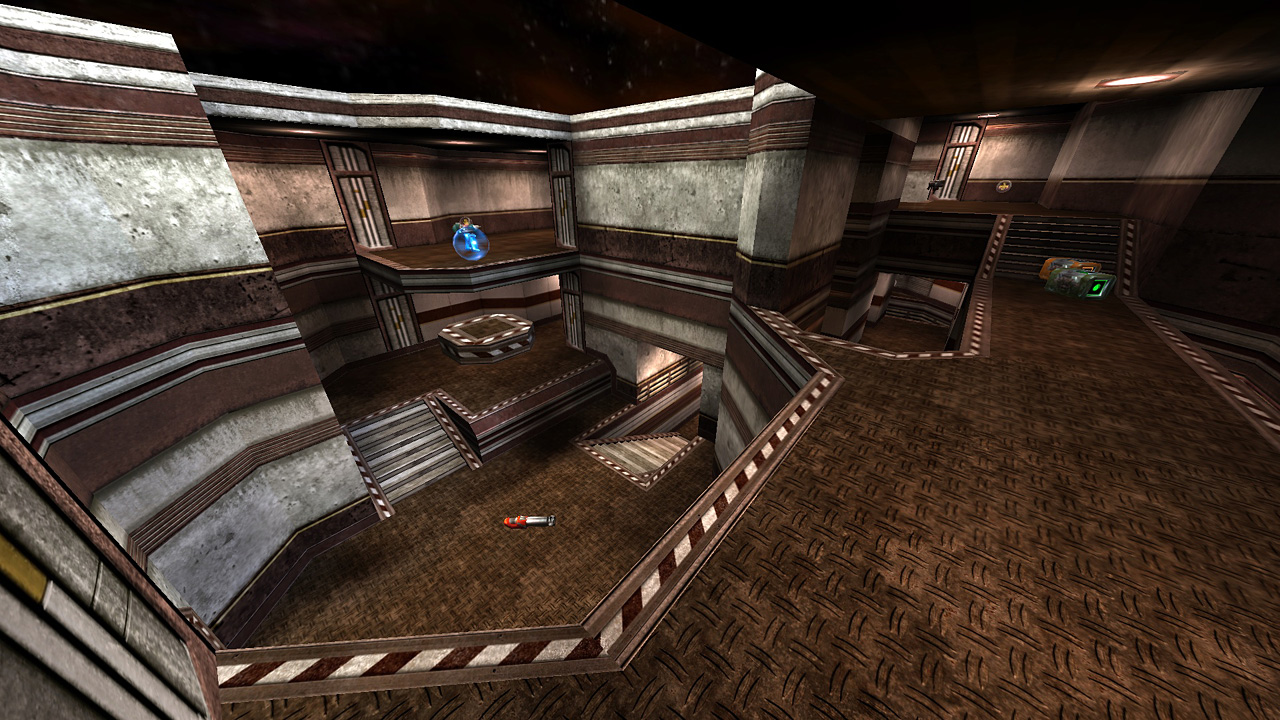
Also, why doesn't the place look banged up and broken? The missing tiles in the floor look strange because nothing else in the room is missing. Only the tiles are missing.
sock
Posts: 424
Joined: Sat Sep 09, 2000 7:00 am

Re: Screenshots

Post by sock »

Bliccer wrote: I think because of the strong colors on the floor.
That is a fair point, the colours are really strong but that is the direction I want to take the textures, a richer palette with higher contrast . Plus most people here seem to be into tech/industrial themes, so bright colours are probably a shock to their system! :D
Well he was evil, but he did build alot of roads. - Gogglor
My [url=http://www.simonoc.com/]Website[/url] & [url=http://twitter.com/SimsOCallaghan]Twitter[/url]
obsidian
Posts: 10970
Joined: Mon Feb 04, 2002 8:00 am

Re: Screenshots

Post by obsidian »

Bliccer wrote:You also have got the jagged errors on the left upper side. Here it was because of the Max. Sample level (too low)... at least in Maya.
Indeed, it didn't go unnoticed, but it's just a simple test render. I could turn sampling much higher but didn't feel like waiting forever for the render.
[size=85][url=http://gtkradiant.com]GtkRadiant[/url] | [url=http://q3map2.robotrenegade.com]Q3Map2[/url] | [url=http://q3map2.robotrenegade.com/docs/shader_manual/]Shader Manual[/url][/size]
lightmill
Posts: 42
Joined: Sun Nov 27, 2011 11:27 am

Re: Screenshots

Post by lightmill »

Interesting observation about exaggerated contrast and black lines making it look less natural.
I assume it's somewhat based on Florence Italian architecture and they indeed tend to have a lot of contrast in decoration and floor tiles. Which you probably never can see in the photos, because limited light level inside the buildings equalizes and washes out the colors and contrast ( I did a quick search for photos and they are all bad representatives of the actual looks)
[url=http://twitter.com/back2cccp]twit[/url]
[url=http://slapmap.wordpress.com/]blog[/url]
[color=#BFFFBF]¯\_(ツ)_/¯ ----------------------------------------------------------------
[/color]
sock
Posts: 424
Joined: Sat Sep 09, 2000 7:00 am

Re: Screenshots

Post by sock »

Based on the previous feedback I have re-created the lighting (it was bad), a detail pass (dirt,dust and cobwebs, but not crazy industrial mine complex) and fixed a couple of texture issues on prefabs. I have included before and after images if you are curious on what has changed. I know it is not techno industrial stuff, but we have enough people doing that stuff already!

Before (click thumbnails for larger image)
ImageImage

After (click thumbnails for larger image)
ImageImage

If you see something wrong or bothering you, say so, silence is worst kind of feedback. ;)
Well he was evil, but he did build alot of roads. - Gogglor
My [url=http://www.simonoc.com/]Website[/url] & [url=http://twitter.com/SimsOCallaghan]Twitter[/url]
Noruen
Posts: 308
Joined: Thu Jan 28, 2010 11:45 pm

Re: Screenshots

Post by Noruen »

I like both versions, maybe better that more colored version. But tell me - what is your r_speeds in this view? :) It must be devilish... But I hope yopu plan to release this "map". I really like your style. And again - I can't believe this is idTech3...

And why are you prejudicted against tech style? :P
lightmill
Posts: 42
Joined: Sun Nov 27, 2011 11:27 am

Re: Screenshots

Post by lightmill »

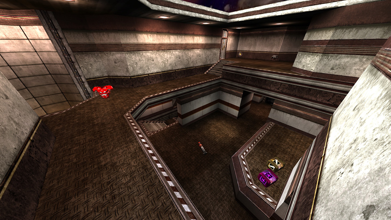
Sock:the texture difference is subtle (I wouldnt notice except dirt on the floor and sharper white-blue floor) but the lighting improved indeed, making the scene look better.
[url=http://twitter.com/back2cccp]twit[/url]
[url=http://slapmap.wordpress.com/]blog[/url]
[color=#BFFFBF]¯\_(ツ)_/¯ ----------------------------------------------------------------
[/color]
MrLego
Posts: 67
Joined: Tue Jul 21, 2009 11:00 pm

Re: Screenshots

Post by MrLego »

Second shots do look better, but the missing floor tiles from the first set would go better with the dirtier look of the second set.

If you're going to dirty it up a bit, some more clutter would help that look, right now things are still too neat and organized - break a chair or something. :D

I've always been a big fan of the medieval styling over the modern look - it just makes a level stand out more when you realize that it doesn't look like every other "Modern Warfare" type of game.

As always, nice work Sock!
[color=#4040FF][b]www.mrlego.com[/b][/color]
obsidian
Posts: 10970
Joined: Mon Feb 04, 2002 8:00 am

Re: Screenshots

Post by obsidian »

Well there is definitely an improved lighting from the uniformly bleh to the more contrasting orangy blueish lighting.

Decals are the bee's knees (I don't know why people say that, bees don't really have knees).
[size=85][url=http://gtkradiant.com]GtkRadiant[/url] | [url=http://q3map2.robotrenegade.com]Q3Map2[/url] | [url=http://q3map2.robotrenegade.com/docs/shader_manual/]Shader Manual[/url][/size]
neoplan
Posts: 125
Joined: Thu Jun 05, 2008 9:47 pm

Re: Screenshots

Post by neoplan »

Wow, looks really nice sock! The lighting is better than before imo. Textures are great as always.

Only the scale of the marble texture on the pillar looks too big for my taste.
Post Reply