Quake3World.com Forums
     Level Editing & Modeling
        q3dmp11 - tech edge


Post new topicReply to topic
Login | Profile | | FAQ | Search | IRC


Print view Previous topic | Next topic 
Topic Starter Topic: q3dmp11 - tech edge

Immortal
Immortal
Joined: 02 Jun 2006
Posts: 2476
PostPosted: 06-07-2009 02:57 PM           Profile Send private message  E-mail  Edit post Reply with quote


Image
Image
Image

ok here is what im working on now, its based on q2 the edge (ha i know, how many times has this been done :) 
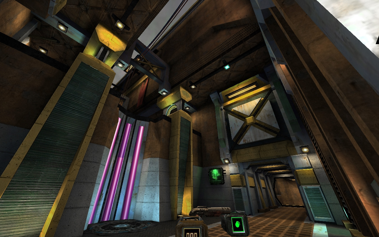
) i've been working on this on and off for a wee while now. this started out as a wee sketch and has started to come together.. if you can give me any feedback that would be really cool.

Things to do:

under the grenade launcher there is a chalk face visible

clipping (right now its very rough)

brush work and nailing down the theme, final textures etc

optimization to get the frame rate down (the construction of quite a bit of this seems to be getting very messy.. sometimes my brain just switches off and surfaces which should be chalk are not, ack. also some crazy cutting from subtractions, so the brash count is higher than it should be.

item layout

a txt file giving credit to all the great texture artists etc


Last edited by fKd on 08-01-2009 06:18 PM, edited 1 time in total.

Top
                 

True Nightmare
True Nightmare
Joined: 06 May 2000
Posts: 4373
PostPosted: 06-07-2009 05:31 PM           Profile Send private message  E-mail  Edit post Reply with quote


I'll try to give it a look sometime soon--the shots look good.

But please stop saying chalk (it's "caulk"). Also, don't use subtract; it's never necessary and almost never does things in a good way. Just use the clipper and edge-dragging. :)

Okay, I'll shut up and quit being a whiny ass now...


Top
                 

Immortal
Immortal
Joined: 02 Jun 2006
Posts: 2476
PostPosted: 06-08-2009 05:49 PM           Profile Send private message  E-mail  Edit post Reply with quote


been missing around with making a rock formation.... kinda fun, but kinda tough at the same time

Image


Top
                 

This is not Æon!
This is not Æon!
Joined: 20 Jan 2002
Posts: 2222
PostPosted: 06-09-2009 09:29 AM           Profile Send private message  E-mail  Edit post Reply with quote


Model it. It's easier and the results better. Both visually and performance vise, since you can optimize it easier/better.


_________________
Q3Map2 2516 -> http://www.zfight.com/misc/files/q3/q3map_2.5.16_win32_x86.zip
Q3Map2 FS_20g -> http://www.zfight.com/misc/files/q3/q3map2_fs_20g.rar
GtkRadiant 140 -> http://www.zfight.com/misc/files/q3/GtkRadiantSetup-1.4.0-Q3RTCWET.exe


Top
                 

Immortal
Immortal
Joined: 02 Jun 2006
Posts: 2476
PostPosted: 06-16-2009 02:03 PM           Profile Send private message  E-mail  Edit post Reply with quote


no feedback makes fKd a sad panda :(

but on a side note, got heaps more done, its really starting to come together now... 2 weeks tops till final


Top
                 

Insane Quaker
Insane Quaker
Joined: 19 May 2007
Posts: 262
PostPosted: 06-16-2009 02:58 PM           Profile Send private message  E-mail  Edit post Reply with quote


I like the style reminds me of Atlantis in Stargate. the "stairs" to the Middle tower thing in the big room feels strange, I also think the map is a bit to dark.


_________________
http://www.g0th.se


Top
                 

Immortal
Immortal
Joined: 02 Jun 2006
Posts: 2476
PostPosted: 06-16-2009 05:14 PM           Profile Send private message  E-mail  Edit post Reply with quote


right right, i was also lookin at those stairs and thinking the same thing so i'll get onto that.
yeah it is quite a dark map, i need a crt monitor so i can see the real colours. im working on a laptop so it tends to make it look brighter depending on the angle on the screen lol.
maybe just increasing the ambient lighting level will do the trick.


Top
                 

True Nightmare
True Nightmare
Joined: 06 May 2000
Posts: 4373
PostPosted: 06-16-2009 06:00 PM           Profile Send private message  E-mail  Edit post Reply with quote


I'm playing it right now...thoughts as I go. First I'm just running around a bit by myself...

-The whole thing maybe feels a *bit* cramped. I certainly don't expect you to expand the map, but maybe something to keep in mind for next time? :)

-Not sure if I'm crazy about these ramps:
Image
The glass seems a bit out of place--it's fine for the windows in various places, but seems weird as ramps...also, is the ledge I'm on just for lurking? It's a little awkward to get up there, so it maybe seems weird to have nothing there...?

-love the hypo placement

-you can get stuck behind the big open crate with the health in it. If you jump up on top and then fall behind it, you're fucked. :)

-jumppad from RL up to YA...maybe make the left-hand side of that a little different somehow, as a visual cue that you're going to go left at the top?

-move the jumppad trigger here:
Image
closer to the wall. You can jump and miss the trigger if you're pushing into the wall (I'm just standing there in that shot), and then have to back up before you go up.

-Wow. RG in a dead-end, only reachable underwater...I dunno about that. That's pretty brutal. If someone knows you're in there, you're pretty much hosed. I would really rethink this bit. Maybe make *some* other way out, even if it's awkward? Maybe hop up some crates and up through a hole near the YA directly above? Something like that? If you don't want someone to drop down, just make a one-way force field out of patch mesh...

-Love the PG area and the shallow water on the floor--that's always a nice audio cue...

-I found lots of places where I would get hung up on wall geometry if I was hugging the wall--you should clip that stuff smooth...

-Played with bots for a bit (and had fun!)--they seem to have some confusion around the health in the crate--I noticed at least one of them going backward and forward there--like they wanted the health but had trouble getting to it. Maybe some clipping is necessary there?

-I really like the vertical elements in this map--lots of level-over-level and death from above and below; that's always good. :)

-The green roof tiles that you can jump up next to from LG seem maybe a bit out of place with the theme. Sort of gothic rather than tech-y.

Hope this helps. Some good stuff here...


Top
                 

Immortal
Immortal
Joined: 02 Jun 2006
Posts: 2476
PostPosted: 06-16-2009 06:30 PM           Profile Send private message  E-mail  Edit post Reply with quote


fantastic help man, work shell be done on almost all of your points. txt credit has been added :)

i've redone the ramps and fixed most of the clipping, bots are getting quite tough which is nice. texturing has been made a bit more solid and the jumppad section from the rl has been fully reworked.

i based the map on the edge and thats where i got the water to rg section... but you might be right... maybe a teleport or something... hmmmm i'll bring some new shots in to work tomorrow and show you guys whats happening so far... maybe even a new test build...

again, thanks so much for taking the time to check this map out, its really good having others look over ya work as all these hours infront of radient, you sometimes lose the ability to know whats working and whats not.


Top
                 

Immortal
Immortal
Joined: 02 Jun 2006
Posts: 2476
PostPosted: 06-28-2009 01:18 PM           Profile Send private message  E-mail  Edit post Reply with quote


Big update... been working all weekend on this... i think its starting to get to the end phase..

and some screenshots
Image
Image
Image
Image
Image

looking forward to some feedback :)


Last edited by fKd on 08-01-2009 06:20 PM, edited 1 time in total.

Top
                 

Elite
Elite
Joined: 12 Jul 2000
Posts: 11553
PostPosted: 07-05-2009 10:34 AM           Profile Send private message  E-mail  Edit post Reply with quote


Just going by the latest screenshots:

Too much dirt on some walls. (I'd prefer no dirt at all, but I presume that's asking too much :))

All that yellow makes me sick.

The steps in that last shot look really thin...


Top
                 

Glayven?
Glayven?
Joined: 23 Jan 2005
Posts: 13025
PostPosted: 07-05-2009 11:09 AM           Profile Send private message  E-mail  Edit post Reply with quote


The best advice I can give for this map/thread is to ignore any comments from DTS.

Nice work fkd. :up:


Top
                 

Immortal
Immortal
Joined: 02 Jun 2006
Posts: 2476
PostPosted: 07-05-2009 04:28 PM           Profile Send private message  E-mail  Edit post Reply with quote


chirp


Top
                 

True Nightmare
True Nightmare
Joined: 07 Aug 2001
Posts: 3736
PostPosted: 07-09-2009 01:04 AM           Profile Send private message  E-mail  Edit post Reply with quote


I had a go as well. Agree pretty much with what pjw said. I would have liked another way out of the PG area, seems like there's a bit much stairs upwards IMO. Also, it's pretty easy to hoard PG and two PG ammo packs, and it's pretty close to the other PG. Maybe your favourite weapon is the PG? Remove the other PG perhaps. Didn't look much at the textureing, but noticed that on a flight of stairs they were misaligned.


Top
                 

I'm the dude!
I'm the dude!
Joined: 04 Feb 2002
Posts: 12498
PostPosted: 07-09-2009 03:58 PM           Profile Send private message  E-mail  Edit post Reply with quote


krekits, is it just me or have you not posted here in ages? Hi and don't be a stranger is all I'm saying...


_________________
GtkRadiant | Q3Map2 | Shader Manual


Top
                 

Insane Quaker
Insane Quaker
Joined: 19 May 2007
Posts: 262
PostPosted: 07-10-2009 03:34 AM           Profile Send private message  E-mail  Edit post Reply with quote


I like the new brighter lightning but I think you have over saturated the colors a bit.

I did a few color tweaks in photoshop on one of your screens and as you can see the result is much more neutral and more relaxing for the eye to look on.


_________________
http://www.g0th.se


Top
                 

The Illuminated
The Illuminated
Joined: 08 Sep 2000
Posts: 1085
PostPosted: 07-10-2009 12:15 PM           Profile Send private message  E-mail  Edit post Reply with quote


g0th- wrote:
I like the new brighter lightning but I think you have over saturated the colors a bit.


I totally agree, this level has way too many different light colour types and the image that goth has done is much better. Subtle lighting with a really nice texture colour balance.


_________________
Well he was evil, but he did build alot of roads. - Gogglor
My Website & Twitter


Top
                 

This is not Æon!
This is not Æon!
Joined: 20 Jan 2002
Posts: 2222
PostPosted: 07-10-2009 01:22 PM           Profile Send private message  E-mail  Edit post Reply with quote


You are very productive.
I don't have time to do a test like the one I did last time and you have improved on most of the things I criticized your last level on. However, here's some things, more or less about graphics:


# Improve and look over clipping. This level is even more detailed than your previous one, thus you need to be even more thorough about your clipping pass.
# Remove unseen faces. It's so simple, just noclip over the level and look.
# Look and see where you have brush sides where there's no face - inside the playable area. I can see one spot in these screen shots, I have been waiting for someone to mention it, but none have.
# Credit me for my weapon markers which I created specially for my Industrial level - Or better, remove them. They are inconsistent with the rest of the markers. I have mentioned this to you before, you need to pay more attention to consistency within your levels, on all parts, from textures, to brush shapes etc.
# Make the water fog more opaque, it looks alright now, but would look much better and not as much as you swim in the air if you increase it.
# Remove one of the dripping lines by the water, it looks very repetitive, or maybe it's just me.
# I have to agree about the saturation here. It's too many different colors, would work just fine in Unreal Tournament, but not as good in Quake 3.
# r_speeds are very high, maybe you can look over the VIS a bit more. But the level has a very high brush detail count it seems, might be hard.

If you can start to nail down stuff like this, you could produce really good stuff I'm sure of it. But then it would take more time between releases of levels.
I like the cable solution here (red and blue thin cables on the wall) and will probably do something similar in my current level in prod.


_________________
Q3Map2 2516 -> http://www.zfight.com/misc/files/q3/q3map_2.5.16_win32_x86.zip
Q3Map2 FS_20g -> http://www.zfight.com/misc/files/q3/q3map2_fs_20g.rar
GtkRadiant 140 -> http://www.zfight.com/misc/files/q3/GtkRadiantSetup-1.4.0-Q3RTCWET.exe


Top
                 

Immortal
Immortal
Joined: 02 Jun 2006
Posts: 2476
PostPosted: 07-10-2009 06:16 PM           Profile Send private message  E-mail  Edit post Reply with quote


great advice, cheers everyone. back to work :)


Top
                 

True Nightmare
True Nightmare
Joined: 06 May 2000
Posts: 4373
PostPosted: 07-10-2009 08:02 PM           Profile Send private message  E-mail  Edit post Reply with quote


Hipshot wrote:
# Look and see where you have brush sides where there's no face - inside the playable area. I can see one spot in these screen shots, I have been waiting for someone to mention it, but none have.


Maybe I'm just being slow--it's been a long week--but I'm not sure what this means? Brush sides where there's no face?


Top
                 

Immortal
Immortal
Joined: 02 Jun 2006
Posts: 2476
PostPosted: 07-10-2009 10:44 PM           Profile Send private message  E-mail  Edit post Reply with quote


i had a caulk face showing, its been fixed ages ago. bit foolish having it in a screenshot :D


Top
                 

This is not Æon!
This is not Æon!
Joined: 20 Jan 2002
Posts: 2222
PostPosted: 07-10-2009 11:03 PM           Profile Send private message  E-mail  Edit post Reply with quote


pjw wrote:
Hipshot wrote:
# Look and see where you have brush sides where there's no face - inside the playable area. I can see one spot in these screen shots, I have been waiting for someone to mention it, but none have.


Maybe I'm just being slow--it's been a long week--but I'm not sure what this means? Brush sides where there's no face?


Sorry, I meant a face with caulk on =) It's been a long week =)


_________________
Q3Map2 2516 -> http://www.zfight.com/misc/files/q3/q3map_2.5.16_win32_x86.zip
Q3Map2 FS_20g -> http://www.zfight.com/misc/files/q3/q3map2_fs_20g.rar
GtkRadiant 140 -> http://www.zfight.com/misc/files/q3/GtkRadiantSetup-1.4.0-Q3RTCWET.exe


Top
                 

True Nightmare
True Nightmare
Joined: 06 May 2000
Posts: 4373
PostPosted: 07-11-2009 08:35 AM           Profile Send private message  E-mail  Edit post Reply with quote


Ah. okay. Thanks for the clarification. :)


Top
                 

This is not Æon!
This is not Æon!
Joined: 20 Jan 2002
Posts: 2222
PostPosted: 07-12-2009 01:57 AM           Profile Send private message  E-mail  Edit post Reply with quote


Ok, I took a look at the pk3 more closely and seriously, you really really need to fix this pk3 before you make a final ship of this level.
It contains 31 different texture folders with 17 shader files - it's crazy!? - some nuggets here are that you included the common shader, the sfx shader and a modified shader file from my latest level, that breaks it!. In the read me you have credited 4 bodies, where one is iD software - for the game - which is not really needed, this is not even close to the number of custom textures you've used in this level. It's technically very bad and I think it's insanely lazy not to have a proper pk3 file. You can't release the level like this, you will probably have conflicts with other levels around then just mine.

Do this:

# Remove all ids shader files - why do you need them here? Have you modified them in any way, that is very bad.
# Move all textures into one folder, name it fkd_p11.
# Copy all separate shaders from all the different files into one shader file, name it fkd_p11.shader.
# Modify that shader file to work with the new texture folder.
# Modify the level to work with the new paths. Just use the search and replace in radiant, it should be very easy but could be a little tedious.
# Fix the conflict with my level either by doing the move I described earlier or by not using them. If you release the level and my _m13 level doesn't work, then I will in the future put a note in my readmes that you are forbidden to use my shaders and textures.


I'm not being mean or anything here, it's just very bad to release a level with a pk3 in this state.


_________________
Q3Map2 2516 -> http://www.zfight.com/misc/files/q3/q3map_2.5.16_win32_x86.zip
Q3Map2 FS_20g -> http://www.zfight.com/misc/files/q3/q3map2_fs_20g.rar
GtkRadiant 140 -> http://www.zfight.com/misc/files/q3/GtkRadiantSetup-1.4.0-Q3RTCWET.exe


Top
                 

True Nightmare
True Nightmare
Joined: 06 May 2000
Posts: 4373
PostPosted: 07-12-2009 08:11 AM           Profile Send private message  E-mail  Edit post Reply with quote


Just adding a quick "me too" here for emphasis.
Hipshot wrote:
I'm not being mean or anything here

He's really not. Proper texture/asset/pack organization is one of my pet peeves, and I would have harassed you earlier, had I noticed. :)

I suspect that you're using some form of auto-pk3-generator? Yeah, don't do that. In any case, if you have any problems sorting it out, feel free to email/pm me for help. (And/or look at the textures/shaders/structure in any of my maps--"Guns" uses a lot of custom stuff, for example.) It's really not that difficult, but can be confusing if you're not used to it...


Top
                 

Immortal
Immortal
Joined: 02 Jun 2006
Posts: 2476
PostPosted: 07-12-2009 05:05 PM           Profile Send private message  E-mail  Edit post Reply with quote


i was gonna clean it all up before i released it... its a beta... i do all that last when im done. i know ya not being mean or anything but while everything is still up in the air in terms of final textures etc. its still far from finished :D

credits have being sorted out etc... plz dont be offended, it really was not my intention.

Hipshot, i'll remove all ya textures so i can keep on ya good side... (your way to talented to annoy) gonna have to fire up photoshop and make some of my own custom textures
which is really what i should be doing anyway.

the final will be clean, tidy and with all the right credits etc.. im so sorry if i offended anyone by forgetting that i had not updated my txt file for a while.. my bad :(

heh, and yeah, i was using map packer from q3map2toolz


Top
                 

True Nightmare
True Nightmare
Joined: 06 May 2000
Posts: 4373
PostPosted: 07-12-2009 10:53 PM           Profile Send private message  E-mail  Edit post Reply with quote


fKd wrote:
i was gonna clean it all up before i released it... its a beta...

Ah. Fair enough. I shouldn't have assumed things would stay that way, with it still being beta. Sorry for that.

fKd wrote:
Hipshot, i'll remove all ya textures so i can keep on ya good side

If I understood him correctly, he only wanted the textures removed if you weren't going to clean it up and re-path the shaders, etc... :)


Top
                 

This is not Æon!
This is not Æon!
Joined: 20 Jan 2002
Posts: 2222
PostPosted: 07-13-2009 12:52 AM           Profile Send private message  E-mail  Edit post Reply with quote


I didn't mean to come out so hard, please don't misunderstand.
Please use the textures, I'm just glad if people like them.

I really thought this was how it was supposed to look in the final version, espec since the reade said that you didn't find readmes for all textures used, etc. And also, even though it's a beta you still don't want to release it like this.

=)


_________________
Q3Map2 2516 -> http://www.zfight.com/misc/files/q3/q3map_2.5.16_win32_x86.zip
Q3Map2 FS_20g -> http://www.zfight.com/misc/files/q3/q3map2_fs_20g.rar
GtkRadiant 140 -> http://www.zfight.com/misc/files/q3/GtkRadiantSetup-1.4.0-Q3RTCWET.exe


Top
                 

foolproof
foolproof
Joined: 11 Jan 2001
Posts: 7927
PostPosted: 07-13-2009 04:21 AM           Profile Send private message  E-mail  Edit post Reply with quote


Some have complained about the lighting, even implying that Q3A maps *must* obey to some, apparently predefined (?) lighting protocol, but I disagree.
Of course, things *can* be taken too far, where you'd create some nausea and seizure inducing nightmare, but in my opinion that isn't the case here at all.
On the contrary; this is a map with a very unique, distinct look; More like a breath of fresh air than an 'abomination', and I applaud it.

Good work, fKd. I'll try to give some more constructive feedback later.


Top
                 

Immortal
Immortal
Joined: 02 Jun 2006
Posts: 2476
PostPosted: 07-13-2009 03:08 PM           Profile Send private message  E-mail  Edit post Reply with quote


all the textures and paths have been fixed and all the credits have now been updated.. i think my new shader file goes even above and beyond what others have done....(credits in shader and txt) the wrong has been righted... i hope :)

things are starting to look better, a nice 10-14 hour stint fixing all sorts.


Top
                 

Immortal
Immortal
Joined: 02 Jun 2006
Posts: 2476
PostPosted: 07-14-2009 04:03 PM           Profile Send private message  E-mail  Edit post Reply with quote


ok here is the next update :) i've fixed all the paths, desaturated a bunch of the textures and added heaps of new geometry.. i think its starting to hit the final stage...

feedback is handy as always. gameplay and aesthetic feedback esp.


again, thanks for all the help


Last edited by fKd on 08-01-2009 06:25 PM, edited 2 times in total.

Top
                 

The Illuminated
The Illuminated
Joined: 08 Sep 2000
Posts: 1085
PostPosted: 07-15-2009 10:41 AM           Profile Send private message  E-mail  Edit post Reply with quote


There is enough detail in this map to make 2 maps! Its crazy some of the things you are doing with bolts, wires and pipes. There is a lot of cool visuals but first I want to talk about the gameplay and how it feels very flat and linear IMHO. Ive got a bunch of screenshots, so sit tight!


There is only one route up via a JP and you need more. On the left hand side next to the water, create some route up with jumps via pipes, wires or more consoles. On the right hand side you should be able to get across from the platform opposite the regen via jumps again. Dropping down to use the JP is too slow and predictable. Remove the ammo packs next to the SG, especially the RG ammo pack.


I love the skybox with the dark city view below and clouds moving across the sky, shame you cannot see more of it. Cut out this space, create a mega window with a docking bay outside for ships to lands on, maybe crates/cargo to hint at how stuff gets to this floating place in the sky. Remove the rocks they dont fit the style of the place, cut the space away and put a crane system there, hint at how the cargo gets off the platform out of the window into the complex. Big tech crane with sections overhanging the atrium!


Remove the glass window to allow players to drop down or ramp jump up from the stairs below. Remove the GL ammo pack, you don't need to do this in Q3. (It seems to be a trait of Unreal) Shift the YA down to the ledge below and create a series of steps up to the ledge above on the left. Jumping route via pipes etc, nothing too direct but doable if being chased.


Not sure how attached you are to the central area but it plays awkward to me. Lower the central platform down so you can jump to it from several different points around the place. When I run around this upper area with the GL I want to jump (difficult) to the central area and there is no routes, it is too linear.


Remove RG ammo pack, move SG to ground floor and put the medi pack in the corner control room.


I really don't like the RG in such a deathtrap dead end, it needs several ways in otherwise people will just camp there and annoy everyone. Cut the floor here and create drop down space for grenades! :P Let people flush out campers with some pineapples on the head. Maybe even a GL ammo pack so everyone gets the hint and kills the camper below.


This area here would be a perfect space for a second route to the RG, cut it out and round under the existing stairs towards the RG. Not sure how attached you are with the water into the RG but I would suggest removing it and replacing it with awkward jumps out via pipes or crates. Approaching the RG area in water is certain death for anyone and campers paradise. I would highly recommend removing the shards+health next to the RG, it screams camp here and annoy everyone.


Change the JP for a lift so if someone is chasing they have to choose the second route up or wait. The wall on the left, switch the fan unit to the floor, computer alcove to the top. Create a platform outwards and switch the large crate around to the front of the two smaller one's. So the alternative route up is hop, skip the crates, to the platform and then up to the top via steps or more jumps. Allow space underneath platform for another route. (see next screenshot)


Create a route underneath that connects the corner room on the left to besides the stairs on the right. Make the corridor tight and put sound clues there, maybe shards from above, just keep the small health above next to the windows.


Replace the second PG with a second RL instead. I would personally raise the whole area up but it may not be practical for brushwork you got there already. Place the RL at the back and no extra ammo packs either.


move the JP further back so there is a ledge to land on above, the space there is too tight and the shard/health behind the JP is dubious, I would use them elsewhere, maybe where you got the mega crate with the +25 health instead.


Create an alternative jump route up with crates or pipes. So if you are chasing someone you can go up the crates while they go the stairs. Move the RL ammo to the bottom of the stairs for route temptation.


Personally I don't like the RL deadend here, it feels awkward and I want the end of the corridor to go somewhere. I would recommend connecting it via JP to the corner room on the left. So if you see someone go for the RL you can cut them off in the corner room with a shotgun to the face as they come up the JP :P

You have broken shaders and console error messages that need to be fixed before you can release anything. I am sure you know how to track them down.

I love some of the detail you have created but the map feels like it lacks a theme, a direction, you have so many tech styles mashed together the map has no identity. If was to describe your map to someone I would say, yeah tech crazy detail and that is it. The map lacks a central feature, vista, wow viewpoint (maybe the big window, docking area idea, screenshot2 above) but you need something. The map feels like you have been creating loads of small sections of detail and then sowing them together with no thought for the bigger picture (the theme). It feels like you have been making a suit and forgot what you wanted to end up with and have 10 arms, 20 legs and no torso! :P

The lighting feels very flat to me, like you are using a high ambient value. Also you have so many different coloured lights it feels likes a disco in places. (I am sure PlanB will love it! but it still feels too gaudy to me) I would recommend you pick three base colours and stick to them throughout the map. Use colour to accent height, for example; yellow->low, blue->high. Save your third colour for marking areas that are special or important, so when the player finds the colour they can recognise it. Pick your colours and location and you will find naviagation will improve subconsciously.

Sound clues, I found the constant wind annoying, turn it into gusts and set it up via delays so it feels more natural and not a constant blast noise. Q3 is pretty bad for sound placement and areas because it is difficult to confine to special areas, so use less. Make sure certain areas have special sounds, like a deep bass sound for the PG location, a good dripping echo sound for the water for example. Take each atrium and create something unique soundwise for each so that players will feel the difference.

That is a lot of waffle and don't take what I say to heart, hope it helps.


_________________
Well he was evil, but he did build alot of roads. - Gogglor
My Website & Twitter


Top
                 

Immortal
Immortal
Joined: 02 Jun 2006
Posts: 2476
PostPosted: 07-15-2009 05:37 PM           Profile Send private message  E-mail  Edit post Reply with quote


woah! great advice, cheers man, i've printed it off and will do some major work when i get home, thanks so much! its really good to get some really solid feedback


Top
                 

Immortal
Immortal
Joined: 02 Jun 2006
Posts: 2476
PostPosted: 07-25-2009 02:58 AM           Profile Send private message  E-mail  Edit post Reply with quote


Image
This image shows new ladder and pipe for more freedom of movement

Image
This shows new window section

Image
new more unified lighting for a less disco feel :)

Image
And here is the new crane and a small glimpse of the outside landing pad section

new build coming soon :)


Top
                 

I'm the dude!
I'm the dude!
Joined: 04 Feb 2002
Posts: 12498
PostPosted: 07-25-2009 10:18 AM           Profile Send private message  E-mail  Edit post Reply with quote


[nitpick] It looks like you need some sort of weight or something on the other side of that crane to counteract the weight of the crane arm and load. [/nitpick]

Looks awesome otherwise.


_________________
GtkRadiant | Q3Map2 | Shader Manual


Top
                 
Quake3World.com | Forum Index | Level Editing & Modeling


Post new topic Reply to topic


cron
Quake3World.com
© ZeniMax. Zenimax, QUAKE III ARENA, Id Software and associated trademarks are trademarks of the ZeniMax group of companies. All rights reserved.
This is an unofficial fan website without any affiliation with or endorsement by ZeniMax.
All views and opinions expressed are those of the author.