 |
 |
|

|
| Topic Starter | Topic: kazdm4 - Putrefactory - beta1 | ||||
|---|---|---|---|---|---|
|
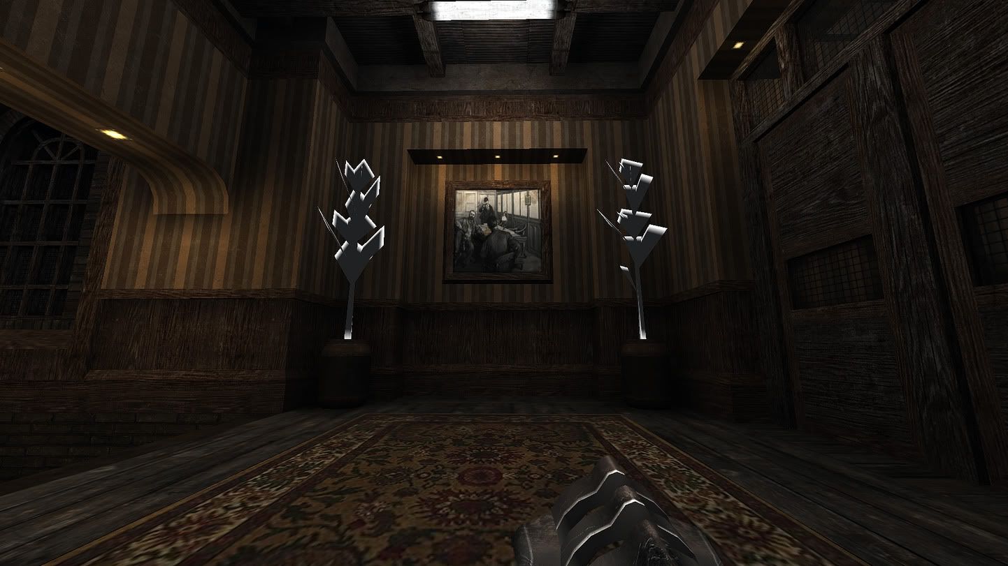
Kaz
Señor Shambler  Posts: 849 |
|
||||
| Top |

|
Dark Metal
Your Daddy  Posts: 13095 |
|
||||
| Top |

|
Anthem
Insane Quaker  Posts: 399 |
|
||||
| Top |


|
Silicone_Milk
Immortal  Posts: 2205 |
|
||||
| Top |

|
Foo
Timed Out  Posts: 38063 |
|
| Top |


|
v1l3
\kill  Posts: 947 |
|
||||
| Top |
|
cityy
surfaceparm nomarks  Posts: 1018 |
|
||||
| Top |


|
Theftbot
Theftbot  Posts: 483 |
|
||||
| Top |
|
Kaz
Señor Shambler Posts: 849 |
|
||||
| Top |
|
ShadoW_86
Insane Quaker Posts: 270 |
|
||||
| Top |
|
Kaz
Señor Shambler Posts: 849 |
|
||||
| Top |
|
skinNCNmaster
Multidirectional  Posts: 2895 |
|
||||
| Top |
| Quake3World.com | Forum Index | Level Editing & Modeling |
  |