Page 75 of 295
Posted: Fri Apr 13, 2007 11:44 pm
by Kaz
[lvlshot]http://kaz.quakedev.com/junk/grungewall2.jpg[/lvlshot]
Some low-tech texturing

edit: it's 384 because i ran out of ideas for the last 128pixels :P
edit2: updated with more pixels
Posted: Fri Apr 13, 2007 11:53 pm
by +JuggerNaut+
Kammesennin wrote:ought to be missing a few pieces on the right wall as well.
maybe they got kicked around!
i think it looks great.
Posted: Sun Apr 15, 2007 12:14 am
by Method
Here's a quick update on the textures:

-Method
Posted: Sun Apr 15, 2007 12:30 am
by Kat
Looking decent.. keep and eye on those specular levels though, that corner that has a bright highlight makes it look like you're still using a relatively high level that's giving the surface a bit more 'reflection' then might be necessary given that it looks like you're going for a very 'dry' environment.
Posted: Sun Apr 15, 2007 12:36 am
by Method
Kat: It's shiny because I used one light for the whole room. Plus it's a beveled patch, so I don't really know how to properly fix it, other than using a light with round texture.
Kaz: Looks nice man.
-Method
Posted: Sun Apr 15, 2007 1:11 am
by Kat
Method wrote:Kat: It's shiny because I used one light for the whole room. Plus it's a beveled patch, so I don't really know how to properly fix it, other than using a light with round texture.
Kaz: Looks nice man.
-Method
Choose a section of the map and get the lighting 'right' in tems of what you're trying to do, my commenting on what *I* see is moot otherwise.
Posted: Sun Apr 15, 2007 1:39 am
by Method
Looks like it's finally shaping up.


-Method
Posted: Sun Apr 15, 2007 3:12 am
by obsidian
I agree with Kat that the specular still looks rather bright. Even in that last screenshot, the wall on the left looks almost like it's gold plated. The floor on the second last screenshot above looks wet.
Looking very grungy indeed otherwise. GJ!
Posted: Sun Apr 15, 2007 3:37 am
by Kaz
damned cool regardless

Posted: Sun Apr 15, 2007 7:25 am
by Method
Thanks for the feedback guys. I updated the above shots.
http://www.methodonline.com/temp/meth_test.htm
Btw did you know that Al Capone's preferred nickname was Snorky? It meant snappy dresser.
-Method
Posted: Sun Apr 15, 2007 8:56 pm
by Yannoche
Superb looking map Method, this reminds me a lot about True Combat mod.
Posted: Sun Apr 15, 2007 10:51 pm
by poub_
Posted: Mon Apr 16, 2007 12:22 am
by Kaz
I actually just got WarPath, the game those levels were made for, and although the game completely blows, those levels are pretty impressive in game (although there are some mildly boring areas).
Posted: Mon Apr 16, 2007 2:38 am
by Amphetamine
Kaz wrote:I actually just got WarPath, the game those levels were made for, and although the game completely blows, those levels are pretty impressive in game (although there are some mildly boring areas).
It looks and feel very Halo 2, even down to the floaty jump and the offhand, instakill melee attack. The models and skins look a lot like the H2 ones as well tbh.
Posted: Mon Apr 16, 2007 5:55 am
by Method
Please tell me if I spam this forum with screenshots. I get the feeling that I post here too often.

Recent shots of other areas can be found
HERE.
-Method
Posted: Mon Apr 16, 2007 7:26 am
by Hipshot
Since it looks good, it's all good =)
Posted: Mon Apr 16, 2007 4:02 pm
by QuakerX
Two things:
1: First screenie is missing a Meth decal in the shot.
2: Not sure how familiar you are with a modeling package, but getting some of that dirt and debris to blend in with the ground using a model would look a lot nicer than the hard edges which are present now. This is more of a final thing to do and I am just throwing out the suggestion.
Other than that, looks good. I was going to suggest adding a bit more color to the scene in the textures but you fixed that with the latest.
Quaker-X
Posted: Mon Apr 16, 2007 4:16 pm
by o'dium
http://www.methodonline.com/temp/meth_test_gray.jpg
I would honestly make that lower floor section a smoothed mesh or patch. The kind of surface you have for the floor is tarmac, and that bends to a certain degree. The harsh edge you have where it starts to bend sticks out to much.
Dirt decals are obviously not added but would bring this level out a bit more, all over the place, dirt decals on edges and randomly on the floor as well as debris and rubbish.
http://www.methodonline.com/temp/meth_test1.jpg
While its nice you have bricks there, the bricks dont exactly make sense. Texture the broken side with a rougher slightly different texture, and who us on the ciling where the bricks have fallen from, where they used to be, by using dirt decals to make the area stand out.
The floor again, decals everywhere.
The dirt groups, mud, dust, whatever they are... These can easily be fixed. Either use an alpha mapped model to simulate fade (Can look good, but naff up close. VERY easy to do however). Or use vertex blending and model the floor and dirt heaps as one, blending out where needed.
http://www.methodonline.com/temp/meth_test3.jpg
No light from the fire? Why come? A nice dlight here would set the area off if you lower the ambient tone in the surrounding area. Same as always with dirt decals.
http://www.methodonline.com/temp/meth_test4.jpg
What are those panels? I suggest if they are suppoised to be electrical boxes you make a quick model, because ATM they look very Quake 1&2 Era (Where people used to make complex things from brushes, like chairs, PC's, tables and the like, they ended up looking like, well, boxes of stuff). Again with the blending on the floor, either alpha map it, or vertex blend it.
Posted: Mon Apr 16, 2007 5:05 pm
by Pext
impressive lighting concept in the last shot
Posted: Mon Apr 16, 2007 11:11 pm
by Method
Thanks for the comments guys.
Quaker-X: Hehe, yea first one indeed is missing a meth graffiti. It's just I've been using one as a placeholder
O'dium: Gonna look into that blending. Also there are quiet a lot of dirt decals, because all of the textures are tiling. Gonna add more. Btw those panels are mailboxes. The ones you would see in Russian buildings. I pretty much built close to how my building used to look, although no urine stains anywhere. Cannot find the ones I built, but there's a similar ones here:
http://www.eastmeetwest.com/images/mailbox.jpg
I might just do the set and texture it, would look better. Also need to make a number decal.
-Method
Posted: Wed Apr 18, 2007 6:32 am
by Method
This area is fairly undetailed, but with time it'll be pretty. I'm going for some sort of hospital/prison look. Need to get some reference though.
 http://www.methodonline.com/temp/meth_test.htm
-Method
Posted: Wed Apr 18, 2007 7:09 am
by Silicone_Milk
Silent Hill-esque?
=)
Lookin great Meth. Just one little nitpick - the misplaced tiles look too clean on the edges (ie. they're too straight)
Shouldn't there be some chips in the edges?
I know I know, its not "detailed" yet. It's just that those edges really stood out to me
Posted: Wed Apr 18, 2007 8:08 am
by Method
Whoa, it's is kinda strange how it works. Just recently I saw some Silent Hill videos and apparently it made a mark on me. I like abondoned stuff overall. Will work on the tiles, thanks for the feedback man.
-Method
Posted: Wed Apr 18, 2007 8:31 am
by o'dium
Dear lord grunge edge decals man! Thats all that shots missing.
Well, that and some seriously fucked up blood stained beds.
Looking great.
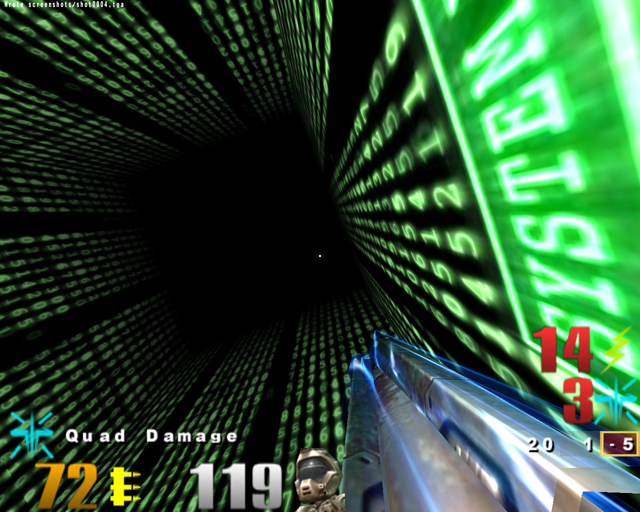
Posted: Wed Apr 18, 2007 11:31 am
by a13n
One of my maps for q3wtfduelctfmappack. (currently named ctf-1on1-matrix)
You had better stock quiet a few gallons of beer to play this map with.
You've been warned.