Page 86 of 295
Posted: Mon Jul 16, 2007 2:31 pm
by wviperw
Look ma, it's Techx!
Posted: Mon Jul 16, 2007 10:11 pm
by dnky
Little bit more of the same.
Looking back down the nave:

Interior of a tower that would sit to the side of the opening to the nave:

Posted: Wed Jul 18, 2007 10:26 pm
by Hipshot
Replacing textures...


Changing geometry...


As you can see, this map is no void map any longer.


One thing that was good with the old texturing, was that there was a fairly good contrast between the textures, orange, gray, red, white, now most things goes in whitescale and other more washed out colors, working on adding some details, maybe change the window frames to a more strong green, red or blue color.
Level will be about ~20-30% bigger due to filling the void with playable areas and more paths.
It's more lit than before because of brighter textures and brighter sky and sun. Gonna remove all small lamps and replace them after I have seen where they are needed, the map is still heavy on performance and every polygon I can get is good.
Quad instead of speed. All items will however be looked over, since the map expanded in size and how it will be played.
Etc etc etc.
There's still a major area to complete, where the RA and the TP exits to. Leaving for semester tomorrow so maybe within three weeks I can have an alpha ready for playing =) There's really no need to comment on any quality before you played it, I know there are things in the screens missing, misaligned, looking odd and so on, I'll get to that when the geo is done...
Posted: Wed Jul 18, 2007 11:11 pm
by Fjoggs
Amazing lighting. Well done.
Posted: Sat Jul 21, 2007 3:02 am
by voodoochopstiks
Good job indeed, but I already told you this, looking forward to a playable version, enjoy your vacation

Posted: Sat Jul 21, 2007 4:32 am
by Scourge
corsair wrote:hey man, go ahead and aim for 3 fps at max =)
btw, whatdyou mean by a 'seperate exteriour' ?
The original Chartres still cramps my system with an Athlon 64 3400+ and a Geforce 6600.

Damn you Kenny. :icon32:
Posted: Wed Jul 25, 2007 12:29 pm
by dnky
Finally finished my interior:

My mesh has a few dark triangle areas, a little bit of texture warping and a few minor t-junc errors...all of which I can live with as they dont really detract from the overall effect.
On to the exterior

Posted: Wed Jul 25, 2007 6:07 pm
by o'dium
Been working on a weapon model, heres some progress on the clip for it. The final texture UV is 2048x2048, and this is a small part of the texture, thats why it appears to be mapped with a lot of wasted space (The space is filled on the real texture):
[lvlshot]http://www.quake2evolved.com/odium/clip_final.jpg[/lvlshot]
Posted: Thu Jul 26, 2007 10:47 pm
by ALMighty
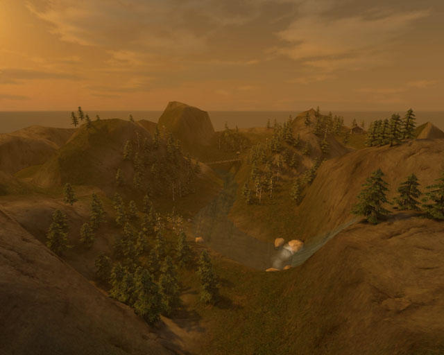
Work continues on my forest level. I'm thinking of making a CTF level out of this. Can't imagine anything else it could be used for really. :icon30:
Posted: Fri Jul 27, 2007 12:02 am
by obsidian
dnky: Looks amazing... reminds me a bit of a darker, more gothic Chartres.
ALMighty: That looks awesome! Though a little too yellow, IMO.
Posted: Fri Jul 27, 2007 1:18 am
by Method
I've been working on more textures. Something I did a few days ago:
[lvlshot]http://www.methodonline.com/temp/comparison11.jpg[/lvlshot]
Wood texture in game (test room):
[lvlshot]http://www.methodonline.com/temp/wood_ingame.jpg[/lvlshot]
-Method
Posted: Fri Jul 27, 2007 2:26 am
by Fjoggs
Posted: Fri Jul 27, 2007 8:38 am
by ALMighty
Method: Your WIP looks absolutely amazing! Like a modern Kingpin: Life of Crime.
Posted: Fri Jul 27, 2007 8:45 am
by dnky
Really heart warming to see great level designing still going on.
Almighty, that looks like an oil painting, I love it. Two trees top left seems to be floating

Fjoggs, awesome as always...I always love your stuff. You MUST finish more!
Method, I appreciate what you're doing there, wood is one of the most tricky materials to pull off in D3 tech I think
Posted: Fri Jul 27, 2007 10:30 am
by Method
ALMighty: Thanks man. Compared to the lost shots I showed, it's just a square room with blockout texture. I guess KP is my style of level design. After all it was Kingpin and not Quake that inspired me to build levels. If in the future KP2 will be in the works, I would really like to work on that. I'm just saying if.
dnky: You're right man, wood is hard to pull off. I failed on my first try and decided not to try anymore untill few days ago. I guess once I get better with textures, I can try and tackle the ones I couldn't pull off before.
Atm the toughest textures to make for me are alpha decals beam supports. I have to first trace it out, then put a texture, then highlight and add slight shadow. Then make it an alpha. Here's another test room that I threw some of my crazy LD experiments:


-Method
Posted: Fri Jul 27, 2007 1:35 pm
by hemostick
obsidian wrote:ALMighty: That looks awesome! Though a little too yellow, IMO.
Maybe it's on Stroggos ?
Posted: Fri Jul 27, 2007 3:23 pm
by dnky
I love that top shot Method....I thought that was the in game shot to begin with and nearly had a fit
My beams:

That was for the CTF map I did. Granted it's recatangular and not curved. In many ways bits of map like that are alot easier to pull off in a model app as UVW mapping the image often gives more satisfactory results than the surface inspectors.
I made mine texture much the same way as yours I think. I created a grey scale template out of numerous vector shapes. I kept inmind that the tone of the pixels is read as depth. Because the edges of my template were very clean it was easy to create a clean alpha mask. Converted the template directly into a normal map, which because the tones were clean and simple, worked very well. The original template image became one of the layers used to create the diffuse image. I generally find it much more satisfactory to work from template to normal to diffuse and specular, rather than from diffuse back to local or height map, but of course this isnt always possible. It's all good fun any way.
Posted: Sat Jul 28, 2007 12:29 am
by Method
I'm gonna try and tackle that top shot soon. Beams look good, Dinky. I was vectoring shapes too.
I tweaked the area that started this project:

-Method
Posted: Sat Jul 28, 2007 6:57 am
by Pext
what are the screens doing there?
Posted: Sat Jul 28, 2007 2:53 pm
by ALMighty
Incredibly cool. Haven't felt this way since I played Kingpin for the first time.
Posted: Sat Jul 28, 2007 3:14 pm
by dichtfux
Yeah, reminds me of Kingpin, too.
When will you publish the map so we can have a look at it ourselves? Still testing/creating/showing off textures only, or did you start making a real (SP?) map out of it?
Posted: Sat Jul 28, 2007 7:24 pm
by g0th-
A early shoot of a map I begun to work at a couple of days ago.

Posted: Sat Jul 28, 2007 7:30 pm
by Foo
I likes that
Posted: Sat Jul 28, 2007 11:06 pm
by Method
ALMighty: Thanks Almighty. That's the best compliment I can ever recieve.
dichtfux: Still testing stuff out. It's basically a map with 9 or so seperate rooms. Some are finished and some are simply for testing purposes.
-Method
Posted: Sun Jul 29, 2007 3:21 pm
by BJA
@g0th: Nice to see some more gothic style maps for q4. The screenshot looks already very promising. I suppose you're gonna add some torches where all those little yellow lights on the upper lelvel are?
@Method: That beem looks pretty cool. Did you create it from scratch or from the reference picture? just curious.
Those blue neon signs are nice since they work well as a complementary color to the yellow from the barrel. But I would be careful not to add to many colours and keep that desurated "Kingpin look".
You could maybe add some paper advertising on the walls and make the windows a little bit more broken. Just some suggestions, looking very good so far.


