Page 108 of 295
Re: Screenshots
Posted: Sat Apr 12, 2008 10:40 am
by ALMighty
Started working on this again, and redid most of it once again. I'm pretty pleased with it now though.
[lvlshot]http://alm.gamedesign.net/images/shot0242.jpg[/lvlshot]
[lvlshot]http://alm.gamedesign.net/images/shot0243.jpg[/lvlshot]
Re: Screenshots
Posted: Sat Apr 12, 2008 12:16 pm
by g0th-
I'm glad you decided to work on this again remember when you first posted about it. Looks a bit better now and the floor system seems very interesting.
any plans of a beta or alpha soon?
Re: Screenshots
Posted: Sat Apr 12, 2008 3:59 pm
by seremtan
goth-
nice architecture but that lighting needs some serious work, not just the contrast like GKY mentioned but also the colour, especially since your skybox doesn't have that colour. personally i'd suggest a greenish tint to the light, with high-contrast lighting (i.e. low ambience) and a thin black fog (i.e. use antiportals for culling instead of z-plane clipping) - but that's just me
i've got to say UnrealEd has its low points (as a BSP editor it gets pissed on from a great height by radiant and an even greater height by hammer) but for pure terrain mapping it's the bomb, especially since you can do the whole thing in the 3D window at fullscreen, plus the dynamic lighting and superfast 'building' (i.e. compiling, but way quicker) means that, as you say, editor shots are basically identical to in-game shots (except for those zoneinfos and terraininfos, which i have displayed at 16x so i can find the fiddly little bastards)
Re: Screenshots
Posted: Sun Apr 13, 2008 8:16 am
by ALMighty
goth-: A beta shouldn't take too long; it's basically releasable, just need to fix it up a bit.
Re: Screenshots
Posted: Sun Apr 13, 2008 1:11 pm
by seremtan
so, i set aside HL2 for a wee while to make this:

it's nothing like finished, but this editor shot gives you the general idea. excuse the giant terraininfo icon in the middle. it's for Onslaught btw. i've had the idea practically forever but never got around to learning UnrealEd until recently. all the static meshes are retail, but a couple of the grass textures are custom
grass is a bastard to do, so i'm trying to conceal the inevitable stripes with blended layers etc
Re: Screenshots
Posted: Sun Apr 13, 2008 7:13 pm
by Plan B
Looks sweet, Seremtan. Has a bit of a cartoony look, mostly because of those tree models I suppose, don' t know if you're going for that?
The grass texture tiling is there, but I don't think it's that harsh.
You could use grass/small boulder-models to cover that up rather than using more terrain layers.
I *think* that UT uses model instancing, so spraying some around at various sizes/angles might have less of a performance impact.
Any particular reason you chose the UT-engine?
EDIT: Because it's for onslaught, obviously.
Re: Screenshots
Posted: Sun Apr 13, 2008 8:42 pm
by rgoer
if you hit the 'g' key to toggle "game view" that icon will go away
Re: Screenshots
Posted: Sun Apr 13, 2008 10:26 pm
by g0th-
Looks good Seremtan. A little to round for my taste but I figure you will put more rocks in there as you progress. as Plan B already said for the grass you could make a static mesh (or use epics) and then use a paint tool to place a lot of instances of that mesh all over the terrain. If you haven't you should also consider using more textures layers on that terrain.
seremtan wrote:goth-
nice architecture but that lighting needs some serious work, not just the contrast like GKY mentioned but also the colour, especially since your skybox doesn't have that colour. personally i'd suggest a greenish tint to the light, with high-contrast lighting (i.e. low ambience) and a thin black fog (i.e. use antiportals for culling instead of z-plane clipping) - but that's just me
Yeah I did a quick look on the lightning today, turns out I had forgotten about a bright ambient light when I took those shots, looks a bit less flat now

I also added a greenish back light that lights from the ground and a couple of blue side lights. Regarding the sky I'm not really sure what to do. If I can find a sky that suits my map better inside of the ut3 paks I will use that ofc but making one by myself will be a bit to time consuming (not to mention it would probably look like shit

Thanks for the advice man
Re: Screenshots
Posted: Mon Apr 14, 2008 3:00 pm
by Silicone_Milk
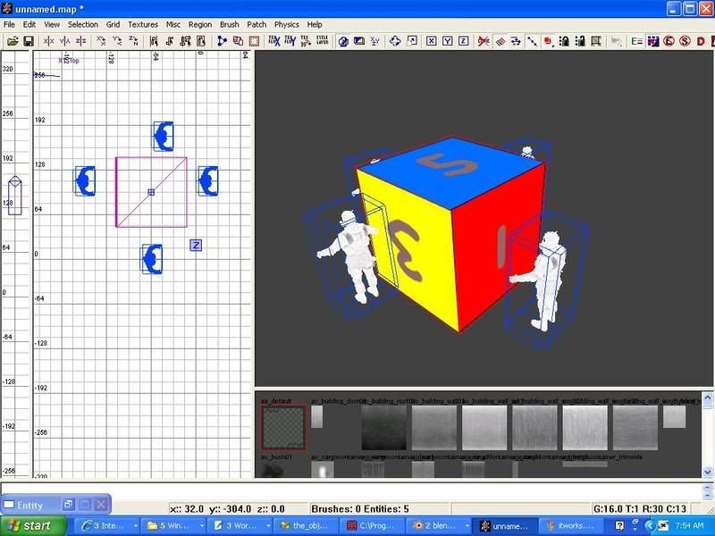
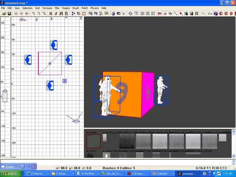
Results of a model exporter I wrote so people without Maya 7 or 8 can create custom models for Call of Duty 4:


Not very impressive looking to be sure

But objects are finally skinned properly. I just need to add in bone support to the exporter and I'll release the program.
Re: Screenshots
Posted: Mon Apr 14, 2008 6:54 pm
by seremtan
Plan B wrote:Looks sweet, Seremtan. Has a bit of a cartoony look, mostly because of those tree models I suppose, don' t know if you're going for that?
actually, i rather like the not-entirely-realistic look some times. it means i can keep things simpler and focus on gameplay. the smoothness of the terrain is to facilitate easy vehicular movement
The grass texture tiling is there, but I don't think it's that harsh.
You could use grass/small boulder-models to cover that up rather than using more terrain layers.
in fact, there's a decoration layer (grasses, etc) that i have yet to add, plus i've smoothed in a dirt layer here and there which breaks things up
I *think* that UT uses model instancing, so spraying some around at various sizes/angles might have less of a performance impact.
yes it does, and in that shot there are only about 4-5 different models at different scales and rotations. but as i said, i want to make sure i keep clear space for vehicles, while also having margins between driving areas for pedestrians (who tend to get a bum deal in this kind of gameplay)
Any particular reason you chose the UT-engine?
EDIT: Because it's for onslaught, obviously.
exactly for that reason. and also because of a lack of satisfying (to me) custom maps. i play the same two retail maps over and over (crossfire and arctic stronghold) because they're the only ones that are any good. torlan is overrated imho
Re: Screenshots
Posted: Mon Apr 14, 2008 6:59 pm
by seremtan
g0th- wrote:Yeah I did a quick look on the lightning today, turns out I had forgotten about a bright ambient light when I took those shots, looks a bit less flat now

I also added a greenish back light that lights from the ground and a couple of blue side lights. Regarding the sky I'm not really sure what to do. If I can find a sky that suits my map better inside of the ut3 paks I will use that ofc but making one by myself will be a bit to time consuming (not to mention it would probably look like shit

Thanks for the advice man
you could try making a static mesh with a panorama on the inside and putting that in the skybox. epic did that in a couple of UT2K4 maps and i reused it that screen, though you can't see it too well as i still haven't nailed down the fog to its final density
re skies in the UT3 packages - what about the sky from floodgate or one of those necris-y vehicle ctf maps?
also, have you noticed how epic give their packages the stupidest and most unhelpful names. took me ages to find the assets i wanted, plus no global search/filter tool like in hammer (unless there is one i don't know about

)
Re: Screenshots
Posted: Mon Apr 14, 2008 7:12 pm
by Foo
seremtan wrote:exactly for that reason. and also because of a lack of satisfying (to me) custom maps. i play the same two retail maps over and over (crossfire and arctic stronghold) because they're the only ones that are any good. torlan is overrated imho
Arctic centers far too much on the final nodes to be of much use, the alt node-layout is the only way to play that map properly IMO.
Dawn and Dria are excellent but Crossfire is the best of the bunch by far.
Re: Screenshots
Posted: Mon Apr 14, 2008 8:18 pm
by seremtan
i use custom node links for both of those anyway, which is the main reason i never play UT2K4 online (the vanilla setups are a bit poo). arctic could use a couple more nodes around the sides, but otherwise is great fun thanks to the nifty terrain layout
dawn has potential but i feel it could have been compressed into a slightly smaller area for better gameplay, while dria is just way too large and favours the raptor as a result which makes the gameplay a bit unbalanced
Re: Screenshots
Posted: Tue Apr 15, 2008 9:25 pm
by g0th-
A little update. I still got a lot of things to fix.
[lvlshot]http://www.g0th.se/pics/g0th_ut3wipscreen08.jpg[/lvlshot]
[lvlshot]http://www.g0th.se/pics/g0th_ut3wipscreen05.jpg[/lvlshot]
[lvlshot]http://www.g0th.se/pics/g0th_ut3wipscreen07.jpg[/lvlshot]
[lvlshot]http://www.g0th.se/pics/g0th_ut3wipscreen06.jpg[/lvlshot]
[lvlshot]http://www.g0th.se/pics/g0th_ut3wipscreen09.jpg[/lvlshot]
Re: Screenshots
Posted: Tue Apr 15, 2008 9:41 pm
by o'dium
Much nicer!
Re: Screenshots
Posted: Tue Apr 15, 2008 10:06 pm
by seremtan
yeah the contrast is better but that yellow light... bleh...
btw how did you set the ambient light to get lighter shadows. i've tried setting the zonelight in the zoneinfo but all it does is increase the ambient on the static mesh shadows, but not the terrain shadows

Re: Screenshots
Posted: Tue Apr 15, 2008 10:19 pm
by g0th-
What did you think was wrong with the yellow?
As for the lights. I used 5 different directional lights (with shadow off) as ambient lights. That way I could simulate the bouncing colors a bit better then just to use zone info or a sky light
Re: Screenshots
Posted: Wed Apr 16, 2008 12:41 am
by phantazm11
Looks really nice g0th

Re: Screenshots
Posted: Wed Apr 16, 2008 5:16 pm
by seremtan
g0th- wrote:What did you think was wrong with the yellow?
As for the lights. I used 5 different directional lights (with shadow off) as ambient lights. That way I could simulate the bouncing colors a bit better then just to use zone info or a sky light
the yellow seems lemon-y or even piss-coloured. it would definitely put me off playing it. also, the predominate colour scheme appears to be yellow and grey, a less-than-inviting combination. also, from the shadows it looks like midday-afternoon (depending on latitude of course), and the skybox suggests coldness, so yellow imho is the wrong colour. a pale grey might work better, with a thin fog of the same RGB
also, good idea on the point lights for ambient. i'm going to end up doing that as well. btw i don't suppose you'd have any insight into why the map i showed above is 55MB in size? i mean, i don't have that many layers (all 256x256 G16) and 3 custom grasses, two of which are 3MB each, but other than they're all retail assets. is it possible that some of the utx/usx stuff has ended up in the mylevel package?
Re: Screenshots
Posted: Wed Apr 16, 2008 6:10 pm
by g0th-
Thanks phantazm11

Seremtan I think the yellow looks fine. But the shadows is a problem because they are the wrong angle (and I don't want to change them) I got some yellow shininess in the skybox that is meant to work as a light source but it's in the wrong angle to create those shadows, it's something to improve upon but for the deadline tonight I have more important things to focus on

Regarding the size it gets smaller when you cook your map. I think my ut3 file is around 200 mb now but it probably shrinks down to around 40 or so when I cook it. I think unreal do some sort of memory thing with the assets to improve performance, witch is why the size is increased so much
Also unreal automatically converts your tga images to dx1 or 5 for alpha so you images are only about 700 kb each if you use 1024
Re: Screenshots
Posted: Thu Apr 17, 2008 5:38 pm
by seremtan
yeah but i'm mapping for UT2K4. isn't cooking a new thing for UT3?

Re: Screenshots
Posted: Thu Apr 17, 2008 6:07 pm
by Silicone_Milk
I almost want to start mapping for UT3 now... CoD 4 feels too restricting trying to make maps in a realistic fashion.
Re: Screenshots
Posted: Thu Apr 17, 2008 6:46 pm
by seremtan
realism is for SP only
my utterly prejudiced 10c worth
Re: Screenshots
Posted: Thu Apr 17, 2008 7:01 pm
by g0th-
seremtan wrote:yeah but i'm mapping for UT2K4. isn't cooking a new thing for UT3?

ahh didn't know that. You have to convert your textures for dx1 manually in ut2004 and yeah cooking is new for ut3
Re: Screenshots
Posted: Thu Apr 17, 2008 8:15 pm
by surgeon62
g0th- wrote:A little update. I still got a lot of things to fix.
[lvlshot]http://www.g0th.se/pics/g0th_ut3wipscreen07.jpg[/lvlshot]
You guys are getting some incredible texturing on the rock these days.... amazing.


