Page 120 of 295
Re: Screenshots
Posted: Fri Aug 08, 2008 1:20 am
by o'dium
You cant say I don't post damn interesting pictures! Heres a little teaser of what we are doing with Sniper scope views. Rather than doing the old bored 2D black overlay, we wanted something a little nicer... So we went with full 3D models. Let me know what you think, if you can handle the action presented in this shot...?

Re: Screenshots
Posted: Fri Aug 08, 2008 3:41 am
by obsidian
You should make it so that you can see the tip of your nose.

Re: Screenshots
Posted: Fri Aug 08, 2008 3:59 am
by bork[e]
I've always thought the snipe view should be off centered according to left/right handed players, and maybe instead of the surroundings of the scope being black, it should be a haze/half "black out" as if the other eye was just about to be closed... but I do like what you have there.
edit: I've always liked how insurgency did this (and many others):

If you were to move the scope left or right,
imo it would really add soemthing to that view, not sure how the "almost closed eye" effect would really play into all that though, might be a dumb idea, just seems like it would really fit on that view if you could make it look right. Or maybe even rotate the view a bit as if you had your head moved a few degrees left or right resting on the rifle.
Re: Screenshots
Posted: Fri Aug 08, 2008 10:48 am
by o'dium
Well we could do that if we wanted to. Not sure yet. But what Insurgency did (and loads of others) is very easy to do, we just make that area off.
Problem with that is that it isn't realistic at all. Not only can you see your surroundings still, but you are given a stupidly small frame in which to snipe from.
Berserk wanted what you suggested, the rest of us wanted what I suggested, so I went with it. But of course, we can test later and see which works better.
Re: Screenshots
Posted: Fri Aug 08, 2008 11:14 am
by o'dium
Ok guys, I would like a vote from you all. I've added a quick "test" mock up of what bork[e] said. Now this is using test media that isn't finished yet, so ignore the scope being a bit bland...
Anyway, what I'v done is a variation of what Insugency did. Only I've made the scope area bigger and I've added a blur to the area your not supposed to see (Which will look exactly the same ingame).
Which do you guys prefere? Let me know, and the outcome will decide the fate of the scope! You cant pick wrong so just pick one!
Either method A:
Or method B:

VOTE NOW!
Re: Screenshots
Posted: Fri Aug 08, 2008 11:30 am
by Fjoggs
Well if you want realism, then it's method A. But method B looks better.
Re: Screenshots
Posted: Fri Aug 08, 2008 12:54 pm
by MKJ
A
Re: Screenshots
Posted: Fri Aug 08, 2008 1:02 pm
by fKd
b imo
Re: Screenshots
Posted: Fri Aug 08, 2008 4:46 pm
by obsidian
B, except increase the size of the frame so that your "eye" is closer to the scope and reduce the width of the scope's frame. There is usually a pretty thin frame around the lense. It'll also mean you have a larger zoomed up section to play with.
Re: Screenshots
Posted: Fri Aug 08, 2008 4:54 pm
by o'dium
Well by design we cant do the second. But the first is an obvious tweak.
Re: Screenshots
Posted: Fri Aug 08, 2008 8:16 pm
by jkoder
B pour moi.
Re: Screenshots
Posted: Fri Aug 08, 2008 9:12 pm
by o'dium
Ok guys, I updated the Method B pic with a newer version. Its nothing amazing just the new model. Still no texture on the actual scope, but at least you can see the new polycount of the weapon. Hope thats better.
Re: Screenshots
Posted: Sat Aug 09, 2008 6:59 pm
by corsair
I prefer version B, but what about enlarging the scope some, so that the circle that is the inner border of the metal part gets close to having the same diameter value as the screen's height's? Just a thought tho.
Re: Screenshots
Posted: Sun Aug 10, 2008 2:20 am
by Silicone_Milk
I like B more but wouldn't it make sense for the view to zoom in slightly off center so the crosshairs would be center with the eye you're looking through?
Also, since one eye would be closed wouldn't the closed eye's side be darker?
Re: Screenshots
Posted: Sun Aug 10, 2008 11:03 am
by o'dium
Silicone_Milk, name me one game thats done that? Thats taking things to far IMO. I'm all for detail but that would make it awful to aim with.
Re: Screenshots
Posted: Sun Aug 10, 2008 12:26 pm
by Fjoggs
Alot of pro snipers doesn't close the non-master eye, because it's very tireing on both the eyes and your head.
Re: Screenshots
Posted: Sun Aug 10, 2008 4:37 pm
by Shallow
BJA wrote: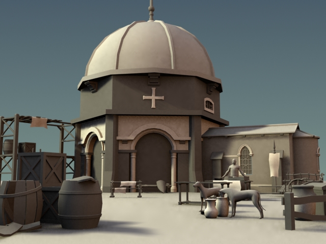
Very nice. Are you going to be adding some canopies here and there, like on market stalls or something? If you make them slightly translucent and maybe a bit moth-eaten they can look awesome in hot, dusty environments like the one you're going for. And I imagine you're already planning on adding tufts of scrub and dried grass but just haven't done it yet.
Re: Screenshots
Posted: Sun Aug 10, 2008 8:12 pm
by g0th-
BJA: Looks really good.
Odium: I think B looks better as well
Here's some zbrush test
[lvlshot]http://www.g0th.se/pics/zbrush_pillar.png[/lvlshot]
Re: Screenshots
Posted: Sun Aug 10, 2008 9:35 pm
by Silicone_Milk
o'dium wrote:Silicone_Milk, name me one game thats done that? Thats taking things to far IMO. I'm all for detail but that would make it awful to aim with.
Now now, if everybody thought like that we'd still be playing pong.
Why should it matter if other games have done something?
Re: Screenshots
Posted: Sun Aug 10, 2008 10:07 pm
by o'dium
Because you use that as a base before you go adding features left and right.
Remember, it would also be pretty sweet if we could shoot other players in the leg and have them fall to the floor, screaming, not being able to move... But we know for gameplay, that just wouldnt work. Thats why people take 10 bullets to the face still, because it just wouldn't be fun. Head shots are great, but damage in games is hardly realistic, right?
Lets think about what you said... Half the screen goes black, you look down a sniper sight that isnt centered to your screen... Would it be fun to use? Well, IMO, no. It would kill the weapon being used.
Re: Screenshots
Posted: Fri Aug 15, 2008 5:58 am
by fKd
shots of what im working on

update shot of red base

Middle looking down

another looking up Woo
Re: Screenshots
Posted: Fri Aug 15, 2008 11:22 am
by a13n
@fKd
Great shots!
I luv your construction which shows something q3 can do.
Re: Screenshots
Posted: Mon Aug 18, 2008 11:32 pm
by WHAT!!
fKd wrote:shots of what im working on
update shot of red base
Middle looking down
another looking up Woo
These really look great.
Re: Screenshots
Posted: Mon Aug 18, 2008 11:45 pm
by fKd
thanks heaps, I'm still busy working on this, with any luck it will be my first released map for q3. so many abandoned maps lol. I'm already itching to make a dm map as ctf seems to not be the most popular gametype for q3, something sci-fi realistic... custom textures would be fun to work with... maybe make my own set with some of my 1000's of ref pics.. but who knows, learning shaders looks complex
Re: Screenshots
Posted: Wed Aug 20, 2008 6:27 am
by +JuggerNaut+
fKd, that looks really good. nice work so far.


