Shared Map
Re: Shared Map
why not start with my or wattro's version and patch all things in? IMO the easier method but do as you like 
 Re: Shared Map
yeah i didn't mind putting some hours in - i just started comp time at work, so it's a good way to keep the hours spent when i am not sure what to do with myself. 
maz0r: thanks for the good list and the comments. super very helpful. i think i can address most of the those (and the issues ix-ir detailed). i won't be ready to call it alpha until the glaring issues are resolved (eg: size).
i just decreased the size of the outer rings in the base, but i'm not certain on the best way to address the area surrounding the base. there are a few potential ideas brewing in my mind but i have to think on those (and what the hell am I gonna do about breakfast?).
any ideas you have for item placement would be great. if they are gonna help drive action, it would be best to start thinking about better placement.
re: megahealth room... i thought about getting rid of the long, useless passage at the back of the megahealth room and instead extending the platform where the megahealth is into the room beside it. this should shorten that area. then i can drop the megahealth either in the arc of the launchpad or at the far end of the lava where i can make the rocky ramp curl to support the changes.
Re: Shared Map
It's hard for me to use wattro's map due to its complexity.maz0r wrote:why not start with my or wattro's version and patch all things in? IMO the easier method but do as you like
If I went wrong with his version, it would be more wasteful.
So I use magnus' geometry.
Depeding on the working section I'll switch to your map.
By the way are we still at brainstorming phase?
Re: Shared Map
No idea, I think we are getting closer to the consolidation phase though. Feel free to toss some ideas around still, but don't feel bad if your new ideas get lost in the mix or whatever.
I have a lot of other revisions I've been meaning to make but I'm hectically busy with work and other stuff so it'll have to wait until next week.
I have a lot of other revisions I've been meaning to make but I'm hectically busy with work and other stuff so it'll have to wait until next week.
Re: Shared Map
@obsidian: i know you are busy, but if some of the ideas can be drawn up on paper fairly quickly, then one of us can probably do the execution.
@a13n: i don't think it's overly complex. 99% of the geo is on grid 16, 32, or 64 - there are some exceptions. working on the map file (included in the pk3) would take some familiarity as it is considerably deviated from the original vision, but it's easily doable. i would suggest for anyone working on it to have a goal and an idea in mind of what they want to do. at this point, i believe i am the only working on the wattro version.
something that i found helpful in this collaborative mapping effort is working on only one half and leaving the other half untouched/original. this makes it easy to compare & analyze (unless you want to fully test CTF playability).
i have also considered (but not ready yet) going back to the non-wattro version (for lack of a better word, help!) of the map and trying to address the issues with that version, but right now i am more compelled to work on this version. i am still brainstorming on the map and attempting to address the outstanding/identified flaws to get it to what i feel is a solid alpha. i'm hoping at that point that the feedback becomes more direct ("this room/corridor would be better like this") but then i've never really released a proper map before, so it's not like i know what i am talking about.
in terms of the consolidation, perhaps there should be one person to do this, or have each person make an attempt? i think the last version i saw was 5c and it still had issues with overall size. i'm not sure if that should be addressed before or during consolidation. also, has much of the small/off grid geo been cleaned up? that would compel me to work on that version
Re: Shared Map
@obsidian, wattro
I see. I see.
For now, I'll devote myself to cut off and shrink the rooms(1 of the 3 paths to midfield) I've worked on so far, while coordianting with wattro's and maz0r's routes.
@wattro
Where are you refering to by "much of the small/off grid geo"?
If you mean spiral stairs, can't I leave them off grid till consolidation?
Re: Shared Map
================================
a13n_ctfptm6c(300kb)
================================
This is still a brainstorming map.
1. shrinked the map along x-axis
2. easier access to func_button
3. replaced one of the jumppads with stairs
I hope this version will satisfy everyone who has given feedback as far as selected section goes.
old xy view
new xy view
Last edited by a13n on Sun Aug 26, 2007 3:45 pm, edited 6 times in total.
Re: Shared Map
Good point, I'll take a look early next week and see if I can plop some basic brushes down as a floor plan and let you guys worry about adding walls and moving stuff around to fit.wattro wrote:@obsidian: i know you are busy, but if some of the ideas can be drawn up on paper fairly quickly, then one of us can probably do the execution.
Re: Shared Map
Finally just got a good look at all of you guys work.
I was thinking that at this phase we were just doing very basic blocking to display concept and get a feel for how the areas work. I will also start to get a bit more detailed in my future versions.
OK, first off you guys do some really nice work. BTW wattro I would like to get a .map of your version so I can also try to work from it as well as a13n's, obsidian's and maz0r's.
I am also working on my most recent version to reduce the base to base distance before I try to patch in any areas from the rest of your versions.
@wattro
I have to say it looks awesome, but for some reason it feels more like a FFA rather than a CTF. Perhaps I just need to get accustomed to more styles of CTF than I currently am.
I spent 15 minuits running around in there and still felt confused...lol. That is not a put down towards your work, but more a joke at myself.
Although there are some areas that I think should be added into the map for sure, thus I need you to post the .map for download so the rest of the team can have a go at pathcing areas into it or using areas to patch into other versions as well.
@a13n
Sorry I didn't get your very last version because from the images I could see that too much nice areas were cut from the map in the name of reducing map size. I actually really like your version prior to this one best of the ones you have put out so far.
The walls blocking the YA area at the top entrance to the flag room are a nice idea. The ramped floor in the lower level of the Haste room is a great idea. The positioning of the Haste feels a bit odd as it did in my version, but I like where you were going with that seperate platform to place the haste on idea. The spiral stairs just past the Fog Telep room and various levels of stairs looks and feels nice too.
@obsidian
I totally understand that you are a moderator and have those obligations as well as other projects and obligations. I have a hard time staying on one project for very long without needing a break unless the project is really moving along. So feel free to take some time to work on other things. If you as mentioned could simply spend a few minuits when you get a good idea to draw it out in an orthographic view or something and give a quick description and expliation of the concept I am sure any one of us will be happy to block your ideas in.
@maz0r
I would like to see you fix that LOS issue I mentioned and then see what you come up with from there. I really like your version as well. Pretty much all of it flows really well. I would like to have a go at working from it too to see what I could come up with out of it.
@biolingoil
Get your but in here and have a go at something. You have had several great ideas and I like your work and I am sure you could come up with some cool stuff to be added in or changed.
@ix-ir
Same for you. You have had lots of great ideas and suggestions and advice. I am really interested to see what kind of areas you would come up with from the versions we have so far.
On a personal note. I really don't care for areas that run along behind the Flag area that much. CTF feels like it should focus on the flag forward. Unless you can enter the areas behind the flag from somewhere else in the base alowing for a rear sneak attack to get the flag then they just feel like a bad idea. Too much temptation to go back there and pick up items while the enemy is stealing away with the flag. If items that you would want to pick up are forwad or lateral to the flag then at least you are not at an automatic disadvantage because you have to cover extra distance to possibly catch up to the FC. They also only add to the size of the map wich has been an issue already.
@all
Some great work so far. Keep it up. I expected this CTFPTM to take way less time, but this is turning out to work well. I like that we are processing the versions to produce a map with the best of all our works in it. I actually feel if we do this right this is headed to be one of the most revered CTF maps out there.
Big ol' WOOT to you all.
Uh, well....good luck with that. :shrug:
[img]http://i57.photobucket.com/albums/g228/Magnus3204/forumheader.jpg[/img]
[img]http://i57.photobucket.com/albums/g228/Magnus3204/forumheader.jpg[/img]
Re: Shared Map
the .map should be in the pk3, if it's not, let me know.
i kinda agree about the path behind the flag. i'm trying to figure out what to do with it. i think i'm just going to use the back corners of the base to give the side routes an option to come in at different levels. i'm attempting to fix that up today.
i guess it may be confusing at first. i think part of that is how it crosses over into the middle area from the rooms to the side of the base. i'm trying to get to that today, too. the other thing that might help is adding more indication of where you are in the level with some decals and landmarks but that won't come until later.
i never thought of potential FFA. it might flow OK for that... maybe a possibility for an additional FFA version using some func_statics after all is said and done.
Re: Shared Map
Sweet. The .map was right there. Now I have more good stuff to work with. Cool.
All good points and ideas from your post above wattro.
All good points and ideas from your post above wattro.
Uh, well....good luck with that. :shrug:
[img]http://i57.photobucket.com/albums/g228/Magnus3204/forumheader.jpg[/img]
[img]http://i57.photobucket.com/albums/g228/Magnus3204/forumheader.jpg[/img]
Re: Shared Map
I'm actually aware of that LOS (like I wrote in my to do list in the same post), but did not bother to fix it, simply because I wanted to get the map out. I just wanted it to be an alternative and already invested more time than I planned. But I'll see if I can up with a simple solution. Stay tuned.Magnus wrote: [...]
@maz0r
I would like to see you fix that LOS issue I mentioned and then see what you come up with from there. I really like your version as well. Pretty much all of it flows really well. I would like to have a go at working from it too to see what I could come up with out of it.
IMO this is a GREAT problem for this project. Nearly all the designers here lack of ctf experience. Either in mapping or in playing. Actually it IS a good idea to create rooms BEHIND the flag. It offers attackers another good chance to sneak in the base or just to hide with the flag until a mate comes to cover him. On the other hand it makes defending much more interesting and challenging since the foes can come from more than on or two directions. So you just can't sit in your base with fov 120 and covering all entrances without moving.Magnus wrote: [...]
On a personal note. I really don't care for areas that run along behind the Flag area that much. CTF feels like it should focus on the flag forward. Unless you can enter the areas behind the flag from somewhere else in the base alowing for a rear sneak attack to get the flag then they just feel like a bad idea. Too much temptation to go back there and pick up items while the enemy is stealing away with the flag. If items that you would want to pick up are forwad or lateral to the flag then at least you are not at an automatic disadvantage because you have to cover extra distance to possibly catch up to the FC. They also only add to the size of the map wich has been an issue already.
[...]
Regarding the regular ctf map pool I can spontaneous think of at least four maps (e.g. w3, p14, p15, w7) which offer such routes. CTF is NOT just grabbing the flag and keep on running along the way home, it's much about hiding, confusing, irritating and teamplay (hide until escort comes). Hiding with the flag in the enemy base for a couple of minutes is really quite common these days (and always was). They often wait for power ups, an escort or the midfield to be cleared by the mates.
And if an enemy stole away with your flag you will NEVER go for any item (as long as you don't stumble about it) if you are sure he is heading for the center. You will try to chase him directly or keep killing yourself until respawning in midfield.
Maybe grab some demos from a random tournament final and get used to ctf playing style nowadays. It may help to understand what ctf is about in q3. Also you could take a closer look at the maps I already suggested earlier in this thread.
@a13n: PLEASE get rid of your func_button at all. It completely constrains fast playing. I know it sounds like a good idea and it actually was - in q2ctf days
Re: Shared Map
That is what I have been saying. If the entrance/exit areas behind the flag offer a route into the flag room from somewhere far outside the flag room then they are OK. As a form of sneak attack. Rear entrances can make good for an unexpected entrance into the flag room; grab the flag and chose a safe way out and away from any defenders.
We have one version with a rear area that basically connects one of the rooms next to the flag room the the other side of the flag room. It has a possibility of rear entry through some air control to leap into a window behind the flag. If air controll is not used then you are just tossed to the other side and your presence is revealed through that same window.
The other rear area we have basically connects a hall from the lower level of the base around behind the flag to the upper level of the base and connects to the two rooms on either side of the base.
IMO a rear entry should offer a quick safe and suprise entry, but be balanced by forcing the FC into a longer more dangerous path in and out of the base and should have an entry/exit point somewhere close to the midfeild.
The FC could remain in the areas leading from the flag room to the exit point untill team mates get there or try to double back or try to go for it and try to beat the defenders to the exit point.
The defenders could try to chase the FC along the way to the exit point or try to beat the FC to the exit point.
With the current versions we have the space and areas required to offer all of this would be hard to come up with in a reasonable way.
I guess we could try to create the needed areas by building them under the entire map.
Anyway the point is that I have been saying that areas behind the flag are OK as long as they truly offer a way into the flag room from behind.
I am going to DL those maps you suggested maz0r and play them a bit before I make any further changes than I have today. This will help a fair bit I am sure. Guess I am still a bit crusty and used to playing the CTF's of 8 years ago....lol.
BTW I really like the button a13n made and the doors. My bots actually use the damn thing. , but I have to say I can't see buttons or activators having much of a place in CTF.
Although all ideas are OK to drop in there because we may find an innovative way to make something work well in CTF for the first time where as it had never worked well before.
We have one version with a rear area that basically connects one of the rooms next to the flag room the the other side of the flag room. It has a possibility of rear entry through some air control to leap into a window behind the flag. If air controll is not used then you are just tossed to the other side and your presence is revealed through that same window.
The other rear area we have basically connects a hall from the lower level of the base around behind the flag to the upper level of the base and connects to the two rooms on either side of the base.
IMO a rear entry should offer a quick safe and suprise entry, but be balanced by forcing the FC into a longer more dangerous path in and out of the base and should have an entry/exit point somewhere close to the midfeild.
The FC could remain in the areas leading from the flag room to the exit point untill team mates get there or try to double back or try to go for it and try to beat the defenders to the exit point.
The defenders could try to chase the FC along the way to the exit point or try to beat the FC to the exit point.
With the current versions we have the space and areas required to offer all of this would be hard to come up with in a reasonable way.
I guess we could try to create the needed areas by building them under the entire map.
Anyway the point is that I have been saying that areas behind the flag are OK as long as they truly offer a way into the flag room from behind.
I am going to DL those maps you suggested maz0r and play them a bit before I make any further changes than I have today. This will help a fair bit I am sure. Guess I am still a bit crusty and used to playing the CTF's of 8 years ago....lol.
BTW I really like the button a13n made and the doors. My bots actually use the damn thing.
Although all ideas are OK to drop in there because we may find an innovative way to make something work well in CTF for the first time where as it had never worked well before.
Uh, well....good luck with that. :shrug:
[img]http://i57.photobucket.com/albums/g228/Magnus3204/forumheader.jpg[/img]
[img]http://i57.photobucket.com/albums/g228/Magnus3204/forumheader.jpg[/img]
Re: Shared Map
Thank you but judging from the feedbacks its size is too large.Magnus wrote: I actually really like your version prior to this one best of the ones you have put out so far.
Just my sincere respect to q2.maz0r wrote:PLEASE get rid of your func_button at all. It completely constrains fast playing. I know it sounds like a good idea and it actually was - in q2ctf days
That's so true.maz0r wrote:Maybe grab some demos from a random tournament final and get used to ctf playing style nowadays. It may help to understand what ctf is about in q3.
I don't really know what ctf is all about.
Would you please tell some links to good demo examples?
@obsidian
I understand that you are too busy.
But please change the font color of my d/l link!
If you are too busy, give me the priviledge as a moderator, and I'll do it by myself.
Re: Shared Map
I completely remixed the layout(integration of wattro's geometry, etc...), except midfield and the base while keeping everyone's concept alive at some kind of form.
Please check it out to see if it's good enough.


a13n_ctfptm6e
Please check it out to see if it's good enough.
a13n_ctfptm6e
Re: Shared Map
hi everyone,
i'm back with an updated version of the map. i've made a bunch of changes (for better or for worse) and even another ugly ass screen shot.
-how is the size and LOS issues now?
-is the overall flow better or worse?
-how bad is item placement? too much, too little, in the wrong spots?
-bots play like idiots, i'll try to address that maybe tomorrow.
-map file included in the pk3, as is aas, levelshot, scripts, etc... enjoy!
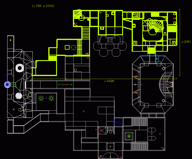
[lvlshot]http://www.robotrenegade.com/q3wptmctf1/source/wattro/q3ctfptmwattro.jpg[/lvlshot]
i'm back with an updated version of the map. i've made a bunch of changes (for better or for worse) and even another ugly ass screen shot.
-how is the size and LOS issues now?
-is the overall flow better or worse?
-how bad is item placement? too much, too little, in the wrong spots?
-bots play like idiots, i'll try to address that maybe tomorrow.
-map file included in the pk3, as is aas, levelshot, scripts, etc... enjoy!
[lvlshot]http://www.robotrenegade.com/q3wptmctf1/source/wattro/q3ctfptmwattro.jpg[/lvlshot]
Re: Shared Map
Gave it a try against bots in OSP. I only play CTF with a few friends now and then, never played in a league or clan. Here's my impressions anyways.
* Played 5vs5 and felt a bit lonely - maybe because the bots just sit in the bases, but the map still feels huge. When I compare the size of the map to the maps I usually play (like wcp9), it really feels too big.
* The layout is a bit confusing imo, especially the part marked in green on the image below.
* Moving along I sometimes felt like I was in a maze because of the strange corners that look as if they were introduced to block LOS (an example is marked in pink, but it felt like there were quite a few of them).
* Some ramps are steep, an example is the one at RG (marked in red).
* It's only a small spot, but there's a long LOS marked in blue.
* The flag is better now with the corridors behind the flag on the upper level, nice.
* Really starts to feel like a cave!

I know this sounds a bit harsh, but I'd think about keeping the flagroom and center and dramatically changing the whole part marked in green. As I said before I'm not a CTF expert, but when compared to the CTF maps I enjoy playing, the layout is way too confusing.
* Played 5vs5 and felt a bit lonely - maybe because the bots just sit in the bases, but the map still feels huge. When I compare the size of the map to the maps I usually play (like wcp9), it really feels too big.
* The layout is a bit confusing imo, especially the part marked in green on the image below.
* Moving along I sometimes felt like I was in a maze because of the strange corners that look as if they were introduced to block LOS (an example is marked in pink, but it felt like there were quite a few of them).
* Some ramps are steep, an example is the one at RG (marked in red).
* It's only a small spot, but there's a long LOS marked in blue.
* The flag is better now with the corridors behind the flag on the upper level, nice.
* Really starts to feel like a cave!
I know this sounds a bit harsh, but I'd think about keeping the flagroom and center and dramatically changing the whole part marked in green. As I said before I'm not a CTF expert, but when compared to the CTF maps I enjoy playing, the layout is way too confusing.
[color=#FFFFFF][url=http://maps.rcmd.org]my FPS maps[/url][/color]
Re: Shared Map
Sweet! Thanks for the great feedback. & many additional thanks for using that image! Harsh it up.
I'm not adverse to changing any areas of the map. Sounds like I need to though if 5v5 w/ bots felt a bit lonely. The size and confusing middle are certainly contributing factors so i'll do bot optimizations today (mainly because i want to see what kind of impact they have) and see where it stands. Then I'll go about reworking routes and seeing why the middle is so confusing* Played 5vs5 and felt a bit lonely - maybe because the bots just sit in the bases, but the map still feels huge. When I compare the size of the map to the maps I usually play (like wcp9), it really feels too big.
* The layout is a bit confusing imo, especially the part marked in green on the image below.
* Moving along I sometimes felt like I was in a maze because of the strange corners that look as if they were introduced to block LOS (an example is marked in pink, but it felt like there were quite a few of them).
* It's only a small spot, but there's a long LOS marked in blue.
*I know this sounds a bit harsh, but I'd think about keeping the flagroom and center and dramatically changing the whole part marked in green. As I said before I'm not a CTF expert, but when compared to the CTF maps I enjoy playing, the layout is way too confusing.
that ramp and the ramps in midfield are the only ones that exceed the standard double-wide. i have to wonder if there another issue at the heart of this?* Some ramps are steep, an example is the one at RG (marked in red).
Nice!* The flag is better now with the corridors behind the flag on the upper level, nice.
* Really starts to feel like a cave!
-
Silicone_Milk
- Posts: 2237
- Joined: Sat Mar 12, 2005 10:49 pm
Re: Shared Map
My Thoughts:
All the stuff that dichtfux marked as confusing needs to be completely removed to simplify things.
To make up for lost space, we can rotate the flag room like so:
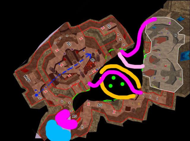
Color Key:
Hot Pink: Marking paths where I blacked out the original picture. Just a generalized sketch of how the path should flow.
Bleh Pink: Alternate route if hotpink doesnt tickle your fancy.
Yellowish Orange: New Room. Breaking LOS while providing another route out/in of the flag room. (total of 3 now)
Green Circles: "Geometrical suggestions" as to where the player should be going in the room.
Bright Blue: Upper platform area added to room to hold an item that will make taking the long route worth the trouble.
All the stuff that dichtfux marked as confusing needs to be completely removed to simplify things.
To make up for lost space, we can rotate the flag room like so:
Color Key:
Hot Pink: Marking paths where I blacked out the original picture. Just a generalized sketch of how the path should flow.
Bleh Pink: Alternate route if hotpink doesnt tickle your fancy.
Yellowish Orange: New Room. Breaking LOS while providing another route out/in of the flag room. (total of 3 now)
Green Circles: "Geometrical suggestions" as to where the player should be going in the room.
Bright Blue: Upper platform area added to room to hold an item that will make taking the long route worth the trouble.
Re: Shared Map
groovy... didn't know one could consume acid by way of reading a post in a thread. thanks silicone milk!!
great feedback, i like it a lot - definitely some great ideas that take a step backwards to move forward. a couple questions for you, if you don't mind, and some bonus comments
1) the orange routes and the hot pink route all line up to the sides of the midfield, but nothing connects to the middle of the midfield (except bleh pink). Is that intended in your design to have only entrances at opposing sides of the midfield (albeit varied, i would assume)?
2) you're also saying to move the LG? any other brief thoughts on overall amount/frequency of weapons/ammo?
3) this isn't far off from something i suggested way back on page 2 or 3... to rotate the base, except i considered rotating it a full 90. just for quicks, i'm gonna use the arbitrary rotation to rotate it 45 and see how painful it looks.
4) the short hot pink route is potentially extremely quick, particularly when coupled with one of the orange routes or the other hot pink route. it would have to be handled delicately, i think.
Re: Shared Map
Here is what will probably be my last submission of this vrsion of layout. I will most likely be abandoning most of the concepts and areas in this one and going for a nearly complete reconstruction other than some of the areas the rest of you have created that are nice ideas.
Anyway here is the latest. Not too much changed. Some routes adjusted, some item placement moved around and a few structure changes to deal with some LOS and flow issues I created in my last version. I also tried to improve bot use of the map so they were not so prone to use the same route all the time. Kind of mixes up play a bit better.
I know size is still an issue, but other than that let me know what you guys think and then I will move on to a new layout concept useing the info from your feedback on this version and patch some of our areas into the new concept.
magnus_ctfptm6b
Uh, well....good luck with that. :shrug:
[img]http://i57.photobucket.com/albums/g228/Magnus3204/forumheader.jpg[/img]
[img]http://i57.photobucket.com/albums/g228/Magnus3204/forumheader.jpg[/img]
Re: Shared Map
wattro: I'll get it uploaded and test with some human players, then give you some feedback.
Re: Shared Map
beautiful... you have my gratitude =)
Re: Shared Map
The areas lines of sight are much better now, good job. The next step is to slightly simplify what's there so it's less confusing.
You have 2 whole 'layers' of rooms between the mid and the bases, I think this is why it's so confusing.
You have 2 whole 'layers' of rooms between the mid and the bases, I think this is why it's so confusing.
Last edited by ix-ir on Sun Sep 02, 2007 1:42 pm, edited 1 time in total.
-
Silicone_Milk
- Posts: 2237
- Joined: Sat Mar 12, 2005 10:49 pm
Re: Shared Map
Haha anytimewattro wrote:groovy... didn't know one could consume acid by way of reading a post in a thread. thanks silicone milk!!
great feedback, i like it a lot - definitely some great ideas that take a step backwards to move forward. a couple questions for you, if you don't mind, and some bonus comments
1) the orange routes and the hot pink route all line up to the sides of the midfield, but nothing connects to the middle of the midfield (except bleh pink). Is that intended in your design to have only entrances at opposing sides of the midfield (albeit varied, i would assume)?
2) you're also saying to move the LG? any other brief thoughts on overall amount/frequency of weapons/ammo?
3) this isn't far off from something i suggested way back on page 2 or 3... to rotate the base, except i considered rotating it a full 90. just for quicks, i'm gonna use the arbitrary rotation to rotate it 45 and see how painful it looks.
4) the short hot pink route is potentially extremely quick, particularly when coupled with one of the orange routes or the other hot pink route. it would have to be handled delicately, i think.
1.) I didnt really realize that was a main entrance of midfield from the topdown shot. That can be adjusted as needed.
The orange lines actually are supposed to define the boundaries of a new room to be added in to fill in that one empty void so the map doesnt get bottlenecked in that particular area.
2.) I would have to actually play through the map to get an idea on ammo/weapon/item placement. I know, I know. I'm sorry I admit it but I've yet to actually play through the map since Alpha 1 by Magnus
3.) Oh really? I havent been keeping completely up to date on whats going on in this thread. I'm sure I missed a good deal of this maps evolution but I just cant find the willpower to force myself to read through all of the missed pages.
I'm glad to hear its been suggested before though
4.) Again, I should point out the orange arent paths but rather the boundaries of an entire room