Page 123 of 295
Re: Screenshots
Posted: Tue Sep 16, 2008 3:55 pm
by o'dium
Another update from me:

Re: Screenshots
Posted: Wed Sep 17, 2008 4:11 am
by fKd
how do you guys make terrain in ya engine so far? it looks a little sharp edged. also does the knife have a spec shader on the blade? it looking a little dull.
hope that helps

once again tho. over all amazing work
keep it up
Re: Screenshots
Posted: Wed Sep 17, 2008 12:02 pm
by o'dium
Terrain is made by models, so it can be as soft or as sharp as you want it to be. Depends on the performance in the area you are getting.
As for the knife, everything has a spec/bump/diffuse. Its because its being lit by a single sky light there. I'm sure it will look more more shiney indoors eh?
Re: Screenshots
Posted: Wed Sep 17, 2008 12:24 pm
by fKd
wicked mate. its prolly easier to see when its moving too.
Re: Screenshots
Posted: Wed Sep 17, 2008 6:28 pm
by o'dium
I know its not exactly screenshots, lol, so don't flame me...
I uploaded a flash based music player to the main OverDose site with some of the sound track on it for you all to listen to. comments are of course welcome, but if its bad of me please limit the hate, kthx:
http://www.teamblurgames.com/overdose/
Re: Screenshots
Posted: Wed Sep 17, 2008 6:46 pm
by dichtfux
There's a white box around it for me (Firefox, Linux) that looks a bit strange, but it works.
Click me for screenie
Re: Screenshots
Posted: Wed Sep 17, 2008 6:50 pm
by o'dium
Ahh linux possibly... I have tested it in IE/FireFox and it works fine on a Windows machine.
Re: Screenshots
Posted: Wed Sep 17, 2008 9:37 pm
by corsair
Odium: I usually like the shots u post here, but that glow effect in the last one doesnt make the least bit of sense to me.
The effect is red, but the source isnt.
Currently its better visible on the dark floor than it is in the air. But the light does not reach the floor, as it points upwards, so it should be much darker. The light in the air should be much more intense as the snow particles are lit by the source.
Your engine doesnt need lame glow effects, they're lame!
Re: Screenshots
Posted: Thu Sep 18, 2008 12:46 am
by fKd
I think the effect looks cool. Is it animated (flickering and shifting with the atmospherics) or a static glow effect? the light colour is wrong (looks like the source is white ish). but thats just a texture issue, no biggie
As its foggy the fog would catch the light causing it to create that kinda effect... am i wrong?
on a side note, i was thinking is that the snow particals are to detailed... you never really see those geometric patterns in snow... at least i have not..
Re: Screenshots
Posted: Thu Sep 18, 2008 5:01 am
by jal_
I like the fog effect. Neat.
Re: Screenshots
Posted: Thu Sep 18, 2008 7:01 am
by o'dium
The lights are static and the flares are animated, that why it looks a tad odd. I havent got around to doing them yet

So don't worry on those
As for the fog particles, I wouldn't read into those, the whole particle system is yet to be done so they are temp work (thats why they dont randomly rotate and all look the same
)
Re: Screenshots
Posted: Thu Sep 18, 2008 4:25 pm
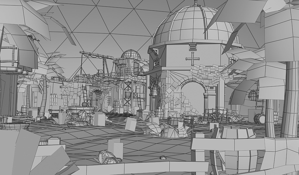
by BJA
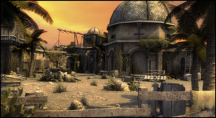
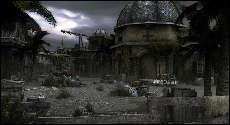
Inspired by Assassin`s Creed, here's a little scene made in 3ds max with different light settings. It's about 80.000 tris, average texture resolution for the objects is 512x512, for the buildings 1024x1024. Texture ressources are mostly from cgtextures.com, a few from google. I'll call that piece done for now, but is there anything you would have made different/better? I'm open for any suggestions and opinions
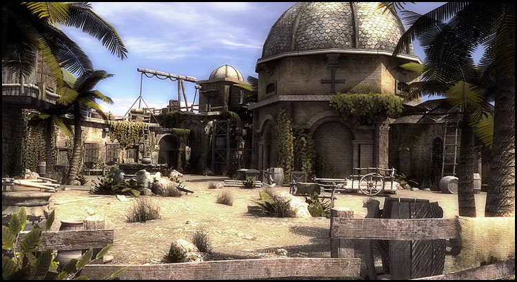 http://www.bja-design.de/different/blue
 ... l_rand.jpg
 http://www.bja-design.de/different/yell
 ... l_rand.jpg
 http://www.bja-design.de/different/blac
 ... l_rand.jpg
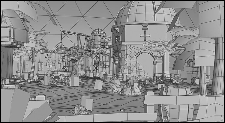 http://www.bja-design.de/different/wireframe_final.jpg
Re: Screenshots
Posted: Thu Sep 18, 2008 4:37 pm
by blushing_bride
What game is this for?
Re: Screenshots
Posted: Thu Sep 18, 2008 4:47 pm
by pjw
Damn.
That looks really nice. Great job of getting the feel right for the whole scene, and I like the different ToD shots--great lighting.
About the only thing that stands out for me as breaking the immersion just a touch is the "X" grass cards. Obviously you're not going to model each blade, but perhaps use 3 or 4 cards crossed instead of just the two to help disguise the obvious straight line where they meet the ground a bit more? [/nitpickery]
Re: Screenshots
Posted: Thu Sep 18, 2008 5:01 pm
by o'dium
Damn awesome work sir.

I think the darker night time one is my fave :P
Re: Screenshots
Posted: Thu Sep 18, 2008 7:37 pm
by monaster
Speechless.
Re: Screenshots
Posted: Thu Sep 18, 2008 9:28 pm
by BJA
@blushing_bride: It wasn't meant to be for any game, but of course you could import all models into the game of your choice (UT3, Crysis, whatsoever game that reads .ase formats). I was just a bit too lazy to do that extra amount of work. The screens were rendered in 3ds Max with the default scanline renderer, btw.
@pjw: good point with the grass, didn't notice it before. I guess a few more polies to make it less planar wouldn't have hurt either.
@o'dium: Yeah, the dark one is my favorite, too. Must be because I've messed around too much with doom3 and my eyes can't endure colors and brightness anymore

@monaster: well, thanks
Re: Screenshots
Posted: Thu Sep 18, 2008 11:09 pm
by ix-ir
Very nice scene. Given that it's an 80k tris scene I'd put more tris into the palm leaves, they look very geometrical.
Re: Screenshots
Posted: Fri Sep 19, 2008 11:22 am
by MKJ
i like the blue one best.
people are bound to like the darker one more because most of the graphical glitches are hidden because of it (e.g. the grass like pjw said).
prolly also no1 reason why most games are dimly lit

Re: Screenshots
Posted: Fri Sep 19, 2008 12:04 pm
by T_Creutzenberg
Very nice BJA! My only complaint is the same as pjw's:
The X-grass look really shite and destroys a lot of the atmosphere.
The rest is awesome.
PS: Oh, and the crane-like thing looks a little bit unrealistic ... i.e. where does the rope go? Why is the rope hanging loose at the top beam although there's something being transported up, ...
Re: Screenshots
Posted: Fri Sep 19, 2008 2:54 pm
by MKJ
the rope is going down the back (away from the camera) of the vertical beam, you can see part of it if you look closely.
Re: Screenshots
Posted: Sat Sep 20, 2008 7:21 am
by BJA
@ix-ir: I think more tris aren't really necessary, but yeah should have given the leaves a bit more of variation.
@T_Creutzenberg: The more I look at the grass the less I like it. Guess it would have been better to replace them with some bushes. For the crane, yeah it would have made more sense to make the rope tight, but I thought it just looks cooler to have it hanging there.
@MKJ: And if you look even closer, you can see that I didn't even texture that rope

It's the only thing I didn't texture though.
Re: Screenshots
Posted: Sat Sep 20, 2008 11:46 am
by dichtfux
That looks amazing BJA! Only thing I noticed before reading the other comments about the grass here was that the palm leaves are a bit edgy.
The dark one's my favourite, too.
Re: Screenshots
Posted: Sat Sep 20, 2008 6:44 pm
by wattro
games with blue skies tend to sell better than equivalent games without blue skies. they also tend to get higher metacritic ratings so i would go with the blue sky scene
Re: Screenshots
Posted: Sat Sep 20, 2008 8:22 pm
by Silicone_Milk
Funny you should mention that Wattro. I personally like the blue sky one much more than the orange and dark shots.
I wasn't sure quite what about the blue one makes me like it so much. I think it might be because the blue sky gives the scene that much more "tropical" feel.
I think that a lot of the detail in the dark scene doesn't stick out as much and get lost in the desaturation.
