Page 127 of 295
Re: Screenshots
Posted: Sat Nov 15, 2008 8:51 am
by sock
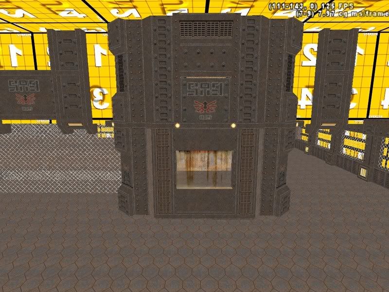
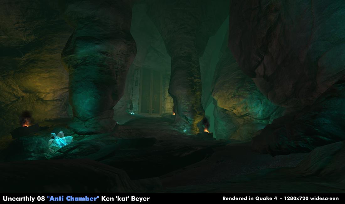
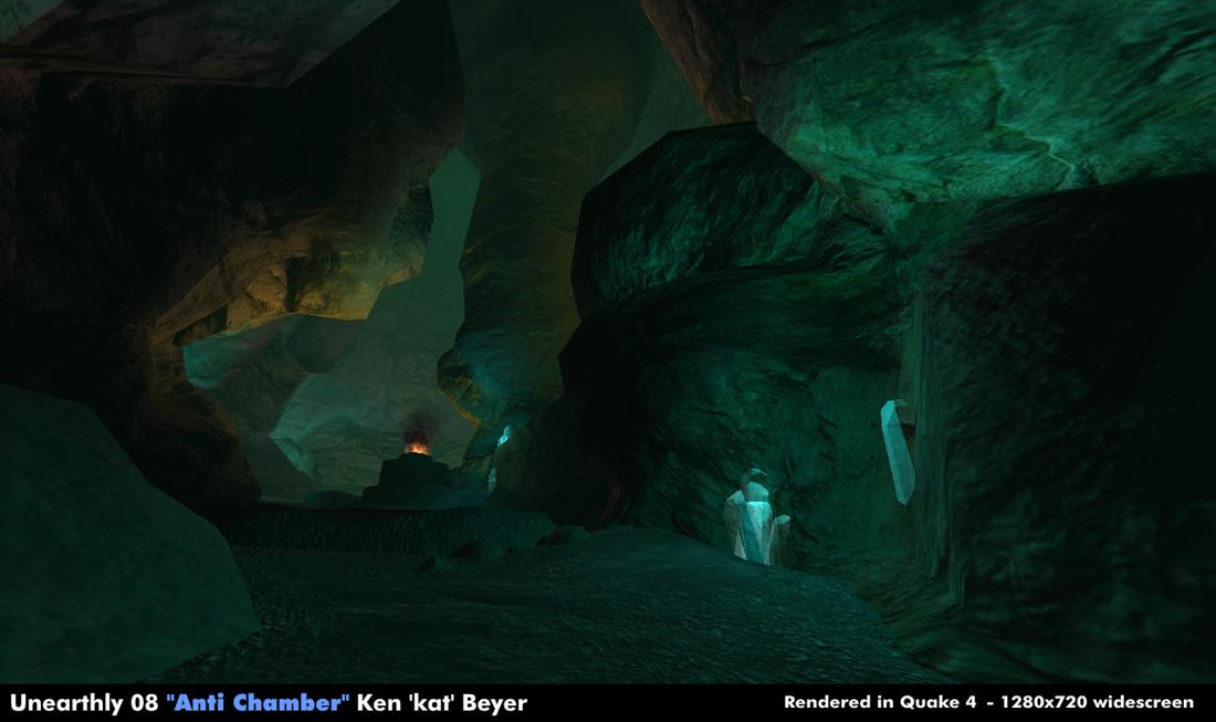
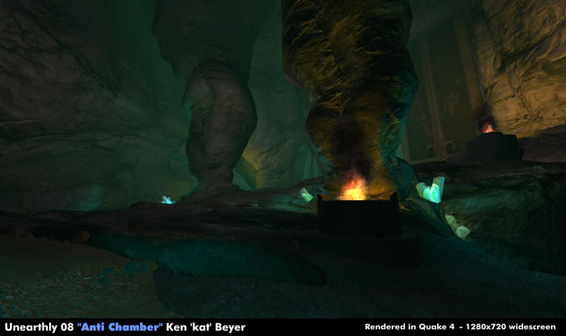
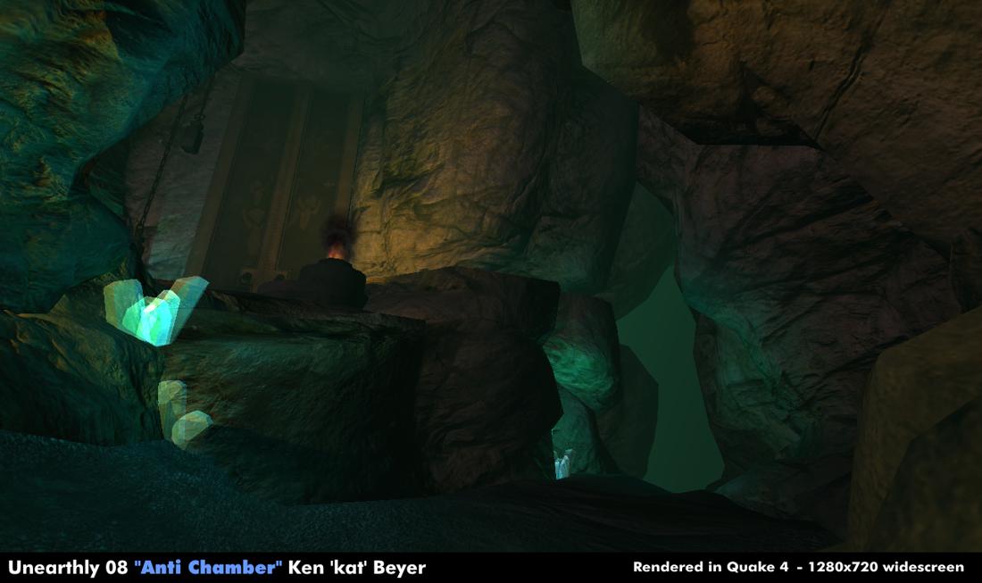
Kat wrote:These are shots from the final submissions to Unearthly Challenge 08.
Modelled in Blender, c.26k tris. Rendered in Quake 4.
Amazing screenshots, do you have bigger resolution one's? other angles?
Any chance of knowing what the FPS was for those images!?! :P
I could not find any details on your site of this work.
WHAT!! wrote:Thanks. I really have to learn how to work with textures though. I'm so tired of working from other peoples textures

You are a doing an amazing job with other people's texture. I imagine maps using your own textures would be even better. It is not easy to create good looking maps from other people's stuff. Really nice style.

Sims
Re: Screenshots
Posted: Sat Nov 15, 2008 9:10 am
by WHAT!!
sock wrote:
You are a doing an amazing job with other people's texture. I imagine maps using your own textures would be even better. It is not easy to create good looking maps from other people's stuff. Really nice style.
Sims
Coming from you, that is a compliment of unmeasurable magnitude! I appreciate it
edit: Also strange timing. I had just finished completing your tutorial on terrain blending just as I came on here to check the thread.
Re: Screenshots
Posted: Sat Nov 15, 2008 11:19 am
by Kat
sock wrote:Amazing screenshots, do you have bigger resolution one's? other angles?
Any chance of knowing what the FPS was for those images!?! :P
I could not find any details on your site of this work.
Thanks matey

I did do some other angles but at the mo' they've got the challenge headings/text on them, I've not written anything up on this project yet except for what's on the polycount forums where you had to post WIP's as you progressed - larger [
1] [
2] [
3] [
4] [
5]
http://boards.polycount.net/showpost.ph ... stcount=32
1280x720@high widescreen runs at 34FPS for me (windowed), that's on a laptop with an nVidia8600Go gfx chip.
Re: Screenshots
Posted: Mon Nov 17, 2008 7:01 pm
by o'dium
i think right. Mark thinks left. Berserk cant tell the difference (no really). Doesnt matter, either way they both will make it, lol:

Re: Screenshots
Posted: Tue Nov 18, 2008 2:16 am
by urgrund777
i'd say left, the texture is more balanced without the contrasting orange in the brick... also, the left one would seem more 'realistic' in context of it being rubble... ie) more dust would have settled on the bricks there, causing them to meld with the surface
Re: Screenshots
Posted: Tue Nov 18, 2008 3:36 am
by a13n
@WHAT!!
The color scheme of these screenshots reminds me of hipshot's.
Re: Screenshots
Posted: Tue Nov 18, 2008 5:49 am
by phantazm11
A quick shot of the quake 3 map I've been working on:

Re: Screenshots
Posted: Tue Nov 18, 2008 7:20 am
by rgoer
phantazm11 that looks pretty sick and clean in an old school kind of way
Re: Screenshots
Posted: Tue Nov 18, 2008 8:46 am
by WHAT!!
a13n wrote:@WHAT!!
The color scheme of these screenshots reminds me of hipshot's.
That's because I pretty much bit his style
Still trying to find my own way of doing things..
edit: well, sort of. I guess you have to download the map to understand. It's the same texture set, but it's built a completely different way. I just like his eye for color and texture. Still wish he was mapping.
Re: Screenshots
Posted: Tue Nov 18, 2008 4:47 pm
by surgeon62
Kat wrote:These are shots from the final submissions to Unearthly Challenge 08.
Modelled in Blender, c.26k tris. Rendered in Quake 4.

How far we have come with the realism on the rock... remember this???
[lvlshot]http://nemesis.thewavelength.net/images/user/europabase468big1.jpg[/lvlshot]
Re: Screenshots
Posted: Tue Nov 18, 2008 5:12 pm
by g0th-
phantazm11: Looking good, I like the "none eye catching" clean details you got going there. The triangle is a bit strange though, maybe put a small trim on the sides of the texture on it?
Re: Screenshots
Posted: Tue Nov 18, 2008 5:30 pm
by Kaz
phantazm11 wrote:A quick shot of the quake 3 map I've been working on:
Is this the map you tested here? If so I can't wait to play the final version I liked the layout alot.
Re: Screenshots
Posted: Tue Nov 18, 2008 9:00 pm
by phantazm11
surgeon62: Wow, that IS some kind of difference. For some reason my mind's eye has the older (Doom) levels looking a lot more detailed. Guess that shows how much immersion these early games actually had.
And just to note: Kat's cave maps all rock!
rgoer: Thanks a lot man.
g0th: Thanks g0th. Will look into the triangle texture.
Kaz: Yes, it is the same map. Very slow going as I have trouble finding time to work on it. It is about 90% done though.
Glad you liked the layout
Re: Screenshots
Posted: Wed Nov 19, 2008 12:19 am
by kloffy
I realize this may not be directly relevant, but I've seen some Crysis screenshots of rocks that even take it one step further. Here's one
Example. Of course, the lighting and vegetation play a big role as well, but the geometry and texture of the rocks themselves is superb.
Nevertheless, I love Kat's maps, they are some of the most visually unique and impressive work on idTech4.
Re: Screenshots
Posted: Wed Nov 19, 2008 1:40 am
by monaster
phantazm11 wrote:
I like that map, really. Looks dark, dirty and somehow ... brutal. Fits to the genuine Quake3Arena feeling that way.
Re: Screenshots
Posted: Wed Nov 19, 2008 12:43 pm
by o'dium
kloffy wrote:I realize this may not be directly relevant, but I've seen some Crysis screenshots of rocks that even take it one step further. Here's one
Example. Of course, the lighting and vegetation play a big role as well, but the geometry and texture of the rocks themselves is superb.
Nevertheless, I love Kat's maps, they are some of the most visually unique and impressive work on idTech4.
Parallax mapping can really help sell the effect of rock, as well as the general feeling of lighting. You have to remember that Quake 4 tech is very old now and to be fair not the best looking either any more. But his point still stands from a Quake technology point at least. Crysis has nice rock, but I've seen nicer still, and will keep seeing nicer. Its just one of those things.
Re: Screenshots
Posted: Thu Nov 20, 2008 9:00 pm
by surgeon62
kloffy wrote:I realize this may not be directly relevant, but I've seen some Crysis screenshots of rocks that even take it one step further. Here's one
Example. Of course, the lighting and vegetation play a big role as well, but the geometry and texture of the rocks themselves is superb.
Nevertheless, I love Kat's maps, they are some of the most visually unique and impressive work on idTech4.
It's the Holodeck!

Re: Screenshots
Posted: Wed Nov 26, 2008 8:00 am
by Silicone_Milk
wtf.... I get so caught up with tiny detail brushes it's retarded.
Trying to keep things stylistic and simple. Using Evillair's eq2 texture set for a Call of Duty 4 map that I posted a shot or two of earlier.
More shots:
[lvlshot]http://i12.photobucket.com/albums/a242/caldiar/shot0009-5.jpg[/lvlshot]
[lvlshot]http://i12.photobucket.com/albums/a242/caldiar/objective3.jpg[/lvlshot]

[lvlshot]http://i12.photobucket.com/albums/a242/caldiar/new_door2.jpg[/lvlshot]
[lvlshot]http://i12.photobucket.com/albums/a242/caldiar/new_door1.jpg[/lvlshot]
Re: Screenshots
Posted: Thu Nov 27, 2008 6:25 pm
by o'dium
Just messing around:

Re: Screenshots
Posted: Thu Nov 27, 2008 7:21 pm
by Hipshot
Seriously, add real volume to the bricks in the rubble piles... looks very flat. And I don't get why people must have so much glow around their lamps, personaly I think it looks very strange, if not combined with fog.
Re: Screenshots
Posted: Thu Nov 27, 2008 7:38 pm
by o'dium
The rubble piles use parallax, which isn't enabled in this pic... Real time ambient occlusion, bloom, and rim lighting is also disabled in this pic.
Also dont worry about the flares. We are in the middle of adding real time light shafts, so that should add to the scene.
Re: Screenshots
Posted: Thu Nov 27, 2008 8:13 pm
by Grenader
Parallax mapping won't solve just how cheap those rubble piles look. Just make the bricks out of tris instead of that flat surface they seem to be flush on.
Re: Screenshots
Posted: Thu Nov 27, 2008 8:53 pm
by obsidian
You went overboard with the cans. Unless someone just raided the pantry, it looks odd with so many strewn about. One or two kicked into the corner would look better.
Re: Screenshots
Posted: Fri Nov 28, 2008 9:26 am
by o'dium
Obs, I agree. I also made them the rusted kind, so they blend into the scene much better.
And Gren, thats just being picky. The rubble piles are supposed to be cheap, because theres no reason for them not to be. Its only is strict view cases like this you even notice it with no parallax.
Re: Screenshots
Posted: Fri Nov 28, 2008 3:19 pm
by g0th-
I agree with Gren. Parallax usually make more tris then necessarily and the bricks will get some stretching on the sides. My personal opinion regarding parallax is that is best used on a tiling ground surface with small stones, roots and that sort of stuff that you want to stick out a bit more but it's not worth to model it because the texture will tile.
Also I really like the wall texture you got there.

