Page 145 of 295
Re: Screenshots
Posted: Wed May 13, 2009 3:30 am
by obsidian
That's where I got the photosource fro... uh... PuFFnStuff sent me a photo of.. uh.. bamboo.
Re: Screenshots
Posted: Thu May 14, 2009 2:42 pm
by surgeon62
TRaK wrote:Hey there, first post here

Here's something I'm working on for
Quake2world:
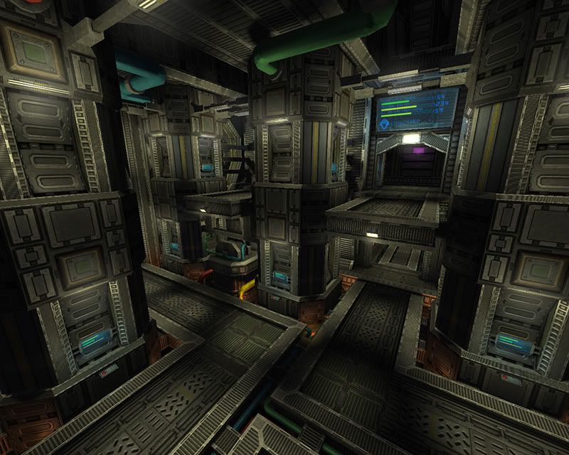
I checked out the site... seems like a great project.

.
Re: Screenshots
Posted: Thu May 14, 2009 8:38 pm
by sumatra
WIP: pukka3tourney6 alpha20
Selfmade textures, still too much grey though...

Re: Screenshots
Posted: Thu May 14, 2009 9:38 pm
by Peenyuh
sumatra wrote:...still too much grey though...
Not at all. I really like the look of these "grey" maps. Though, TRaKs Q2W map is Fantastic! Seems to have found the perfect accents for it.
Re: Screenshots
Posted: Fri May 15, 2009 6:32 am
by jal_
sumatra wrote:WIP: pukka3tourney6 alpha20
Selfmade textures, still too much grey though...
I love the color combination and clean looks of the second and third shots (the second the best). The one I like the less is the first.
Re: Screenshots
Posted: Fri May 15, 2009 8:07 am
by neoplan
@Trak: Screenshot looks great. I also had a look at your Homepage. Great textures, really! Keep that up!
Re: Screenshots
Posted: Fri May 15, 2009 10:52 am
by TRaK
The yellow strip above the door in the third shot has some pretty noticeable tiling artifacts. I'd either even out the texture or break it up in the map a bit with some trims.
Aside from that, the map looks good. I like the color scheme, and those round lights are a nice touch.
Re: Screenshots
Posted: Fri May 15, 2009 12:37 pm
by Hipshot
Those textures are very close to the ones I did for my crescent level.
Re: Screenshots
Posted: Fri May 15, 2009 2:09 pm
by g0th-
Looks great Sumatra, I like the color scheme.
but I think you got a little to much ambient light in there. I can barely see that some of the smaller lights gives away any light. You can also see the tiling quite easily on some of the textures.
Re: Screenshots
Posted: Fri May 15, 2009 3:26 pm
by sumatra
Peenyuh wrote:
Not at all. I really like the look of these "grey" maps. Though, TRaKs Q2W map is Fantastic! Seems to have found the perfect accents for it.
I'll keep a main grey theme with colored areas, but I just want to break up the overall "grey look" a bit more...
jal_ wrote:
I love the color combination and clean looks of the second and third shots (the second the best). The one I like the less is the first.
I just want to distinguish the different areas to support the players orientation on the main items.
So in the first shot the megahealth area is not just blue but has also a bit more weathered/stoney look.
The other parts are more clear and clean.
TRaK wrote:The yellow strip above the door in the third shot has some pretty noticeable tiling artifacts. I'd either even out the texture or break it up in the map a bit with some trims.
Aside from that, the map looks good. I like the color scheme, and those round lights are a nice touch.
Yeah, thats right, the yellowpainted concretetexture is not tiled very clean. It's all WIP. So the textures will be finetuned in the future as well as the lighting..
Hipshot wrote:
Those textures are very close to the ones I did for my crescent level.
Yeah, I also used the great library of cg-textures for reference material.
My main inspiration comes from the new ql-map "trinity", but I was also inspired by your texturedesign. Anyway I've done all by myself on base of those materials on cg-textures and this was a great experience.
So I hope you don't want to blame me for copying textures or ideas of you..

g0th- wrote:
Looks great Sumatra, I like the color scheme.
but I think you got a little to much ambient light in there. I can barely see that some of the smaller lights gives away any light. You can also see the tiling quite easily on some of the textures.
The lighting was no part until now. It's just a huge amount of ambient and skylight. I'm designing the overall lighting in a later stage of process. Anyway glad you like what you see for now.
Thanks to all for your fast feedback, hope to slap out a beta next week when my wisdom teeth are being removed.
I'll keep you posted with screenshots if I got something new...
Re: Screenshots
Posted: Fri May 15, 2009 7:21 pm
by TRaK
Some steampunk textures I'm working on for a new map:
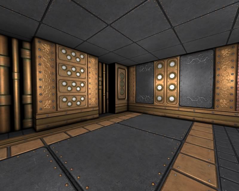
It's just a simple test room btw
Like my other texture sets, they'll be made publicly available on my website when they're done.
Re: Screenshots
Posted: Sat May 16, 2009 11:18 pm
by rgoer
textures look decent enough but holy shit I can't wait for everybody to forget that steampunk ever existed
Re: Screenshots
Posted: Sun May 17, 2009 2:18 am
by Silicone_Milk
I've been noticing a lot of steampunk stuff lately. I wonder why that is?
I want to see more cyberpunk

Re: Screenshots
Posted: Sun May 17, 2009 9:55 am
by Hipshot
sumatra wrote:Yeah, I also used the great library of cg-textures for reference material.
My main inspiration comes from the new ql-map "trinity", but I was also inspired by your texturedesign. Anyway I've done all by myself on base of those materials on cg-textures and this was a great experience.
So I hope you don't want to blame me for copying textures or ideas of you..
It's nice. No blame.
QuakeLive's new levels are looking great. Finaly iD's comming close to the community in means of graphics (for Quake3).
Silicone_Milk wrote:I've been noticing a lot of steampunk stuff lately. I wonder why that is?
I want to see more cyberpunk
I started a
cyberpunk level a wihle ago. But I after a short wihle figured that it's not for Quake3s performance level, then it's not for me - Not anymore. The level ended up as
Crescent.
Re: Screenshots
Posted: Sun May 17, 2009 6:23 pm
by Kat
sumatra wrote:Hipshot wrote:
Those textures are very close to the ones I did for my crescent level.
Yeah, I also used the great library of cg-textures for reference material.
My main inspiration comes from the new ql-map "trinity", but I was also inspired by your texturedesign. Anyway I've done all by myself on base of those materials on cg-textures and this was a great experience.
So I hope you don't want to blame me for copying textures or ideas of you..
You can hardly be accused of stealing or plagiarism when using images from publicly available libraries so I wouldn't worry about it if I were you.

@ the very idea.
Re: Screenshots
Posted: Mon May 18, 2009 1:24 pm
by o'dium
We got a certain something working in OverDose... Can you tell what it is yet...?

Re: Screenshots
Posted: Mon May 18, 2009 3:25 pm
by $NulL
Impressive
Re: Screenshots
Posted: Mon May 18, 2009 4:44 pm
by wattro
you got rocks working?

Re: Screenshots
Posted: Mon May 18, 2009 5:37 pm
by corsair
world machine?
Re: Screenshots
Posted: Mon May 18, 2009 5:43 pm
by o'dium
I'll give you all a little hint:
http://wiki.splashdamage.com/index.php/ ... egatexture
Re: Screenshots
Posted: Mon May 18, 2009 5:51 pm
by g0th-
megatexture?
edit: didn't know you posted the correct answer on this page but I though i recognized those rocky formations.
looks very nice, how much is it left before we can see a beta of even a final product of Overdose?
Re: Screenshots
Posted: Mon May 18, 2009 6:06 pm
by o'dium
I would say over 9,000 days.
No, atm we are working pretty damn heavy on tools and stuff for the team to make everything as easy as possible. But theres a lot of stuff I have sitting on my HDD in screenshot form that I can't post yet, like Player model renders and movies etc. Remember that Marauder Medic...? Yeah, hes done

Re: Screenshots
Posted: Mon May 18, 2009 7:16 pm
by obsidian
Nice. Is the MT restricted to z-plane mapping or can you do it on other axes as well?
Re: Screenshots
Posted: Mon May 18, 2009 7:27 pm
by o'dium
Anything really, that can be UV mapped. So it can be a on a pure flat wall.
Re: Screenshots
Posted: Wed May 20, 2009 2:09 am
by Delirium
@o'dium
that is pretty intense, how many hours did that take to finish?
