Page 182 of 295
Re: Screenshots
Posted: Tue Mar 09, 2010 2:35 am
by fKd
wooo impressive stuff there mr hipshot! are you still working on that dm map you were posting screens for a while back? the one with the id base textures etc?
Re: Screenshots
Posted: Sat Mar 13, 2010 10:18 am
by cityy
[lvlshot]http://img51.imageshack.us/img51/8683/celzw.jpg[/lvlshot]
Messing arround with cel shading. Looks like fun!
Re: Screenshots
Posted: Sat Mar 13, 2010 7:00 pm
by phantazm11
That is too funny cityy! Just this week I was experimenting with the exact same thing. I've been contemplating remaking my Q4 map Flux for Quake 3:
I tell you it will be a crapload easier to do with idtech3 seeing as how in Quake 4 I had to remake every single brush that would be facing out in order to achieve the black cel shading outline.
Re: Screenshots
Posted: Sat Mar 13, 2010 7:07 pm
by Anthem
Gah, I was just finishing up a small cel-shadered run map. xD I'll post screens in a sec.
Edit:
[lvlshot]http://i105.photobucket.com/albums/m231/Lowerboy444/verticality.jpg[/lvlshot]
Re: Screenshots
Posted: Sat Mar 13, 2010 8:16 pm
by cityy
Updated:
[lvlshot]http://i.imgur.com/NG0N5.jpg[/lvlshot]
[lvlshot]http://i.imgur.com/gcPB1.jpg[/lvlshot]
Re: Screenshots
Posted: Sat Mar 13, 2010 10:38 pm
by AEon
cityy wrote:Updated:
[lvlshot]http://i.imgur.com/NG0N5.jpg[/lvlshot]
AEneon going all-out colorful

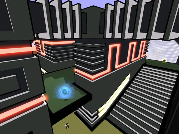
Re: Screenshots
Posted: Sun Mar 14, 2010 10:50 am
by cityy
Hehe AEon, I was inspired by AEneon quite a bit!
[lvlshot]http://img683.imageshack.us/img683/3177/shot0024x.jpg[/lvlshot]
Re: Screenshots
Posted: Thu Mar 18, 2010 1:47 am
by Hipshot
I wanted to create something like that for a long time, never really come around to it though. And I would not use cel for the level, I don't think it fits Q3 at all, since weapons and all are normal.
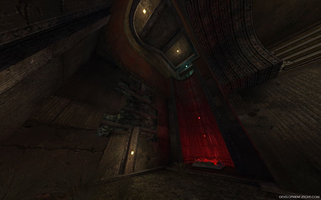
Workflow pic for the MH area of my level.
[lvlshot]http://zfight.com/misc/images/maps/development/max-rad-q3.jpg[/lvlshot]
Re: Screenshots
Posted: Thu Mar 18, 2010 1:47 am
by Hipshot
I guess the difference between the meshes I make for my levels and the ones Epic uses for Unreal, is, that you won't get stuck in mine when running fast and jumping around.
Re: Screenshots
Posted: Thu Mar 18, 2010 2:04 am
by fKd
hahahah meow
Re: Screenshots
Posted: Thu Mar 18, 2010 2:47 am
by Hipshot
And to answer your earlier question. Yes it's that level, however, there are just very few Id textures left, only some very basic ones.
I feel a bit ashamed that I never really managed to use them as I intended, instead I went for a all custom look, which I usually do and what I was trying no to do...
Re: Screenshots
Posted: Thu Mar 18, 2010 2:56 am
by Hipshot
[lvlshot]http://zfight.com/misc/images/maps/m8/m8_33.jpg[/lvlshot]
[lvlshot]http://zfight.com/misc/images/maps/m8/m8_35.jpg[/lvlshot]
[lvlshot]http://zfight.com/misc/images/maps/m8/m8_36.jpg[/lvlshot]
[lvlshot]http://zfight.com/misc/images/maps/m8/m8_37.jpg[/lvlshot]
[lvlshot]http://zfight.com/misc/images/maps/m8/m8_38.jpg[/lvlshot]
Re: Screenshots
Posted: Thu Mar 18, 2010 6:21 am
by cityy
That's looking absolutely awesome Hipshot!
I love the lighting and the nails..

Re: Screenshots
Posted: Thu Mar 18, 2010 11:46 am
by jal_
Very nice shots, Hipshot. Just one side note: They look extremely dark on my crt screen, while fine on the lcd.
Re: Screenshots
Posted: Thu Mar 18, 2010 12:00 pm
by ShadoW_86
Hipshot wrote:
[lvlshot]http://zfight.com/misc/images/maps/m8/m8_36.jpg[/lvlshot]
Looks nice, but tbh whole place it too clean for real mine. It's looking a little bit empty and sterile, and because of it - unnatural. Add a lot of dirt, blots ans such things - details!
Edit: Also, is it fullbright? Look at the ceiling, for me there's too much light, and something feels odd here.
Add wooden pillars to support the scaffolding.
Re: Screenshots
Posted: Fri Mar 19, 2010 2:37 pm
by dONKEY
Roof beams look a bit odd. Not that sure about concrete walls either. But saying that as you normally have such a strong theme in your maps, I'm sure it makes sense.
Re: Screenshots
Posted: Fri Mar 19, 2010 4:35 pm
by AEon
dONKEY wrote:Roof beams look a bit odd. Not that sure about concrete walls either. But saying that as you normally have such a strong theme in your maps, I'm sure it makes sense.
Agree... might be a good idea to differentiate between
supporting beams of wood (those would be a tad thicker), and "
covering planks". The former would be used to actually stabilize the ceiling, i.e. prevent it from caving in. The latter would be planks, and why not actually use a few wider (same length) wooden boards that cover the ceiling, in an attempt to prevent dirt falling from the ceiling.
Looks great anyway.
Re: Screenshots
Posted: Fri Mar 19, 2010 4:54 pm
by Theftbot
[lvlshot]http://www.carto.net/neumann/travelling/usa_california_2003_08/03_empire_mines_state_park_and_fun_pictures/23_main_shaft_empire_mines.jpg[/lvlshot]
Re: Screenshots
Posted: Fri Mar 19, 2010 10:06 pm
by Hipshot
I know about the roof and the light. The latter is a bit annoying...
The roof is more or less fixed...
It will be like
this wall. I already have a roof part that looks similar actually.
Re: Screenshots
Posted: Sat Mar 20, 2010 12:14 am
by cityy
[lvlshot]http://img405.imageshack.us/img405/4420/shot0038u.jpg[/lvlshot]
[lvlshot]http://img197.imageshack.us/img197/3950/shot0039v.jpg[/lvlshot]
I am so tired guys, you can't imagine

Re: Screenshots
Posted: Sat Mar 20, 2010 12:39 am
by Silicone_Milk
cityy, I'm liking the textures being used. They've got a lot of detail packed in them.
However, I think the color scheme is a bit monotone. Some splashes of saturated colors would help make that level really "pop"
Seeing the blue walls, I think some green would go nicely.
Re: Screenshots
Posted: Sat Mar 20, 2010 4:10 am
by wattro
cityy wrote:
I am so tired guys, you can't imagine
get some damned sleep if you havent already

Re: Screenshots
Posted: Sat Mar 20, 2010 9:53 am
by cityy
wattro

@ Silicone_Milk: Yeah I am currently dealing with that.. it's a bit hard for me
[lvlshot]http://img535.imageshack.us/img535/9530/shot0040t.jpg[/lvlshot]
Re: Screenshots
Posted: Sat Mar 20, 2010 10:39 am
by Hipshot
cityy wrote:[lvlshot]http://img405.imageshack.us/img405/4420/shot0038u.jpg[/lvlshot]
Do this instead.

It will take more time, use up more tris, but will look a lot better...
Re: Screenshots
Posted: Sat Mar 20, 2010 10:48 am
by Foo
...or swap that area of floor with a tex that would break in the manner you've set it - Stone.