Page 199 of 295
Re: Screenshots
Posted: Sat Jul 24, 2010 8:57 pm
by cityy
Re: Screenshots
Posted: Sat Jul 24, 2010 10:47 pm
by StroggMaster
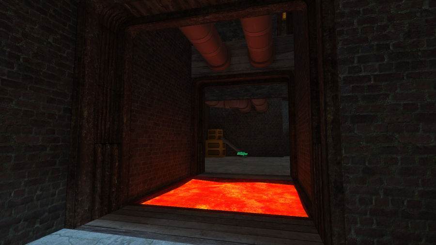
monaster wrote:About the small DMgael: that's what I thought, too. Don't get me wrong: It's not really a problem if you don't want to stick with the UT dimensions but as it is now, your map's really small and quite difficult to navigate smoothly. You can even
run over the power up without any risk to fall into the abyss because it's that small.

One last thing: a railgun is a complete overkill in such a small map or even in a map shaped like this, that's why UT2003 (IIRC) didn't have any sniper weapon in DMgael. I'd suggest swapping it with a LG or if you want to make it confusing a GL

(most probably a SG would be the best choice).
Well, the unfortunate thing is, the lightning gun in Q3A is NOTHING like UT2004's lightning gun. Q3A's version is more similar to the Link Gun than anything else. The railgun is closer to the UT2004 version. Just wish that Q3A would've had a sniper rifle, tho. Actually, the lightning gun in UT2004 is actually like a sniper rifle with lightning bolts, if you think of it. I believe I was going more for the 2004 version rather than the 2003 version, iirc.
Re: Screenshots
Posted: Sat Jul 24, 2010 11:52 pm
by Anthem
Too many projects.

Re: Screenshots
Posted: Sun Jul 25, 2010 12:41 am
by cityy
Anthem wrote:cityy wrote:
Too many projects.
Heh, no it's ok.. my competition map is finished. I only have that wsw map and my ctf map now.
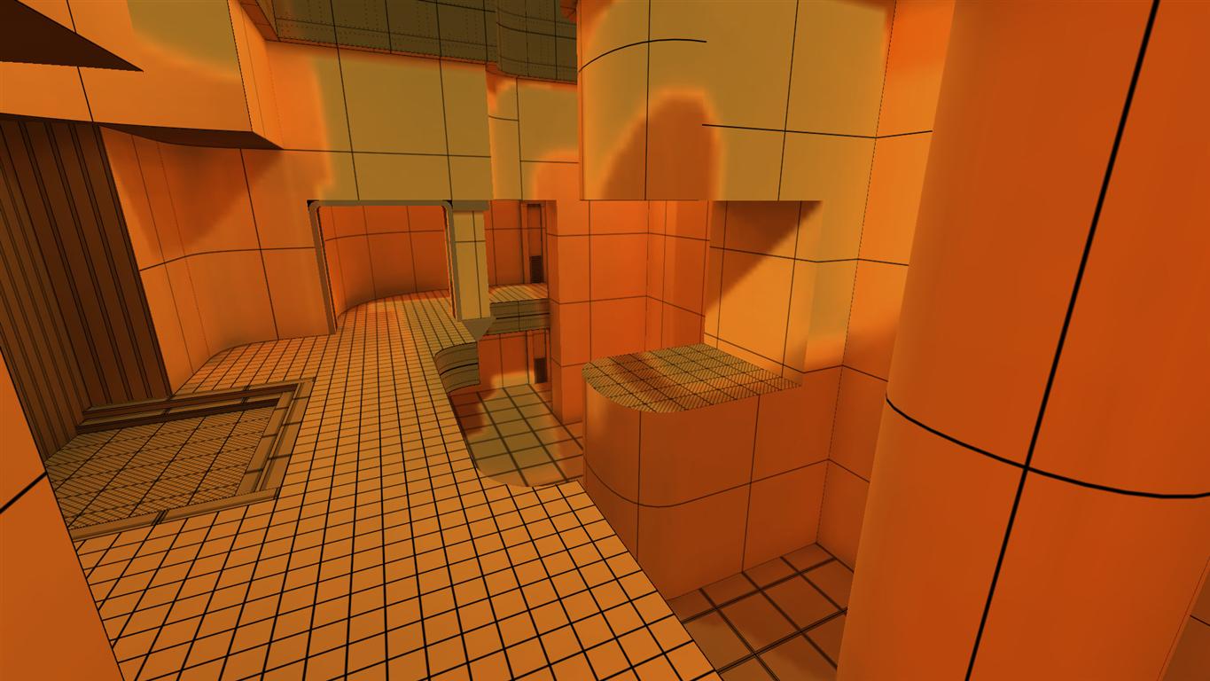
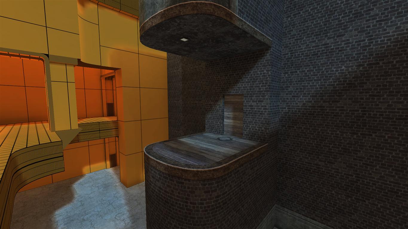
Update on the warsow map:
http://cityy.explicits.de/uploads/maps/ ... w00002.jpg
Still practicing to create good textures.
Re: Screenshots
Posted: Sun Jul 25, 2010 10:41 pm
by cityy
Re: Screenshots
Posted: Wed Jul 28, 2010 4:27 am
by Hipshot
Too bad vanilla Q3 can't do that kind of slight glow... adds a lot.
Re: Screenshots
Posted: Thu Jul 29, 2010 8:20 am
by Theftbot
Worked on door a bit:

Re: Screenshots
Posted: Thu Jul 29, 2010 10:21 am
by o'dium
You really need to work on smoothing groups as well as chamfering those edges somewhat, because ATM its looking very sharp.
Re: Screenshots
Posted: Thu Jul 29, 2010 10:04 pm
by cityy
Re: Screenshots
Posted: Fri Jul 30, 2010 12:22 pm
by fKd
[lvlshot]http://img804.imageshack.us/img804/8056/shot0006j.jpg[/lvlshot]
Re: Screenshots
Posted: Mon Aug 09, 2010 8:09 pm
by seremtan
^ good stuff

Re: Screenshots
Posted: Tue Aug 10, 2010 11:16 am
by o'dium
Re: Screenshots
Posted: Tue Aug 10, 2010 12:12 pm
by ShadoW_86
O'dium, screenshots kills, great job as always. But I would like to ask, is that the same map that you were showing of pictures in the past? Because I see again it's ET conversion, so I'm starting to wander, do you wont to make a new game or ET remake with more advanced graphics?

Edit: And btw, why don't start your own thread here, like "O'dium's project" or sth? You are providing a lot of nice looking pictures, so it would be good to have it all gathered in one place.
Re: Screenshots
Posted: Tue Aug 10, 2010 12:25 pm
by o'dium
It's the same map, just gone through a new design phase as the older map didn't have anywhere near the detail needed really. The map was changed from snow, to post apoc/dessert, as it obviously fitted the theme a lot closer. Just to compare to the older version (And why we scrapped it):
http://media.moddb.com/images/games/1/12/11396/fd_1.jpg
Ugh, WHAT WAS I THINKING?!
We have other maps, lol, just I'm not working on them, so I don't show them

Re: Screenshots
Posted: Tue Aug 10, 2010 12:50 pm
by Bliccer
This is a fresh/sick beauty!
Re: Screenshots
Posted: Tue Aug 10, 2010 2:04 pm
by dONKEY
I really miss normal mapped textures

Looks very good. The rock wall looks a little like a Mr Whippy Ice Cream to me
Re: Screenshots
Posted: Tue Aug 10, 2010 2:35 pm
by o'dium
SO DOES YOUR FACE :@ Yeah still working on the rocks, dunna worry child. Quite tough to get a nice tiling rock texture really
Re: Screenshots
Posted: Tue Aug 10, 2010 3:00 pm
by obsidian
Only suggestion is that all the screenshots so far look entirely monochrome. I know the originals didn't have a lot of colour, but it did have some, and even then you can use your "artistic liberties" to introduce some new hues into the scene.
Re: Screenshots
Posted: Tue Aug 10, 2010 3:21 pm
by o'dium
Thats really the design and style we were going for, keeping it all to one colour scheme. There are certainly different colours in the level, just not as many as you are likely used to in these pics. But I get where your coming from, yeah... All in all, the design and colour tone are this way because its set in an old, dusty area thats inside a sandy, almost desert like location. Its hardly going to be full of bright greens etc.
Plus lets face it dog shit brown always gives off the post apoc vibe
Re: Screenshots
Posted: Tue Aug 10, 2010 3:45 pm
by Bliccer
Ah, this is the final light? Thought these were edited screens with a filter?
Ouh well...
Re: Screenshots
Posted: Sun Aug 15, 2010 11:47 am
by jal_
Odium, as always, a minor thing. I miss the column at the top of the stairs. It offers good covering in a "bullets" game.
Edit: The rocks are impressive.
Edit2: Another thing. I'm noticing the yellowish tinting seems to have become a constant. It's good to have a basic ambient tone, but, imo, you should watch to not abuse it.
Re: Screenshots
Posted: Tue Aug 24, 2010 4:33 pm
by Bliccer
Before the flag is moving to another city I wanted to take a picture of it and share it with the community here
Actually we also attached a pole with a skull and wings to it, but removed them again... not very handy.
Re: Screenshots
Posted: Thu Sep 02, 2010 11:38 pm
by .:Z:.
Re: Screenshots
Posted: Mon Sep 06, 2010 8:48 am
by fKd
just messing around with dmp15
[lvlshot]http://img24.imageshack.us/img24/8393/shot0074s.jpg[/lvlshot]
Re: Screenshots
Posted: Mon Sep 06, 2010 5:06 pm
by Chretien
[lvlshot]http://dl.dropbox.com/u/159251/Map/main.jpg[/lvlshot]
Summer has ended so I'm back to working on my map now and then.


