Page 225 of 295
Re: Screenshots
Posted: Sat Jul 30, 2011 2:39 pm
by phantazm11
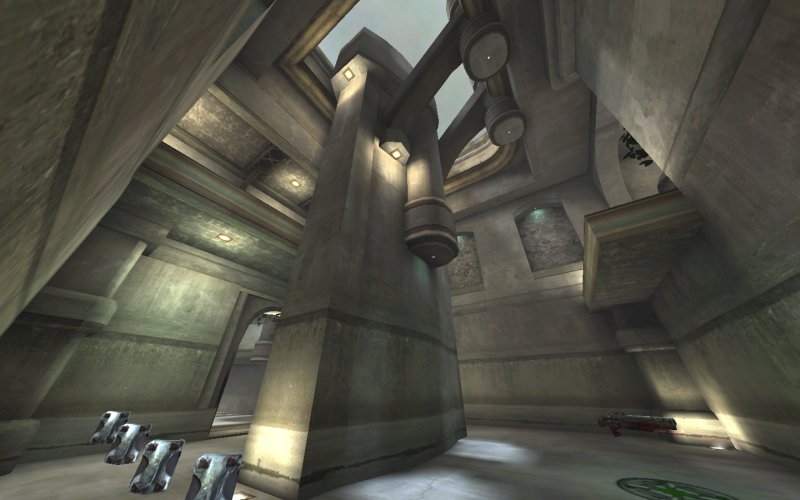
A shot of my WIP map for the Maverick Servers & Gaming Mapping Competition:
[lvlshot]http://i4.photobucket.com/albums/y138/phantazm11/Level%20Design/comp3map4.jpg[/lvlshot]
Re: Screenshots
Posted: Mon Aug 01, 2011 3:15 am
by Zombie13
That looks really nice

Re: Screenshots
Posted: Tue Aug 02, 2011 8:32 pm
by g0th-
A UDK scene Im putting together for school one of the reasons i had to quit the mav competition :/
[lvlshot]http://www.g0th.se/pics/mekathon/wip02.png[/lvlshot]
Re: Screenshots
Posted: Wed Aug 03, 2011 8:28 pm
by Noruen
I'm finalizing my map so I can share with you my progress. It is very small, because I don't want to destroy all my surprises

Re: Screenshots
Posted: Wed Aug 03, 2011 10:47 pm
by phantazm11
@Zombie13: Thanks man.
@g0th: Really sorry that you had to quit the competition.

That UDK scene is looking ace though.
@Noruen: Great looking shot.
Re: Screenshots
Posted: Wed Aug 03, 2011 11:03 pm
by Kaz
g0th: It was worth it because that scene is sweet! Reminds me of one of those cities in Morrowind. Have you considered using a contrasting color of lighting (blue) in addition to the primary orange lights?
Nouren: Dude, that is *awesome*! Reminds me alot of Zanzibar from Halo/ the beach from Wolf ET... If you have time throw a fountain in there :P
Mr. Perryman: see mav's forum for lavish praise
Shadow: Light it already!

Re: Screenshots
Posted: Sat Aug 06, 2011 3:10 pm
by g0th-
Thanks guys, I will probably mix the lights up somehow Im not sure how im going to do it yet. I will probably flashing out most other parts of the scene before i dig more into the lightning. I do have a blue sunlight but its quite week and I also have some blue stuff in the fog so there some tweaking to do as well as its not really recognizable.
Nouren: its looking really nice will be cool to checkout your map once your are done with it.
Re: Screenshots
Posted: Sun Aug 07, 2011 11:11 pm
by Noruen
Beta tomorrow! Check the Maverick Servers forum

Re: Screenshots
Posted: Mon Aug 08, 2011 9:30 am
by EmeraldTiger
@Nouren: Looks fantastic! Can`t wait for the beta.
Beta 1 of Tactical Assault. See Mav forums for more information.

Re: Screenshots
Posted: Mon Aug 08, 2011 7:59 pm
by Noruen
Ok, also BETA of Penumbra is released. See Mavericks Servers Forum

Re: Screenshots
Posted: Wed Aug 10, 2011 9:49 pm
by Delirium
[lvlshot]http://www.gotdelirium.com/maps/preview/der_002.jpg[/lvlshot]
Something for Urban Terror (click to enlarge)
Re: Screenshots
Posted: Wed Aug 10, 2011 11:58 pm
by phantazm11
Great start Delirium!
Re: Screenshots
Posted: Fri Aug 12, 2011 4:30 pm
by cityy
[lvlshot]http://dl.dropbox.com/u/15072710/LOL/fuuuuuq3map2.jpg[/lvlshot]
Re: Screenshots
Posted: Fri Aug 12, 2011 4:38 pm
by obsidian
Re: Screenshots
Posted: Fri Aug 12, 2011 5:33 pm
by Silicone_Milk
lol cityy
Re: Screenshots
Posted: Fri Aug 12, 2011 6:52 pm
by DaEngineer
There's a french phrase for this. Shittà péns.
Re: Screenshots
Posted: Sat Aug 13, 2011 4:03 pm
by o'dium
[lvlshot]http://www.team-blur-games.com/odium/bricks_pom.jpg[/lvlshot]
[lvlshot]http://www.team-blur-games.com/odium/bricks_pom2.jpg[/lvlshot]
Re: Screenshots
Posted: Sat Aug 13, 2011 7:58 pm
by phantazm11
@o'dium...daaaamn!
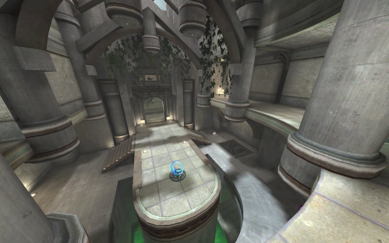
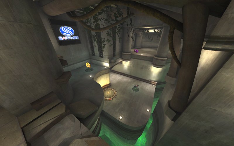
A quick screenshot of my map for the Maverick Servers Mapping Competition.
[lvlshot]http://i4.photobucket.com/albums/y138/phantazm11/Level%20Design/phantq3dm4_rc2.jpg[/lvlshot]
a Release Candidate of this map can be found
Here
Re: Screenshots
Posted: Sun Aug 14, 2011 2:21 am
by nitin77
these maverick comp maps are looking very fine.
Re: Screenshots
Posted: Sun Aug 14, 2011 7:49 am
by AEon
phantazm11,
really nice... downloading...
Re: Screenshots
Posted: Sun Aug 14, 2011 9:10 am
by ShadoW_86
Re: Screenshots
Posted: Sun Aug 14, 2011 9:27 am
by AEon
phantazm11 wrote:[lvlshot]http://i4.photobucket.com/albums/y138/phantazm11/Level%20Design/phantq3dm4_rc2.jpg[/lvlshot]
After a quick test, a few notes:
- Presently the map has one show stopper, the spawn point under the modolo logo is stuck *in* the wall. The bots and the player get stuck when spawning there.
- I noted all your JPs, that are relatively high, will not place you on the upper ledge when you "walk" into them without air control. When edging into the JP trigger, you actually bounce several times until you land on the upper ledge. Apparently, at least in the one case the bots used a JP, the bots can handle it. But normally something like that will confuse the AI. Might want to make the trigger area smaller and orient it so that you walk into the trigger and land on the upper edge. Using forward air control this is fine, presently. Just not sure if the bots like this.
- Using noclip noted that you caulked most of the stuff the player will never see. Above the RA, in the broken tower you could caulk off some more of that rusted metal texture if you will. Also noted the inside of all your ad frames are not caulked. Though you might like to indent the ad slightly from the frame.
- Not sure, but a bit more of the 25H might be good for DM. There is a MH, a 50H a 25H and some 5H, but when playing against 3 bots (as suggested) on Hardcore you are starved for health most of the time.
- The biggest issue with the otherwise beautiful map are the ads. They are ugly as hell. I remember that Sock was able to work out something for the ads in his map (for some previous competition), toning them down, i.e. applying some Photoshop effects to better make them fit into the map. In your case I'd suggest cutting out the ads (e.g. make the black (and other coloured) backgrounds transparent), then stamp the ad maybe using some form of opacity onto a not too dark wooden texture. That way it would look like those signs in the middle ages, and fit *much* better into your map. Presently they really mess up your nice map.
- Just my personal thing, I miss the RG .
- You project the tainted glass windows on the floor, did some experimentation with this years back, looks nifty. But in the room with the Lunar Module ad, the window on the opposite wall projects the coloured light onto the curved back wall of the JP. This wall is parallel to the window and facing away. So it should not be visible here. IMO, just looks strange, like glued on there.
Map feels like a 1on1 tourney map, so you items may indeed be optimized for that. Nice map. Have a hard time understanding the layout, but that is probable just me, needing to play the map more.
Re: Screenshots
Posted: Sun Aug 14, 2011 9:33 am
by cityy
We are not allowed to edit the sponsor images unfortunately.
Re: Screenshots
Posted: Sun Aug 14, 2011 9:38 am
by AEon
Interesting that the contest "creators" have not learned much in the past 1.5 or so years. It is in the best interest of the sponsors to have their ads presented in the most beautiful way. If they stick out like that everyone will fault the ads and not the map, on there
.
Re: Screenshots
Posted: Sun Aug 14, 2011 10:19 am
by Noruen
Final version of Penumbra can be download
here. Enjoy!