Page 245 of 295
Re: Screenshots
Posted: Thu Apr 26, 2012 7:27 pm
by sst13
50% brushes, 50% curves. No models yet.
Re: Screenshots
Posted: Thu Apr 26, 2012 7:38 pm
by obsidian
That kind of geometry is a pain in the ass to build in Radiant, so that's pretty spiffy.
Re: Screenshots
Posted: Thu Apr 26, 2012 10:16 pm
by EmeraldTiger
Looks slick, I dig the minimalist look. First shot reminds me of a curvacious version of The Dark Zone.
Re: Screenshots
Posted: Fri Apr 27, 2012 5:27 pm
by Plan B
Probably a lot of overdraw with intersecting/overlapping brushes and patches to avoid LOD/sparklies, but why not.
Looks great

Re: Screenshots
Posted: Sat May 05, 2012 9:19 pm
by TruthfulLiar
Sweet stuff sock, as usual.

Re: Screenshots
Posted: Sat May 12, 2012 2:04 am
by sst13
Damn curves, get out of my mind!


Re: Screenshots
Posted: Sat May 12, 2012 2:56 am
by EmeraldTiger
I just said "woah" out loud.
Re: Screenshots
Posted: Sat May 12, 2012 7:09 am
by dervish
That just make it in my top ten of badass things done with quake haha
Re: Screenshots
Posted: Sat May 12, 2012 9:34 am
by Bliccer
sst13:Maverickcomp entry? :DDD THAT IS THE SICKAST SHIT EVAH. WTF GIMME MORE xD
Re: Screenshots
Posted: Sat May 12, 2012 10:48 am
by Tanica46
at sst13: the last pictures is cool.
But what height is the staircase?
is this 16? better for playing is 12 and for view is 8.
at the ceiling from q3 ps2 endgame Map would look good.

Re: Screenshots
Posted: Sat May 12, 2012 12:42 pm
by sst13
The stairs are 10 units. 8 units in radiant but I need to scale this map by 1.25 during the compile process.
@Bliccer: It's too early for Maverickcomp:

The map created must be a completely new map that was created specifically for this competition. This means the map is created when the competition starts and not beforehand.
Re: Screenshots
Posted: Sat May 12, 2012 12:42 pm
by cityy
Are you gonna participate though?
Re: Screenshots
Posted: Sat May 12, 2012 2:21 pm
by g0th-
awesome sst13!
I'll hope you enter the mav competition.
Re: Screenshots
Posted: Sun May 13, 2012 2:56 pm
by sst13
@cityy & g0th-: Maybe... need to check my "maps todo list" for maps i didn't started yet.
Re: Screenshots
Posted: Sun May 20, 2012 7:43 pm
by o'dium
WIP Media
[lvlshot]http://www.team-blur-games.com/odium/od_des_1.jpg[/lvlshot]
[lvlshot]http://www.team-blur-games.com/odium/od_des_2.jpg[/lvlshot]
[lvlshot]http://www.team-blur-games.com/odium/od_des_3.jpg[/lvlshot]
Re: Screenshots
Posted: Mon May 21, 2012 3:03 am
by wattro
that looks really cool, o'dium
Re: Screenshots
Posted: Mon May 21, 2012 4:20 am
by EmeraldTiger
Quite atmospheric (besides the obvious placeholder textures), and good work as usual. I'm not sure if it's a result of screenshot capturing though, but the latter two shots seem a bit too dark / high-contrast. If it's because of the natural lighting in-game, I would personally tone down on the difference between dark and light areas. It appears to be too strong, like a contrast overdose. (Pun intended)
Re: Screenshots
Posted: Mon May 21, 2012 7:32 am
by fKd
^ what he said
Re: Screenshots
Posted: Thu May 24, 2012 1:43 pm
by Eraser
Just a lil' something from a WIP level:

Re: Screenshots
Posted: Thu May 24, 2012 1:47 pm
by cityy
What is it gonna be? An e+ level?
You might wanna increase the contrast of your textures a bit and lower the light intensity of the torches.
Re: Screenshots
Posted: Thu May 24, 2012 4:07 pm
by Eraser
Yeah trying something new for the mod...
Thanks for the tips, I'll look into it. I really want this to end up looking awesome, so a lot more is going to be done with it.
Re: Screenshots
Posted: Thu May 24, 2012 6:32 pm
by HomerJ
I've never liked the same texture used on the walls and ceiling. I know it's kind of nitpicky, since it's hard to vary rock textures up without using custom ones, but it looks like the same texture on the stairs, walls, and ceiling. Again, nitpciky cause I'd say it looks dated, but obviously Q3 is dated. Maybe even if you stuck with those textures you could think of some way to break up the ceiling, like the torches do for the wall. I'd suggest some kind of trim on the floor too where it meets the wall or at the bottom of the walls so it doesn't look like the texture is ending so abruptly. Too cool of an archway to just make it look like it's haphazardly placed on a layer of bricks instead of being anchored to them/the ground.
Looks good, I know you said it's a WIP so I'm not saying you wouldn't have done any of this or already don't know it 
Re: Screenshots
Posted: Tue May 29, 2012 8:17 am
by Eraser
Still work in progress but I've made a few changes. Ceiling is more detailed, lighting is less saturated, there's trims along the lower end of the walls and added some dust build up on the floor.

Re: Screenshots
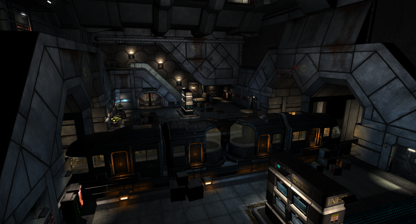
Posted: Tue May 29, 2012 8:27 am
by geX
Very WIP shot from Doom 3: Phobos
We still need to add some detail and work with the light a bit. Its just been a while since we showed something.
Cheers!
Re: Screenshots
Posted: Tue May 29, 2012 1:26 pm
by Noruen
Eraser - you don't use r_overbrightbits?