Page 250 of 295
Re: Screenshots
Posted: Sat Sep 01, 2012 1:38 am
by nitin77
that looks really nice.
Re: Screenshots
Posted: Sun Sep 02, 2012 12:45 am
by Pat Howard
for sure. will there be a q3a version?
Re: Screenshots
Posted: Wed Sep 05, 2012 7:48 am
by cityy
Thanks guys, I most likely wont make a Q3 version of this map.
Re: Screenshots
Posted: Sun Sep 09, 2012 11:06 pm
by cityy
[lvlshot]https://dl.dropbox.com/u/15072710/XonoticCompetition2012/Screenshots/21.jpg[/lvlshot]
[lvlshot]https://dl.dropbox.com/u/15072710/XonoticCompetition2012/Screenshots/22.jpg[/lvlshot]
Put another 1.5 hours of work into this one tonight, still fun.
Why is nobody posting WIP shots lately? I feel like a clown.
Re: Screenshots
Posted: Mon Sep 10, 2012 12:17 am
by EmeraldTiger
Looks snazzy. Great color contrast is utilized with the blue computer screens sitting against the orange sky radiating upon the drab, metallic environment, without appearing tawdry.
The rock walls in the second screenshot are far too angular though, and seem highly unnatural. I would either break it up with some uneven, complex geometry with clipping added to ensure non-disruptive gameflow. Phong shading would also help in removing the hard light differences between adjacent faces.
Re: Screenshots
Posted: Mon Sep 10, 2012 7:21 am
by Eraser
Dumb question maybe, but what game/mod is that for, cityy?
Re: Screenshots
Posted: Mon Sep 10, 2012 7:33 am
by cityy
Ty Emeraldtiger! I will look into the rock detail.
@Eraser:
It's for
Xonotic, a standalone game running on the darkplaces engine.
Here is a VOD btw if anyone wants to see a bit more of the map:
http://www.youtube.com/watch?v=tbG3jKE925k
Re: Screenshots
Posted: Mon Sep 10, 2012 11:03 am
by nitin77
I know you said probably not, but a q3 version of that level would be very appreciated! It looks fab.
Re: Screenshots
Posted: Mon Sep 10, 2012 7:49 pm
by Kaz
I think it'd help alot if you can do something to make it less dark / more contrast / more colorful lighting. Lava pit + blue teleporter lighting is good --> expand on that?
Re: Screenshots
Posted: Tue Sep 11, 2012 6:47 am
by cityy
Had the same thought last night, Kaz.

[lvlshot]https://dl.dropbox.com/u/15072710/XonoticCompetition2012/Screenshots/25.jpg[/lvlshot]
Re: Screenshots
Posted: Wed Sep 12, 2012 3:25 am
by dONKEY
cityy wrote:
Why is nobody posting WIP shots lately? I feel like a clown.
Nah, I like looking at people's WIP.
Can't speak for anyone else, but for me, I am working on something, but don't have that much time at the moment.
Keep it coming man, inspires me to find more time.
Re: Screenshots
Posted: Wed Sep 12, 2012 7:38 am
by HomerJ
dONKEY wrote:cityy wrote:
Why is nobody posting WIP shots lately? I feel like a clown.
Nah, I like looking at people's WIP.
Can't speak for anyone else, but for me, I am working on something, but don't have that much time at the moment.
Keep it coming man, inspires me to find more time.
This. I haven't tried mapping since the Quake II days making crappy maps with Qoole99 that my little brother and I would play...but I enjoy lurking lvlworld and this forum is the reason I registered an account here. I'm sorry I'm quiet, but I truly enjoy seeing all the work done here The more screenshots the better
edit: and no disrespect dONKEY, I know it's not the same, you're a great mapper! I especially have loved your cave/rock/outdoor work
Re: Screenshots
Posted: Wed Sep 12, 2012 11:33 am
by cityy
Heh, ok then guys.
[lvlshot]https://dl.dropbox.com/u/15072710/XonoticCompetition2012/Screenshots/31.jpg[/lvlshot]
Extending ceillings atm and trying to extend the blue color accents.
Re: Screenshots
Posted: Fri Sep 14, 2012 11:47 am
by Fjoggs
That white walltexture on the left doesn't really fit iimo. Looks pretty good. Maybe add some light fixtures to those wires, and have on strech from right to left over the middle.
Re: Screenshots
Posted: Sat Sep 15, 2012 2:02 am
by Pat Howard
@cityy, great geo, but color is a little monotonous. consider replacing the sky with one of more contrast to the rust metal. then make your colored lights match the sky to bring it all together.
Re: Screenshots
Posted: Sat Sep 15, 2012 5:28 am
by obsidian
Needs some chipped painted metal, IMO.
Re: Screenshots
Posted: Sat Sep 15, 2012 5:45 am
by Delirium
This is my newest map update for Urban Terror, You guys have seen Tohunga back when I released beta5 this is now beta10. Will be my last piece for UrT before I start working on a FPS game for the new PlayStation Vita
[lvlshot]http://www.gotdelirium.com/site/site/tohunga_01.jpg[/lvlshot]
[lvlshot]http://www.gotdelirium.com/site/site/tohunga_02.jpg[/lvlshot]
[lvlshot]http://www.gotdelirium.com/site/site/tohunga_03.jpg[/lvlshot]
Re: Screenshots
Posted: Sat Sep 15, 2012 5:47 am
by obsidian
I think there are too many lanterns and they look fairly repetitive. Perhaps try putting them on every other beam.
Re: Screenshots
Posted: Sat Sep 15, 2012 5:56 am
by Delirium
Valid point, I'll put it on the todo.
Re: Screenshots
Posted: Sat Sep 15, 2012 10:13 pm
by KittenIgnition
Pull away from the current Urban Terror mapping method and don't put player clips on every inch of the map. I want to be able to play at least a few of these maps in Q3

IT STILL LOOKS AWESOME THO!
Re: Screenshots
Posted: Tue Sep 18, 2012 1:07 am
by seremtan
a few things:
- lighting is a bit flat (and yellow), a little more contrast would work better (and whiter light)
- broken floor tiles? bit cliched dontcha think?
- window boxes aren't usually made of brick. on a building like that i'd say wood supported in an iron frame
Re: Screenshots
Posted: Tue Sep 18, 2012 1:29 pm
by geX
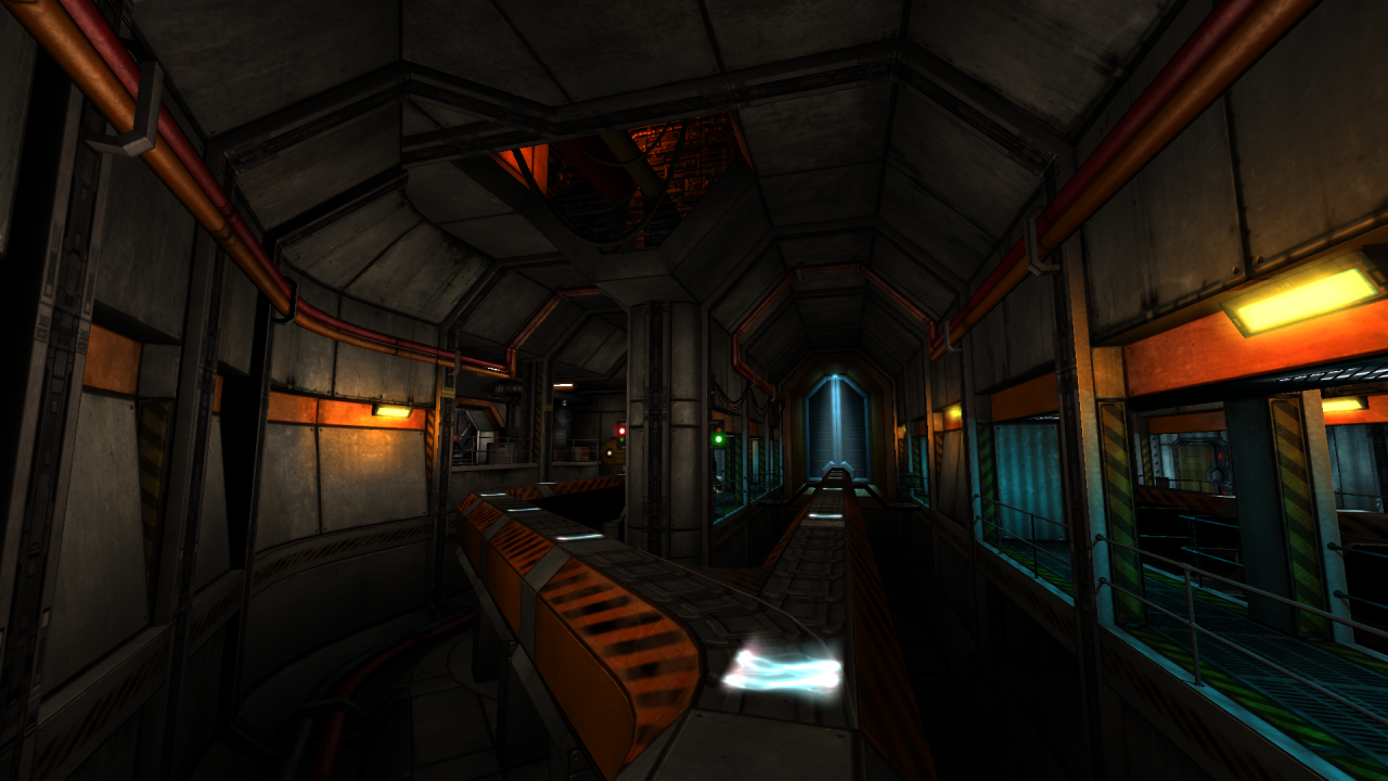
Re: Screenshots
Posted: Tue Sep 18, 2012 1:44 pm
by Eraser
That looks sweet geX. What are you building that for?
Re: Screenshots
Posted: Tue Sep 18, 2012 1:51 pm
by geX
Thanks! Its for Doom 3: Phobos
Re: Screenshots
Posted: Tue Sep 18, 2012 2:25 pm
by Eraser
Really? It's having a bit of a cartoonish feel to me.