Page 258 of 295
Re: Screenshots
Posted: Wed Jul 31, 2013 7:05 pm
by AEon
Obsidian, we may just think of the pretty much same obvious things. Those "Art Deco"-ish lights are featured in almost every US series (in Libraries, or Police Stations etc.) and using more light sources would be the apparent thing to do in an otherwise forced monochrome setting.
I also agree with Obsidian, that satellite dish and the aircon are somewhat "ugly" (though sadly quite plausible reality based). I had the feeling the image was set in the 1920s... so the phone on the table would have to be made a dial phone with old design as well, IMO.
About the lamp cable: One could be kinda avant guard, and add a round hole, with "metal" ring right into the table top where the cable conveniently disappears. That might even look elegant.
Yes, I'm nitpicking...
Re: Screenshots
Posted: Thu Aug 01, 2013 12:01 am
by phantazm11
Looks great cityy
Re: Screenshots
Posted: Thu Aug 01, 2013 11:57 am
by Bliccer
Nice render, but ähm... why is the table turned 180degree? Kind of annyoing to always go around the table to get to the drawers

Re: Screenshots
Posted: Thu Aug 01, 2013 5:51 pm
by Theftbot
Thats a "feature" Bliccer
Re: Screenshots
Posted: Wed Aug 07, 2013 8:06 pm
by sock
sst13 wrote:Quakish version of q3dm16 "Bouncy Map".
[lvlshot]http://sst13.net/pics/13tomb5.jpg[/lvlshot]
Amazing stuff, really love the vibe and different floor levels.

Re: Screenshots
Posted: Thu Aug 08, 2013 11:40 am
by Hipshot
Please post more images that are 78MB, I'm sure we all have 100+ Gbit.
Re: Screenshots
Posted: Thu Aug 08, 2013 11:58 am
by cityy
Sorry, changed it to be an url - I changed the file in the dropbox, forgot I had it linked here..
Re: Screenshots
Posted: Sun Aug 18, 2013 10:34 pm
by Spray
Hey
I was in vacation in Prague so I had to visit lego store as we don't have one in Slovenia
because I needed to buy some pieces to finish the table.
Not a Q3 map, but i thought it might be interesting to see


Re: Screenshots
Posted: Mon Aug 19, 2013 7:28 am
by Eraser
lol, cool

Got a bit lazy on that 4th leg tho?

Re: Screenshots
Posted: Mon Aug 19, 2013 7:43 am
by Theftbot
Which ones are structural or detail?
Re: Screenshots
Posted: Tue Aug 27, 2013 2:22 pm
by Infernis
Re: Screenshots
Posted: Tue Aug 27, 2013 2:30 pm
by Eraser
Looks like Quake 2
Re: Screenshots
Posted: Tue Aug 27, 2013 2:38 pm
by obsidian
Stick a radio tower or some other detail along that skyline to add something interesting to look at. Big flat wall/roof lines are kind of boring to look at. Convert those crates to models and give them a slight rotation. Strogg are cybernetic, but probably not perfectionists.
I'm digging it otherwise.
Re: Screenshots
Posted: Tue Aug 27, 2013 4:44 pm
by AEon
Infernis,
hope you will be posting this map in new a thread here at LEM, to let us give you some feedback. Looks like fun to playtest the map.
Re: Screenshots
Posted: Tue Aug 27, 2013 5:25 pm
by Infernis
Thanks guys. It's actually meant to represent Quake (it's uses remakes of the original Base texture set). But the door and the logo's might make it look more like Quake 2 though. Other areas will definitively have a more original Quake vibe (I hope). Feedback noted.
Aeon of course! In case you don't recognize it, this map is build on a lot of your feedback. Original thread
here.
Re: Screenshots
Posted: Tue Aug 27, 2013 9:17 pm
by fKd
Looks cool man, i think its the yellow lighting which gives it the q2 feel.
Re: Screenshots
Posted: Wed Aug 28, 2013 10:32 am
by nitin77
its definitely the lighting that gives the q2 feel. I'd say go for more of a monchromatic lighting look if you want to emulate q1.
Re: Screenshots
Posted: Thu Aug 29, 2013 7:34 am
by Eraser
It's a combination of the lighting, the heavy-built geometry, the light textures themselves and the trapezoid shaped doorways. Those are all typical Quake 2 things.
Re: Screenshots
Posted: Sat Aug 31, 2013 12:46 pm
by akm
I'm loving the look of that Q1 style map sst13
Brings back the memories, thankyou
Re: Screenshots
Posted: Mon Sep 02, 2013 8:45 pm
by Infernis
Thank you all. Here's some more. Lighting is experimental and thus temporary. I have your feedback in mind.


Big versions:
5
6
Re: Screenshots
Posted: Tue Sep 10, 2013 8:17 am
by Infernis
Re: Screenshots
Posted: Tue Sep 10, 2013 4:25 pm
by obsidian
I'm digging the extra colour palette. Nice dab of blue.
Re: Screenshots
Posted: Tue Sep 10, 2013 4:28 pm
by obsidian
You got the nails.
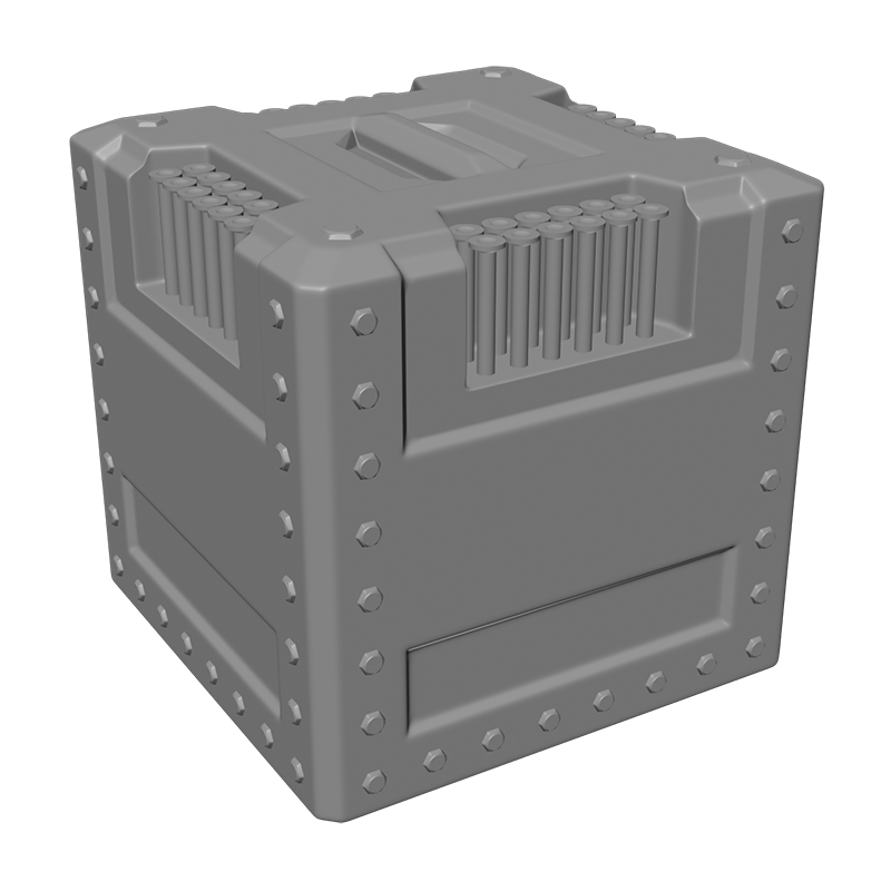
I'm trying a bit of hard surface modelling and learning to do subD. Still terribly inefficient, 3ds Max's quadrify and turbosmooth generates 900,000 polys for this model.
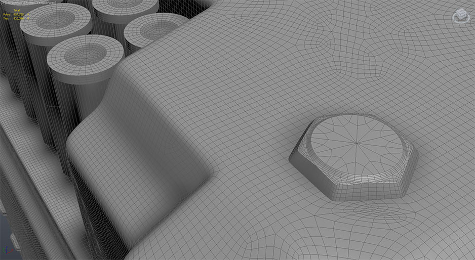
Re: Screenshots
Posted: Tue Sep 10, 2013 5:58 pm
by phantazm11
obsidian wrote:You got the nails.
(Cool images)
I'm trying a bit of hard surface modelling and learning to do subD. Still terribly inefficient, 3ds Max's quadrify and turbosmooth generates 900,000 polys for this model.
Two words: Support loops. Make friends with the Swiftloop tool (in the graphite modeling tools fly out) and you will have much more control with a ton less polygons.
Nice model btw.
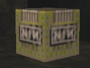
Re: Screenshots
Posted: Sat Sep 14, 2013 2:43 pm
by Martinus
Quake 3 companion cube (by me).:

Cute. isn't it?


