Page 1 of 1
Beta - Nightshift
Posted: Wed Oct 21, 2009 5:27 am
by scythe
Beta 2 - Updated map and screens- 12/03
So, it's been an interesting few weeks. A layoff, a virus, and a reformatted hard drive meant I had to recreate this map from scratch. I've made a lot of changes, optimizations, and improvements, and tried to incorporate as much of your feedback as could. I hope you'll take a look at this new version, I think it's coming along quite nicely. As always, give me you feedback, please.
***
Hey all. Been out of the scene for a while. It's great to see all the recent activity around here. Here's a small tourney map I've been tinkering around with. I'd be interested in any feedback you guys have.
Nightshift - Beta
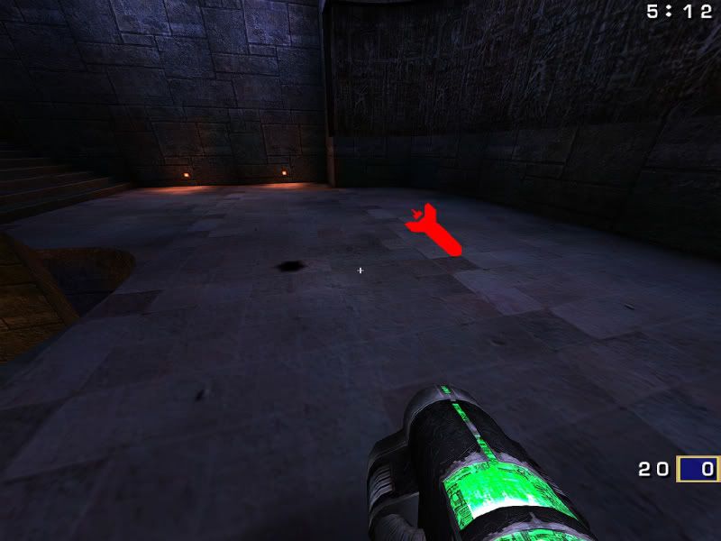
[lvlshot]http://rdahlia.squarespace.com/picture/nightshift01.jpg?pictureId=3876788[/lvlshot]
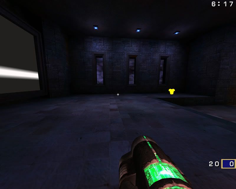
[lvlshot]http://rdahlia.squarespace.com/picture/nightshift02.jpg?pictureId=3876789[/lvlshot]
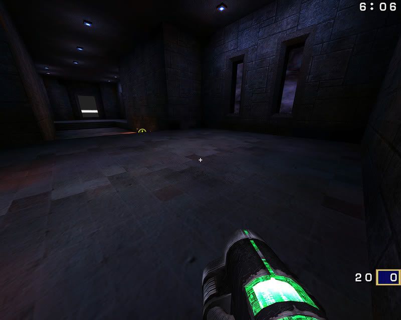
[lvlshot]http://rdahlia.squarespace.com/picture/nightshift03.jpg?pictureId=3876790[/lvlshot]
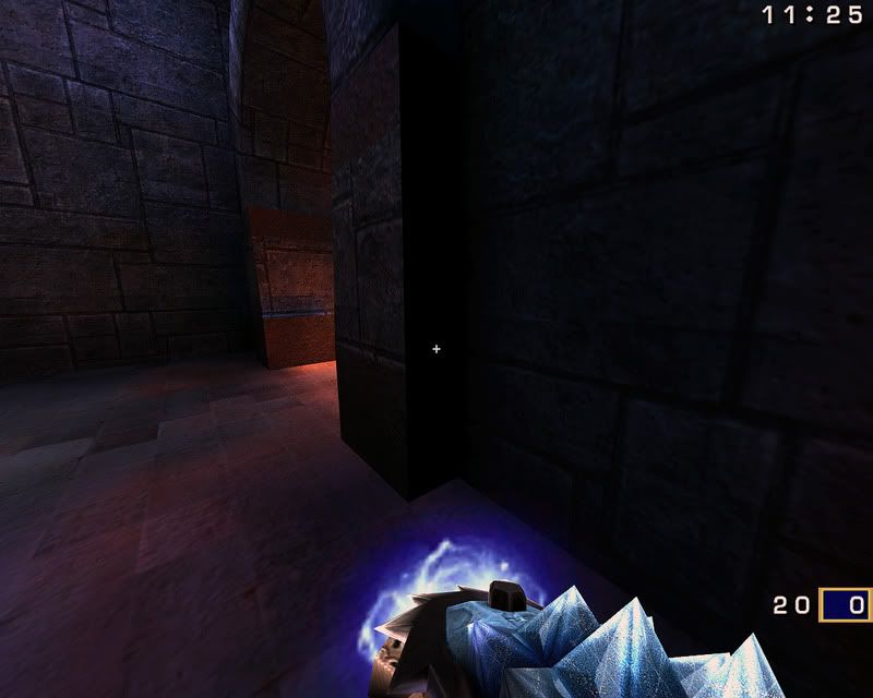
[lvlshot]http://rdahlia.squarespace.com/picture/nightshift04.jpg?pictureId=3876791[/lvlshot]
Re: Beta - Nightshift
Posted: Wed Oct 21, 2009 5:47 am
by Silicone_Milk
images aren't showing for me =\
Re: Beta - Nightshift
Posted: Wed Oct 21, 2009 6:47 am
by fKd
same
Re: Beta - Nightshift
Posted: Wed Oct 21, 2009 7:59 am
by scythe
Ok, sorry about that. Images should load now. I forgot to turn my website's hotlinking filter off.
Re: Beta - Nightshift
Posted: Wed Oct 21, 2009 8:00 am
by AEon
Hehe... your map has that "instant classic" feel to it, the blue lighting suggests dark, but actually properly lights the map and the contrasting red-ish lights near the floor give the map a cozy / safe feeling. I like that

- You are missing one shader/texture for vQ3: textures/hub3aeroq3/q1_tele.TGA...
- Are you sure the map does not have a leak? Standing at the upper RL I am seeing far to much of the map (tris through walls) than I should be. Since the map is minimalistic, this is not an issue yet, but makes me wonder.
- I used noclip to look at the map from outside, and after entering the map again, around the lower RL, suddenly many walls were missing. Something seems to be on edge here, i.e. some technical ugly issue.
- Layout "seems" to be fun... need to play it more for better feedback.
- Since there is so much blue-ish light in the map, a stary night skybox with a huge moon would make sense, and give the map an additional "push" in the nightshift theme, IMO.
- Hope you'll add some more weapon pads (cracks in tiles or the like) for the other weapons too?
- In the style you are using, red-ish light near the floor you may want to add some lava deco, sparingly in the lower areas of the map as additional ambient light.
- Have you done hinting? Standing at the upper RL, looking into the map I am seeing way too many stairs *behind* walls that should not be showing (bind ALT "toggle r_showtris"), even without any explicit hinting.
- Something that made me wonder after playing for a while are those relatively narrow doorways you have all over the map, they look right in size and the also look good, but they definitely represent a bottleneck, a "challenge" to navigate. You may want to make some of those doorways wider.
Nice map... Will you be adding some more details / eyecandy?
Re: Beta - Nightshift
Posted: Wed Oct 21, 2009 8:17 am
by scythe
Thank you very much, AEon.
- I'll definitely get the missing texture sorted, I always seem to miss one.
I have not done any hinting yet, I wanted to see if folks liked the layout before I went any further.
Regarding a possible leak, or technical issue... there's nothing that I know of, but I will double check.
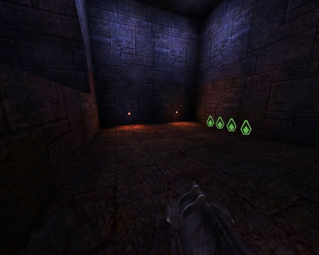
Additional weapon markers are on my to-do list, as well as more general damage, broken tiles and the like.
I'll take a look at the doorways, and yes I intend to add more detail to the map.
Re: Beta - Nightshift
Posted: Wed Oct 21, 2009 10:12 am
by AEon
A few other ideas:
- The placement of the RG is a bit awkward IMO, you might want to make the stairs where the RG is full width, and instead cut a maybe rounded off niche into the wall and place the RG into that.
- I noted you actually do have health in the map - the bots kept using it
 - but I still felt desperate for health quite often in FFA, maybe add/spread around a few more 25Hs (i.e. the SG room or thereabout).
- I *really* wanted to get up onto the MH and RA platforms, well a RJ does it, but a "stepping stone" coming out of the wall would be sorta neat to have. Obviously this will dumb down the map somewhat, but for FFA it would be a "fun" thing, I think.
Re: Beta - Nightshift
Posted: Thu Oct 22, 2009 10:39 am
by cityy
While playing a duel on your map I noticed that I nearly never had to visit the lower level.
Thats how some of the most important items are placed at the moment:
[lvlshot]http://img193.imageshack.us/img193/7853/nightshift1.jpg[/lvlshot]
Once a player has controle over the map he doesn't need to move away from the area between MH, RL and YA since he can controle this three items and the LG easily. The other player only has a YA, a RL (and a RG) to work with. IMO it is like the first frag decides how the game ends. To avoid this I would give the other player another YA to collect.
[lvlshot]http://img193.imageshack.us/img193/7641/nightshift2.jpg[/lvlshot]
I would place it here.
I'd also add an alternative route to the RA wich shouldnt be that obvious.
[lvlshot]http://img193.imageshack.us/img193/9849/nightshift3.jpg[/lvlshot]
Maybe some boxes or some bricks coming out of the wall.
All in all I really like the layout and the color sheme of your map - I wonder how the development will continue
Re: Beta - Nightshift
Posted: Thu Oct 22, 2009 11:17 am
by AEon
cityy,
note that the RL in the RA arena is actually on the lower floor, not at the top of the JP.
But looking at the overview, I think the combo LG, MH, RA - in such close proximity - is a bit much. I'd suggest keeping the LG on the lower level (for now) but moving it more towards the door connecting the MH and RA lower arenas. This is a FFA comment, I don't have enough experience for tourney placement.
Re: Beta - Nightshift
Posted: Thu Oct 22, 2009 12:00 pm
by cityy
note that the RL in the RA arena is actually on the lower floor, not at the top of the JP.
oops - looks like I placed the RL where I wanted to have it ((:
Well, I also don't have much experience when it comes to tourney. IMO tourney maps can be very simular to FFA maps - the only difference may be that you have more health/amor and maybe a powerup instead a mega health because you have to face more enemies than one. Anyway, I just started playing quake a few months ago, I don't know much
Re: Beta - Nightshift
Posted: Thu Oct 22, 2009 5:42 pm
by scythe
Thanks for the comments guys. I'm going to try and get started on a new version today, and I'll try to address all of these issues. If anyone else has time to give feedback, I'd really appreciate it.
Re: Beta - Nightshift
Posted: Fri Oct 23, 2009 1:36 am
by InsaneKid
Hey, Scythe?

Have u mapped for D1 too? <:
Re: Beta - Nightshift
Posted: Sat Oct 24, 2009 6:26 pm
by scythe
D1? Hmm, not sure what you mean. Doom maybe? I started mapping with Quake 1. Actually messed around with Doom, but I never released anything. It's hard to believe there was once a time that Doom mapping was a complicated new thing to learn.
Re: Beta - Nightshift
Posted: Sun Oct 25, 2009 6:19 pm
by Anthem
I like the beginnings of the map you are working on. It seems fairly inspired by the traditional hub3aeroq3, and I enjoyed the overall layout with which you have started.
I will now address some things I felt are in need of change:
The bullet mark is where the pad takes you. I think the pad should push you directly to the rocket launcher. Perhaps increase the pad strength to push you a few more units up and towards the direction of the rocket (on all pads).
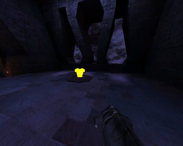
The yellow armor seems quite out of place.
The yellow armor could be moved to there since nothing is there. I generally map by centralizing the important weapons and pickups (spread out yet equally distributed near an equidistant center from two rooms or projections). For instance: I place the mega and red armor at opposite sides (vertically) of the map, yet they are in the center. I then place two yellow armors at opposite sides of the map (horizontally) to spread out the armor distribution. I also tend to centralize the distribution of the rail, rocket and powerup while placing a lightning and plasma and two shotguns at opposite sides of the map. Just some food for thought. I don't exactly like where you have your red armor and mega health at the moment. They seem rather scrunched together.
I also recommend clipping these to make them less .. for lack of a better word.. sticky. It is easy to get stuck on them while simply strafing around the map. A 45 degree clip should help eliminate such problems.
I hope to see that you continue your work on this map. You have a good start and I look forward to seeing the end result.
Re: Beta - Nightshift
Posted: Mon Oct 26, 2009 4:22 am
by scythe
Thanks for the comments Anthem, great suggestions. I'm working on a new version right now, it should be up in a day or two.
Re: Beta - Nightshift
Posted: Fri Dec 04, 2009 7:19 am
by scythe
Updated to beta 2, see OP.
Re: Beta - Nightshift
Posted: Fri Dec 04, 2009 10:39 am
by v1l3
It's got a nice layout..I like the blueish gothic look. There isn't too many solid ol' school goth maps coming out these days.
Re: Beta - Nightshift
Posted: Fri Dec 04, 2009 11:12 am
by AEon
Sad to hear about the loss of the map source, hope you could decompile the
BSP and us that as a basis?
Thoughts:
- Balancing the side of the map MH+YA vs. RA is a good move. So is the MH on the lower floor and placing the RG where the MH used to be.
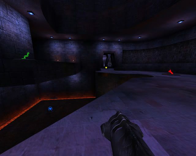
- When standing at the RG looking both towards the RL and also towards the 50H, the blue lights on the lower ceiling above these items are *exactly* on the height of the player's eyes. This leads to flickering of the blue lamp texture and also the lit areas in on the ceiling there. It might be enough to simply up those ceiling areas by 8u.
- You seem to have done something with your wall patches in the "corners" - they are using *way* too many tris (r_showtris), i.e. over 700 on the corners behind the RL (RA arena). As if you were using high densisty cylinders or something. Or you set some compiler option. IMO, this is a waste of tris, since the default number of tris is more than enough to make those walls look round, "dividing" a 90° corner into 16 segments is overkill (half, i.e. 8 segments would do). Presently, with only 3K tris looking at that wall this is not really an issue, just something to keep in mind when you start adding more detail. Note: This is an issue for all your patches, AFAICT.
- It might be a good idea to turn your weapon/item brushwork into a ASE model. Thus turning off clipping, plus letting your align the textures on the in more detail, plus letting you centrally change the design without having to copy/paste them all over the map later on.
- The upper TP (on the wall on the right) has a very nice decorative angled cut into the wall (indented), please add more of those all over the map, they look neat.
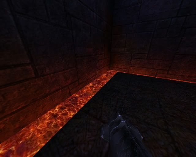
- The lower areas seem to have lost detail: Your lava edges could use some edge detailing to make them look less straight and more interesting. E.g. grates over the lave or something.
- Pity that the .arena only suggests one bot for FFA, it might be neat to have at least one other bot. Major as "solo" bot is a very good AI choice for this map BTW.
I still feel as if I am getting snagged with the doorways, but that may simply be lack of strafe-jumping skill on my part.
Re: Beta - Nightshift
Posted: Fri Dec 04, 2009 11:39 am
by Anthem
Excellent changes, scythe. This map has really come together since your last beta.
First of all, I really want to say that this change is probably my favorite part of the map. The window looks quite good, and it really is a good spot for the YA.
Second, I want to say that the map still looks a little overpowered by the mega health.
I love that you have two rocket launchers by the red armor and mega health respectively, but with the railgun next to the mega health too the balance is a bit screwed. The two most powerful weapons in the game are right next to eachother with yellow armor and mega health. Compare that to rocket and red armor.
I also feel that the map is lacking a plasma gun, which may be good for breaking up some of the long distance fighting.
That's where I would recommend a plasma gun be placed should you decide to put it in your map.
Last, these lines of lava make a good border, but they seem a bit pointless not to be clipped. I can see if you want them to damage people for a few points if they happen to walk into them, but they seem just for decoration.
Anyway, I love your map and I am excited to judge it in the NoGhost competition.
Re: Beta - Nightshift
Posted: Fri Dec 04, 2009 5:53 pm
by cityy
I really like your map - playing it is a lot of fun.
If you want to add a plasma gun - be aware of this:
http://www.youtube.com/watch?v=_T-scyvspOI (SKILLZ!


)
With cpm you can even do the RL to RG jump with an easy strafe. Maybe put the RG area a bit higher to avoid this.
I actually don't think the RG near the MH is such a bad thing since you can reach it easily from the other "side" of the map - this way it doesn't cause that much imbalance.
I think the MH room could be a bit less wide. Maybe make it a bit smaller or put the MH on a higher level than the rest of the room for more interesting fights. I like the RA pit - though it feels like there should be another way to get there. I'm still not sure about this..
Re: Beta - Nightshift
Posted: Fri Dec 04, 2009 11:58 pm
by Fjoggs
My mind is boogling. Its so low on details, and yet looks awesome. x_x
Re: Beta - Nightshift
Posted: Sat Dec 05, 2009 4:47 am
by obsidian
Fjoggs wrote:My mind is boogling. Its so low on details, and yet looks awesome. x_x
It's the lighting that sells it. There's a nice contrast between the cold ambient blues and the small warm oranges.
Re: Beta - Nightshift
Posted: Sun Dec 06, 2009 7:54 pm
by scythe
Thanks for the compliments and feedback, guys. I'm going to try and get a "release candidate" up later in the week.