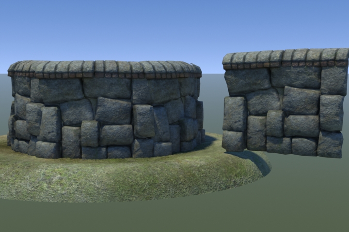
sock wrote:@cityy, yep the lighting is very hit or miss. I have 3 monitors at home and it looks amazing on 2 and completely black rubbish on the 3rd. Some people are going to love it for mood and lighting, others will just think it is too dark and I am crazy! :P I spent a while trying out different light styles and this one got the most votes of 'wow, nice and moody'. If enough people request it I can do a special lighter set.
Yeah, got to hate how big the dark/light contrast is on older monitors. That's always a problem when your doing dark areas. I think you should stick to working on the 2 better monitors as those are the standards today. Castle looks great btw. Are you planing on releasing some of the awesome stuff you been working on soon?
its just a tiny 2-3 vs ctf map. having fun again which is nice. should have a map for you guys to play very soon. i've been doing a basic clipping pass, but i need to get it really tight. bots are playing retarded :/
@kaz thats really coming along nicely. keep going man!
@g0th-, I plan to release some stuff this weekend if I get the final green light from a couple of friends. It seems my forever map is ready to ship!
Well he was evil, but he did build alot of roads. - Gogglor
My [url=http://www.simonoc.com/]Website[/url] & [url=http://twitter.com/SimsOCallaghan]Twitter[/url]
wooo impressive stuff there mr hipshot! are you still working on that dm map you were posting screens for a while back? the one with the id base textures etc?
That is too funny cityy! Just this week I was experimenting with the exact same thing. I've been contemplating remaking my Q4 map Flux for Quake 3:
I tell you it will be a crapload easier to do with idtech3 seeing as how in Quake 4 I had to remake every single brush that would be facing out in order to achieve the black cel shading outline.
I wanted to create something like that for a long time, never really come around to it though. And I would not use cel for the level, I don't think it fits Q3 at all, since weapons and all are normal.
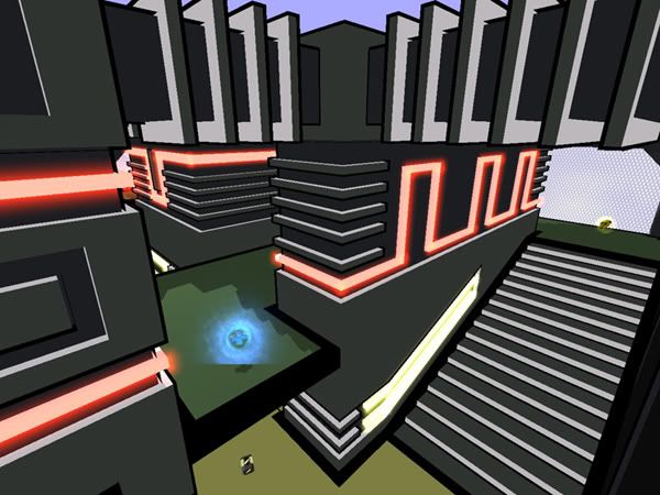
Workflow pic for the MH area of my level.
[lvlshot]http://zfight.com/misc/images/maps/development/max-rad-q3.jpg[/lvlshot]
I guess the difference between the meshes I make for my levels and the ones Epic uses for Unreal, is, that you won't get stuck in mine when running fast and jumping around.
Last edited by Hipshot on Thu Mar 18, 2010 2:34 am, edited 1 time in total.
And to answer your earlier question. Yes it's that level, however, there are just very few Id textures left, only some very basic ones.
I feel a bit ashamed that I never really managed to use them as I intended, instead I went for a all custom look, which I usually do and what I was trying no to do...
Looks nice, but tbh whole place it too clean for real mine. It's looking a little bit empty and sterile, and because of it - unnatural. Add a lot of dirt, blots ans such things - details!
Edit: Also, is it fullbright? Look at the ceiling, for me there's too much light, and something feels odd here.
Add wooden pillars to support the scaffolding.