Recently I have been thinking about creating another map, something different. To me the textures or texture set are very important since they inspire to create a map of a certain type and design. This is also true e.g. of the skybox. I will compile the map, and gaze into the skybox, and then try to frame the interesting views into it.
So I am wondering if there are any new (new to me that is, they could be 5+ years old) texture sites out there? New skyboxes?
I would also find it very instructive if some of the recent mappers could share their process of going about selecting textures for their maps? cityy maybe you could explain this using your western-styled map? Where did you find the textures, how do you go about matching them up?
What does one need to look out for, to make the textures work. Often I look at the list of texture files in the pk3 and wonder how those could ever be turned into anything nice... but clearly it was possible. I seem to be missing some artistic eye for texture decoration apparently.
Presently, cutting apart (again) Sock's HD industrial texture set. That set is really nice, but I don't really want to recreate a factory, though the various crete textures should come in handy.
Anyway, any thoughts, suggestions, ideas, I am sure could be quite instructive.
On how to find and select textures for a map?


Re: On how to find and select textures for a map?
When I create textures I try to make sure that the general wall textures somehow give you the same feeling when you line them up, so they won't be distracting to the player, even if I know a lof of people run with textures low or off.
Q3Map2 2516 -> http://www.zfight.com/misc/files/q3/q3map_2.5.16_win32_x86.zip
Q3Map2 FS_20g -> http://www.zfight.com/misc/files/q3/q3map2_fs_20g.rar
GtkRadiant 140 -> http://www.zfight.com/misc/files/q3/GtkRadiantSetup-1.4.0-Q3RTCWET.exe
Q3Map2 FS_20g -> http://www.zfight.com/misc/files/q3/q3map2_fs_20g.rar
GtkRadiant 140 -> http://www.zfight.com/misc/files/q3/GtkRadiantSetup-1.4.0-Q3RTCWET.exe
Re: On how to find and select textures for a map?
I don't see myself very eligible to answer this but making 'good' textures was mostly a matter of practise to me.
The most important thing is to stay coherent withing your set - keep thinking of your texture as a part of the set rather than an individual image. Stick to reasonable resolutions for the context the textures are used in and try to keep things within a simular range of contrast (except if you wan't to set accents). I know there is a more 'scientific' approach to this relying on actual image values but all I do is go by mood and feeling.
Sock would surely be the guy to ask about this - he's got years of experience and probably already tried several approaches to make a texture set.
There are probably loads of factors you can take into account that I can't think of right now (or generally . Visual density should probably among them, having the same 'noise level' in your textures to again make things look coherent.. a good composition is key.
Hope it helps any, sorry for the late reply. I would love sock to lose some words about this topic as well btw.
Edit:
Oh yeah, what I did for ct3tourney3/McSarge's is create the large surface core textures first (wood planks, brick, concrete, tiles) trying to stick to what I wrote above. The rest of the work kind of went by itself.. so much for my professionalism.
The most important thing is to stay coherent withing your set - keep thinking of your texture as a part of the set rather than an individual image. Stick to reasonable resolutions for the context the textures are used in and try to keep things within a simular range of contrast (except if you wan't to set accents). I know there is a more 'scientific' approach to this relying on actual image values but all I do is go by mood and feeling.
Sock would surely be the guy to ask about this - he's got years of experience and probably already tried several approaches to make a texture set.
There are probably loads of factors you can take into account that I can't think of right now (or generally
Hope it helps any, sorry for the late reply. I would love sock to lose some words about this topic as well btw.
Edit:
Oh yeah, what I did for ct3tourney3/McSarge's is create the large surface core textures first (wood planks, brick, concrete, tiles) trying to stick to what I wrote above. The rest of the work kind of went by itself.. so much for my professionalism.
www.ferdinandlist.de/leveldesign
Re: On how to find and select textures for a map?
I seem to not have worded things very precisely. I was actually much less ambitious in my question, not wanting to create (how could I), but on how to go about choosing textures for a map.
I started off with some scribbles of a possible map, sketching a few design ideas I would like to have in there... that quickly led me to note a few materials and where to use them in the map. E.g. I would like a crete basic design, but with greenery (grass, earth, plants, trees), also glass and wood, some of rock for cliffs/rock columns... etc. After downloading all of Sock's textures I think I have found most of them.
It appears that selecting the "set" of textures you want to end up with is basically some ideas one wants to integrate in the map, and then a lot of looking up and finding what one likes. Obviously, one will at some point need to put them in a map with lighting, and look how the game "gets along with them" them, i.e. check if they fit together.
Re: On how to find and select textures for a map?
For textures, consistency is absolutely important. When mixing different textures together, you can end up with some large differences between textures that doesn't make them go well together. I'm not just talking about mixing themes either... but rather the tone, colour and saturation of the texture.
Tone is the difference between light and dark areas. You don't want to have your textures looking too bright on one texture and too dark on others, otherwise you'll end up with certain textures that stick out too much. You can adjust this by balancing the levels of your image until you have an even tone across your texture set.
Colour is important, I dislike maps with rainbow colour schemes or poorly matched colours. I think I told cityy a while ago about colour theory, and I think level designers should all take note. Level design is art, so why not take some pointers from traditional art theory and learn about how colours work best together? There are a lots and lots and lots of resources and more if you Google.
Short story:
[spoiler]In first year university, I was late signing up for courses and I found a lot of the general credit classes had filled up and I needed something for a science course. Only one left was some birdbrained "Science of Colour" course which was filled with ditsy art and lit majors who were looking for the easiest sounding science class to take. I think the course description implied that there would be a lot of painting involved, so for art majors, how hard can that be? I can paint, but for me, I wasn't thrilled. It sounded dull and mundane, and I wanted a real science class. Sitting in class, I'd roll my eyes when some ditsy girl kept asking rather basic questions that elementary school kids would know..
Turns out the class was actually detailed, going into not just colour theory as it relates to art, but about photons, reflections, refractions, biology of the human eye, etc. Only disappoint was that the course skipped over quantum wave-particle theory, I would have loved to see ditsy's head explode when her tiny brain overloaded. I ended up with the highest grade in the class despite spending a minimal amount of time doing my readings for it. Anyway, point is that colour theory sounds really basic but can be incredibly interesting the deeper you dive into it. Also... some hot girls in that class who didn't mind having a study partner, but that's another story.[/spoiler]
I've found that id Tech engines work well with textures that are slightly desaturated with spots of strong saturated colours as focal points. So for most textures, I slide down colour saturation way down and keep it consistent across different textures. A lot of beginner texture artists create textures with far higher levels of saturation and I find that the map pops out too much and doesn't look realistic... it almost glows.
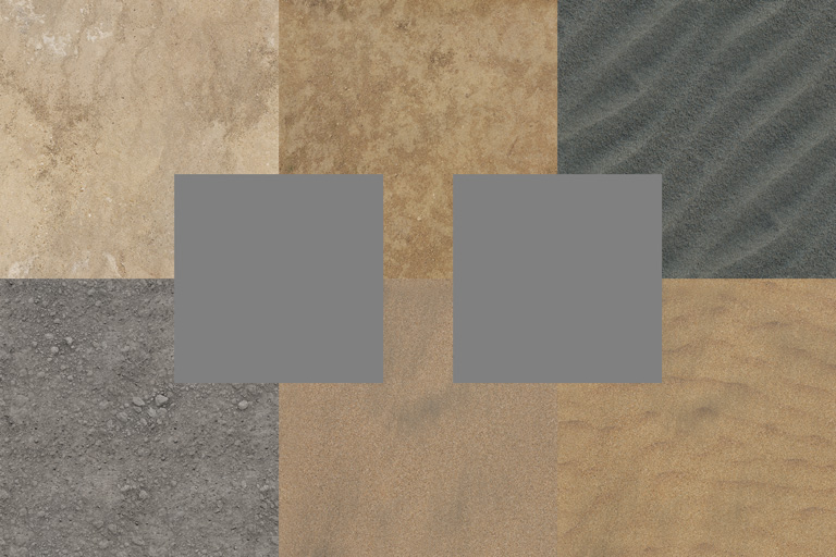
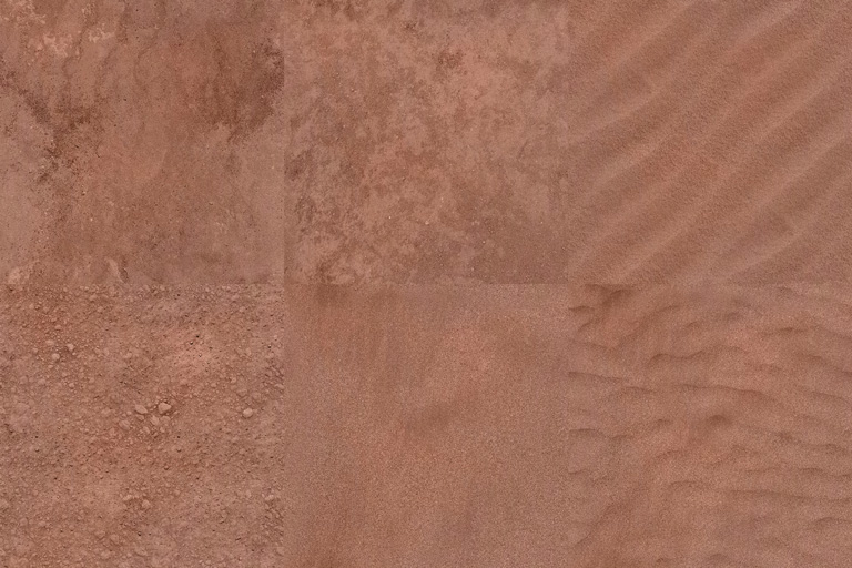
As an example of all this, here are some terrain textures that I was working on some time ago. Terrain textures make a good example, because consistency is all the more important when they are alpha-blended across a terrain mesh. Anything that isn't consistent sticks out like a sore thumb when viewed from far away and it makes tiling problems obvious:
I started off with a mad mix of colours and tones. The textures were independently edited to tile properly in a different file, then copied onto this large palette. The gray boxes are there for reference, they are 50% gray fills so that I can tweak each texture to a good middle tone.
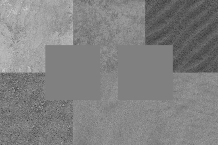
I applied a saturation adjustment layer and dialed it down to 0%. I now have gray scale textures. You can see the large difference in tone between some of the darker textures and lighter ones.
I applied a levels adjustment layer to each texture. Then tweaked the levels of each texture until it matched the 50% gray fills. Your textures don't necessarily need to use 50% fills, it's just a nice even tone that I chose to work with in this case. Sometimes you may want significantly brighter or darker textures depending on your case. The main idea is that you want the tone for each texture to match each other. If you squint, it should look like one consistent texture. The top-right texture for instance was *way* too dark before, but now it matches the other textures.
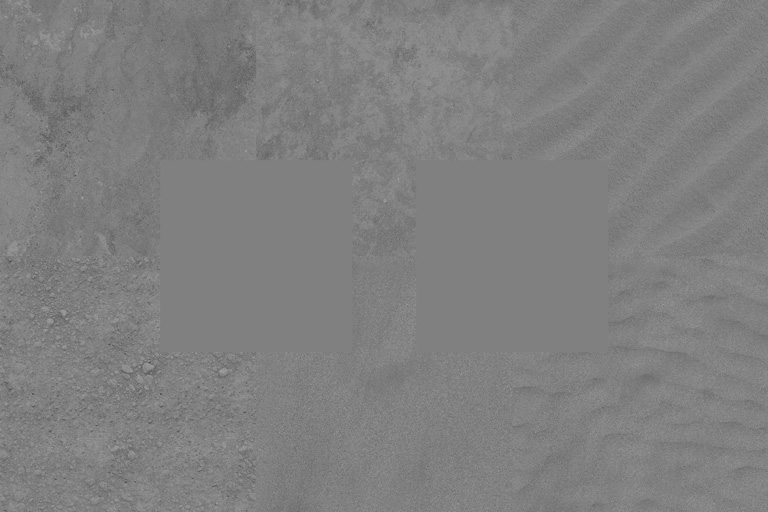
A new adjustment layer was added on top of all the textures to globally bump up the contrast on some of the details that got washed out in the process.
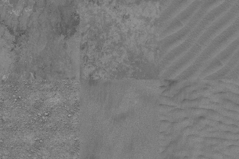
Finally, I applied a painted colour scheme to the textures which I sampled from some desert photos I found on Google. Of course, terrain textures are an extreme case when you want this kind of consistency, but checking your normal textures to make sure they are in the same ballpark is always a good idea.
Tone is the difference between light and dark areas. You don't want to have your textures looking too bright on one texture and too dark on others, otherwise you'll end up with certain textures that stick out too much. You can adjust this by balancing the levels of your image until you have an even tone across your texture set.
Colour is important, I dislike maps with rainbow colour schemes or poorly matched colours. I think I told cityy a while ago about colour theory, and I think level designers should all take note. Level design is art, so why not take some pointers from traditional art theory and learn about how colours work best together? There are a lots and lots and lots of resources and more if you Google.
Short story:
[spoiler]In first year university, I was late signing up for courses and I found a lot of the general credit classes had filled up and I needed something for a science course. Only one left was some birdbrained "Science of Colour" course which was filled with ditsy art and lit majors who were looking for the easiest sounding science class to take. I think the course description implied that there would be a lot of painting involved, so for art majors, how hard can that be? I can paint, but for me, I wasn't thrilled. It sounded dull and mundane, and I wanted a real science class. Sitting in class, I'd roll my eyes when some ditsy girl kept asking rather basic questions that elementary school kids would know..
Turns out the class was actually detailed, going into not just colour theory as it relates to art, but about photons, reflections, refractions, biology of the human eye, etc. Only disappoint was that the course skipped over quantum wave-particle theory, I would have loved to see ditsy's head explode when her tiny brain overloaded. I ended up with the highest grade in the class despite spending a minimal amount of time doing my readings for it. Anyway, point is that colour theory sounds really basic but can be incredibly interesting the deeper you dive into it. Also... some hot girls in that class who didn't mind having a study partner, but that's another story.[/spoiler]
I've found that id Tech engines work well with textures that are slightly desaturated with spots of strong saturated colours as focal points. So for most textures, I slide down colour saturation way down and keep it consistent across different textures. A lot of beginner texture artists create textures with far higher levels of saturation and I find that the map pops out too much and doesn't look realistic... it almost glows.
As an example of all this, here are some terrain textures that I was working on some time ago. Terrain textures make a good example, because consistency is all the more important when they are alpha-blended across a terrain mesh. Anything that isn't consistent sticks out like a sore thumb when viewed from far away and it makes tiling problems obvious:
I started off with a mad mix of colours and tones. The textures were independently edited to tile properly in a different file, then copied onto this large palette. The gray boxes are there for reference, they are 50% gray fills so that I can tweak each texture to a good middle tone.
I applied a saturation adjustment layer and dialed it down to 0%. I now have gray scale textures. You can see the large difference in tone between some of the darker textures and lighter ones.
I applied a levels adjustment layer to each texture. Then tweaked the levels of each texture until it matched the 50% gray fills. Your textures don't necessarily need to use 50% fills, it's just a nice even tone that I chose to work with in this case. Sometimes you may want significantly brighter or darker textures depending on your case. The main idea is that you want the tone for each texture to match each other. If you squint, it should look like one consistent texture. The top-right texture for instance was *way* too dark before, but now it matches the other textures.
A new adjustment layer was added on top of all the textures to globally bump up the contrast on some of the details that got washed out in the process.
Finally, I applied a painted colour scheme to the textures which I sampled from some desert photos I found on Google. Of course, terrain textures are an extreme case when you want this kind of consistency, but checking your normal textures to make sure they are in the same ballpark is always a good idea.
[size=85][url=http://gtkradiant.com]GtkRadiant[/url] | [url=http://q3map2.robotrenegade.com]Q3Map2[/url] | [url=http://q3map2.robotrenegade.com/docs/shader_manual/]Shader Manual[/url][/size]
Re: On how to find and select textures for a map?
That was really interesting... especially on how to get the texture consistent. Though I have to admit I love the original textures too ... not just the orange/red final ones.
Re: On how to find and select textures for a map?
On that note you don't want to do things like:
-Mix sci tech with like lets say gothic textures with toon textures.
-Use textures that have high differences in Hue, Saturation, Contrasts.
-Use textures that are blurry w/textures that are sharp(granularity).
-Mix sci tech with like lets say gothic textures with toon textures.
-Use textures that have high differences in Hue, Saturation, Contrasts.
-Use textures that are blurry w/textures that are sharp(granularity).
Re: On how to find and select textures for a map?
Quality thread.
Ripe for the Link Resources sticky already, methinks.
Ripe for the Link Resources sticky already, methinks.