q4map Rusted - Beta 1

Discussion for Level editing, modeling, programming, or any of the other technical aspects of Quake
Post Reply
StormShadow
Posts: 557
Joined: Wed Feb 16, 2005 8:10 pm

q4map Rusted - Beta 1

Post by StormShadow »

A few things. First, this map in all likelihood will be submitted to the VIA/Doom3World mapping comp, so please dont distribute this map anywhere outside this forum. I had a bad experience with a beta of mine getting stuck up on quake4files.com before I was ready for it to be there, and I would rather not repeat that experience :)

Obligatory Screenshot:
Image

There are two files in this pk4, storm4dm3, and storm4dm3_a. The second is an alternate build without the railgun.

My concerns are that the map is too open for the railgun, and that its too easy to camp certain areas. I did try to put the RG in an out of the way location in build 1, but it may not be enough.

I am mostly looking for item placement feedback, but I will retool the layout if need be, so feel free to suggest anything.

DL here:
http://www.planetquake.com/stormshadow/ ... 3_beta.zip
User avatar
Hipshot
Posts: 1547
Joined: Sun Jan 20, 2002 8:00 am

Post by Hipshot »

...however, this looks pretty nice!
mm, VIA ;)
Q3Map2 2516 -> http://www.zfight.com/misc/files/q3/q3map_2.5.16_win32_x86.zip
Q3Map2 FS_20g -> http://www.zfight.com/misc/files/q3/q3map2_fs_20g.rar
GtkRadiant 140 -> http://www.zfight.com/misc/files/q3/GtkRadiantSetup-1.4.0-Q3RTCWET.exe
Geit
Posts: 73
Joined: Fri Nov 10, 2000 8:00 am

Post by Geit »

Looks good, I'll give it a whirl
[b]My Latest Map[/b]
[url=http://goat.gamepoint.net/maps.php?id=63]Clean and Simple (Geit4dm1 [TDM])[/url]

[b]My Maps[/b]
[url=http://goat.gamepoint.net/]The Goat[/url]

[b]Articles[/b]
[url=http://goat.gamepoint.net/articles.php?id=7]How to make a successful TDM map[/url]
[url=http://goat.gamepoint.net/articles.php?id=8]Curved stair tutorial[/url]
Geit
Posts: 73
Joined: Fri Nov 10, 2000 8:00 am

Post by Geit »

Some comments at a quick glance:
- I like the layout :icon25:
- The jumppad shader seems to be missing
- The ceilings seem to be a bit low, I don't bump my head, but it looks and feels a bit awkward.

I'll look at the item placement more closely when I find the time.
[b]My Latest Map[/b]
[url=http://goat.gamepoint.net/maps.php?id=63]Clean and Simple (Geit4dm1 [TDM])[/url]

[b]My Maps[/b]
[url=http://goat.gamepoint.net/]The Goat[/url]

[b]Articles[/b]
[url=http://goat.gamepoint.net/articles.php?id=7]How to make a successful TDM map[/url]
[url=http://goat.gamepoint.net/articles.php?id=8]Curved stair tutorial[/url]
sumatra
Posts: 325
Joined: Sat Feb 12, 2005 10:02 pm

Post by sumatra »

Great layout. Feels a bit tight though. Maybe raising the ceiling a tad it would feel more natural.
I like your itemplacement very much. It feels well balanced (from the first look) and keeps the players moving. Also the teleporter support the overall flow of the very fast map. Never seen such a vertical interconnection/fightingarea in Q4. But it seems to work great.

I have one small suggestion though:
The curve beneath the RG needs some major item. Was thinking of a second RL, but it would be quite near to the RG. Maybe a 50h bubble would serve as well.

Good job, like this vertical gameplay.
(That's one of the things I missed in Q4)
[url=http://www.pukkadesign.com][color=#41c0eb]..::pukkadesign.com[/color][/url]
primaltheory
Posts: 623
Joined: Wed Dec 28, 2005 4:31 am

Post by primaltheory »

How did you get the green tele and the yellow jumppad? I couldn't figue out how to do that!
Why not?

[i]Jenny: lol, i'm not changing the whole harddrive directory structure for a mod. Do it proper like other mods please.[/i]
StormShadow
Posts: 557
Joined: Wed Feb 16, 2005 8:10 pm

Post by StormShadow »

Okay thats 2 requests to raise the celing.. ill bump it up 32 units or so.
Geit wrote: - The jumppad shader seems to be missing
I just checked the shader, I misspelled something.. it will be fixed :)
sumatra wrote: The curve beneath the RG needs some major item. Was thinking of a second RL, but it would be quite near to the RG. Maybe a 50h bubble would serve as well
I intentionally left that area barren of any health to prevent camping, to negate the railgun a bit. I agree that the area does need a little something.. ill debate what I can put there.. 2nd sg possibly?
sumatra wrote:Good job, like this vertical gameplay.
Thanks! Ive never really made a good vertical level, I thought this would be a good opportunity for me to do so especially since, as you mentioned, q4 seems to be lacking them.
primaltheory wrote:How did you get the green tele and the yellow jumppad? I couldn't figue out how to do that!
If you have the Q4 XMAS map pack, then you have the proper jump pad. It will be in the same directory as the normal jpad, but it will be called jumppad_color.lwo or something. You can add a color key to that pad to get the yellow fx. You can also select any func_fx effect and add a color key to it. Thats how I got the yellow jpad effects, and the yellow weapon marker fx. I tried to do a matching yellow for the TP, but for some reason it comes out green (maybe its a mix of the blueish tp fx and my yellow?).

Key: color
value: <color code>
primaltheory
Posts: 623
Joined: Wed Dec 28, 2005 4:31 am

Post by primaltheory »

Oh alright! Thanks was wondering about that!
Why not?

[i]Jenny: lol, i'm not changing the whole harddrive directory structure for a mod. Do it proper like other mods please.[/i]
Oeloe
Posts: 1529
Joined: Fri Mar 19, 2004 8:00 am

Post by Oeloe »

Not liking the stock teleporter model. :(
User avatar
hemostick
Posts: 203
Joined: Wed Feb 14, 2001 8:00 am

Post by hemostick »

If you really want a yellow teleport effect, you could always modify a copy of the func_fx =)

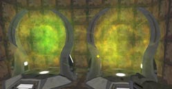
Here's my go at it. To the left, vanilla teleporter.fx - both func_fx use the same color key (1 0.7 0).
Image
Save teleporter_col.fx in effects/mp/ and assign a func_fx _color of 1 0.7 0 (increasing the green higher will make some bits shift out of yellowish to more-than-enough-green) in the editor.
Voila, golden tele :)
Last edited by hemostick on Wed Jan 04, 2006 2:34 am, edited 3 times in total.
pjw
Posts: 860
Joined: Sun May 07, 2000 7:00 am

Post by pjw »

This is feeling pretty cool. I think the RG is okay as-is in the first version--might be even more okay if you sink the tele to reach it back a little deeper to even make it more dangerous. Performance seems quite good as well--nice job. :)

Suggestions:

1. Maybe add a little pinkish-reddish glow around the surface of the blood/acid/goo?

2. The sloped pipes that you can walk on need some work. They look just sorta jammed in there and have no real fittings or anything (also, the one needs to be lowered/extended since you can see inside it :) ).

3. I'd really like to see this expanded just a bit more if you're amenable. Right now it feels like there are just two areas--the RL area and surrounding stuff, and the tele-to-RG/RG off in a second area. It feels like it could be a solid Tourney map, but it feels a bit small for DM. Maybe a third "area" off behind GL, or off behind RG, either way? (Or even under either of those areas...or above...)

4. You don't need to extend your sky brushes up like that for the two lights you have set off in the atmosphere. :) I think you should just be able to put a small caulk box around the light entity to prevent leaks... I also notice that you're using projected lights almost entirely; is there any reason for this, or is it just a preference, or...? I also notice that none of your lights have an assigned texture--you're doing yourself a disservice if you don't take this step, since the default texture is considerably darker and less interesting than some of the others. rav_squarebevel_02 is a nice bright-but-not-too-harshly-edged choice for general lighting.

5. I think you'ld be able to tone down your ambient a bit and have the level look better--brightness is about 100 now, and I think you could tone it down to half that and mess with the rest of the lighting a bit to compensate--normals would get a lot more pop. I noticed on my recent level that things looked a lot nicer when I took this step.

[Edit: Oh yeah, and the little plat overlooking the RG tele (on the r as you're facing tele) seems really weird and empty--maybe just add some ammo or a couple of health shards, or something?]
Last edited by pjw on Wed Jan 04, 2006 2:12 am, edited 1 time in total.
I beat the internet; the end guy is hard.
SonicClang
Posts: 209
Joined: Sun Mar 28, 2004 8:00 am

Post by SonicClang »

I don't have time to play this tonight, but I just wanted to say that the screenshot you posted looks really cool. I can take a run through tomorrow night.
The number 1 cause of death in games is panic.
[img]http://webpages.charter.net/sonicclang/small.jpg[/img]
StormShadow
Posts: 557
Joined: Wed Feb 16, 2005 8:10 pm

Post by StormShadow »

hemostick wrote:If you really want a yellow teleport effect, you could always modify a copy of the func_fx =)
thx, I will certainly add that that :)
pjw wrote:I'd really like to see this expanded just a bit more if you're amenable. Right now it feels like there are just two areas--the RL area and surrounding stuff, and the tele-to-RG/RG off in a second area. It feels like it could be a solid Tourney map, but it feels a bit small for DM. Maybe a third "area" off behind GL, or off behind RG, either way? (Or even under either of those areas...or above...)
I thougt about expanding.. but I expanding an existing layout has never really worked well for me. Plus the focus is 1v1, whether or not it works as an ffa doesnt concern me too much :)
pjw wrote:You don't need to extend your sky brushes up like that for the two lights you have set off in the atmosphere. I think you should just be able to put a small caulk box around the light entity to prevent leaks
Okay, ill give that a go. Im just concerned that it wont show up properly... like, if its blocked, it wont cast? Ill mess around and see what I can do. The .map file does look pretty ghetto with those big ass towers encasing the lights.
pjw wrote:I also notice that you're using projected lights almost entirely; is there any reason for this, or is it just a preference, or...?
In short, yes :) Most of my main lights are overhead lights, and I think they look better this way. I love the shadow effect as well, even though I know 90% of ppl who play this map wont see it.
pjw wrote: I also notice that none of your lights have an assigned texture--you're doing yourself a disservice if you don't take this step, since the default texture is considerably darker and less interesting than some of the others. rav_squarebevel_02 is a nice bright-but-not-too-harshly-edged choice for general lighting.
I was completely aware that I had this option! Using textures on the lights never even crossed my mind. Great tip, I will definitely implement this.
pjw wrote:
5. I think you'ld be able to tone down your ambient a bit and have the level look better--brightness is about 100 now, and I think you could tone it down to half that and mess with the rest of the lighting a bit to compensate--normals would get a lot more pop. I noticed on my recent level that things looked a lot nicer when I took this step.
I will tone it down a bit, but I really do want it to be functional as a competetive tourney map, i.e. - playable first, pretty second. I also think that the lighting is relatively realistic considering the amount of sunlight I have - I simply dont think shadows would be especially dark. Hell, I dunno.. I will tool around with it...

Thanks a lot!
pjw
Posts: 860
Joined: Sun May 07, 2000 7:00 am

Post by pjw »

StormShadow wrote:Most of my main lights are overhead lights, and I think they look better this way. I love the shadow effect as well, even though I know 90% of ppl who play this map wont see it.
Are you aware that you can get exactly (well, maybe not *exactly*, but eh) the same effect if you pull the centers out on simple volumetric lights? (e.g. check the little "center" box and pull the pink dot around--you can pull the center *way* outside the volume itself if you want long cast shadows). Plus the regular volumetric lights are more flexible and a lot more friendly to tweak, IMO.
StormShadow wrote:I was completely aware that I had this option!
LOL. I just found the typo funny. :)
StormShadow wrote:I will tone it down a bit, but I really do want it to be functional as a competetive tourney map, i.e. - playable first, pretty second. I also think that the lighting is relatively realistic considering the amount of sunlight I have - I simply dont think shadows would be especially dark. Hell, I dunno.. I will tool around with it...
Just know that seriously competitive players are going to have their brightness cranked and shadows turned off anyway, so don't be too concerned. In any case though, you could have pretty much the same brightness almost everywhere--just less ambient and more directional light to help the normals/spec.
Oeloe
Posts: 1529
Joined: Fri Mar 19, 2004 8:00 am

Post by Oeloe »

Yeah, forgot to mention i got 60 FPS _everywhere_ on your map with a radeon 9800. No fps tweaks. :)
StormShadow
Posts: 557
Joined: Wed Feb 16, 2005 8:10 pm

Post by StormShadow »

pjw wrote: Are you aware that you can get exactly (well, maybe not *exactly*, but eh) the same effect if you pull the centers out on simple volumetric lights? (e.g. check the little "center" box and pull the pink dot around--you can pull the center *way* outside the volume itself if you want long cast shadows). Plus the regular volumetric lights are more flexible and a lot more friendly to tweak, IMO.
No, I was not aware at all. I guess you learn something new every day :) I may implement this, but I may not have time to experiment much, as the contest is over very soon and I have a ton of other stuff to fix. Thanks for the tip though, I will certainly get some use out of this in the future :)
pjw wrote: Just know that seriously competitive players are going to have their brightness cranked and shadows turned off anyway, so don't be too concerned. In any case though, you could have pretty much the same brightness almost everywhere--just less ambient and more directional light to help the normals/spec.
Gotcha.
Oeloe wrote: Yeah, forgot to mention i got 60 FPS _everywhere_ on your map with a radeon 9800. No fps tweaks.
Glad to hear it :) I was concerned that some of my recent additions may have hurt the performance a bit, but I guess not. Performance is a one of the things im being judged on, so its key to keep everything reasonable.
User avatar
hemostick
Posts: 203
Joined: Wed Feb 14, 2001 8:00 am

Post by hemostick »

Yeah, this runs supersmooth, and game flow seems fast. I tend to hit low ceilings next to ramps in a few places though.
Post Reply