Mostly I like the layout quite a bit--lots of cool over/under and interesting angles of attack, but a few parts of it confuse and/or frighten me...

This view here is one of the ones that's great! Shooting someone in the back of the head as they're trying to get to the tele will be fun. I'm not crazy about this tele going to half of the linked pair, rather than it's own destination though...that's always just felt weird to me...

Is it intentional to allow the player to lurk up here where I'm standing?

I agree with Kaz...that little ledge makes it pretty easy to get MH, and also looks weird without something on it...

I kept wanting to rocket-jump up on top of there. Maybe just take that on up flush with the ceiling and redo the sky-window dealie into an L-shape?

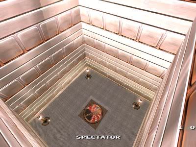
Target on that jumppad needs fixage
badly. You can get off up at the right if you really work it, but it feels really bad. Jumppads should never require english to get somewhere IMO...

This is really tight and clumsy when you're trying to jump down and head down the stairs. I didn't take time to noclip around, so don't know if it's possible, but it would be really nice to move that wall back off a bit so you don't bash into the wall trying to hop down into the stairway.

I'm not real crazy about the lift here--I think you could do something a bit more creative... (yep, that's vague)
Hope this helps. I'm looking forward to seeing this with a bit more coherent texture scheme--maybe something custom? If you're going to try to stick with mostly stock texures, I would at least get rid of the bright shiny metal bits--they clash badly with the more gothic stuff IMO.
I beat the internet; the end guy is hard.