Shared Map

Discussion for Level editing, modeling, programming, or any of the other technical aspects of Quake
Post Reply
Magnus
Posts: 529
Joined: Wed Feb 16, 2005 6:38 pm

Post by Magnus »

Sweet. More feedback. Thanks all.

OK, here is an update to that immage.

More notes below.

Image

The rust red lines I pointed out there are the level of the floors. I see both upper floor and lower floor being made of see through grating built in a ring going around the big colum of rock in the middle of that room.
So on the upper floor you would be able to see down to the lower part of the room, but not be able to shoot anyone you see down there and on the lower floor you would be able to see the lava just below your feet through the grating, but no damage would come to you because it is built to be something like 16 units above the lava surface.
So if you see the flag carrier go through above or below you would not be able to attack them, but you would have a general idea of what direction they went.

The base area is WAY too open. I mentioned in a previous post that a proper base would need to be built. That area where the flag is located is just a sort of place holder for whatever kind of structure we come up with for the base proper.

Once we have a general map layout that seems like a good one that we all agree on I will be happy to focus on the flag room and as well as any other rooms and try to come up with further detailed structure layouts for the areas.

I agree that it should have irregular walls and such for a more organic feel. I figure a model or something for the tunnels and rooms would be a good idea.

Obsidian has a good point. I did leave few areas for vertical play. The middle ground room is about it other than that small room along the side paths with the JP.
I can try to quickly build a rough basic map of what I have in that layout so we can run around in it and get a feel for how it flows and what should be placed where.

If everyone would like that just let me know.

Well I am off to try to crate or adjust some space that will allow for some good vertical play.
Uh, well....good luck with that. :shrug:

[img]http://i57.photobucket.com/albums/g228/Magnus3204/forumheader.jpg[/img]
zZCastleZz
Posts: 58
Joined: Sat Jun 23, 2007 3:06 am

Post by zZCastleZz »

AH that looks like a really great layout!

Only two things that I noticed that are fairly slight in my opinion.
Ill try to write up a higher detail description if you dont under stand what I mean.

1. the north and south sides of area 1 have one slight thing that sticks out to me. It appears that the tunnels on the north and south sides have tunnels that are directly above/under each other when I think it might be a little better if the tunnels were offset a litte bit and allowed for them to possibly see int each other a little bit. The ends of both tunnels should kind of meet each other and the people above could see down into the tunnel below for a short distance.

2. center atrium area has one slight thing that sticks out to me. The north and south sides of the atrium it might be just a tiny bit too easy to bypass the area by simply staying close to the wall. Its possible that it would be just a tiny bit better for the level in general if the north and south walls came in just a bit more and the center room was like 15% more round than oval.

I like the layout though. I think that it looks really quite nice indeed.
While it is a technically sound design in that it has very little in terms of visibility problems there is one thing that I do notice. The layout is very round as built entirely with curves when a level designed in quake 3 might tend to stay on 90s and 45 degree angles while only using curves in key places.

Is the plan to build the level as a series of organic caves? That would mean the level would be best built mostly in max with brushes as visibility culling. IMO for this project it would be best to keep it a little more simple and prepare to build the level with mostly brushes. It would just be the safer way to go and save a lot of you some headaches. I could be wrong though!

who is going to be the one to build this fine levels core layout in GTK?
-The Castle
Magnus
Posts: 529
Joined: Wed Feb 16, 2005 6:38 pm

Post by Magnus »

OK now it gets a bit more convoluted. Sorry.

Here is the once again latest version of this layout.

The center room is now round providing more play area.
With the halls that entered from the north and south curved in the opposite direction they enter into the room from farther apart so it will be less tempting to bypass this area by going from one hall to the one right next to it.
I added 3 rooms below the entire thing. These add more of a vertical element to the play.
I also added some JP to some of the pre existing areas for additional vertical play.
I hope you can get the idea of the layout for these rooms. I will post an explination with broken down views of each area if needed.

If you look close you will see some markers.
The yellow dots are YA
The red dots are RA
The white rings are wepon placeholders
The bright blue ring in the middle could be either a quad or more likely a Mega Health.
The blue and red squares are teleporters for the blue and red sides and the red and blue lines show what ones are connected.

Image

I really feel at this point if everyone likes this layout then I should make a very rough map of this layout so we can go in and get a feel for how well it works and so you can all see and truly understand what is going on in there.

@zZCastleZz:

Thanks for the nice comments :)

Yes from what has been discussed the map is to have a very organic caves and naturally formed rooms feel to it.
So yes as I said above I can only see this being done justice by making a model or something to that effect, but it may turn out to be workable using brushes.

Not sure as to who will have the final build on this map.

I can immagine what you mean about the offset of the tunnels and being able to see into the lower from the upper just befor you enter the room. I will work on that later.

Well sorry I didn't go into more detail with descriptions as I have with the rest of the immages. I am a bit tired. I hope you all understand. :)

I would really like a lot of feedback, comments and such this time before I go on.

Thanks.
Uh, well....good luck with that. :shrug:

[img]http://i57.photobucket.com/albums/g228/Magnus3204/forumheader.jpg[/img]
zZCastleZz
Posts: 58
Joined: Sat Jun 23, 2007 3:06 am

Post by zZCastleZz »

My gut feeling on this is that you have a great level layout however you should hold back for a little bit before building. A lot of potential for the level to be cool here but will everyone else who helps out be fluent enough in using max and exporting ASE models for use in Quake 3 to be able to be of much help?

Its possible that you want to do a couple things, and maybe in wrong maybe I'm not, but I think the idea of making the level model heavy and fully organic might be a possible mistake. Maybe you will want to plan the level around being more brush based and using models as set pieces rather than have them be your base geometry. Although if other people who will be working with you are comfortable with the idea of building and texturing model peices then by all means go right ahead.

Also here in this picture there are a few spots I notice in the layout that pinch a little too much.

Image

I marked the spots with red. I know it might seem a little strange that I'm pointing those out but to build connecting areas like this can end up being somewhat unclean.

With the above comment about the level being model heavy vs brush heavy I also want to bring to your attention that it can be fairly easy mess up your visibility culling on smoothly curving tunnels.

You wouldn't want to be able to see into rooms that are on the outside of the center atrium but with the current drawings it would be very possible for your line of sight to extend too far.

It seems like you should nit pick a little more before the building starts to happen. Though I understand you most likely have a good idea of what you want to build in your minds eye. Its possible im looking at the layout much too literally.

It seems as though the level itself would benefit if you removed some 25% of the risky design and added 25% more standard quake 3 style geometry. the other 50% could be ambitious and all that good stuff. IE: really badass staircase for the bottom area and really awesome cave pieces for the whole level ect ect..

know what I mean?

edit: Ah I just realized that you did say that everyone discussed doing the organic caves stuff. Sorry ! That could have been a much shorter post lol..
-The Castle
wattro
Posts: 375
Joined: Mon Feb 20, 2006 1:12 am

Post by wattro »

how big are the CTF games you are looking for? 4 v 4? 6 v 6? 8 v 8? think about your targets

While what you have looks like a good start, I am not a fan of the hallways or the layout. The middle rooms and the flag rooms are the only cool rooms.. The hallways seem pretty long and devoid of gameplay. Hallways that don't have any gameplay should be kept very short (eg: act as vis or rail blockers only). I'm not sure I understand the purpose of the lower rooms besides as an attempt to add vertical gameplay (that or I don't really understand what is being drawn). you can achieve vertical gameplay in other ways and my initial thoughts are that you have too many TPs and JPs.

if i were to capture either flag, i would likely take the sidepaths and try to skirt through the middle sticking to one side (it's not that big, so criss-crossing would be easy too) and run the sidepaths the whole way.

what about rotating the bases, and moving them so they are flipped/mirrored of each other (blue is rotated 90 degrees, and in the upper left corner of your map... red is rotated 90 degrees the other way, and in the lower right corner of your map). get rid of now shortest routes (from base to center), and use the opposite ends as power-up zones/control points (enlarge them). Make everything a bit tighter and make each path interact with other paths more so.

lastly, lava is cool, but it shouldn't be the nemesis in your map. this is my opinion and i don't know what the actual plan for it's effect on gameplay will be. It's ok for it to factor in here and there, but it should serve more for aesthetics and challenges around trick jumps than it should for being a considerable obstacle.

take with grain of salt...

edit: that all being said, there is something to say about how easy it is to put together a smaller map than a bigger map.
ix-ir
Posts: 192
Joined: Wed May 16, 2007 9:43 pm

Post by ix-ir »

Those lower level rooms will not work well. The map's also gaining far too many bounce pads. I'd suggest either flatten the top level and make a new lower level or turn the current top level into 2 fully realised levels. Good gameplay comes from clean, simple design.

For the decorative side take a look at lun3dm4 by lunaran and read his history of its development: http://www.lunaran.com/page.php?id=20

In essence: get the gameplay worked out, only concentrate on that and when you're done work in the decorative stuff. Decoration works best if kept a little apart from the player. It's much harder job to modify the level at a later date if you use models.

As to how big 4v4 and 5v5 are the only kinds of CTF that are played. If the map is well made it should be able to deal with both.
Magnus
Posts: 529
Joined: Wed Feb 16, 2005 6:38 pm

Post by Magnus »

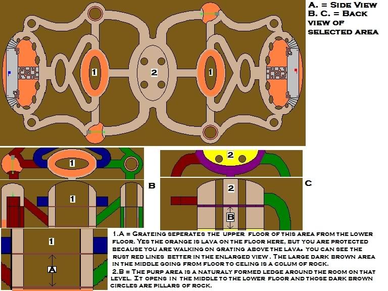
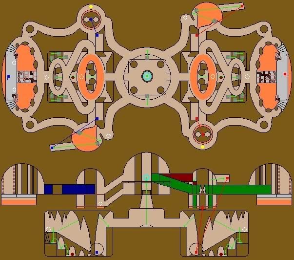
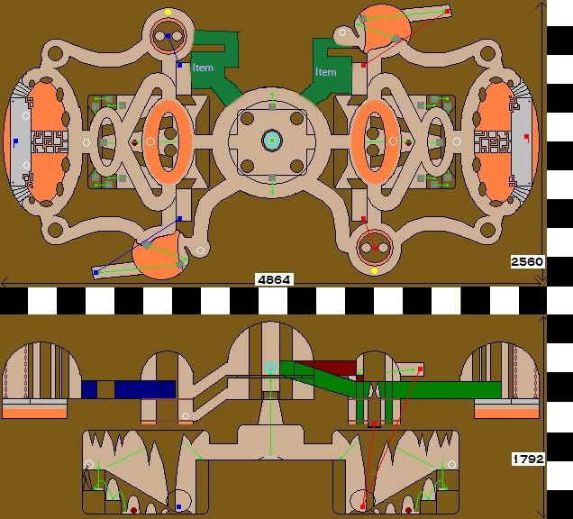
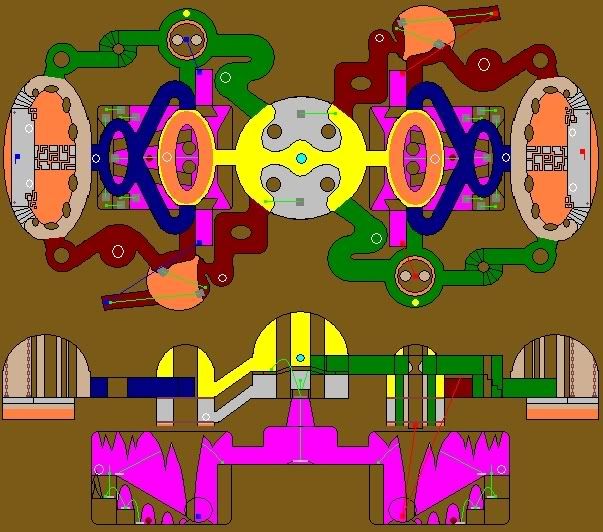
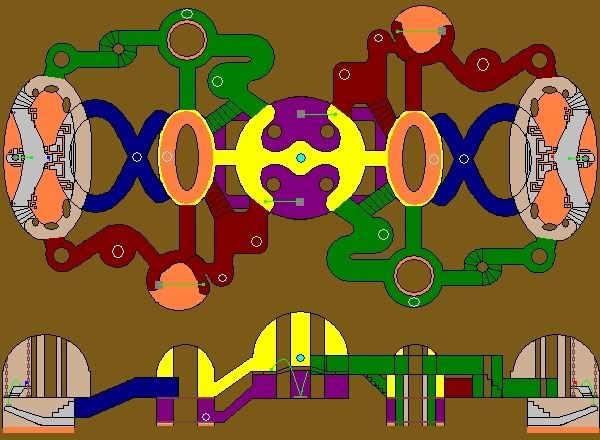
OK , first here are some redone versions of the most recent layout.

This gives some idea of scale. For the halls/tunnels to be wide enough to work it turns out that they are a bit of a long strech at a time.
Each of the black or white squares would be 256x256.

Image

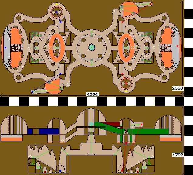
Color added to help seperate and identify areas.

Image

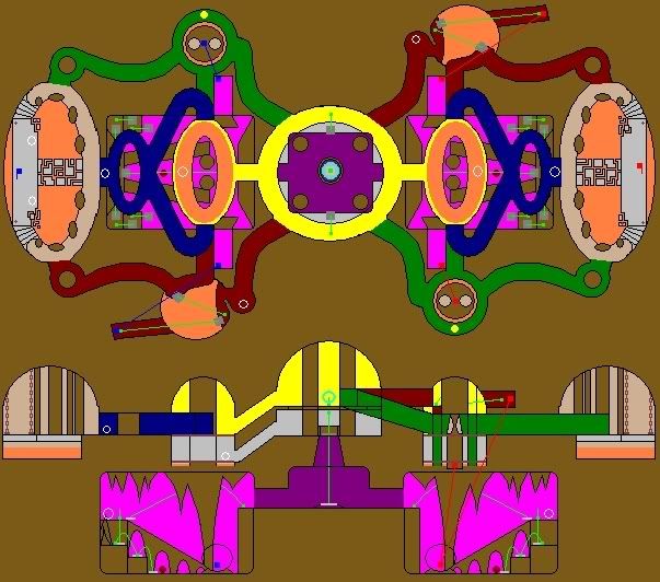
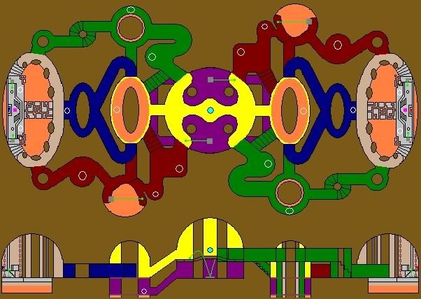
Some side views to make some areas more clear.

Image

Now, first yes I added those lower rooms for nothing more than added verticle play as it has been suggested that more verticle play was needed. I to kind of felt they were kind of lame, but ....

The sharp corners are just a result of quickly drawing the layout. No need for them to be so sharp in the atuall build.

As far as the map being made of models I just figured from some of the comments in this thread that models were the plan. I must have misunderstood. Brushes or Models are fine with me as long as it works well and looks good.

I am not the only voice on this PTM the others may have a different idea, but I was thinking 4 v 4 easy and 6 v 6 pushing it.
Although in my opinion if a map is built with 12 v 12 in mind (not in size, but rather in optimization) then any number less than 12 v 12 would run very smooth.

I realy didn't see the hallways as being that long untill I took a look at my immage that shows some scale. I was seeing it as not taking more than about 4 seconds to run the length of any of the sections of hallway.

As for JP if you factor in the lower rooms there are a bit too many. Although those rooms can be removed.
For the Teleporters there are only 2 red teleproters and 2 red teleporter destinations and 2 blue teleproters and 2 blue teleporter destinations.
wattro wrote:if i were to capture either flag, i would likely take the sidepaths and try to skirt through the middle sticking to one side (it's not that big, so criss-crossing would be easy too) and run the sidepaths the whole way.
Yea I been thinking the same thing for some time now. I pictured myself running the flag and though were would be some altenate paths I would be forced into due to enemy players I kept seeing it as stick to running along one side all the way.
I realy feel this needs to be addressed and some of your suggestions sound like something to consider and try.

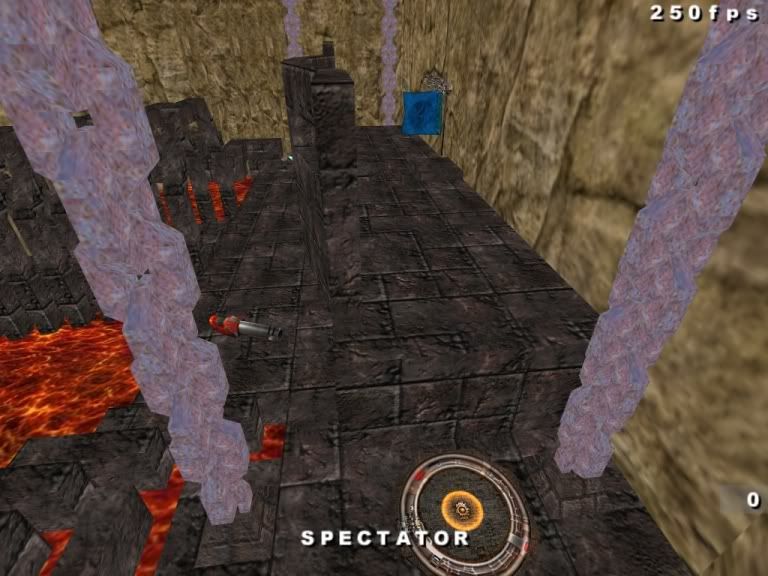
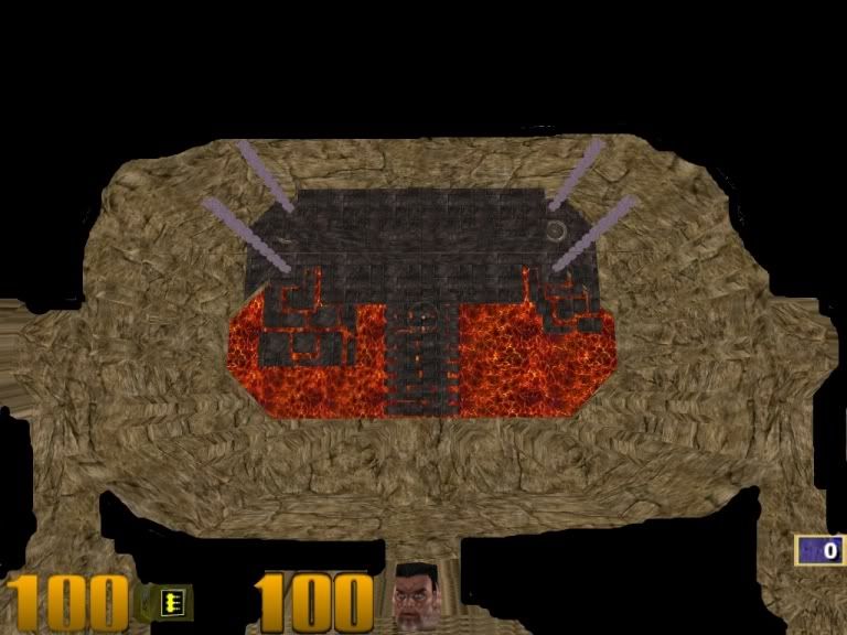
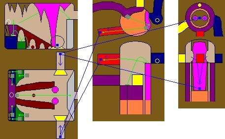
As for the lava no there is realy no place that I see the lava as an obstacle. I placed it there for looks and atmosphere only. The lava in the flag room is only a problem if you decide to close your eyes and run around resulting in falling off of the ledge...lol and the lava in the pre-middle room is covered by a metal grate floor there is no way to be damaged by the lava here.
ix-ir wrote:Those lower level rooms will not work well. The map's also gaining far too many bounce pads. I'd suggest either flatten the top level and make a new lower level or turn the current top level into 2 fully realised levels. Good gameplay comes from clean, simple design.
I totally agree. As I said above they were just an attempet at adding some verticle play. I thought they were lame, but I was too tired and lazy at the time to come up with any better. :p
ix-ir wrote:For the decorative side take a look at lun3dm4 by lunaran and read his history of its development: http://www.lunaran.com/page.php?id=20
Nice. That looks much easier to build than what I thought we were thinking about.

I was thinking we were looking at something like this:

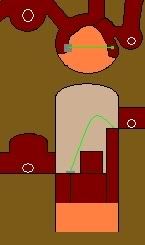
This is a cave room I created for a Morrowind Mod I built.

Image

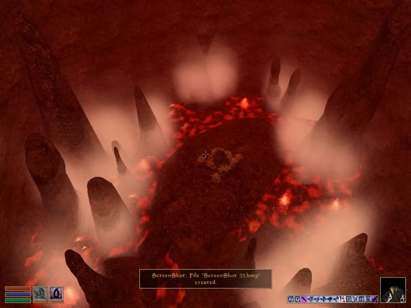
See how rounded and natural and organic it is. This would be way harder to produce in the Q3A engine without models or brush heavy terrains.

Ok now, with all of that in mind where should we go from here?

I assume we dump the 3 lower level rooms? Work on some imaginative ideas to prevent players (and bots) from being tempted to restrict gameplay to the sides of the map and draw them into the center more and those center rooms?
Work on some ideas to shorten some halls? They are already curved to prevent rail sniper troubles so there is just the as said (boring) factor wich I agree with that needs to be dealt with.
Last edited by Magnus on Wed Jul 11, 2007 11:25 pm, edited 1 time in total.
Uh, well....good luck with that. :shrug:

[img]http://i57.photobucket.com/albums/g228/Magnus3204/forumheader.jpg[/img]
Silicone_Milk
Posts: 2237
Joined: Sat Mar 12, 2005 10:49 pm

Post by Silicone_Milk »

My first impression to shorten the long curved halls is to use short angled halls connecting a small middle room with some sort of item(s) to make the long run worthwhile.

Image

Forgive my crappy drawing skills. I just woke up. Using a mouse. No coffee :icon32:

But here I added some angled halls with a 180 degree turn to join the areas.

You could make it look like there was some sort of mining company in these caverns or something or have it be a nuclear waste dump site. You could make these rooms look like they're built into the rock and fill them up with barrels and little stuff like that.

Just a thought.
Magnus
Posts: 529
Joined: Wed Feb 16, 2005 6:38 pm

Post by Magnus »

Nice idea Silicone_Milk. It actually inspired a few more ideas.

Here is the next ammendment to this layout.

Image

I still would like feedback on my lats post as well as this one. Thanks all. :)
Uh, well....good luck with that. :shrug:

[img]http://i57.photobucket.com/albums/g228/Magnus3204/forumheader.jpg[/img]
boilingoil
Posts: 48
Joined: Sat Apr 28, 2007 6:28 am

Post by boilingoil »

I like what you've done with the halls. I think we should ditch the bottom room and build an alpha. It wouldn't be hard to add it if it was really needed, seeing as there is only one way in and out.

ix says: "... or turn the current top level into 2 fully realised levels."

I think that would be a good idea.
[url=http://www.quake3world.com/forum/viewtopic.php?t=30543]OILDM1 is BETA5![/url]
Magnus
Posts: 529
Joined: Wed Feb 16, 2005 6:38 pm

Post by Magnus »

OK. Here is hopefully the final on this layout.

The white circles are suggested item placement spots and the bright blue dot in the center as explained before could be a mega health or as ix-ir said a quad.
I decided to break that ledge that was going all the way around the middle room and instead connect the two sides with a bridge. I think this addresses the temptation to just stick to the sides of the map.
It all looks nice and clean with no long boring or sniper friendly halls some verticle play a few crunch spots and plenty of oppertunity to double back.

Image

If anyone needs an explination of any of the areas I will be happy to do so.

I will also again be happy to build a very rough map of this layout so we can go in and have a look and get a feel of the flow and gameplay. Just let me know if any of you want me to do so.
Last edited by Magnus on Sun Jul 08, 2007 6:56 pm, edited 2 times in total.
Uh, well....good luck with that. :shrug:

[img]http://i57.photobucket.com/albums/g228/Magnus3204/forumheader.jpg[/img]
a13n
Posts: 1672
Joined: Thu Feb 10, 2005 2:08 am

Post by a13n »

Cool(the last pic). :icon31:
I agree with removing the lowest area and accompanying teleporters, not just because they look harmful to bots but also they seem to be a bit confusing.
wattro
Posts: 375
Joined: Mon Feb 20, 2006 1:12 am

Post by wattro »

spouting off some thoughts:

-i like the simpified layout
-no lava in the middle?
-only 3 ways to pass through the middle? it looks like the trick is to stay up top but lots of the action will be on the ground floor - everything funnels here, so it's an obvious control point... how will wrestling control of this point happen? how will defending this point happen? can i easily rocket jump across and bypass all the action?
-what's the difference between purple and red? does red lead into purple? and does green lead into yellow? (if so, make them the same colors)
-how does this layout compare to the popular CTF maps? what do they have that this layout doesn't and what do you have that they don't
-this layout is a lot better for visblocking and rail blocking... just how big are those flag rooms? how big are the halls comparatively? if that means the halls are too long, condense them
-are the hallways too flat and not enough vertical options?
boilingoil
Posts: 48
Joined: Sat Apr 28, 2007 6:28 am

Post by boilingoil »

I say go ahead with the alpha, that way we can get a feel for size and gameplay.
[url=http://www.quake3world.com/forum/viewtopic.php?t=30543]OILDM1 is BETA5![/url]
Magnus
Posts: 529
Joined: Wed Feb 16, 2005 6:38 pm

Post by Magnus »

wattro wrote:spouting off some thoughts:
-i like the simpified layout

Thanks. :) It is a lot easier on the eyes and feels a lot cleaner now.

-no lava in the middle?

No. Action should be the focus here. Let the gibbs provide something neat to look at....lol.

-only 3 ways to pass through the middle? it looks like the trick is to stay up top but lots of the action will be on the ground floor - everything funnels here, so it's an obvious control point... how will wrestling control of this point happen? how will defending this point happen?

Actually I thought about that and for now I will leave the answers to that up to those that are playing the map. They should be good enough to develop a strategy that fits the area. There are two entry points on top for each side and one entry point on the bottom for each side with a JP to get up on the the top level at the north and south as well as items will be provided to let any good players come up with a good plan of action.
It seems to me the environment of a map should never decide who has control of an area. Let the players skill decide that.
Keep in mind that this layout only shows the cave rooms and tunnels, but there is still blocking to do inside i.e. the build of a proper base structure and any other interesting and/or functional structures.

can i easily rocket jump across and bypass all the action?

I don't think so. What is the maximum distance that one can potentially rocket jump and what is the arc on that jump? If they tried to rocket jump there would they hit the ceiling interrupting their jump? Also as I said with additional structures still to be built inside the areas there is always the possibility of stalactites hanging from the ceiling blocking a rocket jump.

-what's the difference between purple and red?

Red is connected to the level above and purple is the lower level in this room.

does red lead into purple?

No.

and does green lead into yellow? (if so, make them the same colors)

Yes. If I make the yellow the same color as the green then it would not show as well that red leads into this area as well. I though that it was fairly evident from the combination of the colored top and side views that this is the case. Guess I was depending too much on folks seeing and remembering the images on back in this thread and just getting the point from the combination of them all.

-how does this layout compare to the popular CTF maps? what do they have that this layout doesn't and what do you have that they don't

Well for now this will be the alpha build and so far it is all what feels right to the team. As long as we truly want the map to be useful and focus on great flow and game play, good looks and effects, great bot support and item placement and good stats like r_speeds, fps and trying to not burden ping times with too much info then it should turn out to be something that players will make popular.
Although taking a look at other mapping successes as well as failures is always a good idea. :icon25:

-this layout is a lot better for visblocking and rail blocking... just how big are those flag rooms?

Roughly 1280x768 units. Although the room is broken up into smaller portions by pillars of rock and will be even further broken up by structures. The flag room as it is in the image is just a volume that will contain other volumes.

how big are the halls comparatively? if that means the halls are too long, condense them

Roughly 128 wide and 256 to 512 long before they make a sharp turn. So they are fairly short. There are still 4 somewhat long halls, but 2 of them are on an angle and 2 flat.
I don't know about the rest of the team, but I don't want to shut out railers/snipers all together. That would be unfair to and turn away a fraction of potential players as sniper is their style. I want the flag runner to have a chance to get away with the flag, but not a guaranteed capture. If the rest of the team disagrees with this we can change it again.

-are the hallways too flat and not enough vertical options?

No there are at least one vertical and one horizontal option for each hallway if not more. Well there is one hall that is totally horizontal, but it is so sectioned up and branched it really doesn't need any vertical.

Consider though that we may like the layout image, but get inside the map and find that some things just won't fit or work or that we just don't like it at all and have to start a new layout.
All part of the fun of the process. :icon25:

Thanks for giving us so many good things to consider. :)

OK, I will build an alpha1 of this layout. It will be very rough and lots of angles instead of actual curves at this point. Basic textures and some lights not to be pretty but just so you can see where you are going and what is around you.
Uh, well....good luck with that. :shrug:

[img]http://i57.photobucket.com/albums/g228/Magnus3204/forumheader.jpg[/img]
sock
Posts: 424
Joined: Sat Sep 09, 2000 7:00 am

Post by sock »

Image

Suggestions/Idea

* I have never been a fan of dying to the environment in Team matches, it is just frustrating. Lava=no fun. Having small amounts lava in a map is ok, but you should always give the player room to move.
* The layout you are suggesting seems to consist of very long corridors, the game will be too slow, you need to crunch the layout.
* Flip the flag room around so players can use the entrance corner to the flag room for cover.
* Having items next to the flag is a bad idea, the defenders should be forced to move around the flag room, not sit on item spawns waiting.
* Your layout does not have much vertical paths, drop downs would be cool to add. Nice places to defend and wait for FC.
* A lower route out of the middle area would be nice but funneled into a JP so there is a sound clue for defenders.
* I especially like the idea of a JP from low to the Flag to spice things up and keep the flag defenders on their toes.
* The red route (bottom of image) with lava and JP seems linear, maybe split the room with height and have a stair/JP set either side for choices.

Sims
Well he was evil, but he did build alot of roads. - Gogglor
My [url=http://www.simonoc.com/]Website[/url] & [url=http://twitter.com/SimsOCallaghan]Twitter[/url]
ix-ir
Posts: 192
Joined: Wed May 16, 2007 9:43 pm

Post by ix-ir »

That's a very solid looking layout and sock's suggested layout takes it a step further. The flag room still needs more, if there are 2 guys there with RG and LG how can you make a move on the flag that's not just deathmatching your way through?

I assume sock's map is asymmetrical just to show the changes, the map must of course be mirrored on the centre line, asymmetry between the halves is an attractive idea but doesn't work.

The yellow room between the base and mid would be a good location for a 2ndary powerup for each team, probably a regeneration. The blue and green enterances to that room could use a little seperation, perhaps a wall between them that projects into the room.
boilingoil
Posts: 48
Joined: Sat Apr 28, 2007 6:28 am

Post by boilingoil »

Sock's suggestion does a great deal for the hallways, I agree. Keeping them from being too long and seeing too far with the high/low is cool. The idea of the blue path ending in a ledge is cool too, kind of like a lookout point.

This is my idea for the flag room, I think it adds a little more vertical play, and balances out offense/defense a bit.

Image

Here's an quick/ugly 3d view i drew in Ps if it helps.

Image
[url=http://www.quake3world.com/forum/viewtopic.php?t=30543]OILDM1 is BETA5![/url]
Magnus
Posts: 529
Joined: Wed Feb 16, 2005 6:38 pm

Post by Magnus »

Yea I liked some of sock's suggestions as well.

As you can see below I already addopted some of it into the map.

I would like to say that quite a few folks keep saying the halls are too long and the map is too big. Let me assure you they are not.

Now. We have a bigger problem guys. I am just about finished with the rough alpha and I decided to stop and go in and see how it was bacause it was looking kind of off as I built it and as big as that flag room appears to be once you get into it the thing is really small.

As you can see in the immage below the pink square near the flag in the flag rooms is the actuall size of a info_player_deathmatch in the room. And as you know that closely matches the size of a player ingame.

Image

Here are some actuall screen shots and as you can see from the flag there and the RL and the PG in the background this room is way too tight and closed in. Not at all as open as 1280x768 would seem.

Image

Image

I really like the drawn image you made boilingoil. :icon14: I think we should go with that flag area. I will change the flag area to match this and that may clear up our space problem in that room. Otherwise we are just going to have to make the room bigger.

Oh and if you look at the immages here you will see that the room in the red hall with the jp over the lava is actually already a high ledge that can be used as a point to wait to ambush the FC.
See that JP doesn't toss you across to a ledge that is on the same level as the JP it tosses you up to a ledge that is a full level higher.

Image
Uh, well....good luck with that. :shrug:

[img]http://i57.photobucket.com/albums/g228/Magnus3204/forumheader.jpg[/img]
Silicone_Milk
Posts: 2237
Joined: Sat Mar 12, 2005 10:49 pm

Post by Silicone_Milk »

Are those chains made out of brushes?
Magnus
Posts: 529
Joined: Wed Feb 16, 2005 6:38 pm

Post by Magnus »

Yes they are. Any special reason you ask? :paranoid:
Uh, well....good luck with that. :shrug:

[img]http://i57.photobucket.com/albums/g228/Magnus3204/forumheader.jpg[/img]
Magnus
Posts: 529
Joined: Wed Feb 16, 2005 6:38 pm

Post by Magnus »

Oh, by the way here is an updated version of the "final" layout...lol. Guess it wasn't so "final".

I added in boilingoil's flag area and I moved where the blue halls enter the pre-mid room so they have more distance away from where the stairs from the green and red halls enter this room like ix-ir said. Good ideas. :)

Now you can see better that those secondary branches of the green and red halls go into the lower level of that pre-mid room.

Image
Uh, well....good luck with that. :shrug:

[img]http://i57.photobucket.com/albums/g228/Magnus3204/forumheader.jpg[/img]
Silicone_Milk
Posts: 2237
Joined: Sat Mar 12, 2005 10:49 pm

Post by Silicone_Milk »

No, no reason. Just curious.

(Although I would think that an .ase model would be better suited for the chains)
Magnus
Posts: 529
Joined: Wed Feb 16, 2005 6:38 pm

Post by Magnus »

Oh OK. :icon25:

I was getting ready for a reminder why I shouldn't have done that XD.

The way it is all shaping up we may dump the chains anyway.
Uh, well....good luck with that. :shrug:

[img]http://i57.photobucket.com/albums/g228/Magnus3204/forumheader.jpg[/img]
wattro
Posts: 375
Joined: Mon Feb 20, 2006 1:12 am

Post by wattro »

what about widening the whole map somewhere between 1024 and 2048 units? slice it at the center, it'll let you make the bases bigger and do some cool room stuff in the middle areas... the part where the blue corridors figure 8 into each other could use some spiffining
Post Reply