BJA: KP actually had quiet a few of those colored square neon signs (red, orange, yellow and violet).
http://pcmedia.ign.com/media/previews/i ... pin004.jpg
http://www.3dnews.ru/documents/639/kingpin06.jpg
http://www.sg.hu/kep/1999_08/kingpin3.jpg
KP is a combination of desaturated colors with little splatter of color.
I created that beam from scratch, had to paint the highlights and all. The reference that I had is the image I posted on this forum, can't really use that low quality and broken perspective photo. What I did was use the pen tool to trace the shape, then filled it with texture and started blending in layers. Then highlighted and darkened some areas.
-Method
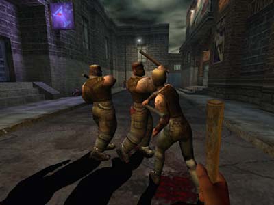
Screenshots
Oh ok, Kingpin was really more colorful than I thought. It's such a long time that I played the game and from what I remember back than I thought it was most grey and brown desurated. Btw. if there will ever be a Kingpin2 I hope you'll be working on it  you did a very nice job to recreate the atmosphere, now when I compare your q4 shots with the screens you posted from Kingpin.
I'm crazy about KP man. Even guys that made it say I should let it go. KP2 was in development by a different studio a while ago, but after Interplay went down they canceled the project. It don't matter. If KP2 is not by Xatrix, then it's not KP2, fo'gettaboudit. Now people that worked on KP got spread all over the industry. Art Director joined Valve and worked on HL2. Senior LD went to id Software. Completely different companies, I tell ya.
Thanks man, I'd really love to work on KP2 (with the core company that made the first).
-Method
Thanks man, I'd really love to work on KP2 (with the core company that made the first).
-Method
-
Strahlemann
- Posts: 35
- Joined: Fri Jan 13, 2006 6:45 pm
Great work Method! I also love that kind of KP feeling in your screenshots. Can't wait to get my virtual presence running around in it. I'm also interested how you'll be able to support the already thick atmosphere with sound.
Very nice. Keep going.
I for myself worked on the 2048³ mapping contest for Nexuiz that hit the deadline today.
My submission is called "Strength" and uses a lot of evillairs eX textures. I'm thinking about a Q4 port.


Very nice. Keep going.
I for myself worked on the 2048³ mapping contest for Nexuiz that hit the deadline today.
My submission is called "Strength" and uses a lot of evillairs eX textures. I'm thinking about a Q4 port.


Floating window is the king.
@o'dium
Do those details have anything to do with gameplay?
This is my sowyd.
Automation of window placement and resizing.
and below is an automation of keyboard scaling and arbitrary rotation.
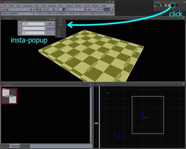
Both of them are achieved with a generic utility.(There is also a custom map save&backup button on the tool bar.)
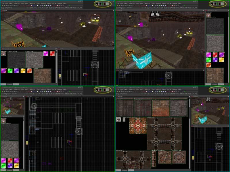
Radaint 1.2.13 can be more comfortable even if its development is dead!
Do those details have anything to do with gameplay?
This is my sowyd.
Automation of window placement and resizing.
and below is an automation of keyboard scaling and arbitrary rotation.
Both of them are achieved with a generic utility.(There is also a custom map save&backup button on the tool bar.)
Radaint 1.2.13 can be more comfortable even if its development is dead!
Re: Screenshots
After spending some more time at the level, Still a lot more to do but its getting better and better
Odium: that looker looks great nice work
Strahlemann: Do a q4 port I would love to try your map out
Odium: that looker looks great nice work
Strahlemann: Do a q4 port
Last edited by g0th- on Wed Aug 08, 2007 11:39 pm, edited 1 time in total.
[url]http://www.g0th.se[/url]
Re: Screenshots
Looks amazing, g0th-, especially the textures. Only suggestion is the varied coloured lighting looks a little off. I would stick with a single colour scheme.
Re: Screenshots
I agree with Obsidian about the lighting. Texturing and modelling looks great!

Re: Screenshots
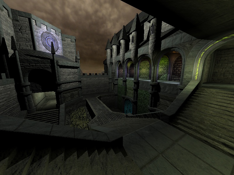
Uhm, maybe I have bad vision or maybe I just don't get this Q4 mapping thing. But I think the textures looks really blury and undetailed. Then the path down in the middle, the texture looks like a rooftexture...
Q3Map2 2516 -> http://www.zfight.com/misc/files/q3/q3map_2.5.16_win32_x86.zip
Q3Map2 FS_20g -> http://www.zfight.com/misc/files/q3/q3map2_fs_20g.rar
GtkRadiant 140 -> http://www.zfight.com/misc/files/q3/GtkRadiantSetup-1.4.0-Q3RTCWET.exe
Q3Map2 FS_20g -> http://www.zfight.com/misc/files/q3/q3map2_fs_20g.rar
GtkRadiant 140 -> http://www.zfight.com/misc/files/q3/GtkRadiantSetup-1.4.0-Q3RTCWET.exe
Re: Screenshots
obsidian and ALMighty I will look into the lightning a bit more and try it with a single color scheme thanks for your inputs.
Hipshot: yes it is a roof texture. I put it there as a placeholder for now. About the textures I agree with you that their are some of them that lacks details most of these textures doesn't have a decent specular map yet. This is my first serious try with textures so I am pretty much picking up a lot of things up as I go along with it. Feel free name any particular textures that you thinks looks bad and I see what I can do about it.
Hipshot: yes it is a roof texture. I put it there as a placeholder for now. About the textures I agree with you that their are some of them that lacks details most of these textures doesn't have a decent specular map yet. This is my first serious try with textures so I am pretty much picking up a lot of things up as I go along with it. Feel free name any particular textures that you thinks looks bad and I see what I can do about it.
[url]http://www.g0th.se[/url]
Re: Screenshots
That is flippin lovely
Some very tiny uneducated comments:
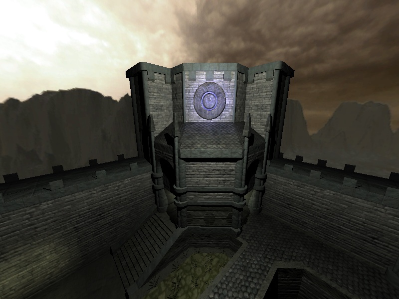
I like the different colour for the lower 'level' it kind of highlights the fact you are in the dungeon area.
The 'cobblestone' texture of the walkway troubles me but can't put my finger on why it just looks out of place somehow, maybe a simpler texture would 'go' with the rest of the map theme. If you keep it, maybe make it 'greener' with a light or make the texture smaller, just a thought, maybe the border is too thick, dunno.
The opposite top wall facing you looks a bit bare. Flag, turret, geometry, decal. Personally I'd go high with a couple of tall flagpoles to give it even more depth.
Maybe place a different texture with a bit of colour inside the frames of the small turrets, this would 'draw' the eye upwards and open up the map a little.
Great work
Edit: forgot to mention I like the way you've made the architecture solid/heavy/purposeful/imposing. I find this is sadly lacking in a lot of maps and is especially important to get right with gothic maps when you have to make it look as if it was made with big/heavy blocks of stone
Some very tiny uneducated comments:
I like the different colour for the lower 'level' it kind of highlights the fact you are in the dungeon area.
The 'cobblestone' texture of the walkway troubles me but can't put my finger on why it just looks out of place somehow, maybe a simpler texture would 'go' with the rest of the map theme. If you keep it, maybe make it 'greener' with a light or make the texture smaller, just a thought, maybe the border is too thick, dunno.
The opposite top wall facing you looks a bit bare. Flag, turret, geometry, decal. Personally I'd go high with a couple of tall flagpoles to give it even more depth.
Maybe place a different texture with a bit of colour inside the frames of the small turrets, this would 'draw' the eye upwards and open up the map a little.
Great work
Edit: forgot to mention I like the way you've made the architecture solid/heavy/purposeful/imposing. I find this is sadly lacking in a lot of maps and is especially important to get right with gothic maps when you have to make it look as if it was made with big/heavy blocks of stone
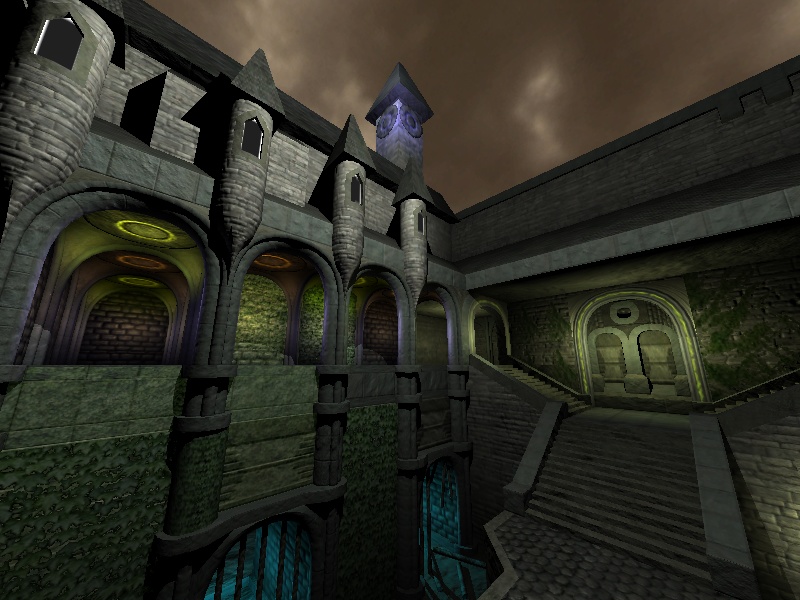
Re: Screenshots
Thanks ppp That is some good suggestions. I think I am going to put a "church window" texture inside the frames of the towers or at least I am going to try to create one
About the bare side of the roof I am not sure what to do there yet. I will play around with it a bit and see what can be done. I am thinking flags/tower bricks atm.
And the cobblestone probably looks out of place because its a roof texture
Some new pictures:
About the bare side of the roof I am not sure what to do there yet. I will play around with it a bit and see what can be done. I am thinking flags/tower bricks atm.
And the cobblestone probably looks out of place because its a roof texture
Some new pictures:
[url]http://www.g0th.se[/url]
Re: Screenshots
few WIP shots from the current build of OverDose.
Whats not on display here, is the sun glare (Hence the tiny sun), tree shadows, and any actual structures in the map. Its a simple test. Lighting and those few tiny bits in there are all simple test media.


Whats not on display here, is the sun glare (Hence the tiny sun), tree shadows, and any actual structures in the map. Its a simple test. Lighting and those few tiny bits in there are all simple test media.


Re: Screenshots
Really looking forward to the first release, O'dium!
[color=#FFFFFF][url=http://maps.rcmd.org]my FPS maps[/url][/color]
Re: Screenshots
That's looking cool, and reminds me of the start of Oblivion...
Re: Screenshots
Already changed the lighting (Knew I would).
I'm now using tables to simulate lightnight strikes, and lightning light, so that when a strike happens in the sky, the whole surface flashes with it. Obviously I've darkened the tones and so on...
Its quite a nice little effect, and when I add the rain effects should be quite sweet
Thanks for the comments guys.
Re: Screenshots
Still working on the lighting, but I changed it to night and also re-did the water:


Re: Screenshots
The water looks great! I also like the sky and overall lighting. Very nice start.
Re:
wow nice work on keeping uniform texel density.o'dium wrote:Just finished two locker models for OverDose, misc map detail. Ones a simple model, the other open for rarer, but finer detail. And yeah, it even has alpha tested coat hangers in there lol:
pretty damn spiffy if you ask me!
- Russell Meakim AKA The Castle
Portfolio: http://castledoes.carbonmade.com/
YouTube: https://www.youtube.com/user/zZCastleZz
Tsu: https://www.tsu.co/zZCastleZz
Twitter: @zZCastleZz
Portfolio: http://castledoes.carbonmade.com/
YouTube: https://www.youtube.com/user/zZCastleZz
Tsu: https://www.tsu.co/zZCastleZz
Twitter: @zZCastleZz
Re: Screenshots
I decided to start on something new today. I wanted to create a new layout and work on something completely independent of everything else I've been working on. Alpha should be available in the next day or two.
[lvlshot]http://www.robotrenegade.com/maps/obq3castiron/screenshots/alpha01_20070821.jpg[/lvlshot]
[lvlshot]http://www.robotrenegade.com/maps/obq3castiron/screenshots/alpha01_20070821.jpg[/lvlshot]