wattro wrote:yeah i like it - lots of fast action =)
Thanks. That was what I was thinking. Smaller map; faster action.
-too bad about the lighting. it should be fairly quick to light this map? the version i have been working on takes about 150 seconds to bsp
Cool. I guess I was more worried about geting a better layout version out as my others were just too big and hallish.
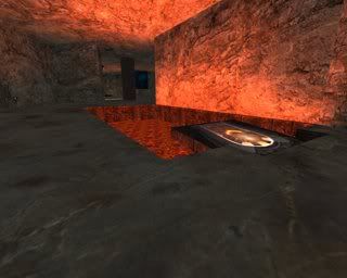
-i'm not sure about the battlesuit/lava path... the reason for this is that if a team is ahead, then dude can just camp in there and wait it out until he is discovered. since only one person can go in at a time, if he's powered up, he'll face 1-on-1 and likely win, and if he wins, he'll get your battlesuit. plus teammates can pile in there over time.
Yea I need to fix that.
The way I envisioned that area working was you jump out there, get the battlesuit, the platforms sink below the lava, you dive in and head for the rear entrance, the battlesuit wears off just as you come out of the lava and you dont need it anymore, you grab the regen to head in to get ahold of the flag and have a chance to get out of there without support.
I had the platforms set as doors that would go down when you jumped to them. That way you are forced to get in the lava and most likely go for that rear entrance area below the lava, but something is wrong with the doors and they just barely bob up and down. I must be missing a parameter or have a bad value in one of the parameters for the door/platforms. I have the battlesuit and path timed so that if you go straight for the secret rear area after getting the battlesuit it will wear off just as you exit the lava behind the flag room.
So basically the idea was that if you tried to hang out in that room too long your battlesuit will wear off because I set the count on it to only 20 seconds. Also what if a member of the opposing team gets the battlesuit after yours has worn off and comes in there after you. If you try to hang out in that room for too long you are screwed.

Although with the platforms not sinking it is all going to go down just as you described.
I will fix that along with the other stuff I found wrong.
wattro wrote:-i was pretty confused at first on the layout, and i still am a bit confused inside the base as to what leads where
Silicone_Milk wrote:The connecting area between the bases and the midfield really need work. I was literally lost for 10 minutes before I figured out how to make my way to the midfield.
Yea perhaps I should put out an overhead view or drawing of the map layout along with the link to the fixed version.
Also perhaps I should create and place some directional decals or something to help guide the way...lol.
-with the 4th entrance to the midfield, it's pretty easy to sneak in/through the midfield without being exposed - this makes it easy to capture if you take the long route out of the base to midfield and then you are left with the short route
Yea I figured there is a super long way across the midfeild from the top entrances so I decided to attach those entry points to the shortest path from midfeild to base and the super short way across the midfeild from the bottom entrances so I decided to attach those entry points to the longest path from midfeild to base.
I hoped this would create some balance and let player decide what is best for them. "Do I want to be in danger for a longer amount of time time in the midfeild or in the paths from midfeild to base?"
-bots played pretty good, they were pretty surprisingly more intense than expected
Thanks I really like to do a good job on making bot play a lot better.
-the lava was flowing from the dudes mouth, looked pretty ace,
Sweet! Thank goodness. I was not looking forward to tracking down the problem. Glad it works. Thanks.
though that room just leads to a teleporter/deadend. why not put the red armor further into the deadend?
Great idea! I'll do that. Thanks. I hope the teleporters made sense. The idea is to allow quick access to the different areas of your teams side of the map. As you can see all 3 teleporters place you right next to where you can go right into the next.
Oh by the way. I did get that crash also. I think it has something to do with the .aas because it took a really long time to create the .aas.
It usually takes about 25 seconds or less to crate a .aas for a map this size and such, but this time it took 1150 seconds or so.
I noticed there were an unsual amount of splits this time as well.
In my other versions there were like 350,000 splits, but in this version there were like 2,250,000 splits. This give anyone an idea of where the problem is?
Well be back with those fixes in a bit.

Thanks again!
Uh, well....good luck with that. :shrug:
[img]http://i57.photobucket.com/albums/g228/Magnus3204/forumheader.jpg[/img]