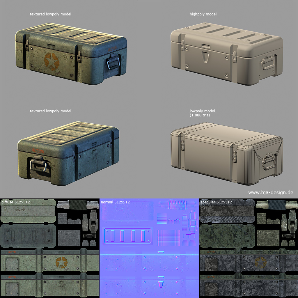
I look forward to seeing the new blending textures. It shouldn't be a problem at all really to just make a new texture thats a blend of the snow and the rock.
Screenshots
Re: Screenshots
lol, thanks. Its hard ot really expand something as basic as Q2 
I look forward to seeing the new blending textures. It shouldn't be a problem at all really to just make a new texture thats a blend of the snow and the rock.
I look forward to seeing the new blending textures. It shouldn't be a problem at all really to just make a new texture thats a blend of the snow and the rock.
Re: Screenshots
I think you did great at that. It's definately got that special q2 feeling, while looking good by todays standards. I was a little disappointed by q4 not having that brown orange colour scheme actually.o'dium wrote:lol, thanks. Its hard ot really expand something as basic as Q2

Re: Screenshots
Because as I always say, "its good to share", unless its B&J's Phish Food, in which case bugger off its mine, with its little fishies and stuff... Nomnommomonmoommm... Erm... Where was I? Oh yeah, right, I decided to pop a few screenies up for you of some ingame love. Remember folks, we are ALWAYS looking for new modellers and mappers, and anybody who has experience modelling player models please get in touch with me, as we are desperately seeking some new player models for the teams. Here are the screenshots; Enjoy, and post feedback in the forums!


Re: Screenshots
As I always say when links aren't working: "The links aren't working!"
edit: as a matter of fact, I cant even view your main page - same error.
edit: as a matter of fact, I cant even view your main page - same error.
Re: Screenshots
Yeah, yay for hosting, woo...
Re: Screenshots
Even the links themselves take ages to load.. strangely enough. : (at first glance I thought you forgot to include em : )
I am pretty curious now though, would you be arsed to want to upload them to some free host?
I am pretty curious now though, would you be arsed to want to upload them to some free host?
Re: Screenshots
Its nothing to exciting. I dont have an imageshack account or whatever its called
EDIT: Easier than I thought, so here they are for now if those links dont come back on yet. As I said, nothing amazing, heh... JPEG Quality will be shocking too I bet.


EDIT: Easier than I thought, so here they are for now if those links dont come back on yet. As I said, nothing amazing, heh... JPEG Quality will be shocking too I bet.


Re: Screenshots
those pics themselves might not be that exciting.. but they're most ceirtainly not bad either. And having built both the map and sweet engine features is pretty fkin nuts if you ask me 
gg
gg
Re: Screenshots
Fear the particles!!!

Nah, just testing my new rocket model
Nah, just testing my new rocket model
Re: Screenshots
Some of you may remember me posting this map 2 or so years ago (Think I named it shrimp for the "alpha" release), but anyway... hard drive died a long time ago and after that, I couldn't be bothered to start this map up again until a few weeks ago. Started it over from scratch and fixed some of the mistakes I made previously and tried to put in some of the suggestions you all made. (ones I could remember)...
very early shoots, but it's something.

and a pic of the central room:
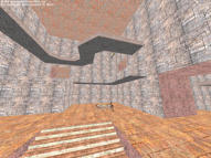
very early shoots, but it's something.
and a pic of the central room:
Re: Screenshots
bork[e], I don't even remember you ever mapping. I was surprised recently when you were talking about Radiant stuff in GD or something and you actually knew what you were talking about. It's probably just my Alzheimers.
Has a nice Q1 feel to that first screenshot. Is that ring on the right some sort of lift that bobs up and down? The second one, the scale looks HUGE! It could just be the screenshot and FOV, but it looks excessively large.
Has a nice Q1 feel to that first screenshot. Is that ring on the right some sort of lift that bobs up and down? The second one, the scale looks HUGE! It could just be the screenshot and FOV, but it looks excessively large.
[size=85][url=http://gtkradiant.com]GtkRadiant[/url] | [url=http://q3map2.robotrenegade.com]Q3Map2[/url] | [url=http://q3map2.robotrenegade.com/docs/shader_manual/]Shader Manual[/url][/size]
Re: Screenshots
that second screen does look pretty bad, I'm still not sure why I posted it... I guess maybe to give another look for people that might remember it.  And you were the one that bot clipped that first screenshot for me after I had many troubles with the .aas file back when. heh
but that upper screen, the ring is just a platform with RA you can reach by hitting the JP from the left side of the room. I ran a fast light compile before posting the shoot to make it more "postable" and must have slipped into the ceiling while taking it.
but that upper screen, the ring is just a platform with RA you can reach by hitting the JP from the left side of the room. I ran a fast light compile before posting the shoot to make it more "postable" and must have slipped into the ceiling while taking it.
Re: Screenshots
I botclipped that for you? Wow. I have absolutely no recollection of that. 
[size=85][url=http://gtkradiant.com]GtkRadiant[/url] | [url=http://q3map2.robotrenegade.com]Q3Map2[/url] | [url=http://q3map2.robotrenegade.com/docs/shader_manual/]Shader Manual[/url][/size]
Re: Screenshots
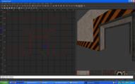
Got off my lazy butt and did some more mapping, starting on the techfort, the minimalistic approach and then add some custom models n' crap later.
I hate curved surfaces, but I've found a way to cope with them and still ahear to the design.


Textures WIP, I like the white texture I did however, stripe is from q3. -faster render of course.
I hate curved surfaces, but I've found a way to cope with them and still ahear to the design.


Textures WIP, I like the white texture I did however, stripe is from q3. -faster render of course.
Re: Screenshots
A little too stripy and I would at least make the stripes go the same way (those crossbars over the doors have the stripes going the other way). I like the outdoor shot, though.
[size=85][url=http://gtkradiant.com]GtkRadiant[/url] | [url=http://q3map2.robotrenegade.com]Q3Map2[/url] | [url=http://q3map2.robotrenegade.com/docs/shader_manual/]Shader Manual[/url][/size]
Re: Screenshots
How about something like this for the wall, better? I haven't done much with the top part at the spawn entrance yet.


Re: Screenshots
umm, try and get something like this going:
Maybe even cut down on some the caution stripes in places by adding some structural brushes supporting the ceiling or something similar. and on the inside of the entry way (What I have textured with that white base texture), "I" think it looks a bit better on the eye like that... without carrying that texture (caution tape) all the way around the entryway.
Lots of opinions there, do what you think looks good.
 It's not like I made anything worth really remembering though. But I like working with radiant, reminds me of the highschool years screwing up house plans in auto cad.
Maybe even cut down on some the caution stripes in places by adding some structural brushes supporting the ceiling or something similar. and on the inside of the entry way (What I have textured with that white base texture), "I" think it looks a bit better on the eye like that... without carrying that texture (caution tape) all the way around the entryway.
Lots of opinions there, do what you think looks good.
obsidian wrote:I have absolutely no recollection of that.
Re: Screenshots
Thanks for the advice bork (it does look very nice), I'll use those for my red base, which is going to be very standard wall style (blocks) with a more dirty rocky red look. That structural look would match it nicely. For this blue base I'm focusing on as much curved surfaces as I can with a general theme of a clean, frosty, sterile look.
Re: Screenshots
Mitre those edges!bork[e] wrote:
[size=85][url=http://gtkradiant.com]GtkRadiant[/url] | [url=http://q3map2.robotrenegade.com]Q3Map2[/url] | [url=http://q3map2.robotrenegade.com/docs/shader_manual/]Shader Manual[/url][/size]
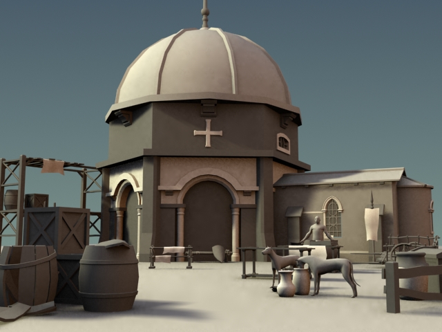
Re: Screenshots
A little environment scene I'm currently working on. The trees are from 3ds max and are just placeholders, the dog and human models are zbrush base models and just there to get the scaling right. Everything very wip and all objects are randomly placed. I'm not very happy with the camera angle so I'll probably change that.
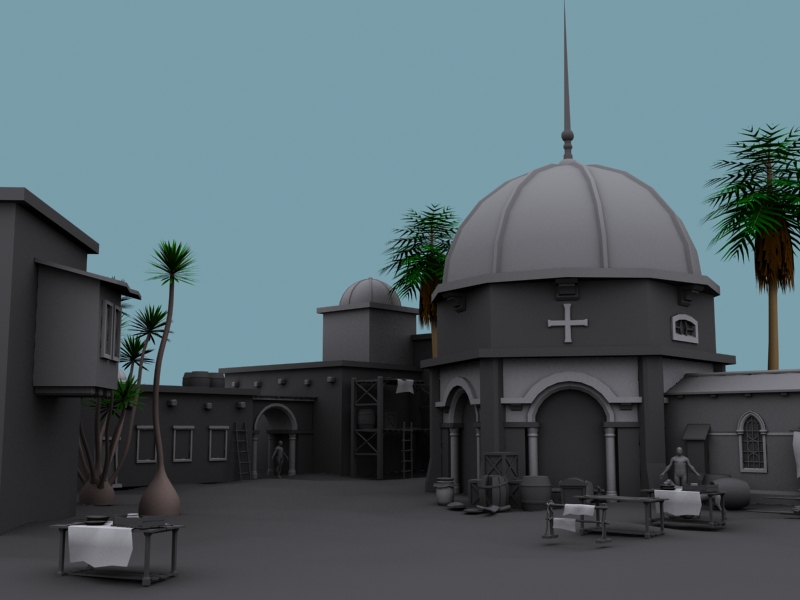
a different angle:
Some textured props.

a different angle:
Some textured props.