Screenshots
Re: Screenshots
i used to use photobucket, but in order to use it u have to make an account, then at some point, i couldnt upload any more pics to my old forums cause i reached my limit or something, but that was years ago, they must have fixed that.Silicone_Milk wrote:Am I the only one here that thinks imageshack is the work of the devil?
I use photobucket to host my images but it always seems like everybody else uses imageshack. Any particular reason?
but i do like imageshack, cause u dont have to log in.
[url=https://github.com/Garux/netradiant-custom]NRC[/url]
[url=https://defrag.racing/]Defrag[/url]
[url=http://ws.q3df.org/]Q3 Map Archive[/url]
[url=https://defrag.racing/]Defrag[/url]
[url=http://ws.q3df.org/]Q3 Map Archive[/url]

Re: Screenshots
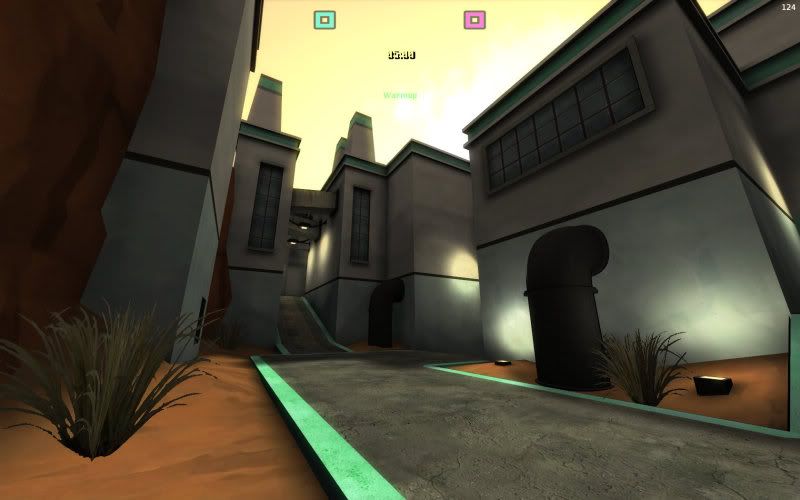
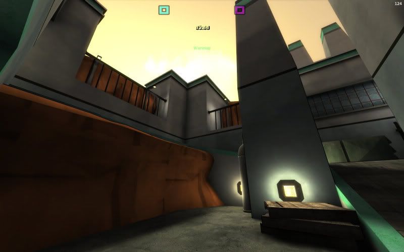
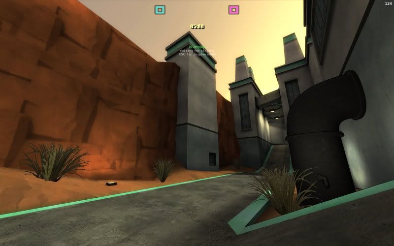
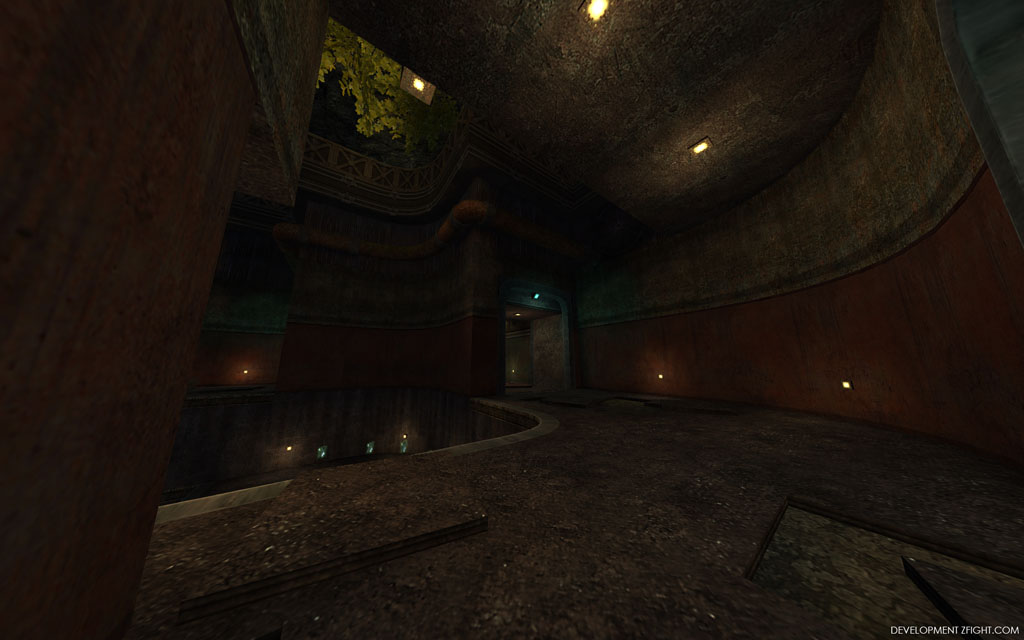
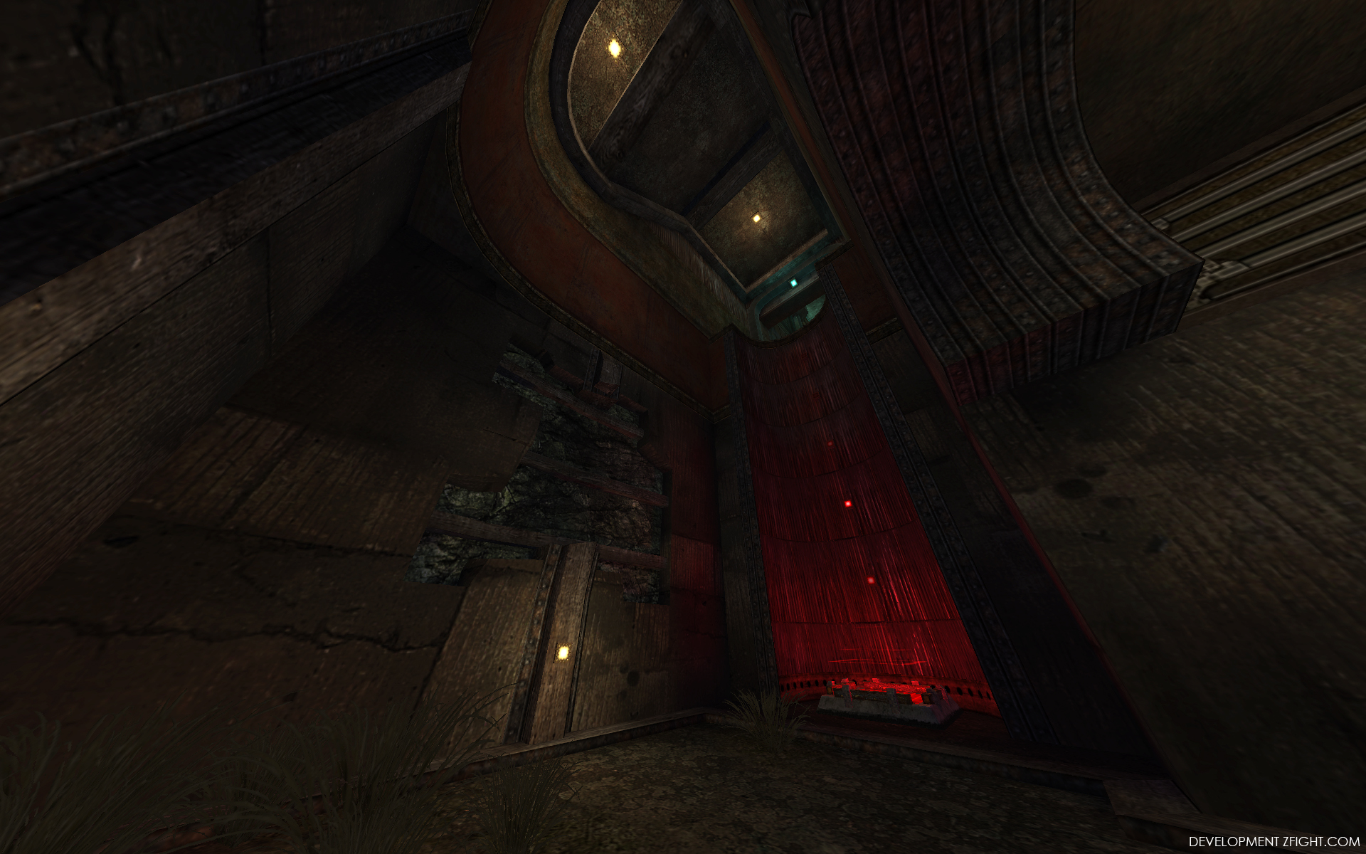
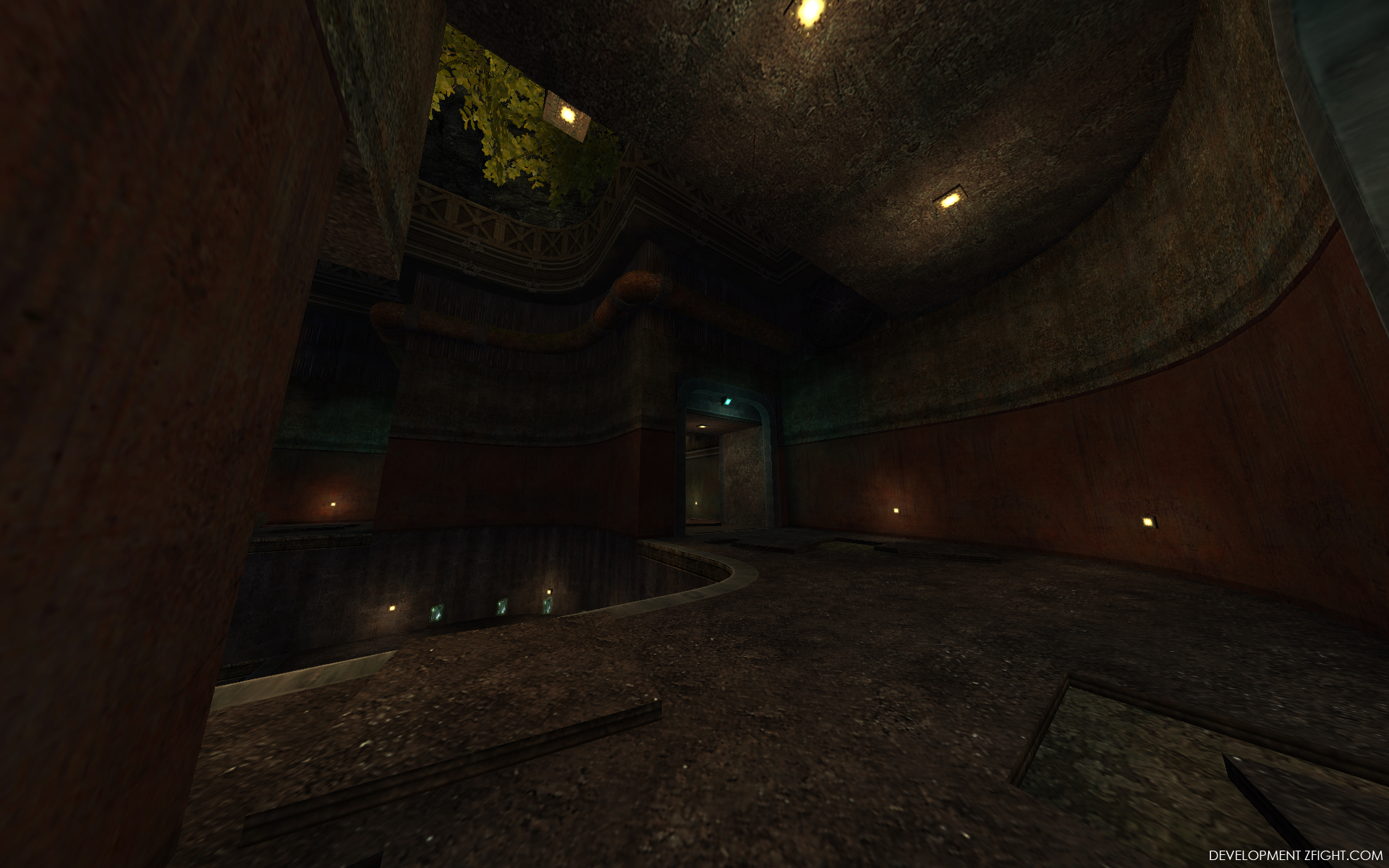
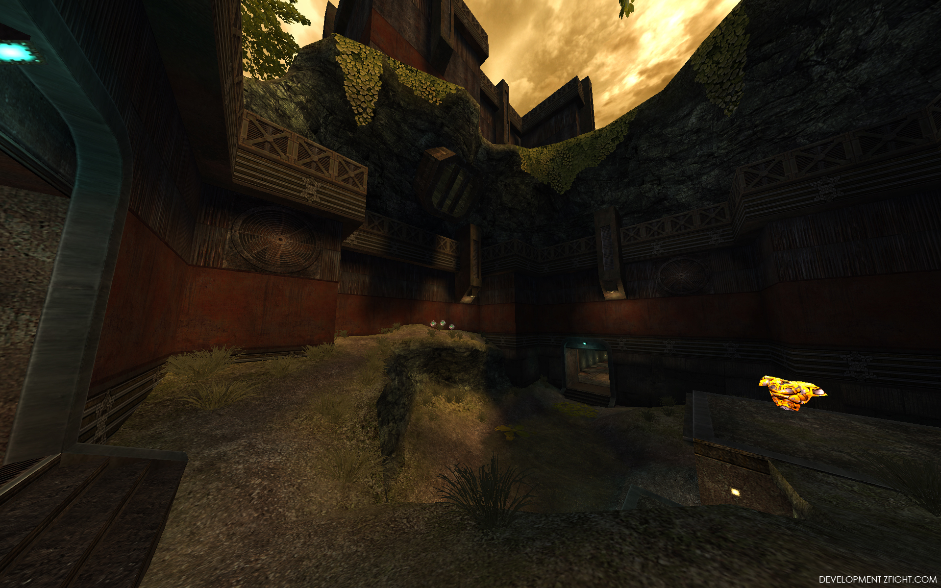
Kinda "done" style vise with the outside areas now...
I have been stuck for such a long time on trying to make outsides look different from insides, I have that more or less sorted out now.
[lvlshot]http://zfight.com/misc/images/maps/m8/m8_21.jpg[/lvlshot]
[lvlshot]http://zfight.com/misc/images/maps/m8/m8_16.jpg[/lvlshot]
[lvlshot]http://zfight.com/misc/images/maps/m8/m8_17.jpg[/lvlshot]
HQ 1920 1200
http://zfight.com/misc/images/maps/m8/m8_21_hq.jpg
http://zfight.com/misc/images/maps/m8/m8_16_hq.jpg
http://zfight.com/misc/images/maps/m8/m8_17_hq.jpg
Q3Map2 2516 -> http://www.zfight.com/misc/files/q3/q3map_2.5.16_win32_x86.zip
Q3Map2 FS_20g -> http://www.zfight.com/misc/files/q3/q3map2_fs_20g.rar
GtkRadiant 140 -> http://www.zfight.com/misc/files/q3/GtkRadiantSetup-1.4.0-Q3RTCWET.exe
Q3Map2 FS_20g -> http://www.zfight.com/misc/files/q3/q3map2_fs_20g.rar
GtkRadiant 140 -> http://www.zfight.com/misc/files/q3/GtkRadiantSetup-1.4.0-Q3RTCWET.exe
Re: Screenshots
Your map looks amazing as one would expect of a hipshot map. :P One suggestion- the square bounce pad looks rather jarringly out of place and less subtle than the rest of the map's style.
Re: Screenshots
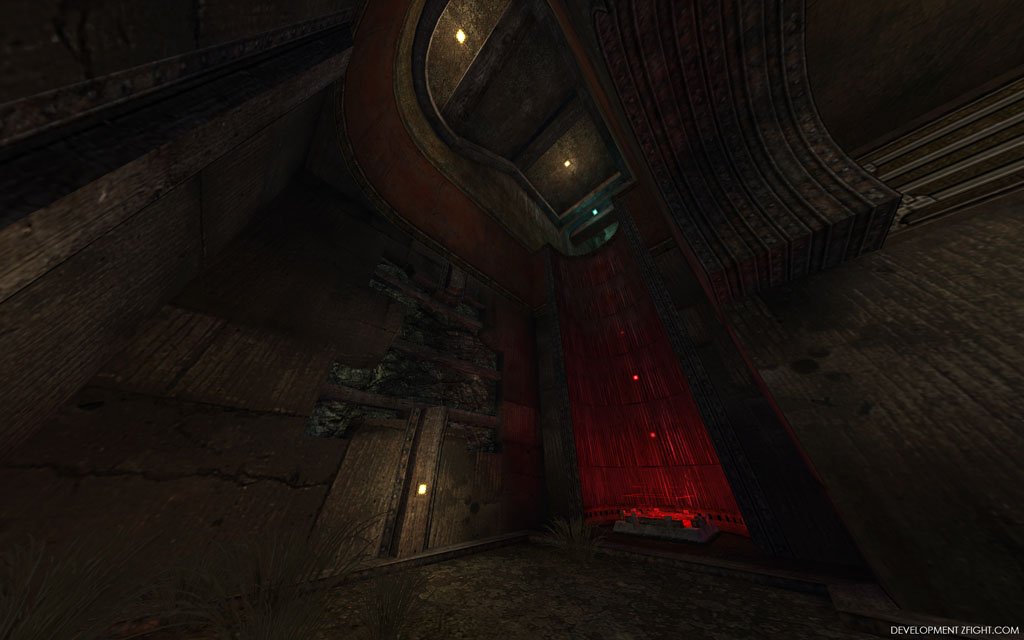
q3dmp12 3 days in, no textures or fine details.. just building as i go


Re: Screenshots
First screenshot looks really q3tourney3'ish. I like it from the shots. Awesome what you can do in 3 days.
Re: Screenshots
Working on another remake for Generations Arena -- The Cistern from Quake.
[lvlshot]http://www.tabun.nl/tmp/gen/tabq1dm5_pre03.jpg[/lvlshot]
[lvlshot]http://www.tabun.nl/tmp/gen/tabq1dm5_pre04.jpg[/lvlshot]
[lvlshot]http://www.tabun.nl/tmp/gen/tabq1dm5_pre05.jpg[/lvlshot]
Brushwork is getting there, but lighting is just a quick placeholder/test.
[lvlshot]http://www.tabun.nl/tmp/gen/tabq1dm5_pre03.jpg[/lvlshot]
[lvlshot]http://www.tabun.nl/tmp/gen/tabq1dm5_pre04.jpg[/lvlshot]
[lvlshot]http://www.tabun.nl/tmp/gen/tabq1dm5_pre05.jpg[/lvlshot]
Brushwork is getting there, but lighting is just a quick placeholder/test.
[size=85][url=http://www.tabun.nl]www.tabun.nl[/url][/size]
Re: Screenshots
This makes me want to play Quake again.
Re: Screenshots
fKd, please tell me you don't have a job  If you're working and can map that much in 3 days, that's just insane!!!! Even if you're not working, that's still pretty insane!
Tabun I really like the colour pallet you have there, looks very good.
Tabun I really like the colour pallet you have there, looks very good.
Re: Screenshots
yup, also have a job 
Re: Screenshots
fKd, you are quite awesome!
Two more shots from me:
[lvlshot]http://www.leveldk.co.uk/images/middle_2.jpg[/lvlshot]
[lvlshot]http://www.leveldk.co.uk/images/middle_1.jpg[/lvlshot]
The vine bit in that screen shot looks a bit square, but that view is only every visible in spectator mode. The main thing I wanted to show was the new murky water on top of my canal model.
Re: Screenshots
fkd,
I like the architecture style in the first two shots. Not sure it goes with the architecture in the second two shots though.
I like the architecture style in the first two shots. Not sure it goes with the architecture in the second two shots though.
Re: Screenshots
@ hipshot: If all these colours  are for real and not photoshop'd (and I'm pretty sure that you didn't photoshop'd any of these amazing shots ) I'm pretty damn impressed.
Also looking forward to another fKd map! Considering the detail of your projects you should be called a speed mapper even if it's several months until final realisation.
dONKEY's, Tabun's and Kaz's maps are looking quite promising too, hope there's some chance for testing before holidays are finished!
EDIT: Seems that every single person mentioned is here at the moment, nice
If you are caught on a golf course during a storm and are afraid of lightning, hold up a 1-iron. Not even God can hit a 1-iron.
-Lee Trevino, golfer who actually has been struck by lightning.
-Lee Trevino, golfer who actually has been struck by lightning.
Re: Screenshots
@donkey, I like the massive archways but it feels like they need a support half way up so they dont look like one massive Q3 arch blob. The roof space could do with some small details and the buildings on the far side of the canal need to overhang the canal not be vertically flush with the canal edge. Maybe try some loading dock stuff .
@fkd, looking cool but it feels the same as your previous work, same palette and tech style. Also can't see any epic center pieces or theme items, I know it is early but you need a visual hook, something to remember the map by.
@tabun, has a nice Q1 atmosphere but you need to experiment with more diverse angles, everything looks straight and on the grid style. Also start to break uniform items like torches in a row by removing some or putting them out. The same with pillars, remove, move or break some.
@hipshot, amazing as always, the colour palette is gorgeous outside and subdued inside. Maybe try pipes along the floor edges with items on top, player could jump up for them, plus it will break the clean floor edges.
Well he was evil, but he did build alot of roads. - Gogglor
My [url=http://www.simonoc.com/]Website[/url] & [url=http://twitter.com/SimsOCallaghan]Twitter[/url]
My [url=http://www.simonoc.com/]Website[/url] & [url=http://twitter.com/SimsOCallaghan]Twitter[/url]
Re: Screenshots
Ah, good details...I have a loading dock and bridge section in mind on the other side...but I feel a new model coming on after seeing that ta!
Re: Screenshots
Kinda ended up more plain than I would have liked, but meh. I need to do something new so I'm done for now.
Re: Screenshots
http://q3a.ath.cx/?mapdetails=ghost-adigha i got lots of good feedback of the map. except for the ending. nobody liked it lol.
[url=https://github.com/Garux/netradiant-custom]NRC[/url]
[url=https://defrag.racing/]Defrag[/url]
[url=http://ws.q3df.org/]Q3 Map Archive[/url]
[url=https://defrag.racing/]Defrag[/url]
[url=http://ws.q3df.org/]Q3 Map Archive[/url]
Re: Screenshots
/me searches for old defrag folders on his harddrive
[color=#FFFFFF][url=http://maps.rcmd.org]my FPS maps[/url][/color]
-
tehSandwich
- Posts: 64
- Joined: Thu Jun 11, 2009 5:49 am
Re: Screenshots
[lvlshot]http://img9.imageshack.us/img9/5121/tshnewtextures.jpg[/lvlshot]
Here's some self-made textures made for a possible upcoming map. Everything besides the neons was made by me. The brick texture was based from a photo reference by these guys.
What you currently see is pretty much everything i made at the moment. I'll update when more textures will be made.
Here's some self-made textures made for a possible upcoming map. Everything besides the neons was made by me. The brick texture was based from a photo reference by these guys.
What you currently see is pretty much everything i made at the moment. I'll update when more textures will be made.
Re: Screenshots
floor texture needs to be scaled down. but looking mint
-
Silicone_Milk
- Posts: 2237
- Joined: Sat Mar 12, 2005 10:49 pm
Re: Screenshots
Sandwich, diggin the corrugated metal texture. Also like how that patch bends around to meet the wall rather than just ending flush with the wall's edge.
Re: Screenshots
@WHAT!!
that looks great, although your lights look like they're pressed up against the wall, do you use shaders? or light entities?
@tehSandwich
Woah, Nice corrugated Iron boards there! I also like the zinc trim texture you've done. Good job
that looks great, although your lights look like they're pressed up against the wall, do you use shaders? or light entities?
@tehSandwich
Woah, Nice corrugated Iron boards there! I also like the zinc trim texture you've done. Good job
[url=http://gotdelirium.com/][img]http://www.gotdelirium.com/stuff/gdd.png[/img][/url]
-
tehSandwich
- Posts: 64
- Joined: Thu Jun 11, 2009 5:49 am
Re: Screenshots
[lvlshot]http://img338.imageshack.us/img338/2944/shot0001e.jpg[/lvlshot]
[lvlshot]http://img193.imageshack.us/img193/4619/shot0002er.jpg[/lvlshot]
[lvlshot]http://img10.imageshack.us/img10/5867/shot0003bl.jpg[/lvlshot]
Here's some pretty neat dot lights and a semi-crappy wood texture. I might want to dirty up those planks.
Those dot lights made me work a lot to make them actually colorful. They also make a subtile flicker.
About the corrugated plate texture, i did a shader to make it shiny. I might want to push it in front of the lightmap.
I'm making those tiny maps for the sole purpose to demonstrate them textures and to try to find the right style for the possible upcoming map.
