Finally I finished a playable beta version. I'm really eager for your thougts/ideas on the current state.
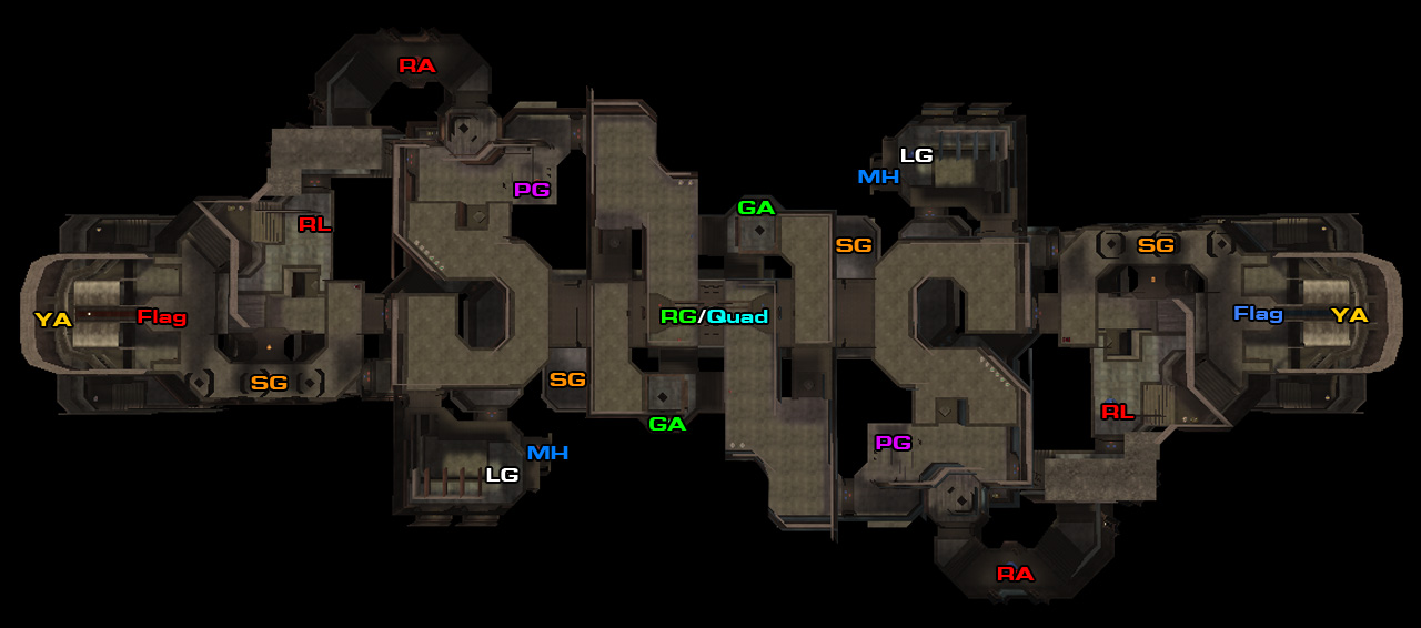
I changed many parts since the last alpha version. I tried to scale down the distance between the bases/flags and decrease the complexity of the connections. I removed the third tier in the mid as well.
I hope I found the right balance beetween Attack and Defense.
I'm looking forward on feedback regarding the following points:
- Layout (I dont want to change big structures, but I willingly improve small parts/areas)
- Items (The items are not decided yet, counting on competitive feedback especially by QL CTF players)
- Visuals/Theme (Everything you have to suggest to improve the overall style and making the map easier to learn)
My To-Do-List:
- Clipping
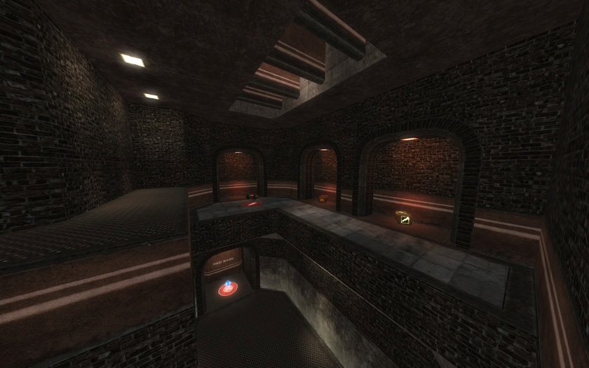
- Lighting
- Fixing/Improving Areas
- Detailing (Just a bit, to make different areas more recognizable)
Q3 Version:
http://pukkadesign.com/maps/pukka3ctf2b01-Q3.zip
Quake Live Version:
http://pukkadesign.com/maps/pukka3ctf2b01-QL.zip

Thanks for any helpful comments in advance!
-sum
