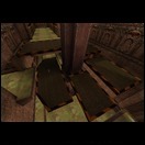
dONKEY wrote:As the worst Q3 player in the world I am least qualified to comment on game play, but there seems to be some very long lines of sight here. The platform above the RA area for example. You can grab the RG and RA and camp up there.
Yes I'm looking for some gameplay pointers regarding item placement as well. I'm aware that this won't be the bestest map ever released, it's a bit of a practice exercise for me, but I'm sure there's some things I could change relatively easily to improve things.
dONKEY wrote:Overall the map seems wide and flat. Again I can't comment on the playability aspects, but visually it seems that way. There is little above the players head and the skyline looks flat. I would aim for some height variation. Adds nothing to gameplay, but makes for a more appealing visual.
With adding height variations, do you mean in the "skyline" of the map or height differences in the map in general? I'm aware that gameplay-wise the map is relatively flat, but I do not think it is something that can easily be changed without rebuilding whole sections of the map. I'd rather wrap up this map as it is and really re-think my whole design and building strategy and start from scratch on a new map.
dONKEY wrote:
There were a few area with details that I didn't understand. The crumbling brick work or light under the clock seemed to promise an advantage by a clever move, but don't seem to have any role in play at all.
Not much of a trickjumper here, so sorry if I disappointed you.
dONKEY wrote:
The overall theme is a mix of tech and gothic. I'm really wishing you would go for old school gothic. The mixture causes a bit of a problem for me. With so many new maps going for hi res textures, stock id images look dated. I can see the point of uses stock images if you really go for that look, but at the minute its a bit confused. If you want to do the crumbling gothic arena façade, that reveals a tech layer beneath, then why not go for up dated textures? If you intend to stick to stock texture, then maybe make the brushwork a little more interesting.
I was originally thinking of giving it a look of a really old abandoned gothic building which has been refurbished to use for deathmatches. I figured that in such an old place you'd need to improve things with current day technology so that's why I originally made the bridge with those diamond plating and warning stripe textures, as if they were added in at a later stage. The fans resemble some sort of air conditioning system because otherwise it would become damp and warm. Not a good temperature for blowing each other to pieces

I could do two things. Remove all the somewhat tech-looking structures or exaggerate them even more. I'm currently opting for the latter, because it would be a good way of adding more detail I think. Using a tech texture set which looks completely different from the stock id Software textures in combination with the standard gothic textures would look out of place I think.
dONKEY wrote:
Mostly walls meet the floor at 90 degrees. Mostly walls are axial. I would either go for more interesting texturing and decal use, or more appealing brushwork.
I'll look into this.
dONKEY wrote:
I love all the big fans, but again they are just there. I didn't really get why they are just there. Mostly this is a gothic level, how do the fans fit? If they did something....I dunno like blowing leaves or smoke, I would see more point.
Explained before

Maybe things make sense to me because I thought them up but they aren't quite as logical to everyone else.
dONKEY wrote:
Like I said I'll leave the game play to the pros we have here. Visually though, I would think about what you are trying to achieve.
I will. Thanks for the feedback. It's really a learning experience so getting feedback is really important to me. Even if the feedback might not immediately end up in this map, it will definitely help my next


