Only issues I could find:
- a few door frames could use some clipping: the Mega door, and the mid and upper doors near LG.
- if you're concerned about looks at this stage, you should give that rock feature another look: the way it connects to the buildings looks unrealistic.
Item placement etc. seems perfect. This is one great map, well done!
First off, thank you for looking and the comments. The rock wall is not exactly to my liking but I am working on it. Where are you getting hung up on the doors? I have some clips in place but seems more are needed.
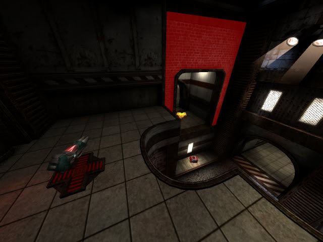
I gave it a short run. I think it looks alright, reminds me of shadow's work for some reason. It still has quite a few dark spots that you might want to eliminate. Also you could invest in some more colors - textures and lighting look a little desaturated because you use a lot of white lights and textures. However, architecture looks good - be sure to highlight it with your lighting to strengthen the impression. Keep it up. Oh yeah, one last thing.. your tiles floor texture has a dark spot that causes repetition - if you could light that up a little it might look better.
Well I quickly put together a few I noticed, areas needing attention marked in red below. I just hate getting stuck on random pieces of detailing. Every door with that design also has a campable exploit on top of the door reachable via RJ etc., just for your info
Architecture is awesome and the textures are nice; I like the stone walls so far. Layout was good as far as I can tell too, but there are some clipping issues as themuffinman said.
I agree that it seems a bit desaturated, but the red lights really pop. My suggestion would be to either bring up the reds in the textures or tone down the red lights. A little color variation in the lighting might be cool too (maybe some gentle blues in the darker areas, I dunno, kinda like the color the sunlight is now). Also might be neat to do some alpha blending on the gravel parts at the bottom.
Well I was hoping the red lights would overcome the whiteness of the level, was trying to stick with a color scheme I suppose. Maybe trade out the white lights for a soft yellow? Not sure how to go about the alpha blending as suggested, will have to look into that. I did fix the clipping issues around the doors and such. Still need to work on the rock feature.
I think it's more an issue with the texture itself. Like, the bounce and weapon pads have bright red and they look great. The lights have that white glare on them, the whole face looks fullbright, and they don't seem to cast a lot of red light for how bright they are, so they kind of stand out.
Maybe some trim around the red light texture? I'm not sure; they do well at cutting the monotony of the other colors, though.
The gameplay is pretty good. I like how the map feels. It is very basic yet it offers a lot. My only concern is that one can grab MH and the YAs without much of a problem.
I need to play it a bit more before I can comment on the rest of the layout.
Cool map. I like the design - architecture and texturing. Lighing not so much - it's a little flat and dull (as was mentioned already). Textures are pretty cool but a little blur and low res. I assume it's ffa map, and for that looks pretty good. My only concern atm is, that it's really small, and can be pretty campy at one point. When you stand on GL platform, you can see almost whole map, and all major items (YAs and MH), if you are stocked with rockets and slugs you can alsmost control whole map from there.
K, think I got the rock sorted out. Also messed around with lighting, clipping, and some item placement. Same download as before. As far as camping the gl area goes, I was thinking the 2 tele destinations up around there would make that less than desirable. If you have a suggestion I am willing to work with it.
Well, you can try to move things around, btu it's probably too late for such things, when map is nearly finished. Such issues should have been solved during alpha testing rather. Just reported it for you to take such things under consideration next time .
ShadoW_86 wrote:Cool map. I like the design - architecture and texturing. Lighing not so much - it's a little flat and dull (as was mentioned already). Textures are pretty cool but a little blur and low res. I assume it's ffa map, and for that looks pretty good. My only concern atm is, that it's really small, and can be pretty campy at one point. When you stand on GL platform, you can see almost whole map, and all major items (YAs and MH), if you are stocked with rockets and slugs you can alsmost control whole map from there.
I like maps with this "feature"... camping spots... I mean, I don't tend to camp, but I like when someone does. It presents an additional challenge. While worrying about the various other players popping up, I get to find a way to knock that camper outta his spot. I'm about 50/50 with this, but, it's huge for me when I do. As long as the map isn't too saturated with these spots, I'm good. I give this map a 8/10.
[color=#00FF00][b]"How do you keep the natives off the booze long enough to pass the test?" Asked of a Scottish driving instructor in 1995.[/b][/color]