Screenshots
Re: Screenshots
Looks awesome, as always but I feel like there is something wrong with the lighting.. do you compile with -gamma and -compensate?
www.ferdinandlist.de/leveldesign
Re: Screenshots
It looks stunning, but yeah, the lighting is a bit flat to my eyes, its more like vertex lit, a bit too uniform?
Re: Screenshots
WOW!
Is the wall in the first shot one texture, or made up of individual wood planks?
Is the wall in the first shot one texture, or made up of individual wood planks?

Re: Screenshots
Thanks, guys.
But, yes, there's problems with the light. I'm gonna work on it, but I don't like to high of a contrast, not any more, I like it better when the colors and light blends better together... it's a phase I guess.
@ surgeon62, it's a texture. If you mean the actual wall.
But, yes, there's problems with the light. I'm gonna work on it, but I don't like to high of a contrast, not any more, I like it better when the colors and light blends better together... it's a phase I guess.
@ surgeon62, it's a texture. If you mean the actual wall.
Q3Map2 2516 -> http://www.zfight.com/misc/files/q3/q3map_2.5.16_win32_x86.zip
Q3Map2 FS_20g -> http://www.zfight.com/misc/files/q3/q3map2_fs_20g.rar
GtkRadiant 140 -> http://www.zfight.com/misc/files/q3/GtkRadiantSetup-1.4.0-Q3RTCWET.exe
Q3Map2 FS_20g -> http://www.zfight.com/misc/files/q3/q3map2_fs_20g.rar
GtkRadiant 140 -> http://www.zfight.com/misc/files/q3/GtkRadiantSetup-1.4.0-Q3RTCWET.exe
-
themuffinman
- Posts: 384
- Joined: Fri Mar 05, 2010 5:29 pm
Re: Screenshots
Hipshot that's looking great! Somewhat reminiscent of Solitude. It's a pity you didn't find the time to take part in the Maverick Comp 3. Was looking forward to seeing what you would put together.
Re: Screenshots
Beautiful textures. I also think contrast should be increased, but it can maybe break the atmosphere.
Also Hipshot - your http://www.zfight.com is not working anymore?
Also Hipshot - your http://www.zfight.com is not working anymore?
Re: Screenshots
Looking good hipshot. I'd also do a little more work with the light, needs some contrast. Textures are beautiful!

Small WIP from Doom 3: Phobos we posted on our twitter page
Small WIP from Doom 3: Phobos we posted on our twitter page
Re: Screenshots
Ohh, that look cool.
My only problem is the red small lights, I think the glow is way too much and then there's that ugly doom brown fog again...
@ Noruen, it's working, just isn't anything there at the moment. Gonna put up the new level there later.
My only problem is the red small lights, I think the glow is way too much and then there's that ugly doom brown fog again...
@ Noruen, it's working, just isn't anything there at the moment. Gonna put up the new level there later.
Q3Map2 2516 -> http://www.zfight.com/misc/files/q3/q3map_2.5.16_win32_x86.zip
Q3Map2 FS_20g -> http://www.zfight.com/misc/files/q3/q3map2_fs_20g.rar
GtkRadiant 140 -> http://www.zfight.com/misc/files/q3/GtkRadiantSetup-1.4.0-Q3RTCWET.exe
Q3Map2 FS_20g -> http://www.zfight.com/misc/files/q3/q3map2_fs_20g.rar
GtkRadiant 140 -> http://www.zfight.com/misc/files/q3/GtkRadiantSetup-1.4.0-Q3RTCWET.exe
Re: Screenshots
@geX: that looks really sweet! I can't wait for the whole mod to be available for download btw  ! I just think there are many much red lights in one place, it would be probably better to use just one instead of 4 at once.
[url]http://shadowsdomain.wordpress.com/[/url]
Re: Screenshots
Amazing how good Doom 3 still looks these days.
-
IveGotPenisEnvy
- Posts: 71
- Joined: Tue May 24, 2011 7:36 pm
Re: Screenshots
The id Tech 4 engine is underrated.
Re: Screenshots
Thanks guys. I see what you mean about the red lights, a smaller flare might help with the problem. They are a bit dominating
Yeah the engine still looks good! and this shot is even taken with vanilla doom. We havent used any of those graphics mods that seem to flood the doom 3 community. We can make it pretty anyway
Yeah the engine still looks good! and this shot is even taken with vanilla doom. We havent used any of those graphics mods that seem to flood the doom 3 community. We can make it pretty anyway
-
EmeraldTiger
- Posts: 392
- Joined: Fri Sep 17, 2010 1:53 am
Re: Screenshots
While I am not a Doom 3 player, I must say that what you've got there looks terrific! Just comes to show that even id tech 4, when done right, can measure up to today`s standards. Good luck with your project.
[color=#00FF00][b]EmeraldProductions[/b][/color]
http://emeraldproductions.weebly.com/index.html
http://emeraldproductions.weebly.com/index.html
Re: Screenshots
not sure why ppl are beating up on idtech4, really look at the level design in doom3 and even q4. there is some amazing stuff in there. but that being said, ya screenshot does look very nice indeed
Re: Screenshots
Ambientlit and no light-entites atm, so forgive the lighting.
Early detailstages of a 1on1 map I've been working on after I got back the mappingitch! (I blame mavericks competition.)


Early detailstages of a 1on1 map I've been working on after I got back the mappingitch! (I blame mavericks competition.)
Re: Screenshots
Lovely textures.
[size=85][url=http://gtkradiant.com]GtkRadiant[/url] | [url=http://q3map2.robotrenegade.com]Q3Map2[/url] | [url=http://q3map2.robotrenegade.com/docs/shader_manual/]Shader Manual[/url][/size]
-
Silicone_Milk
- Posts: 2237
- Joined: Sat Mar 12, 2005 10:49 pm
Re: Screenshots
mmm that's pretty sexy
Re: Screenshots
Yeah that's a really cool texture set you've got going there.
-
IveGotPenisEnvy
- Posts: 71
- Joined: Tue May 24, 2011 7:36 pm
Re: Screenshots
Fuck you! That's not QUAKE 3 YOU LIAR!!! The lighting looks beautiful at the moment, adding light entities will ruin it!
Re: Screenshots
yeah that looks cool even if its ambientlit
Re: Screenshots
Meh, just replace ambient with sun, add more windows/lamps and you're good to go. I can't even remember the last time I made anything with point lights, mostly because they look unnatural. (light needs a source to look good, light entity is rather useful for spotlights instead)
Re: Screenshots
@Fjoggs - very nice textures and atmosphere! (reminds me of unreal1) looking really cool man
Re: Screenshots
Reminds me too of unreal 1, which is good.
And I have to disagree with Ouija, point lights can really add a lot - if used correctly.
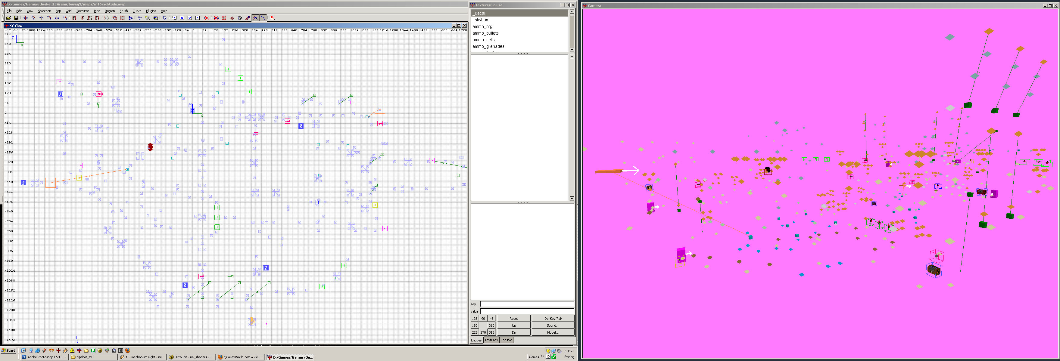
This is solitude, my Maverick Q3 Entry last year.
http://zfight.com/misc/images/pointlights.jpg
It uses 540 lights. It's so many, that it's almost a point cloud render of the level =)
And I have to disagree with Ouija, point lights can really add a lot - if used correctly.
This is solitude, my Maverick Q3 Entry last year.
http://zfight.com/misc/images/pointlights.jpg
It uses 540 lights. It's so many, that it's almost a point cloud render of the level =)
Q3Map2 2516 -> http://www.zfight.com/misc/files/q3/q3map_2.5.16_win32_x86.zip
Q3Map2 FS_20g -> http://www.zfight.com/misc/files/q3/q3map2_fs_20g.rar
GtkRadiant 140 -> http://www.zfight.com/misc/files/q3/GtkRadiantSetup-1.4.0-Q3RTCWET.exe
Q3Map2 FS_20g -> http://www.zfight.com/misc/files/q3/q3map2_fs_20g.rar
GtkRadiant 140 -> http://www.zfight.com/misc/files/q3/GtkRadiantSetup-1.4.0-Q3RTCWET.exe