Well, it's coming together. I definitely like the mid area more than the previous version. I will elaborate more on some of my issues with it later.
Again, some small errors:
This needs to be clipped behind it (players can walk behind the teleporter):
http://i787.photobucket.com/albums/yy15 ... tf1b23.jpg
Side of water is visible:
http://i787.photobucket.com/albums/yy15 ... tf1b26.jpg
This is just a preference, but I think it looks a lot better this way (move the trim on the left so that it is flush with the vertical trim like on the right):
http://i787.photobucket.com/albums/yy15 ... tf1b21.jpg
Some more small preferences:
Change the large trim texture to the small trim on the left. I commented on this before, and what you did helped, but I feel the contrasting sizes of trim are very out of place.
http://i787.photobucket.com/albums/yy15 ... f1b210.jpg
Weapon clip the decorative fencing. I know I have preached about grate clipping consistency before, but it doesn't seem right that the "ceiling" fences can hold boxes and debris, but can't stop a rocket. I just feel it would be cleaner if the weapons (such as grenade) could bounce off of these fences (as well as any other fences / grates that aren't a part of the center "obstacle".):
http://i787.photobucket.com/albums/yy15 ... tf1b25.jpg
http://i787.photobucket.com/albums/yy15 ... tf1b24.jpg
The flower (whatever, lol) "grate" texture is a tad overused.
I recommend replacing this with wood:
http://i787.photobucket.com/albums/yy15 ... tf1b29.jpg
Another example of an area in which it is overused:
http://i787.photobucket.com/albums/yy15 ... tf1b22.jpg
Game play preferences:
The upper area of the base seems almost pointless. While it
is a nice and functional area to have in a map, it seems almost useless unless a player is very low on health. I recommend switching the 25 health with the YA:
http://i787.photobucket.com/albums/yy15 ... tf1b28.jpg
While I know this is supposed to be a death trap, I think it would benefit game play if there was some sort of support here (maybe a pipe) that was low enough to impair movement, but better than being in the water completely. It would be a thin platform that would be easy to push a player off of, but it would be a step better than the underwater tunnel a few players will be exiting:
http://i787.photobucket.com/albums/yy15 ... tf1b27.jpg
Anyway, like I said, it's definitely coming together. The lighting in some spots is a bit dark still. I love the sunlight that filters through the opening in the roof. I think it would be really cool if there were some portions of the roof (wall area) that were caved in a bit to expose some more of this sunlight on the darker areas of the map. For instance in the RL room, the wall opposite of the wooden "windows" could be caved in, and the support above could be pushed downward a bit. Openings in the wall under and over the support trim at the top would expose sunlight to the room. Here's a small picture I made to help illustrate what I mean (ignore the shitty paint drawing..

):
http://i787.photobucket.com/albums/yy15 ... cavein.png
There is brick, and in the background is concrete/dirt or something. The lined trim at the top is the roof trim (bent down). The red lines are sunlight.
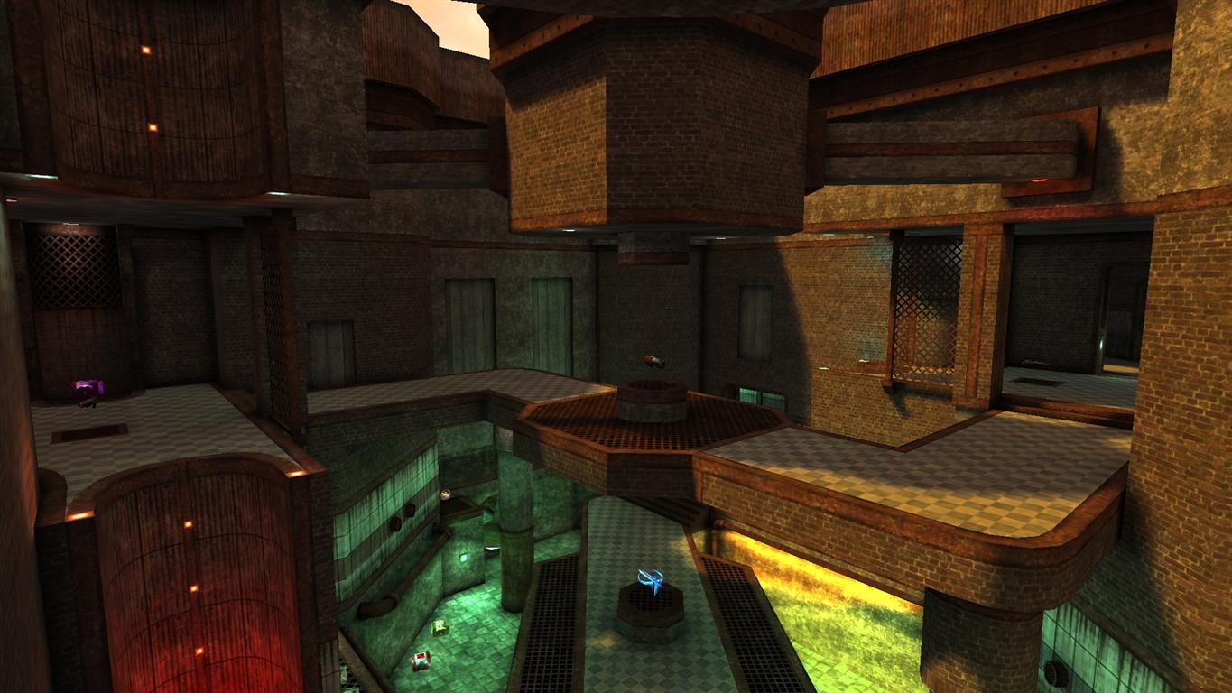
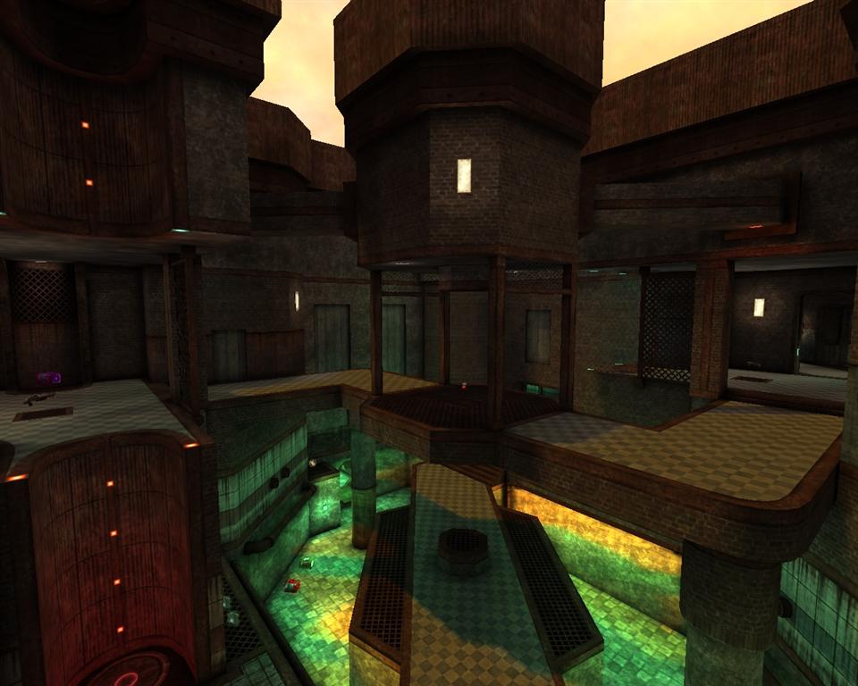
The mid area seems to be good, but I feel like there should be a bit less emphasis on the water, and more hard surfaces on which to stand. The map is really adopting a q3ctf2 feel by making the mid this dependent on water. Maybe some floating (and sunk) crates or something would be good enough on which to stand.
Keep it up. You are doing fine. Just a bit more aesthetic tweaking and you will have the theme and detailing right on track to completion.