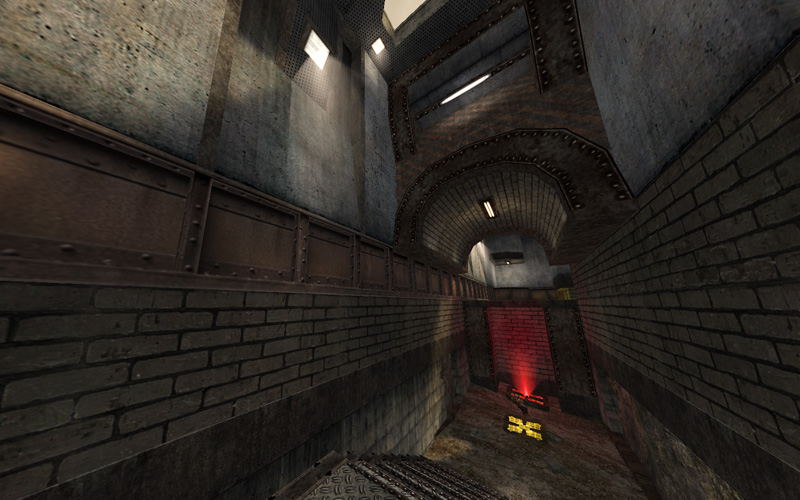
@Hipshot: Funny, I actually like the colorful lights and coronas at night time a lot better, but at the same time, I also never felt those lights “belonged” in the first place... more on that below.
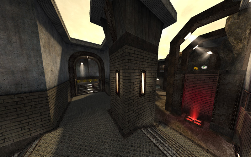
@Sumatra: You asked me if I had any ideas for a more consistent theme. Of all the possible directions in this map, the idea that sticks out to me the most clearly at this moment is the rusty metal frame supports you have partially enclosing some of the pathways. It kind of reminds me of
this map. Maps that are sandy/rusty/post-apocalyptic tend to have a less varied color palette, which is why I said above that I don’t think the bright colors fit. Of course you could take the colorful night time direction (that shot above reminds me of Asian Nights), but my intuition tells me a day-time setting is in order. It seems that Hipshot feels that way too. That being said, we are not you

. Go with whatever idea is coming to you most clearly and directly and the theme should take care of itself.
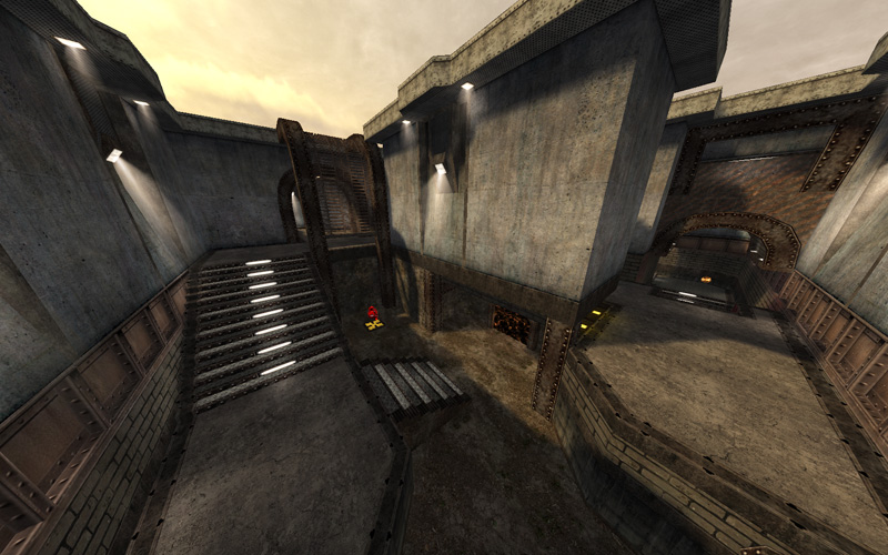
As for the layout, the problems with the MH area become pretty clear once the map is looked at from above. That area is just “tacked on” to the side of the rest of the map, which is very compact and circular otherwise.

My favorite part of the map is definitely the path outlined in red. The rest of the map is useful with the RG and some other items, but people definitely won’t be spending much time there. This is why I think the MH is positioned exactly opposite where it should be. If you were going to expand this map (and I think you should, just a little), I think you should do so in the direction of the green arrow and put the MH there instead. As things are, the map is pretty lopsided.
-pat


