ZOMG, IT'S BETA2!!!!!1111one
Download: http://cityy.explicits.de/uploads/maps/ ... _beta2.zip
Feedback:
- performance
- clipping
- texturing
- new mid
- lighting
-cityy
ct3ctf1 by cityy (RC)
Re: ct3ctf1 by cityy (BETA)
www.ferdinandlist.de/leveldesign
Re: ct3ctf1 by cityy (BETA)
Well, it's coming together. I definitely like the mid area more than the previous version. I will elaborate more on some of my issues with it later.
Again, some small errors:
This needs to be clipped behind it (players can walk behind the teleporter):
http://i787.photobucket.com/albums/yy15 ... tf1b23.jpg
Side of water is visible:
http://i787.photobucket.com/albums/yy15 ... tf1b26.jpg
This is just a preference, but I think it looks a lot better this way (move the trim on the left so that it is flush with the vertical trim like on the right):
http://i787.photobucket.com/albums/yy15 ... tf1b21.jpg
Some more small preferences:
Change the large trim texture to the small trim on the left. I commented on this before, and what you did helped, but I feel the contrasting sizes of trim are very out of place.
http://i787.photobucket.com/albums/yy15 ... f1b210.jpg
Weapon clip the decorative fencing. I know I have preached about grate clipping consistency before, but it doesn't seem right that the "ceiling" fences can hold boxes and debris, but can't stop a rocket. I just feel it would be cleaner if the weapons (such as grenade) could bounce off of these fences (as well as any other fences / grates that aren't a part of the center "obstacle".):
http://i787.photobucket.com/albums/yy15 ... tf1b25.jpg
http://i787.photobucket.com/albums/yy15 ... tf1b24.jpg
The flower (whatever, lol) "grate" texture is a tad overused.
I recommend replacing this with wood:
http://i787.photobucket.com/albums/yy15 ... tf1b29.jpg
Another example of an area in which it is overused:
http://i787.photobucket.com/albums/yy15 ... tf1b22.jpg
Game play preferences:
The upper area of the base seems almost pointless. While it is a nice and functional area to have in a map, it seems almost useless unless a player is very low on health. I recommend switching the 25 health with the YA:
http://i787.photobucket.com/albums/yy15 ... tf1b28.jpg
While I know this is supposed to be a death trap, I think it would benefit game play if there was some sort of support here (maybe a pipe) that was low enough to impair movement, but better than being in the water completely. It would be a thin platform that would be easy to push a player off of, but it would be a step better than the underwater tunnel a few players will be exiting:
http://i787.photobucket.com/albums/yy15 ... tf1b27.jpg
Anyway, like I said, it's definitely coming together. The lighting in some spots is a bit dark still. I love the sunlight that filters through the opening in the roof. I think it would be really cool if there were some portions of the roof (wall area) that were caved in a bit to expose some more of this sunlight on the darker areas of the map. For instance in the RL room, the wall opposite of the wooden "windows" could be caved in, and the support above could be pushed downward a bit. Openings in the wall under and over the support trim at the top would expose sunlight to the room. Here's a small picture I made to help illustrate what I mean (ignore the shitty paint drawing.. ):
):
http://i787.photobucket.com/albums/yy15 ... cavein.png
There is brick, and in the background is concrete/dirt or something. The lined trim at the top is the roof trim (bent down). The red lines are sunlight.
The mid area seems to be good, but I feel like there should be a bit less emphasis on the water, and more hard surfaces on which to stand. The map is really adopting a q3ctf2 feel by making the mid this dependent on water. Maybe some floating (and sunk) crates or something would be good enough on which to stand.
Keep it up. You are doing fine. Just a bit more aesthetic tweaking and you will have the theme and detailing right on track to completion.
Again, some small errors:
This needs to be clipped behind it (players can walk behind the teleporter):
http://i787.photobucket.com/albums/yy15 ... tf1b23.jpg
Side of water is visible:
http://i787.photobucket.com/albums/yy15 ... tf1b26.jpg
This is just a preference, but I think it looks a lot better this way (move the trim on the left so that it is flush with the vertical trim like on the right):
http://i787.photobucket.com/albums/yy15 ... tf1b21.jpg
Some more small preferences:
Change the large trim texture to the small trim on the left. I commented on this before, and what you did helped, but I feel the contrasting sizes of trim are very out of place.
http://i787.photobucket.com/albums/yy15 ... f1b210.jpg
Weapon clip the decorative fencing. I know I have preached about grate clipping consistency before, but it doesn't seem right that the "ceiling" fences can hold boxes and debris, but can't stop a rocket. I just feel it would be cleaner if the weapons (such as grenade) could bounce off of these fences (as well as any other fences / grates that aren't a part of the center "obstacle".):
http://i787.photobucket.com/albums/yy15 ... tf1b25.jpg
http://i787.photobucket.com/albums/yy15 ... tf1b24.jpg
The flower (whatever, lol) "grate" texture is a tad overused.
I recommend replacing this with wood:
http://i787.photobucket.com/albums/yy15 ... tf1b29.jpg
Another example of an area in which it is overused:
http://i787.photobucket.com/albums/yy15 ... tf1b22.jpg
Game play preferences:
The upper area of the base seems almost pointless. While it is a nice and functional area to have in a map, it seems almost useless unless a player is very low on health. I recommend switching the 25 health with the YA:
http://i787.photobucket.com/albums/yy15 ... tf1b28.jpg
While I know this is supposed to be a death trap, I think it would benefit game play if there was some sort of support here (maybe a pipe) that was low enough to impair movement, but better than being in the water completely. It would be a thin platform that would be easy to push a player off of, but it would be a step better than the underwater tunnel a few players will be exiting:
http://i787.photobucket.com/albums/yy15 ... tf1b27.jpg
Anyway, like I said, it's definitely coming together. The lighting in some spots is a bit dark still. I love the sunlight that filters through the opening in the roof. I think it would be really cool if there were some portions of the roof (wall area) that were caved in a bit to expose some more of this sunlight on the darker areas of the map. For instance in the RL room, the wall opposite of the wooden "windows" could be caved in, and the support above could be pushed downward a bit. Openings in the wall under and over the support trim at the top would expose sunlight to the room. Here's a small picture I made to help illustrate what I mean (ignore the shitty paint drawing..
http://i787.photobucket.com/albums/yy15 ... cavein.png
There is brick, and in the background is concrete/dirt or something. The lined trim at the top is the roof trim (bent down). The red lines are sunlight.
The mid area seems to be good, but I feel like there should be a bit less emphasis on the water, and more hard surfaces on which to stand. The map is really adopting a q3ctf2 feel by making the mid this dependent on water. Maybe some floating (and sunk) crates or something would be good enough on which to stand.
Keep it up. You are doing fine. Just a bit more aesthetic tweaking and you will have the theme and detailing right on track to completion.
[url=http://www.xfire.com/profile/vlnoheaven/][img]http://i105.photobucket.com/albums/m231/Lowerboy444/xfire.png[/img][/url]
[url=http://teameventhorizon.com/]Team Event -O- Horizon[/url]
[url=http://mapping.maverickservers.com/]NoGhost Map Making Competition 2 (June 2010)[/url]
[url=http://teameventhorizon.com/]Team Event -O- Horizon[/url]
[url=http://mapping.maverickservers.com/]NoGhost Map Making Competition 2 (June 2010)[/url]
Re: ct3ctf1 by cityy (BETA)
Nice work, sorry for the totally nub and maybe OT question, but where did you get those helper textures used in the first screenshots ? Are the free for download somewhere or did you make it yourself ? reason i ask is cause i like your method 
Re: ct3ctf1 by cityy (BETA)
The template textures are likely made himself because I haven't seen those ones before. However, there are two great template texture packs that I recommend should you want to use this method to start mapping.
The first one is the AEcell texture pack. You can find it here:
viewtopic.php?f=10&t=41665&st=0&sk=t&sd=a&hilit=AEcell
If you are looking for something just a bit simpler, then I recommend going with Evil Lair's template texture pack (although some of the other packs like dsi and eCel would probably work too) found here:
http://www.evillair.net/v2/index.php?op ... &Itemid=53
If you want the sizes on the textures you will have to make your own templates.
[url=http://www.xfire.com/profile/vlnoheaven/][img]http://i105.photobucket.com/albums/m231/Lowerboy444/xfire.png[/img][/url]
[url=http://teameventhorizon.com/]Team Event -O- Horizon[/url]
[url=http://mapping.maverickservers.com/]NoGhost Map Making Competition 2 (June 2010)[/url]
[url=http://teameventhorizon.com/]Team Event -O- Horizon[/url]
[url=http://mapping.maverickservers.com/]NoGhost Map Making Competition 2 (June 2010)[/url]
Re: ct3ctf1 by cityy (BETA)
I made the template textures myself. You can download one of the alphas and grab the textures out of the pk3.
Ty for your feedback Anthem, gonna look into it!
Ty for your feedback Anthem, gonna look into it!
www.ferdinandlist.de/leveldesign
Re: ct3ctf1 by cityy (BETA)
Oh cool thanks for the quick reply, I will definitely look into your method for the future :-)
Another thing learned on this forum. And i thought the Q3 scene was dead, boy was I wrong
Once again apologies for hijacking your thread
On topic:
I took a quick walk through the beta and it's looking like a very well made ctf map and looking forward to play it !
One small remark though, maybe some more indication of which side you are on be nice, as far as I can tell the only way to know what side your on is by looking at the jumppads color ?Edit: I must be colorblind... as I didnt notice the red/blue tinted textures the first run throught the map.. On the other hand, it is rather hard to notice the red compared to the bricks, as is really is rather subtle. Guess I should have checked the blue side first :d
GJ !
Re: ct3ctf1 by cityy (BETA)
Thanks for the new beta, here's my feedback (no pics this time sonce I can't upload anthing at the moment, I hope you'll still know what map sections I am talking of):
1) A messed up spawn point: underneath the platform with LG ammo and 25 health on it, RED bots can directly spawn inside the BLUE base (don't know if it's the same vice versa, didn't test that)
2) In the room with the teleporter and the water pool: the JP there, stand in front of it and look at the right edge (metal trim texture), you can get stuck, there most likely because of an extended clip
3) Same JP as before: take it up and look at the corridor with the stairs leading to the MH (that's the one to your right once you've used the JP); exactly in that corridor at the bottom of these stairs bots carrying a flag get stuck and will run in circles continuously.
4) Do something about the water level: If you try to get out of the pools and don't rise to the surface exactly before the pool's edge (example: you've been swimming to the pool's edge and not diving there) you can't exit the water.
5) Check the clipping around the "death trap" water pool (Anthem called it that way, so I'll stick with it) with the teleporter: I surprisingly managed to make something like a wall jump after speeding up with strafe-jumping from the room with the MH and only hit the left wall in front of the teleporter but didn't lose any speed and jumped right into the TP.
If you are caught on a golf course during a storm and are afraid of lightning, hold up a 1-iron. Not even God can hit a 1-iron.
-Lee Trevino, golfer who actually has been struck by lightning.
-Lee Trevino, golfer who actually has been struck by lightning.
Re: ct3ctf1 by cityy (BETA)
Thanks for the feedback guys! Considered some of it.
Got a RC ready - grab it here: http://cityy.explicits.de/uploads/maps/ ... tf1_RC.zip
Changes:
- LG swapped with PG
- replaced RG with another RL
- moved LG ammo from base
- several texturing and lighting improvments
- medkit has been replaced with a 50 and 4 shards
- mid "cage" was removed, went for sumatra's suggestion instead
- clipping fixes
Feedback:
- clipping
- texture alignments
- target_locations
To be done:
- arrow decals showing you the way to the bases
- what ever you come up with
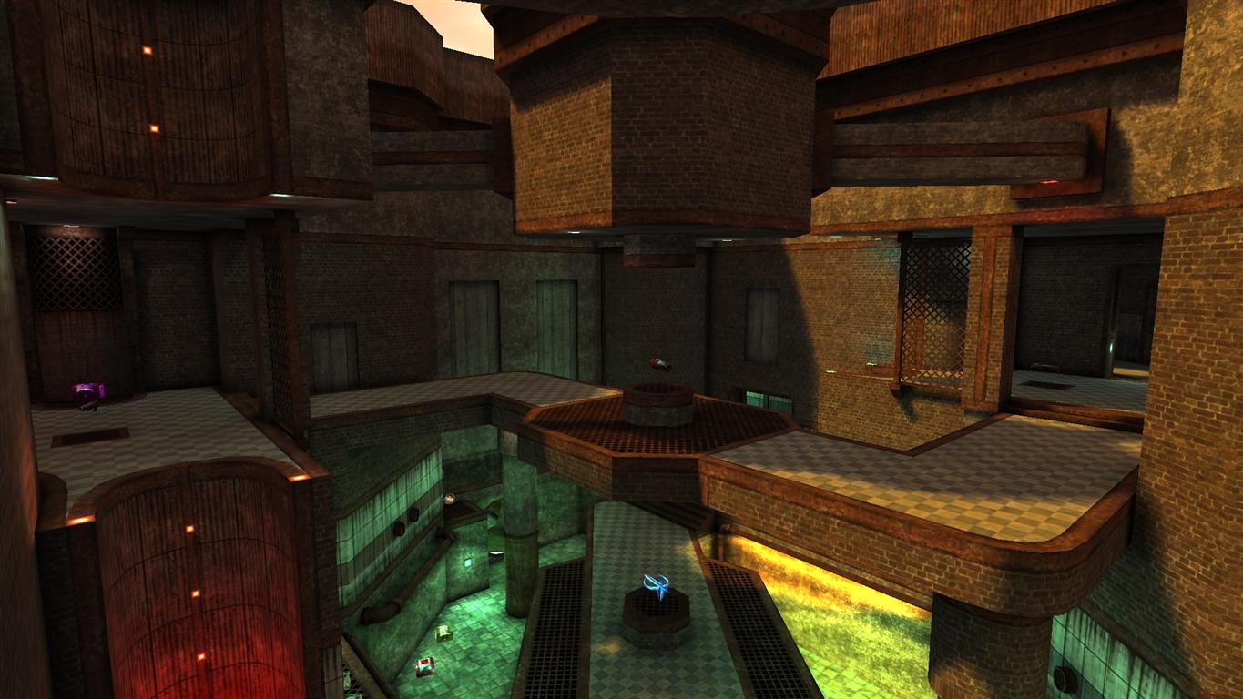
[lvlshot]http://img440.imageshack.us/img440/6642/ct3ctf1.jpg[/lvlshot]
Got a RC ready - grab it here: http://cityy.explicits.de/uploads/maps/ ... tf1_RC.zip
Changes:
- LG swapped with PG
- replaced RG with another RL
- moved LG ammo from base
- several texturing and lighting improvments
- medkit has been replaced with a 50 and 4 shards
- mid "cage" was removed, went for sumatra's suggestion instead
- clipping fixes
Feedback:
- clipping
- texture alignments
- target_locations
To be done:
- arrow decals showing you the way to the bases
- what ever you come up with
[lvlshot]http://img440.imageshack.us/img440/6642/ct3ctf1.jpg[/lvlshot]
www.ferdinandlist.de/leveldesign
Re: ct3ctf1 by cityy (RC)
Some errors:
Sparklies:
http://i787.photobucket.com/albums/yy15 ... f1_rc1.jpg
Make this like the other base:
http://i787.photobucket.com/albums/yy15 ... f1_rc2.jpg
Needs to be fixed in both bases:
http://i787.photobucket.com/albums/yy15 ... f1_rc3.jpg
Caulk or missing patch on pipes:
http://i787.photobucket.com/albums/yy15 ... f1_rc4.jpg
Z-Fighting:
http://i787.photobucket.com/albums/yy15 ... f1_rc5.jpg
Align lower trim where it is lighter:
http://i787.photobucket.com/albums/yy15 ... f1_rc6.jpg
Game play:
Move these pipes down so they can be utilized like the big pipes by the death trap:
http://i787.photobucket.com/albums/yy15 ... f1_rc7.jpg
Add shards to this area (like in the picture) to help alert the defenders:
http://i787.photobucket.com/albums/yy15 ... f1_rc8.jpg
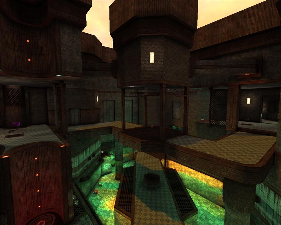
On an ending note, the center area of the mid seems to be quite simple. I don't like the cages that are there now because they are fairly obtrusive to a player who wants to strafe the mid. The mid is now just a bridge, and it looks odd without anything on the central portion of the bridge. I liked the other center from b2 a lot better. The fence platforms on either side above the jump pad were also useful to land on from strafing mid. It feels like the map just regressed. I think it's necessary to change mid again.
Also, I know it will be bad for those in the water, but Rail might be a good weapon to bring back. The lines of sight are rather long, so rail will be useful in many situations. And, if a flag runner gets out of range of lightning, he or she is relatively safe since there are no major long range weapons. I recommend adding it in a place where it won't be picked up often, but a defender can pick it up if necessary.
The current fencing in mid is rather obtrusive to chasing a flag runner as well, so with those two changes I think the map would play better.
Also, the target_locations are good, but it would be better if they were labeled per base. Red Base rather than Base, etc.
So, fix the problems above and release a new RC!
Sparklies:
http://i787.photobucket.com/albums/yy15 ... f1_rc1.jpg
Make this like the other base:
http://i787.photobucket.com/albums/yy15 ... f1_rc2.jpg
Needs to be fixed in both bases:
http://i787.photobucket.com/albums/yy15 ... f1_rc3.jpg
Caulk or missing patch on pipes:
http://i787.photobucket.com/albums/yy15 ... f1_rc4.jpg
Z-Fighting:
http://i787.photobucket.com/albums/yy15 ... f1_rc5.jpg
Align lower trim where it is lighter:
http://i787.photobucket.com/albums/yy15 ... f1_rc6.jpg
Game play:
Move these pipes down so they can be utilized like the big pipes by the death trap:
http://i787.photobucket.com/albums/yy15 ... f1_rc7.jpg
Add shards to this area (like in the picture) to help alert the defenders:
http://i787.photobucket.com/albums/yy15 ... f1_rc8.jpg
On an ending note, the center area of the mid seems to be quite simple. I don't like the cages that are there now because they are fairly obtrusive to a player who wants to strafe the mid. The mid is now just a bridge, and it looks odd without anything on the central portion of the bridge. I liked the other center from b2 a lot better. The fence platforms on either side above the jump pad were also useful to land on from strafing mid. It feels like the map just regressed. I think it's necessary to change mid again.
Also, I know it will be bad for those in the water, but Rail might be a good weapon to bring back. The lines of sight are rather long, so rail will be useful in many situations. And, if a flag runner gets out of range of lightning, he or she is relatively safe since there are no major long range weapons. I recommend adding it in a place where it won't be picked up often, but a defender can pick it up if necessary.
The current fencing in mid is rather obtrusive to chasing a flag runner as well, so with those two changes I think the map would play better.
Also, the target_locations are good, but it would be better if they were labeled per base. Red Base rather than Base, etc.
So, fix the problems above and release a new RC!
[url=http://www.xfire.com/profile/vlnoheaven/][img]http://i105.photobucket.com/albums/m231/Lowerboy444/xfire.png[/img][/url]
[url=http://teameventhorizon.com/]Team Event -O- Horizon[/url]
[url=http://mapping.maverickservers.com/]NoGhost Map Making Competition 2 (June 2010)[/url]
[url=http://teameventhorizon.com/]Team Event -O- Horizon[/url]
[url=http://mapping.maverickservers.com/]NoGhost Map Making Competition 2 (June 2010)[/url]
Re: ct3ctf1 by cityy (RC)
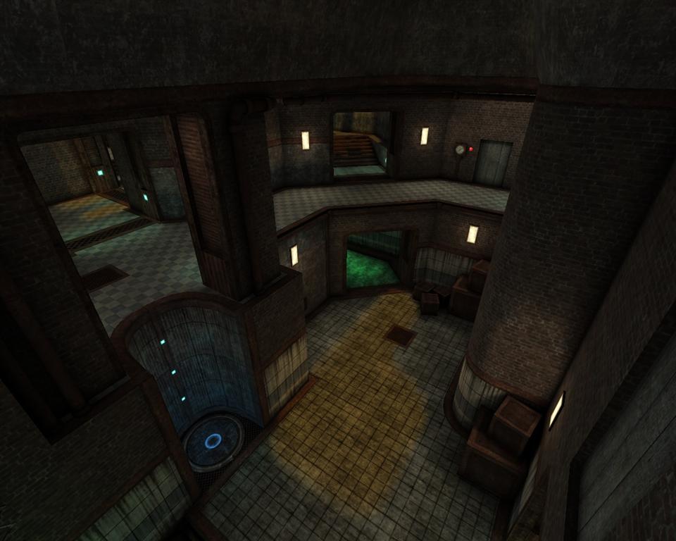
Working on mid: http://cityy.explicits.de/uploads/maps/ ... ot0202.jpg
www.ferdinandlist.de/leveldesign
Re: ct3ctf1 by cityy (RC)
RC2: http://bit.ly/a7qI16
This should be the last release candidate.
Changes:
- cosmetic stuff
- upper mid design was reworked
- shards added at the 50 in base
- LG ammo removed from base
Feedback:
- texture alignment
- clipping
- other bugs
Screenshot
http://cityy.explicits.de/uploads/maps/ ... ot0206.jpg
This should be the last release candidate.
Changes:
- cosmetic stuff
- upper mid design was reworked
- shards added at the 50 in base
- LG ammo removed from base
Feedback:
- texture alignment
- clipping
- other bugs
Screenshot
http://cityy.explicits.de/uploads/maps/ ... ot0206.jpg
www.ferdinandlist.de/leveldesign
Re: ct3ctf1 by cityy (RC)
The center looks a bit better, and I suppose the solid grates are fine.
Some errors:
Check all of these trims to ensure that they are aligned correctly:
http://i787.photobucket.com/albums/yy15 ... 1_rc21.jpg
The clipping is a bit sloppy here:
http://i787.photobucket.com/albums/yy15 ... 1_rc22.jpg
Suggestions:
Perhaps "pry" the planks off of some of these false windows/doors to expose a dirt/cement wall and let the planks lay on the floor or against a wall.
http://i787.photobucket.com/albums/yy15 ... 1_rc24.jpg
Replace the floral grate texture of the center of the top bridge to the wood plank texture. As you can see, the floral grate texture dominates the area. Also, it might be cool to continue the fence trim around the top of the center of the bridge.
http://i787.photobucket.com/albums/yy15 ... 1_rc25.jpg
Preferences:
Make this round again. It seems as though you changed the "pipes" to an octagonal shape to alleviate the need for clipping. Clipping the round tunnel would be simple and it looks a lot better.
http://i787.photobucket.com/albums/yy15 ... 1_rc23.jpg
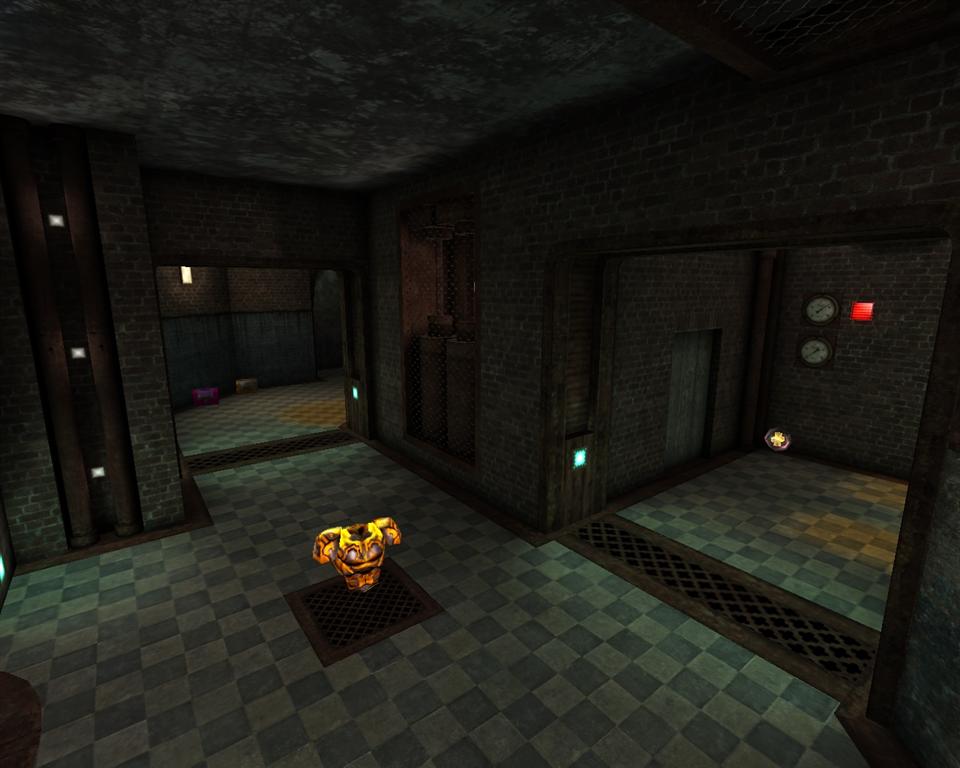
This hallway reminds me of the "monotonous" hallway in your second tourney map, "Rainy Day". This is, quite easily, the most boring part of the map. I recommend adding some hanging things from the ceiling, breaking some of the tiles on the walls, and maybe make something protruding from the walls to help break up the monotony.
http://i787.photobucket.com/albums/yy15 ... 1_rc26.jpg
I also recommend making a more subtle teleporter effect. The that is there now is cool, but it seems weird when compared to the theme of the rest of the map. Something more ambient and glowy would probably help.
The map has turned out very well. With a few more tweaks to the theme (I still recommend decals =P), it will be ready for release.
Good job!
Some errors:
Check all of these trims to ensure that they are aligned correctly:
http://i787.photobucket.com/albums/yy15 ... 1_rc21.jpg
The clipping is a bit sloppy here:
http://i787.photobucket.com/albums/yy15 ... 1_rc22.jpg
Suggestions:
Perhaps "pry" the planks off of some of these false windows/doors to expose a dirt/cement wall and let the planks lay on the floor or against a wall.
http://i787.photobucket.com/albums/yy15 ... 1_rc24.jpg
Replace the floral grate texture of the center of the top bridge to the wood plank texture. As you can see, the floral grate texture dominates the area. Also, it might be cool to continue the fence trim around the top of the center of the bridge.
http://i787.photobucket.com/albums/yy15 ... 1_rc25.jpg
Preferences:
Make this round again. It seems as though you changed the "pipes" to an octagonal shape to alleviate the need for clipping. Clipping the round tunnel would be simple and it looks a lot better.
http://i787.photobucket.com/albums/yy15 ... 1_rc23.jpg
This hallway reminds me of the "monotonous" hallway in your second tourney map, "Rainy Day". This is, quite easily, the most boring part of the map. I recommend adding some hanging things from the ceiling, breaking some of the tiles on the walls, and maybe make something protruding from the walls to help break up the monotony.
http://i787.photobucket.com/albums/yy15 ... 1_rc26.jpg
I also recommend making a more subtle teleporter effect. The that is there now is cool, but it seems weird when compared to the theme of the rest of the map. Something more ambient and glowy would probably help.
The map has turned out very well. With a few more tweaks to the theme (I still recommend decals =P), it will be ready for release.
Good job!
[url=http://www.xfire.com/profile/vlnoheaven/][img]http://i105.photobucket.com/albums/m231/Lowerboy444/xfire.png[/img][/url]
[url=http://teameventhorizon.com/]Team Event -O- Horizon[/url]
[url=http://mapping.maverickservers.com/]NoGhost Map Making Competition 2 (June 2010)[/url]
[url=http://teameventhorizon.com/]Team Event -O- Horizon[/url]
[url=http://mapping.maverickservers.com/]NoGhost Map Making Competition 2 (June 2010)[/url]
Re: ct3ctf1 by cityy (RC)
the main problem with this map imo is that it has no central theme or any functional detail. there for it feels bland. its just a maze of random if ya catch my drift. lots of plain walls, some rooms/hallways are just plain boxes (im thinking underwater) if i was to try and explain the map i would have a hard time. you need to use some kinda of theme. build some kinda of machines or something. or furniture (barrels and crates even. as over used as they are... it would add just that something more.) brick, pipes and green water is not really doing it for me. also im not a fan of the jp texture, it makes no sense to me... maybe change up the blend mode?
also the red and blue sides are not obvious. (maybe some wall hangings?)i think its the red rust texture that does it. if i was you id take a bit more time on this one. you have been pumping out maps at a fast rate... one ever month at lvl.
sorry to be a downer.. i might be being a bit negative. but i know you are an amazing mapper.. maybe you have gotten tunnel visioned in your process. i was the same. im trying to learn/change and grow and i know you can do the same.
Re: ct3ctf1 by cityy (RC)
@fKd:
Na, you're spot on. I feel the exact same way, but cityy made it clear to me that he isn't worrying about details too much. I think his biggest problem is theme at the moment. That was my biggest complaint about his NoGhost competition map, and it holds true to this map too.
He is a great mapper, of course. It's definitely not easy to create a theme (unless you're fKd... detailing like a god seems to be second nature...). I still think it's passable as a map, though. There's nothing... wrong. The map is a bit bland, but it could be a lot worse.
[url=http://www.xfire.com/profile/vlnoheaven/][img]http://i105.photobucket.com/albums/m231/Lowerboy444/xfire.png[/img][/url]
[url=http://teameventhorizon.com/]Team Event -O- Horizon[/url]
[url=http://mapping.maverickservers.com/]NoGhost Map Making Competition 2 (June 2010)[/url]
[url=http://teameventhorizon.com/]Team Event -O- Horizon[/url]
[url=http://mapping.maverickservers.com/]NoGhost Map Making Competition 2 (June 2010)[/url]
Re: ct3ctf1 by cityy (RC)
the three w's
when, where and why.
when, where and why.
Re: ct3ctf1 by cityy (RC)
@ Anthem:
I unfortunately had to make the clipping at the water that sloppy so you can get out of the water propperly in VQ3.
The Water tunnels are not made of patches anymore because of subdivision issues when you looked at them from a further distance.
Gonna look into the other stuff. =)
@ fkd:
I see your point and I totally agree. When I started this I actually wanted to create a cool environment instead of just a normal level/arena. Anyway when I put up beta2 to the #cpmpickup servers and got the first complains about performance I was like "nooooooooooooooooooooooooooooooooooooo". :/ All my plans on adding further detail got carried away and stuff. Also my planning wasn't really good from the beginning - I'm taking too much inspiration from the classic quake style with it's closed off walls with ceilling trims and those things.. makes my levels always feel restricted and certainly even a bit boring. Anyway, I guess it's too late for this one, I'm gonna try too improve that in my next level.
Experiences teaches us I guess and disregarding the points you mentioned this map is some kind of improvment over my old ones in terms of textures as I made them all myself which was a challenge for me - I hope I can improve on the other points too in the future.
www.ferdinandlist.de/leveldesign
Re: ct3ctf1 by cityy (RC)
i get ya man, heh ya cant please all the ppl all the time 
performance issues? hmmm i guess this is an interesting topic, what kinda specs should we be mapping towards? im sure a lot of q3 players are still running old school machines, but at the same time... i dont think that should restrict are artistic freedom.. hmmm some stuff to think about indeed.
as for textures, i had no idea you made em all yourself, bloody good job mate! but they need nicer geo to really make em pop
you'll get em next time bud gg!
Re: ct3ctf1 by cityy (RC)
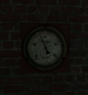
Highest r_speeds I get is 12300. I know that's really not much but I already got these complaints and since the map gets played in it's current state I don't want to mess it up.
Edit:
http://cityy.explicits.de/uploads/maps/ ... ot0209.jpg
http://cityy.explicits.de/uploads/maps/ ... ot0208.jpg
http://cityy.explicits.de/uploads/textures/gauge.gif
Edit:
http://cityy.explicits.de/uploads/maps/ ... ot0209.jpg
http://cityy.explicits.de/uploads/maps/ ... ot0208.jpg
http://cityy.explicits.de/uploads/textures/gauge.gif
www.ferdinandlist.de/leveldesign
Re: ct3ctf1 by cityy (RC)
BUMP for justice.
[url=http://www.xfire.com/profile/vlnoheaven/][img]http://i105.photobucket.com/albums/m231/Lowerboy444/xfire.png[/img][/url]
[url=http://teameventhorizon.com/]Team Event -O- Horizon[/url]
[url=http://mapping.maverickservers.com/]NoGhost Map Making Competition 2 (June 2010)[/url]
[url=http://teameventhorizon.com/]Team Event -O- Horizon[/url]
[url=http://mapping.maverickservers.com/]NoGhost Map Making Competition 2 (June 2010)[/url]